

Set sail on a creative adventure with these 25 fun and easy pirate doodle ideas perfect for all the adventure seekers out there! Whether you’re a young artist fascinated by tales of the high seas or an experienced doodler looking for playful new themes, these designs offer a treasure trove of inspiration. From swashbuckling pirates and treasure maps to pirate ships and parrots, each doodle invites you to explore the thrilling and imaginative world of pirates. Grab your pens and pencils, and embark on a doodling journey that brings the excitement of pirate adventures to life!
All artwork provided is original and can be used as a reference for your own drawings.
Table of Contents
Pirate Holding A Sword
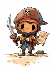
The sand spilling onto the character’s feet is a subtle but impactful detail. It grounds the pirate in their environment, creating a sense of place and adding depth to the illustration. This tiny addition makes the scene feel more alive and dynamic.
I’m particularly drawn to the way the artist rendered the wooden texture on the sword handle. Those fine lines give it a worn, weathered look that fits perfectly with the pirate theme. It’s these small touches that can really elevate a piece from good to great.
The skull on the hat is slightly crooked, which adds personality and a touch of humor. It suggests this isn’t a fearsome pirate, but rather a more lighthearted character. As an artist, I’ve found that these kinds of small asymmetries can make characters feel more relatable and less rigid.
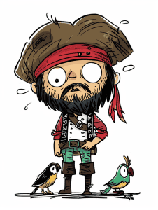
Pirate With A Parrot
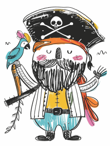
For a beginner tackling this playful pirate illustration, I’d suggest starting with the basic shapes. The character’s body is essentially a big oval, with simple geometric forms for the limbs and hat. Sketch these out lightly first to nail down the proportions and pose.
The charm of this piece lies in its loose, energetic linework. Don’t aim for perfection – embrace those wobbly lines and uneven coloring. It’s what gives the drawing its character. Focus on capturing the expressive elements like the rosy cheeks, the wild beard, and that mischievous parrot. These details bring the pirate to life.
As for color, notice how it’s applied sparingly but effectively. The pops of blue, yellow, and pink really make the illustration pop against the white background. When you’re coloring, leave some areas white for contrast. And don’t forget those little squiggles around the edges – they add movement and frame the whole piece nicely.
Pirate Wearing Eyepatch
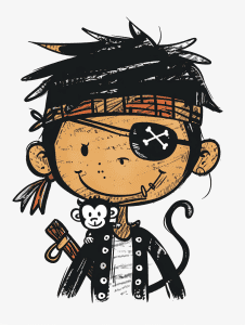
The exaggerated, spiky hair really stands out in this illustration. It adds a wild, energetic feel that contrasts nicely with the character’s more stoic expression. That juxtaposition creates visual interest and hints at a complex personality.
I’m drawn to the scratchy, hand-drawn quality of the linework. It gives the whole piece a raw, expressive vibe that you don’t often see in polished digital art. As an artist, embracing those imperfections can actually make your work more engaging. The uneven lines and scribbled shading add texture and depth without relying on complex rendering techniques.
Pirate Swinging From A Rope
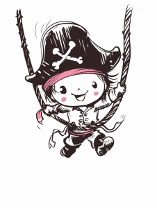
The artist creates depth in this playful pirate character sketch through a few clever techniques. Those swinging ropes give a real sense of motion and space – notice how they curve around the figure, implying a three-dimensional scene. The character’s pose also contributes, with limbs and clothing elements stretching outward at different angles.
Shading plays a big role too, even in this simple line drawing. Look at the dark areas under the hat brim and within the folds of the clothing. Those shadows, though minimal, give form to the figure. The varied line weight is another smart choice – thicker outlines contrasted with finer interior details enhance that dimensional feel. As an artist myself, I’m impressed by how much depth they’ve achieved with relatively sparse linework.
Pirate Crossed Arms
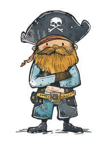
To capture the proportions of this quirky pirate character, I’d recommend starting with basic shapes. The body is essentially a squat rectangle, while the head is a larger oval. Getting these foundational forms right is crucial before adding details.
For practice, try quick gesture drawings focusing solely on the main shapes and their relationships. Pay attention to how the oversized head compares to the stubby body – it’s nearly half the total height! The hat adds even more visual weight up top. Notice how the arms are positioned, creating a compact silhouette. Sketching this character repeatedly from different angles would help internalize these unique proportions.
When you’re ready to refine, grid methods can be useful for accuracy. But don’t lose the playful energy in pursuit of perfection. This illustration’s charm comes from its exaggerated features and slightly wonky lines. Embracing those qualities while maintaining overall proportional relationships is the real challenge here. Have fun with it!
Pirate On A Boat
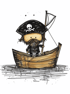
The focal point of this illustration is undoubtedly the character in the boat. The artist has cleverly used contrast to draw our eyes there – the dark hat and beard against the lighter face and boat. That pirate hat with its skull and crossbones really pops, doesn’t it? It’s a great example of using a strong silhouette to capture attention.
I’m impressed by how the boat’s curved lines lead our gaze upward to the character. Notice how the mast and sail continue that upward motion, creating a nice flow. The water lines at the bottom also serve to frame the boat and push our focus inward. It’s a smart compositional choice that keeps us engaged with the main subject.
Pirate Standing On Deck
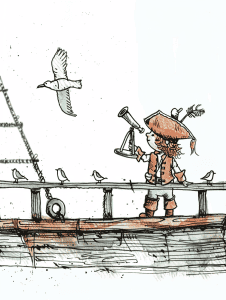
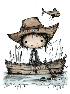
This ink and watercolor illustration has a delightful nautical theme. The simple linework and subtle washes really capture the essence of a young pirate or sailor on a dock. I love how the seagull adds movement to the otherwise static scene.
For a creative variation, why not flip the perspective? Imagine drawing this from the seagull’s point of view, looking down on the dock and the little figure below. You could emphasize the vastness of the sea beyond, maybe add some distant ships or an island. The child would become smaller, but their pose with the telescope could remain a focal point. This aerial view would give you a chance to play with interesting angles and shadows on the dock planks too.
Another idea: consider setting this scene at sunset or sunrise. The warm oranges and pinks reflecting off the water could create a beautiful contrast with the blue tones already present. You might even add lanterns along the dock for an extra touch of magic as day transitions to night. The interplay of light and shadow would bring a whole new dimension to this charming maritime scene.
Pirate Next To A Crate
This illustration’s style is delightful – I love how the artist has captured so much character in such a simple, cartoonish design. The thick, bold outlines and flat colors give it a storybook quality that would translate beautifully to all sorts of subjects.
Imagine applying this approach to, say, a bustling cityscape. You could keep that same chunky, exaggerated look for buildings and vehicles, using a similar color palette of muted tones with pops of brighter hues. The key would be maintaining that balance of detail and simplicity. Just like the pirate’s expressive face and carefully chosen accessories tell a story, you could pack personality into each little storefront or passing car.
I’d encourage experimenting with scale too. This pirate takes up a good portion of the frame, which really lets those small details shine. In a city scene, you might zoom in on just a couple of buildings or a single street corner to capture that same level of charm. The slightly wobbly, hand-drawn quality of the lines is what really makes this style sing – don’t be afraid to embrace little imperfections!
Pirate With Bottle Of Rum
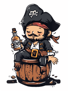
This illustration captures a playful, lighthearted take on the classic pirate archetype. The caricatured style with its exaggerated proportions and cartoonish features creates an instant sense of fun. I’m particularly drawn to how the artist used bold, clean linework to define the character, giving it a punchy graphic quality that really pops.
The color palette is clever – mostly muted earth tones that evoke weathered wood and aged fabrics, punctuated by that vibrant red bandana. It’s a nice balance that keeps the overall feel cohesive while still providing visual interest. The way the pirate is perched atop the barrel adds to the whimsical mood, almost as if he’s about to topple over at any moment. As an artistic choice, it injects some dynamic energy into what could have been a static pose.
Pirate Sitting On A Tiny Boat
This illustration has such a delightful sketchy quality – I’m immediately drawn to those loose, expressive lines. To recreate that effect, you might try using a dip pen with watered-down ink. It’ll give you that beautiful variation in line weight and a slightly unpredictable flow that adds character.
For the watercolor-like washes, here’s an unconventional idea: try using coffee! Seriously, different strengths of brewed coffee can create lovely sepia tones that would suit this palette perfectly. Plus, it’s a fun way to experiment with materials you probably already have on hand. The splotchy texture in the water could even be achieved by sprinkling salt on wet coffee washes – it creates these cool, organic patterns as it dries.
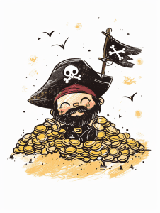
Pirate Counting Gold Coins
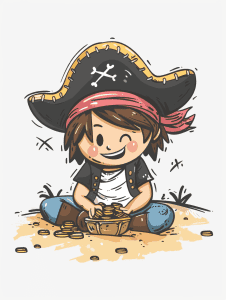
The negative space in this drawing is cleverly utilized to enhance the overall composition. Look at how the white background creates a stark contrast with the character, making the pirate child really pop out. This empty space isn’t just blank – it’s purposeful, directing our eyes to focus on the adorable little buccaneer.
I particularly like how the artist left some areas loosely defined, like the edges of the sand pile. It gives a sense of softness and imperfection that adds to the childlike quality of the piece. The sparse use of “X” marks in the background is a nice touch too. They hint at a treasure map theme without overwhelming the main subject. As an artist, I’d encourage you to experiment with leaving certain areas more open like this – it can really make the detailed parts shine.
Pirate On A Dock
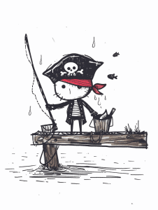
The fine details in the pirate’s outfit really catch my eye. Look at how the artist carefully drew the striped shirt, complete with subtle shading to give it depth. They even included small touches like the skull and crossbones on the hat and the ragged edges of the wooden plank. Those little elements really bring the character to life.
I’m also impressed by the background details. Notice the ripples in the water and the tiny fish swimming by? That kind of environmental context isn’t always easy to nail, especially in a minimalist style like this. The artist didn’t overdo it, but added just enough to set the scene. As a tip, when you’re drawing backgrounds, less is often more – suggest the setting without overwhelming the main subject.
Penguin Dressed As A Pirate
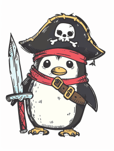
This little pirate penguin is absolutely adorable! The artist has done a great job with the linework and basic coloring, but there’s definitely room to add more texture and depth.
One technique I’d suggest is cross-hatching. It would work really well to add shadows and dimension, especially on the penguin’s white belly and the folds of the pirate hat. You could also use it more subtly on the sword blade to give it a metallic sheen. Cross-hatching takes practice, but it’s a versatile way to create texture without muddying the clean style.
Another option would be to incorporate some stippling, particularly for the fuzzy look of the penguin’s feathers. Tiny dots clustered more densely in shadow areas would give a soft, downy appearance. This could contrast nicely with the harder edges of the hat and sword. Just be careful not to overdo it – a little stippling goes a long way!
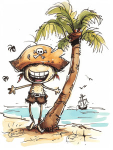
Pirate Beside A Palm Tree
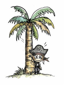
The current perspective gives this palm tree and pirate character a storybook feel, doesn’t it? I love how the tree looms large, creating a sense of shelter for the little buccaneer below. But imagine if we shifted the viewpoint…
Looking down from above could make the pirate seem even tinier and more vulnerable against the vast ocean backdrop. Or a worm’s-eye view might amp up the drama, with the palm fronds spreading like a green explosion against the sky. Zooming in tight on just the character’s face could let us really capture those expressive eyes and cheeky grin. There’s so much room to play with mood and scale here!
I’d be curious to see how altering the line work might change things too. Those loose, sketchy strokes give it a breezy, tropical vibe. But crisper outlines could push it in a more graphic direction, maybe even leaning into a woodcut-inspired look. What do you think – which perspective would you most want to experiment with?
Pirate Wearing Spectacles
The contrast in this piece is striking, especially between the character’s wide-eyed expression and his rugged pirate attire. Those bulging eyes really pop against the darker tones of his face and hat. It’s a clever way to draw attention to the character’s comical, slightly alarmed look.
Color contrast plays a big role too. The red bandana and bright green parrot stand out boldly against the muted browns and grays of the pirate’s clothing. This helps break up the otherwise earthy color scheme and gives the eye some vibrant focal points to latch onto. I particularly like how the artist used white highlights sparingly – just on the eyes, teeth, and shirt – to create depth without overcomplicating the cartoon style.
Sleeping Pirate
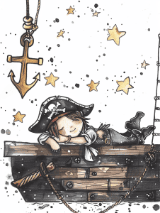
The illustration already has some lovely dynamic elements with the stars and splatters, but we could push it further. Consider adding some motion lines or a subtle swirling effect around the anchor to suggest it’s swinging or moving. This would create a sense of gentle movement and draw the eye through the composition.
As for the figure, you might experiment with their pose. Perhaps have them reaching out towards one of the stars or leaning further over the edge of the boat. Even a small adjustment like having their hair or clothing appear wind-blown could inject more energy. The stars themselves could be given trailing lines to imply they’re shooting across the sky rather than static.
These tweaks would maintain the dreamy, whimsical feel while adding a touch more liveliness. Remember, sometimes less is more – you don’t want to overwhelm the quiet charm of the original piece. Play around with these ideas and see what resonates with your artistic vision.
Pirate On Gold Coins
This playful pirate illustration could translate beautifully into a watercolor painting. The loose, sketchy style would lend itself well to fluid watercolor washes, allowing you to build up layers of transparency for the gold coins and create a sense of depth. You might experiment with salt or alcohol techniques to add texture to the background, mimicking the speckled effect.
For a completely different take, consider adapting it into a 3D sculpture or diorama. Imagine crafting the pirate’s expressive face and beard from polymer clay, then surrounding him with a sea of tiny, glittering coins. The flag could be made from actual fabric, adding an interesting textural contrast. This approach would really bring the character to life in a tangible way. Just picture how fun it would be to create all those little gold pieces!
Pirate On A Shore
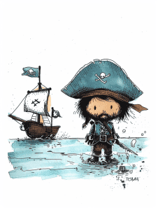
The artist employs a clever use of repetition in the blue-green hues throughout this illustration. You’ll notice this color palette in the pirate’s hat, the ship’s flag, and the water, creating a cohesive visual theme. This technique helps tie the elements together and gives the piece a unified feel.
Looking closer, there’s a subtle pattern in the character’s facial features – those round, dot-like eyes echo the buttons on their coat. It’s a small detail, but it adds charm and consistency to the design. As for the water, the artist uses short, repetitive brush strokes to suggest movement and texture. This approach gives the impression of waves without overcomplicating the background. When you’re starting out, focusing on these kinds of repeating elements can really help bring a drawing together.
Pirate Holding A Cup
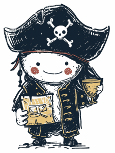
The skull and crossbones on that pirate hat immediately grab your attention. It’s a bold, iconic symbol that anchors the whole character design. The contrast of the white skull against the dark hat really makes it pop.
I’m impressed by how much personality comes through in such a simple style. Those rosy cheeks and that little smile give a friendly vibe, which is an interesting juxtaposition with the pirate theme. The way the artist balanced cute and menacing elements is clever. As for technique, notice how the rough, sketchy lines add texture and charm without overcomplicating the drawing. That’s not easy to pull off – it takes confidence to know when to stop and let simplicity speak for itself.
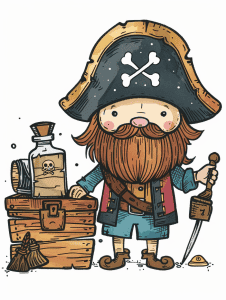
Pirate Finding A Treasure Chest
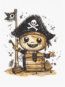
As an experienced artist, I’d start with the basic shapes that make up the character’s body and head. That wooden barrel form is the foundation, so I’d rough that in first with some quick, loose lines to capture its cylindrical shape. Then I’d move to the round head, getting the proportions right in relation to the body.
The hat is a key defining feature, so I’d sketch that next – its triangular shape and slight curve help establish the pirate theme. From there, I’d work on refining the facial features, particularly those big expressive eyes. They really give the character its personality. Lastly, I’d add in the details like the flag, mop, and surrounding elements to flesh out the scene. Those smaller touches can wait until the main structure is solid.
Getting the overall composition and proportions nailed down early is crucial. It’s tempting to dive into the fun details, but building a strong foundation first will save headaches later. This image has such great energy – capturing that loose, sketchy quality in the linework would be key to preserving its charm.
Pirate Holding A Compass
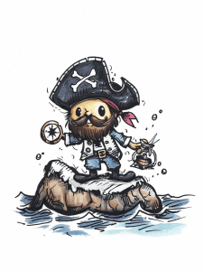
The artist’s use of line weight variation really brings this pirate character to life. Notice how the outlines are bold and confident, especially on the hat and face, while interior details like the fur texture use lighter, sketchier strokes. This contrast adds depth and draws focus to key features.
I’m impressed by the watercolor-like effects achieved in what looks to be a digital medium. The splashes around the walrus-ship and the subtle color blending in the water give it an organic, painterly feel. That’s not easy to pull off digitally. If you’re aiming for a similar style, try experimenting with textured brushes and playing with opacity settings to get that watery look.
Pirate With A Magnifying Glass
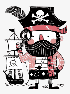
The stylized nature of this pirate character might trip up beginners. Those bold, graphic shapes and clean lines look deceptively simple, but capturing that precise balance between detail and abstraction takes practice. I’d suggest starting with the basic geometric forms – the circular head, rectangular body – before tackling the intricate patterns and textures.
Getting the proportions right could be another hurdle. Notice how the head is oversized compared to the body, giving it that playful, cartoony vibe. Beginners often struggle to intentionally distort proportions while still maintaining a cohesive character design. The tiny pirate ship is a nice touch, but scaling it correctly in relation to the main figure might be tricky at first. Overall, this illustration’s charm comes from its confident execution – something that only develops with time and lots of sketching!
Pirate Beside A Coconut Tree
Let’s focus on that palm tree – it’s a great element for beginners to practice. Try sketching just the trunk and fronds repeatedly, experimenting with different line weights and curvatures. Pay attention to how the fronds fan out asymmetrically at the top. This will help you get comfortable with organic shapes and flowing lines.
For a fun challenge, tackle that exaggerated cartoon character. Start with basic shapes – an oval for the body, a circle for the head. Then add details like the oversized hat and grinning expression. Don’t worry about perfection; cartoon drawing is all about capturing personality through simple forms and exaggeration. Play around with different proportions to see how they affect the character’s vibe.
Pirate Climbing A Rope Ladder
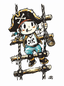
The line work in this piece really shines. There’s a confident, sketchy quality to the strokes that gives the character a lively, energetic feel. It’s not overly polished, which works perfectly for this style of illustration. The artist has done a great job balancing loose, expressive lines with more controlled details.
I’m particularly impressed by the use of negative space, especially around the character’s legs and the rope ladder. It creates a sense of movement and lightness that fits the playful pirate theme. The subtle shading adds just enough depth without overwhelming the clean lines. As a tip, when working in this style, don’t be afraid to let some areas breathe – not everything needs to be filled in or perfectly defined.
As you wrap up these 25 fun and easy pirate doodles, take a moment to admire the adventurous spirit and creativity you’ve brought to your sketchbook. Each pirate, ship, and treasure chest reflects your artistic talent and love for the thrill of the high seas. You’ve transformed blank pages into a lively collection of pirate-themed doodles that capture the essence of swashbuckling adventures. Keep your drawing tools handy and your imagination sailing, and let the world of pirates continue to inspire your creative journey. Happy doodling!

")
