

Add a touch of fall charm to your bullet journal with these 20 fun autumn doodle ideas! Perfect for bringing the cozy vibes of the season into your daily planning, these doodles capture everything we love about autumn—crunchy leaves, pumpkins, warm drinks, and more. Whether you’re a bullet journaling pro or just starting, these simple and creative autumn-inspired designs are easy to recreate and perfect for adding a seasonal flair to your pages. Grab your pens and let’s doodle your way into the warm spirit of fall!
All artwork provided is original and can be used as a reference for your own drawings.
Table of Contents
Pumpkin Soup
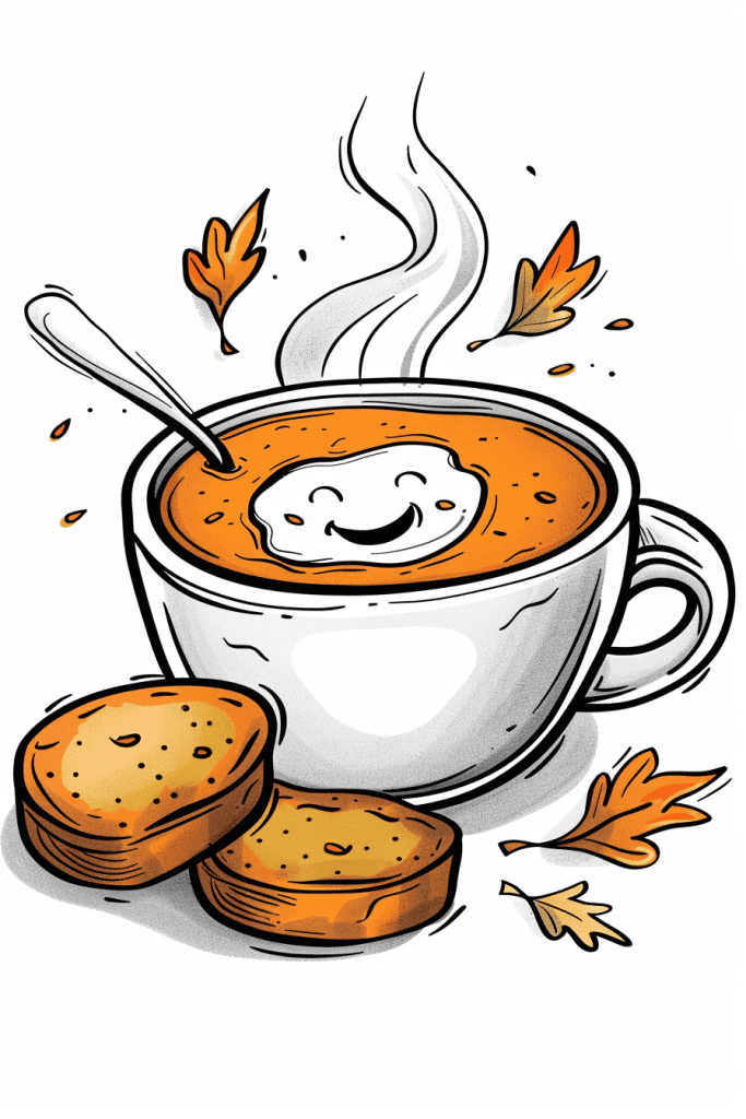
Looking at this cozy autumn scene, I’m struck by how the artist created such a warm, inviting mood. To recreate this unconventionally, you might try using actual pumpkin puree or spices mixed with paint to capture that rich orange color and add texture. The steam could be fun to render with candle smoke – carefully waft it over the paper to leave ghostly trails.
For the cute smiley face in the soup, why not experiment with coffee rings? A mug bottom dipped in light cream could stamp out that perfect circular shape. Then use a toothpick dipped in espresso to draw the facial features. The toast pieces could be stamped using actual bread corners – just coat them lightly in brown paint. Playing with food and drink as art tools fits the culinary theme and could yield some interesting effects.
Apple Cider With Cinnamon Stick

The negative space in this illustration is used brilliantly to create a sense of lightness and whimsy. Notice how the white background allows the cup and floating hearts to stand out, giving the whole piece an airy, cheerful feel. It’s not overcrowded – the artist knew when to stop and let the blank space speak for itself.
Looking at the cup itself, see how the facial features are minimal? Just a few simple lines for the eyes and cheeks, but it’s enough to convey emotion. That’s a great technique for beginners to practice. You don’t always need to draw every detail. Sometimes less really is more, especially when you’re going for a cute, stylized look like this.
The steam and hearts rising from the cup are cleverly arranged to draw the eye upward. It creates movement and adds visual interest to what could have been empty space. As you’re sketching, think about how you can use simple elements like this to guide the viewer’s gaze around your composition. It’s a subtle but effective way to make your drawings more dynamic.
Smiling Pumpkin
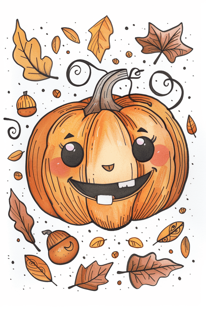
The delicate linework on the pumpkin’s surface really stands out to me. Those fine vertical lines give it depth and texture, making the pumpkin feel three-dimensional. It’s not easy to achieve that effect, especially with what looks like pen or marker.
I’m also impressed by the variety of autumn leaves scattered around. Each one has its own unique shape and veining pattern. That level of individuality in the small details shows patience and skill. The acorns are a nice touch too – their texture contrasts nicely with the smoother leaves. Overall, there’s a great balance of detail and simplicity in this cute fall scene.
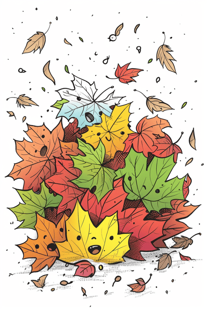
Smiling Leaves Dancing In The Breeze
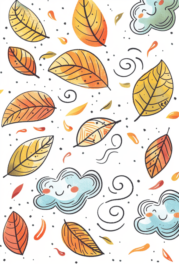
Looking at this delightful autumn scene, I’m struck by how the artist has already created a sense of movement and depth through their use of swirling lines and varied leaf shapes. To add even more texture, I’d suggest experimenting with stippling or cross-hatching techniques within the leaves themselves. This could give them a more intricate, detailed appearance and enhance the overall richness of the illustration.
Another approach would be to play with negative space. Try carefully erasing small areas within the leaves to create the illusion of light filtering through or to mimic the natural imperfections found in real foliage. This subtle technique can add a surprising amount of depth and realism. And don’t forget the background – adding a light wash or pattern behind the main elements could make them pop even more, giving the whole piece an extra layer of visual interest.
Scarecrow Wearing A Strawhat
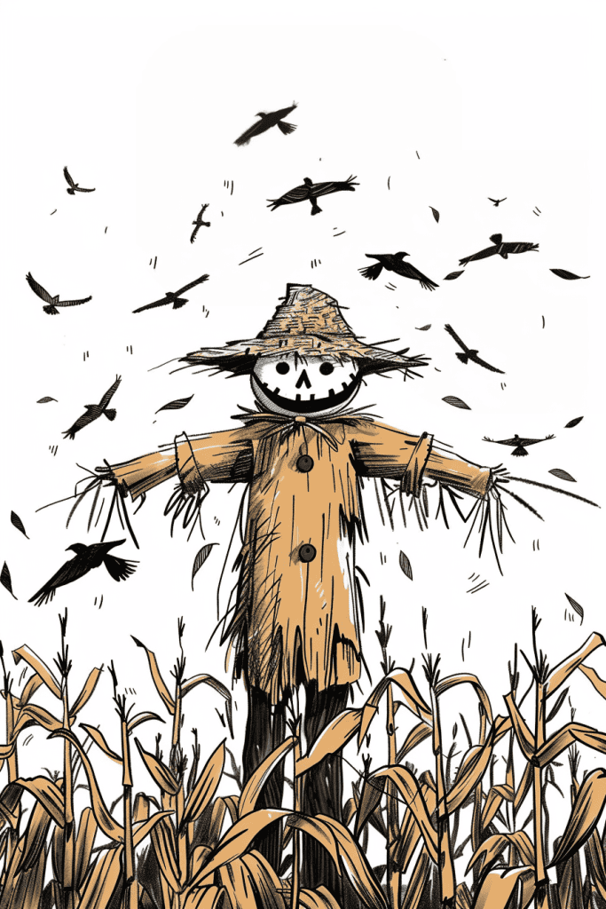
The low-angle perspective really makes this scarecrow loom large, doesn’t it? It’s a smart choice that amplifies the eerie mood. Those crows swirling overhead add to the unsettling vibe too.
If you wanted to shake things up, try a bird’s-eye view. Imagine looking down on that cornfield, with the scarecrow as a tiny figure below. It could create a sense of isolation, like he’s lost in a sea of corn. Or maybe experiment with an extreme close-up on that grinning face. Getting right in there would amp up the creep factor big time.
Playing with perspective is one of the most powerful tools we artists have. It can completely flip the emotional impact of a scene. In this case, the current view makes the scarecrow dominate. Changing it could shift the whole story the image is telling. Always worth exploring different angles to see what new ideas emerge.
Quaint Cabin
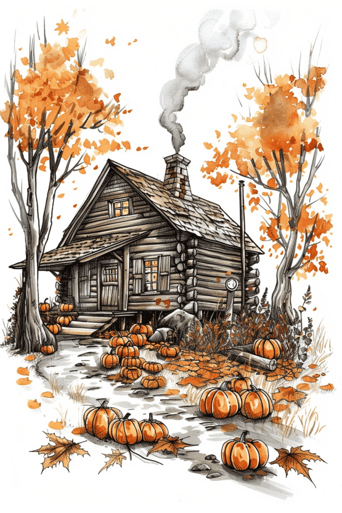
The contrast in this autumn scene really brings it to life. Look at how the warm oranges and yellows of the trees and pumpkins pop against the cool grays of the log cabin and smoke. That temperature contrast creates a cozy, inviting mood.
Texture plays a big role in the contrasts too. The rough, angular lines of the cabin logs stand out sharply from the soft, billowing smoke and the delicate autumn leaves. And check out the contrast in detail – the intricately rendered cabin against those loose, expressive tree branches. That variety keeps your eye moving through the whole image.
I love how the artist used mostly muted earth tones, but then added those pops of bright orange pumpkins. It’s a great way to draw focus and add visual interest without going overboard on color. Overall, this piece has a beautiful balance of contrasts that work together harmoniously. Nicely done!
Squirrel Holding Acorn
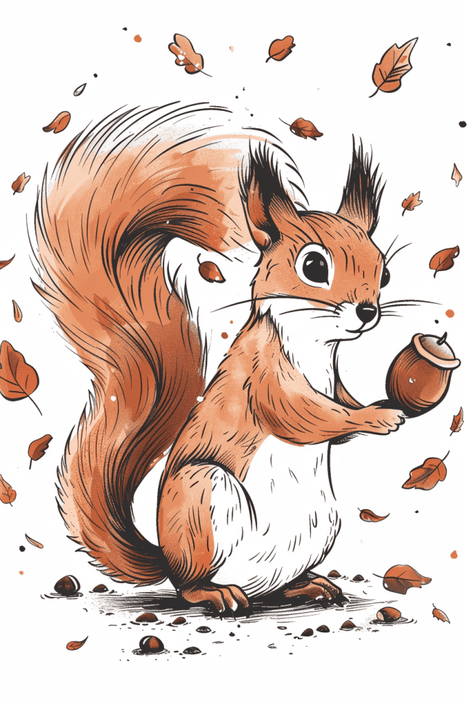
This squirrel illustration already has some great dynamic elements, but we could push it further. The falling leaves add movement, but let’s amp that up. Try exaggerating the swirl of leaves around the squirrel, creating a mini whirlwind effect. This would enhance the autumn feel and give a sense of action.
For the squirrel itself, consider tweaking its pose slightly. Maybe have it leaning forward more, as if it’s about to dash off with its acorn prize. You could also play with its fur, making it look a bit more windswept. This would tie in nicely with the increased leaf movement.
The line work is clean and expressive, which is great. To add extra life, you might experiment with varying line weights more dramatically, especially around areas of movement like the tail and paws. This technique can really make certain parts pop and guide the viewer’s eye through the composition.
Raccoon Peeking Out From A Tree Trunk
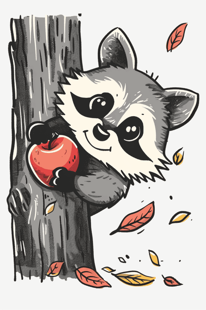
This adorable raccoon illustration would translate beautifully into a watercolor painting. The soft, textured fur and rounded shapes lend themselves well to loose, flowing brushstrokes. You could really play up the autumnal mood by experimenting with wet-on-wet techniques for those falling leaves.
For a totally different take, consider adapting it into a linocut print. The strong contrast and graphic quality would work nicely in black and white. Carving those expressive eyes and that cheeky grin could be a fun challenge. Plus, the wood grain texture in the background would translate perfectly to the natural variations you get with block printing.
Owl Perched On A Branch
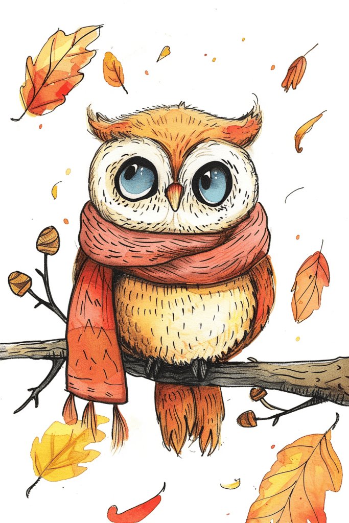
The artist has done a wonderful job using repetition and patterns throughout this adorable owl illustration. Look at how they’ve created texture on the owl’s body using short, repeated strokes – it really brings the feathers to life. You can see similar patterning on the scarf, with parallel lines giving it a cozy, knitted feel.
The falling leaves are another great example. They’re scattered around the owl in various sizes and orientations, but their similar shapes create a cohesive autumnal pattern. The artist even repeated some of the warm orange and yellow tones from the leaves in the owl’s feathers and eyes. This color repetition ties the whole piece together beautifully. If you’re looking to improve your own illustrations, paying attention to these kinds of thoughtful details can really elevate your work.
Hedgehog Curled In A Pile Of Leaves
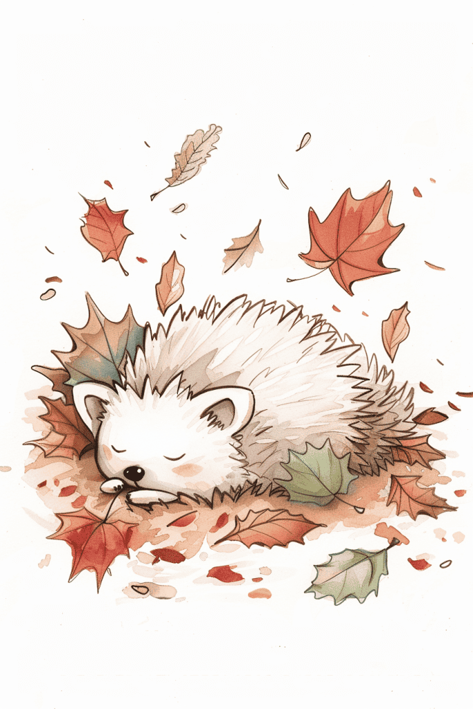
The hedgehog immediately grabs my attention in this delightful autumn scene. Its spiky yet soft-looking quills and peaceful expression create a wonderful focal point. The way the artist captured its curled-up posture amidst the falling leaves is quite endearing.
The color palette really brings the seasonal mood to life. Those warm oranges and reds of the maple leaves contrast beautifully with the hedgehog’s pale fur. I’m particularly impressed by how the artist suggested texture through their linework and shading techniques. You can almost feel the crispness of those dry leaves.
If you’re looking to recreate something like this, I’d suggest starting with a light pencil sketch to nail the hedgehog’s shape. Then build up layers of color, working from light to dark. Don’t forget those little details that bring it to life – the rosy cheeks, the subtle shadows under the leaves. It’s those thoughtful touches that elevate a piece from good to great.
Lantern Surrounded By Stars
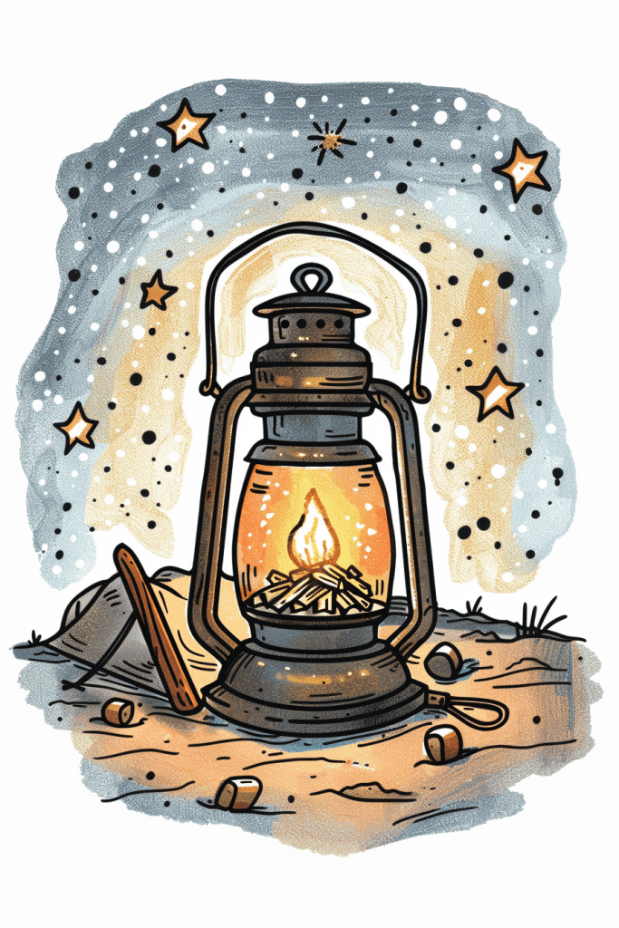
For a quick sketch of this lantern scene, I’d start with the central oil lamp. It’s the focal point and sets the scale for everything else. Rough out its basic shape first – the cylindrical body, conical top, and that warm glow inside. Getting the proportions right here is crucial.
Next, I’d block in the starry night sky and ground. A few loose, sweeping strokes can capture that swirling, dotted background. Don’t fuss over perfect stars yet. For the foreground, some jagged lines and a few pebbles will suggest the rocky terrain. The contrast between the soft sky and rugged ground really makes the lamp pop.
Lastly, I’d add those little details that bring it to life – the handle on top, the stick and cloth nearby. These elements tell a story and add depth. Remember, it’s just a quick sketch, so suggest rather than render fully. The goal is to capture the essence and mood of the scene, not every speck of dust.
Fox Behind Pile Of Leaves
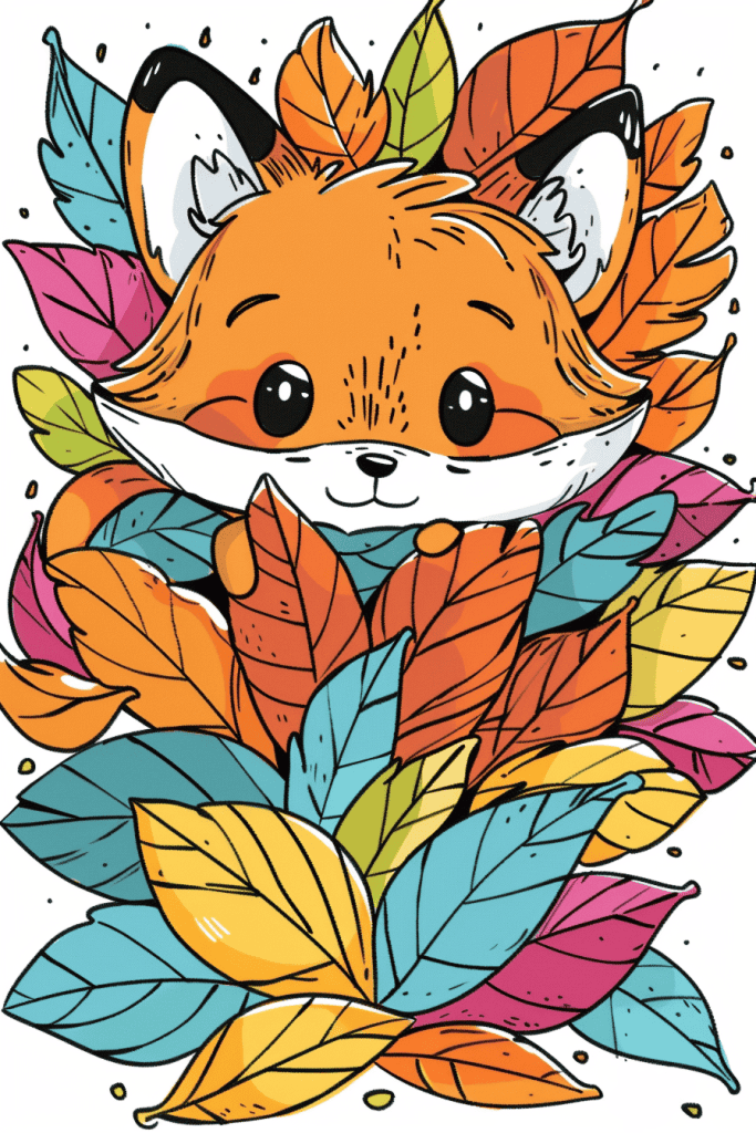
The artist’s use of vibrant, contrasting colors really makes this fox illustration pop. Those bold blues and pinks against the orange fur create a striking visual effect. It’s not a realistic color palette, but it works beautifully to grab attention and convey a playful mood.
I’m impressed by how the leaves are arranged to frame the fox’s face. It’s a clever compositional technique that draws the eye right to those big, expressive eyes. The varied leaf shapes and sizes add visual interest without overwhelming the main subject. If you’re new to illustration, experimenting with framing elements like this can really elevate your work.
Rabbit Surrounded By Wildflowers
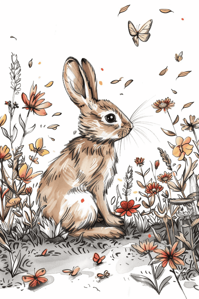
The detailed fur texture on that rabbit would be tricky for a beginner. Getting the right balance of individual hairs and overall shape takes practice. I’d suggest starting with basic forms and gradually building up the fur’s complexity.
Those delicate flowers and butterflies scattered throughout the scene add another layer of difficulty. Their varied sizes and placements create a sense of depth, but capturing that depth on paper isn’t easy. A beginner might struggle with proportions and perspective here. One approach could be sketching the main elements first, then adding smaller details later.
The overall composition is quite busy, which can be overwhelming. Deciding what to emphasize and what to simplify is an art in itself. I’ve found that even experienced artists sometimes get bogged down trying to include every little detail. For a beginner, it might help to focus on one section at a time, or to do a simplified version first before tackling the full complexity.
Cupcake With Pumpkin Topper
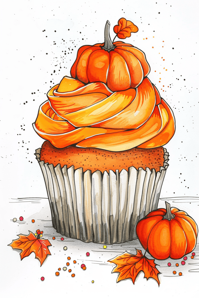
Looking at this delightful autumn cupcake illustration, I’d recommend starting with the basic shapes. Try sketching several simple cupcakes using just circles and rectangles. Focus on getting the proportions right – the base should be wider than it is tall, with the frosting mound about equal in height to the base.
Once you’ve got the basic form down, practice drawing the swirls of the frosting. Use loose, curving lines and build up the volume gradually. Don’t worry about perfection – frosting is naturally a bit uneven. For an extra challenge, try adding a miniature pumpkin on top, paying attention to the segmented shape and stem. The fall leaves scattered around would be great for practicing organic shapes and shading techniques too. Start with simple leaf outlines, then add veins and color gradients to bring them to life.
Cozy Sweater
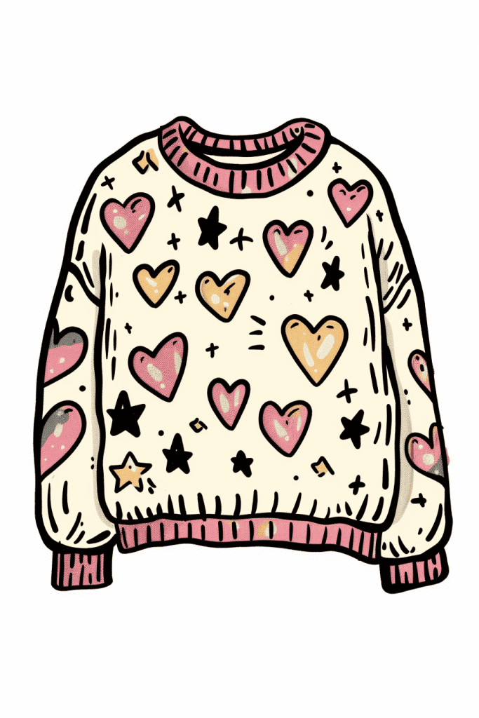
The color palette really stands out in this illustration. Those soft pinks and warm yellows against the cream background create such a cozy, inviting feel. It’s a great example of how limited colors can pack a big punch when used thoughtfully.
I’m impressed by the texture work too. Look at those little details – the ribbed collar and cuffs, the subtle shading on the hearts. Those touches elevate it from a flat design to something with depth and character. As a beginner, focusing on those small elements can really level up your drawings.
The overall composition is nicely balanced. The way the hearts and stars are scattered creates movement without feeling chaotic. It guides your eye around the sweater in a pleasing way. That’s not easy to pull off, especially with a busy pattern like this.
Outdoor Picnic Scene
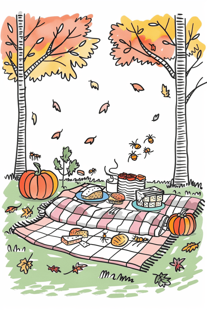
This autumn picnic scene is beautifully composed, with lots of charming details that capture the season. The falling leaves, pumpkins, and warm color palette really set the mood.
To enhance the drawing, I’d suggest adding a cozy blanket or throw draped over part of the picnic spread. This would introduce some interesting textures and folds to draw, while reinforcing the comfy autumn vibe. It could overlap the checkered blanket, creating depth and visual interest. Plus, who doesn’t love snuggling up with a soft blanket on a crisp fall day?
The addition would also balance out the composition nicely, filling in some of the empty space on the blanket without overcrowding the scene. Just imagine how satisfying it would be to render those soft fabric folds and shadows! It’s a great opportunity to practice different drawing techniques too.
Cozy Fall Socks
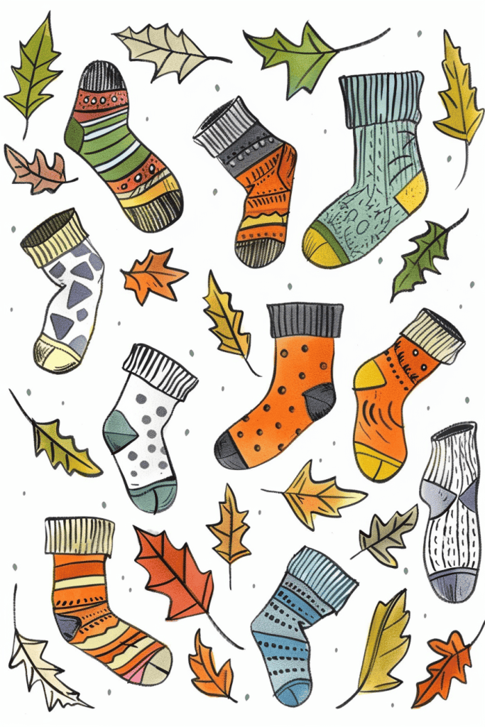
When drawing cozy socks and autumn leaves like these, a common pitfall is getting too caught up in the details too early. It’s tempting to dive right into intricate patterns, but that can lead to stiff, overworked illustrations. Start with loose, fluid shapes to capture the overall form and movement of the socks. Those curvy, organic lines are key to conveying their soft, comfy nature.
Color choice is crucial here too. Notice how the artist uses a warm, earthy palette that evokes fall, but avoids making it too literal or predictable. Don’t feel constrained to traditional autumn colors – that pop of blue adds interest. And speaking of interest, varying the sock designs keeps the eye moving around the composition. Try sketching out a bunch of quick thumbnail designs before committing to final versions. That way you’ll end up with a dynamic mix of patterns and shapes.
Cluster Of Fall Leaves
For a beginner tackling this vibrant autumn scene, mastering varying line weights would be crucial. Notice how the outlines of the larger maple leaves are bolder, while the smaller falling leaves have more delicate strokes. This contrast adds depth and visual interest. Practice drawing leaves with light, sketchy lines first, then go back to emphasize certain edges.
The playful expressions on the leaves really bring this illustration to life. Developing your ability to convey personality through simple shapes and details can elevate a basic nature sketch into something more engaging. Try sketching quick facial expressions on everyday objects to build this skill. And don’t be afraid to exaggerate – that surprised yellow leaf in the center catches the eye precisely because of its dramatic mouth shape.
Basket Overflowing Of Apples
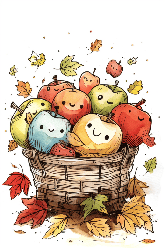
Let’s start with the basket and apples – that’s the core of this adorable fall scene. For a beginner, I’d suggest simplifying the apple shapes into basic circles first. Don’t worry about all the little details and expressions right away. Focus on getting different sizes and a nice arrangement in the basket.
The basket itself could be broken down into a simple curved shape for the body and some basic lines for the weave pattern. As for those falling leaves, try using simple leaf shapes without all the intricate veins and edges. A beginner could practice drawing a few basic leaf outlines scattered around. The key is capturing that cozy autumn feeling without getting bogged down in every little detail. Build up the complexity gradually as you get more comfortable with the basic shapes and composition.
Pumpkin Wreath
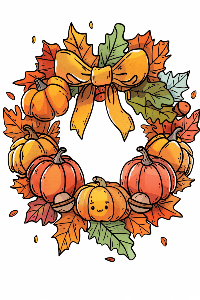
One subtle detail that really elevates this autumn wreath illustration is the tiny face on the central pumpkin. It’s easy to miss at first glance, but that little smiling expression adds a touch of whimsy and personality to the whole piece. It transforms the pumpkin from a simple object into a cute character, giving the wreath a bit of unexpected charm.
The artist’s use of shading and highlights is also quite skillful. Notice how the pumpkins have a soft gradient from orange to yellow, creating dimension and volume. The same technique is applied to the bow at the top, making it appear silky and three-dimensional. These small touches of light and shadow throughout the image bring the whole composition to life, making it feel rich and vibrant rather than flat.
With these 20 fun autumn doodle ideas, your bullet journal will be filled with all the warmth and beauty of the season. From falling leaves to cozy sweaters, these simple yet charming designs will inspire creativity and make your journal feel like a true reflection of fall. Whether you’re organizing your to-do list or just adding some seasonal decorations, these doodles will bring a smile to your face every time you open your journal. So, grab your favorite pens and embrace the playful side of autumn!

")
