

Embrace the warmth and tranquility of the season with these 25 cozy fall forest watercolor ideas. Perfect for capturing the rich hues of autumn, from vibrant oranges and deep reds to earthy browns and greens, these watercolor paintings will transport you to peaceful woodland scenes. Whether you’re a beginner or an experienced artist, these cozy forest-inspired ideas are a great way to explore the beauty of fall while practicing your watercolor techniques. Let the soothing atmosphere of autumn forests inspire your creativity!
All artwork provided is original and can be used as a reference for your own drawings.
Table of Contents
Winding Path Through The Woods
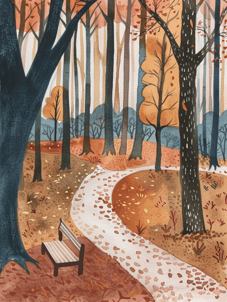
Wow, this autumn forest scene is beautifully rendered with such a warm, inviting color palette. The winding path and lone bench really draw you into the peaceful atmosphere.
For an interesting variation, how about shifting the perspective to a bird’s eye view? Imagine looking down on this forest from above, with the path snaking through like a ribbon. You could play with abstract shapes for the treetops, using those same rich oranges and golds. The bench could become a tiny focal point, barely visible through gaps in the canopy. This angle would give a totally different feel while keeping the core elements.
Another idea – try setting this scene at night. Picture how the moonlight might filter through those bare branches, casting long shadows. You could use deep purples and blues, with touches of silver. Maybe add some fireflies or an owl for visual interest. The path could glow faintly, leading viewers’ eyes through the darkness. This nocturnal take would completely transform the mood while maintaining the basic composition.
Treehouse
This illustration’s dreamy, luminous quality could translate beautifully to urban nightscapes. Imagine applying those glowing string lights to neon signs and streetlamps, with towering skyscrapers replacing the tree branches. The soft, hazy edges and watercolor-like blending would lend themselves well to reflections on wet pavement.
The artist’s use of warm golden tones against cool blues creates such captivating contrast. You could play with that same technique in a desert scene, perhaps. Picture golden sand dunes beneath a starry night sky, with a Bedouin tent aglow like that treehouse. The falling snow could become windblown sand, maintaining that sense of quiet movement. Adapting this style to new subjects is all about capturing that cozy, magical atmosphere.
Meadow Within A Forest
The mood here is serene and dreamy, with a touch of nostalgia. It’s like those hazy summer afternoons where time seems to slow down. The artist has really nailed that feeling through their color choices and loose, organic style.
Those soft, warm tones in the background – the peachy sky and golden grasses – they’re key to setting that dreamy atmosphere. And look at how the tree is rendered – it’s not precise, but suggestive. Those splatters and loose brushstrokes in the foliage give it a sort of magical quality. It reminds me of illustrations from old storybooks I loved as a kid.
The wildflowers in the foreground add so much life and charm. See how they’re just simple strokes and dots? You don’t need to paint every petal to capture their essence. And those little birds? They’re barely there, but they complete the scene perfectly. As an artist, it’s about knowing when to add detail and when to let the viewer’s imagination fill in the gaps.
Tranquil Forest
This autumn forest scene has such a warm, glowing quality. To recreate that ethereal atmosphere, I’d suggest experimenting with alcohol-based markers on yupo paper. The non-absorbent surface would let you build up layers of translucent color, perfect for capturing those dappled light effects filtering through the leaves.
For the fallen foliage on the forest floor, try a splatter technique using a toothbrush dipped in watercolor. Flick it gently to achieve that scattered leaf look. It’s messy but fun, and gives a great organic feel. You could even use actual leaves dipped in paint as stamps to add texture and interest to the foreground.
The depth in this piece is striking. To emphasize that sense of perspective, consider using a masking fluid to preserve the brightest highlights in the background before laying down your base washes. It’s an old-school technique, but it would work wonders for maintaining that luminous focal point drawing the eye down the path.
Squirrel Gathering Acorns
The negative space in this autumn scene really makes the tree and squirrel pop. See how the white background creates a stark contrast with the warm browns and oranges? That’s a clever way to draw focus to the main elements without cluttering the composition.
I love how the artist used the falling leaves to transition between the solid tree and the empty space. It creates a sense of movement and adds depth. The gradual fading of the leaves as they drift down is a nice touch – it guides the eye smoothly across the image. You could try a similar technique to blend foreground and background elements in your own work.
As for the ground, leaving some areas undefined helps emphasize the detailed acorns and grass tufts. It’s a good reminder that you don’t need to fill every inch of the canvas. Sometimes what you leave out is just as important as what you put in. Overall, the balance of detail and simplicity here is really effective.
Foxes In Sun Drenched Clearing
The fur on those foxes is absolutely exquisite. Look at how the artist captured the texture and coloration, blending oranges and whites to create a soft, realistic coat. They’ve even included subtle shadows and highlights that make the fur appear three-dimensional.
The background really brings the autumn mood to life. Those splashes of red, orange, and yellow leaves seem to dance across the canvas. It’s not just a static backdrop – there’s movement and energy in those abstract leaf shapes. The way the tree trunks fade into the background gives a nice sense of depth too.
I’m impressed by the foxes’ expressions. Their eyes and slight head tilts convey curiosity and companionship. Getting animal expressions right can be tricky, but this artist nailed it. The whole scene feels alive and captures a quiet moment in nature.
Sunset Viewed From Forest Clearing
This watercolor landscape beautifully captures the serene mood of a forest lake at sunset. The artist has skillfully used color blending and light effects to create a dreamy atmosphere.
To add more texture, I’d suggest experimenting with salt techniques. Sprinkling coarse salt on wet areas of the painting can create interesting crystalline patterns, perfect for adding texture to the water’s surface or giving the trees a more organic feel. You could also try splattering or flicking paint for a speckled effect in the foliage or sky.
Another option is to incorporate some dry brush strokes, especially in the foreground vegetation. This would add visual interest and depth to the scene. Don’t overdo it though – the soft, ethereal quality is part of what makes this piece so captivating. Just a touch of added texture in key areas could really make certain elements pop without losing the overall dreamy vibe.
Morning In The Woods
Looking at this atmospheric forest scene, changing the perspective could dramatically alter its impact. The current low-angle view emphasizes the height of the trees and creates a sense of being enveloped in the woods. If you raised the viewpoint, you’d lose some of that immersive quality, but you might gain a broader view of the forest’s expanse.
The path winding through the foreground is a key element here. Shifting to a bird’s-eye view would transform it into a ribbon snaking through the canopy, potentially creating an interesting contrast between the organic shapes of the trees and the more defined curve of the trail. On the flip side, a ground-level perspective right on the path could intensify the feeling of being in the forest, with the fallen leaves in sharp focus and the trees looming even taller above. It’s all about what story you want to tell with your art.
Rustic Wooden Bridge
The contrast in this autumn scene is striking, particularly between the warm and cool colors. Those vibrant reds and oranges of the foliage really pop against the cooler grays of the tree trunks and wooden bridge. It creates a lovely sense of depth and dimension.
Texture plays a big role in the contrasts too. Look at how the artist juxtaposed the rough, organic shapes of the rocks and leaves with the smooth, geometric lines of the bridge railings. That interplay of textures adds visual interest and keeps your eye moving through the composition. The loose, fluid style of the trees and foliage contrasts nicely with the more structured elements.
I’m impressed by the lighting contrasts as well. See how the artist suggested dappled sunlight filtering through the leaves? Those brighter spots amid the shadows give the scene a real sense of warmth and atmosphere. It’s not easy to capture that fall light, but they’ve done a great job here. Overall, the contrasts work together beautifully to evoke that crisp, colorful feeling of an autumn day.
Riverbank Line With Willow Trees
This autumn scene already has a lot of life to it, but we could push the dynamism even further. One way to inject more energy would be to add some wildlife – maybe a heron taking flight or a fish jumping from the water. That sudden movement would create a focal point and give the eye something to latch onto.
Another approach is to play with the wind. Right now, the trees are pretty still. If we curved some of those willow branches and added more fallen leaves swirling over the water’s surface, it would instantly make the scene feel more active. Wind is a great tool for bringing static landscapes to life.
The water itself could use some attention too. Creating more variation in the ripples and reflections would suggest a livelier current. Maybe add some white water around the grasses or a small set of rapids in the distance. Water’s always moving, so the more we can capture that, the more dynamic our scene becomes.
Quaint Log Cabin
This watercolor illustration has such a cozy autumn feel – I can almost smell the crisp air and wood smoke! To adapt it into a different medium, oil painting could really bring out the rich warm colors and add depth to those autumn leaves. The cabin’s textures would shine with thicker paint application.
For a completely different take, imagine this as a mixed media piece. You could build up layers with collaged paper for the leaves, use actual twigs for tree branches, and even incorporate some embroidery for added texture on elements like the pumpkins or cabin details. The possibilities are endless when you start combining techniques.
What do you think about trying it as a digital illustration? While you’d lose some of the watercolor’s organic qualities, you could really play with lighting effects – maybe add a subtle glow to those cozy windows or experiment with particle effects for falling leaves. The key is to lean into the strengths of whichever medium you choose.
Peaceful Forest Scene
The repetition of tall, slender pine trees creates a strong vertical rhythm in this piece. Notice how the artist varies the height and spacing of the trees to avoid monotony while maintaining the overall forest pattern. The silhouetted shapes are simplified, but still capture the essence of pine trees.
At the forest floor, there’s a beautiful pattern of glowing lights. These spots of luminescence are scattered throughout the underbrush, forming an organic, irregular pattern that contrasts nicely with the more structured tree shapes above. The artist cleverly uses different sizes and intensities of these light spots to suggest depth and movement.
The sky shows a subtle pattern too – see those soft, horizontal brush strokes suggesting clouds? They provide a gentle counterpoint to the strong verticals below. Overall, the balanced use of repeating elements gives the scene a dreamy, enchanted feel without becoming too rigid or predictable. It’s a great example of how patterns in nature can inspire artistic compositions.
Rolling Hills
The sun immediately grabs my attention in this watercolor landscape. It’s a brilliant focal point, perfectly centered on the horizon and radiating warmth across the entire scene. The way the artist captured its glow with soft yellow washes is really striking.
Moving down, I’m drawn to the layers upon layers of rolling hills and valleys. The technique here is fantastic – you can almost feel the depth and distance. Those wavy, organic lines create such a sense of movement. I’d suggest studying how the artist varied the colors and values to achieve that three-dimensional effect. It’s not easy to pull off, but it really makes the landscape come alive.
The autumnal color palette is gorgeous too. Those rich oranges, golds, and deep purples give the piece such a cozy, nostalgic mood. If you’re looking to practice, try experimenting with similar warm earth tones in your own work. Watercolor can be tricky, but it’s perfect for creating those soft, blended transitions between hues.
Majestic Waterfall
Alright, let’s dive into this stunning waterfall scene. For a quick sketch, I’d start with the central waterfall cascade. It’s the focal point and sets the vertical energy for the whole composition. Lay in those strong, flowing lines to capture the water’s movement and the rocky outcrops framing it.
Next, I’d rough out the surrounding forest, focusing on the contrast between the darker evergreens and those pops of autumn color. Don’t get bogged down in details here – just block in the major shapes and values. The misty background adds depth, so keep those marks loose and light.
For the foreground, sketch in those larger rocks and the reflective pool at the base. These ground the scene and give a sense of scale. Remember, in a quick sketch, suggestion is key. You’re aiming to capture the essence and mood rather than every leaf and pebble. The play of light and shadow here is crucial for creating that sense of drama and atmosphere.
Large Oak Tree
The artist’s use of negative space really stands out here. They’ve left large areas of the canvas white, which brilliantly contrasts with the detailed tree and creates a sense of light and atmosphere. It’s a gutsy move that pays off, giving the piece a dreamy, ethereal quality.
I’m impressed by the watercolor technique on display. The way the artist has built up layers of orange and yellow leaves, allowing them to bleed and blend, captures the essence of autumn foliage perfectly. There’s a looseness to the brushwork that suggests movement, as if a breeze is rustling through the branches.
The trunk and branches are rendered with confident, sweeping lines that convey the tree’s age and character. Notice how the artist has varied the pressure and thickness of their strokes to suggest texture and depth. It’s a subtle touch that adds a lot of visual interest without overcomplicating the composition.
Hiking Trail
The dappled light filtering through the trees would be tricky to capture for a beginner. Getting those subtle variations in tone and color requires a delicate touch with watercolors. It’s all about layering washes and leaving some areas of the paper untouched to create that glow.
Those stepping stones winding through the forest floor are another challenge. Their irregular shapes and how they catch the light adds depth, but nailing the perspective could be frustrating at first. The forest floor itself is a complex mix of leaves, shadows, and textures that might overwhelm someone just starting out. My advice would be to simplify it at first – focus on the major forms and add detail gradually.
The trees themselves present their own difficulties. Conveying their sense of height and mass without making them feel stiff or uniform takes practice. Notice how the artist varies the edges – some crisp, some soft – to create depth and atmosphere. That’s not an easy technique to master, but it really brings the scene to life.
Hidden Pond In A Forest
This watercolor forest scene offers a great opportunity to practice reflections. Start by sketching the basic shapes of the trees and their reflections in the water. Focus on how the vertical lines of the trees contrast with the horizontal ripples in the pond. Pay attention to how the reflections are slightly distorted and broken up by the lily pads.
For a beginner exercise, try simplifying the color palette. Pick just 3-4 main colors from the image – maybe a dark blue for the water, oranges and reds for the sky, and brown for the trees. Practice mixing these colors to create the various hues you see. This will help you learn color theory without getting overwhelmed. As you gain confidence, gradually add more nuanced shades to capture the subtle variations in the foliage and reflections.
Harvest Moon
The use of light in this piece is absolutely stunning. The way the full moon illuminates the scene creates a focal point that draws the eye immediately. The artist has masterfully captured the glow and texture of the moon, making it feel three-dimensional and alive against the night sky.
I’m impressed by the rich color palette throughout the forest. The warm oranges and cool blues create a beautiful contrast, evoking the feeling of an autumn evening. The subtle touches of pink in the foreground flowers add depth and interest. When painting nighttime scenes, many beginners stick to dark blues and blacks, but this artist shows how a varied palette can bring a nocturnal landscape to life.
Golden Birch Trees
This autumn birch forest scene is beautifully rendered with warm, vibrant colors. The white birch trunks stand out crisply against the golden background, creating a lovely sense of depth.
To enhance this drawing, I’d suggest adding a subtle animal element – perhaps a deer partially hidden behind one of the trees or a fox peeking out from the fallen leaves. This would introduce a focal point and bring more life to the scene. It doesn’t need to be prominent, just a hint of wildlife to complement the forest setting.
The watercolor technique used here is quite skillful, especially in capturing the delicate leaves and dappled light. Those fallen leaves on the forest floor add great texture. If you decide to add an animal, use the same loose, fluid style to help it blend seamlessly with the existing elements. Remember, less can be more – even a simple silhouette could work beautifully in this ethereal autumn landscape.
Family Of Deers
When tackling a scene like this, many beginners rush to capture every little detail, especially in the forest background. But that’s a trap! The magic here is in the contrast between the detailed deer and the softer, more impressionistic trees. Focus on nailing the texture and spots of the deer’s coat – that’s where the viewer’s eye will naturally go.
For the forest, think broad strokes and atmosphere rather than individual pine needles. Notice how the trees fade into a misty background? That’s your chance to create depth without overworking it. And don’t overlook those wildflowers in the foreground. They add a pop of color and life, but keep them loose and suggestive. You want them to complement the deer, not compete for attention. Remember, sometimes what you leave out is just as important as what you put in.
Family Enjoying Apple Picking
The vibrant use of watercolors really brings this autumnal scene to life. As a beginner, mastering loose washes and color blending would be crucial to capture that ethereal, dreamy quality. Notice how the artist allows colors to bleed and mix organically, creating depth and atmosphere.
Perspective is another key skill to develop here. The path leading into the distance and the towering trees frame the scene beautifully. Getting those proportions right – from the larger trunks in the foreground to the smaller details in the background – helps draw the viewer in. And don’t forget those little pops of red berries or apples scattered throughout. Those small details add so much character and really make the whole piece come alive.
Cozy Picnic Scene
Let’s start with the tree – that’s the focal point here. For a beginner, I’d suggest simplifying those intricate branches and leaves into basic shapes. Maybe just outline the main trunk and a few major branches, then use loose circular shapes for the foliage. Don’t get bogged down in details.
The picnic spread on the ground could be pared down too. Instead of trying to capture every item, pick 3-4 key elements – say, the basket, a prominent piece of fruit, and the blanket’s pattern. That’ll give the essence without overwhelming a new artist. As for the background, some simple washes of color would work well to suggest the grassy area and distant foliage. No need to define every blade of grass or leaf.
The beauty of watercolor is in its looseness, so encourage that from the start. Let the paint do some of the work – a few well-placed splashes can suggest leaves or dappled sunlight beautifully. And remember, white space is your friend in watercolor. Don’t feel you need to fill every inch of the paper.
Collection Of Mushrooms
One subtle detail that really elevates this mushroom illustration is the use of tiny white speckles on many of the mushroom caps. It adds texture and dimension, making them feel more lifelike and magical. You can see it especially well on the red mushrooms – those little dots give them that classic toadstool look.
The artist also did a fantastic job with the fallen leaves scattered around the forest floor. They’re not just brown shapes, but have hints of blue, green, and red worked in. This ties them into the overall color palette and creates a sense of decay that fits the autumn forest vibe. The curled edges on some leaves are a nice touch too – it shows great attention to how leaves actually look when they’ve fallen.
Large Campfire
For a beginner tackling this magical campfire scene, I’d suggest starting with the focal point – that glowing fire. It’s the heart of the image, so getting its warm colors and flickering shapes right will set the tone for everything else.
Don’t stress about perfect details at first. Focus on capturing the overall mood with loose, expressive strokes. That dreamy starry sky? A mix of blue washes and splatters can work wonders. And those logs people are sitting on? Simple cylinder shapes will do the trick. Remember, it’s easier to add detail later than to overwork things from the start.
Babbling Brook Flowing Through Forest
The vibrant color palette really makes this forest scene pop. There’s a beautiful interplay between cool blues and greens with warmer purples and oranges. Those colorful mushrooms scattered throughout add these delightful splashes of whimsy.
I’m struck by the artist’s use of watercolor textures. Look at how they’ve captured the dappled light filtering through the trees and the mossy forest floor. The way the paint bleeds and blends gives everything this dreamy, ethereal quality. It’s not trying for photorealism, but instead embraces the fluid nature of the medium.
The composition draws your eye right into the scene, following that meandering stream deeper into the woods. There’s so much detail to discover – ferns unfurling, glowing mushrooms, the play of light on water. It invites you to linger and explore this magical little slice of forest.
These 25 cozy fall forest watercolor ideas are the perfect way to immerse yourself in the beauty of autumn while honing your artistic skills. Each painting captures the calm, rustic charm of the season, offering a soothing and creative escape. Whether you’re painting for relaxation or simply want to celebrate the magic of fall, these watercolor ideas will fill your canvas with the serene beauty of nature. Grab your brushes and let the enchanting colors of fall forests bring your artwork to life!


