Escape to a world of warmth and charm with these 20 charming cottage sketches designed to bring cozy vibes to your art. Whether you’re a budding artist seeking inspiration or a seasoned sketcher looking to capture the inviting essence of countryside cottages, these designs offer a delightful mix of rustic simplicity and artistic elegance. From quaint little homes nestled in lush gardens to cozy cottages surrounded by serene landscapes, each sketch invites you to explore the peaceful and idyllic world of cottage living. Grab your pencils and sketchbook, and let your creativity flow as you create scenes that evoke the comfort and charm of a cozy cottage retreat!
All artwork provided is original and can be used as a reference for your own drawings.
Table of Contents
Cottage With Wraparound Porch
![](https://brightercraft.com/wp-content/uploads/2024/08/wraparound-porch-226x300.png)
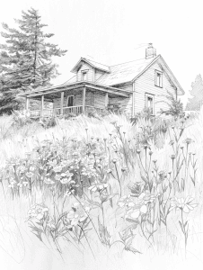
The artist’s use of varying line weights is really effective here. Look at how the foreground elements like the tall grasses and wildflowers are drawn with bolder, more defined lines. As your eye moves back towards the house and trees, the lines become progressively lighter and less detailed. This creates a natural sense of depth, mimicking how our eyes perceive objects at different distances.
Shading plays a crucial role too. The foreground has the most contrast between light and dark areas, especially in the texture of the grass. The house and trees have more subtle shading, which pushes them further back in space. I’m particularly impressed by the soft shadows under the porch roof – they add dimensionality without overwhelming the piece. If you’re working on similar landscapes, pay close attention to how shadows fall and fade as objects recede into the distance. It’s a subtle but powerful way to create depth in a 2D drawing.
Woodland Cottage
![](https://brightercraft.com/wp-content/uploads/2024/08/woodland-cottage-226x300.png)
This sketch beautifully captures a tranquil, almost dreamy woodland scene. The delicate linework and soft shading create a sense of ethereal quietude, as if we’ve stumbled upon a secret cottage hidden deep in the forest.
The artist’s use of contrast is particularly effective here. Notice how the dark, gnarled trees frame the lighter tones of the cottage, drawing our eye to the focal point. The gentle curves of the thatched roof and chimney smoke add a touch of coziness, contrasting nicely with the stark vertical lines of the surrounding trees. I’m impressed by how the subtle details – like the deer in the foreground and the textured foliage – enhance the overall atmosphere without overwhelming the composition.
If I were advising a beginner on recreating this mood, I’d suggest focusing on varied line weights and thoughtful negative space. The lighter touch on background elements helps create depth, while bolder strokes on the foreground details bring them forward. It’s a technique that takes practice, but it’s incredibly rewarding when you nail it.
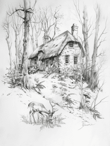
When tackling a complex scene like this, I’d suggest starting with a basic grid method. Lightly sketch a grid over your paper, then visually divide the reference image into the same number of sections. This helps nail down the relative sizes and positions of key elements – the cottage, trees, and deer.
For the intricate details, try using negative space to your advantage. Instead of drawing each individual branch, focus on the shapes formed between them. This technique often leads to more accurate proportions and a looser, more natural feel. I’ve found it particularly useful for capturing the delicate structure of bare trees against the sky.
Pay close attention to the way the cottage sits in the landscape. Its angled roof and chimney create interesting lines that contrast with the organic shapes around it. Getting those angles right will really anchor your composition. Don’t forget to step back frequently and squint at your work – it’s amazing how this can reveal proportion issues you might have missed up close.
Cottage With Stonepath
![](https://brightercraft.com/wp-content/uploads/2024/08/with-a-stone-path-leading-to-it-226x300.png)
This pencil sketch has such a lovely sense of depth and texture. You know, an interesting way to recreate this effect might be using charcoal powder and erasers. Start by laying down a light base of charcoal, then use various eraser types to pull out the highlights and define shapes. Kneaded erasers work great for soft edges on the trees, while a precision eraser could crisp up the cottage details.
For those winding stepping stones, I’d suggest experimenting with textured surfaces. Maybe press the paper onto a rough stone or bark, then shade over it to capture that organic, uneven quality. It’s a technique I stumbled upon years ago that can add surprising dimension to a drawing.
The delicate branches could benefit from an unconventional approach too. Have you ever tried using grass or thin twigs dipped in ink? It can create beautifully organic, slightly imperfect lines that would suit this pastoral scene perfectly. Just be prepared for some happy accidents – they often lead to the most interesting results!
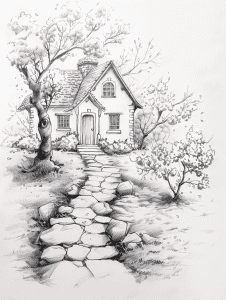
The stone path immediately catches the eye in this sketch, doesn’t it? It’s a brilliant use of leading lines, drawing our gaze right up to that quaint cottage. The way the artist varied the size and spacing of the stones creates a sense of depth and perspective too.
I’m impressed by how the trees frame the composition. Their curving branches echo the arched doorway and windows, tying the whole scene together. That big tree on the left adds some nice visual weight to balance out the house. And those wispy branches? They give the drawing a delicate, airy feel that contrasts nicely with the solid stonework.
You know what really makes this work though? The use of negative space. See how the white areas around the cottage make it pop? That’s a technique worth practicing. Overall, this artist has a great grasp of creating focal points and guiding the viewer’s eye. If you’re looking to improve your own sketches, studying compositions like this is a great place to start.
Cottage In A Meadow
![](https://brightercraft.com/wp-content/uploads/2024/08/windmill-nearby-226x300.png)
The negative space in this sketch really makes the cottage pop. Notice how the artist left the sky and surroundings mostly blank, drawing the eye straight to that cozy little house nestled in the grass. It’s a smart technique that adds depth and focus without overcrowding the scene.
Those wispy grass strokes in the foreground are doing some heavy lifting too. They create a sense of movement and texture while still leaving plenty of white space. It’s a delicate balance – too much detail would make it feel cluttered, but this amount gives just enough suggestion of a windswept field. As a beginner, try experimenting with varied line weights in your grass to achieve a similar effect. And don’t be afraid to let some areas breathe – sometimes what you don’t draw is just as important as what you do.
This sketch has a lovely sense of movement and atmosphere. The wild grasses in the foreground really pull you into the scene. To create a distinctly different variation, I’d suggest shifting the perspective dramatically.
Imagine viewing this cottage from above, as if you’re a bird soaring overhead. The thatched roof would become the focal point, with the grasses forming a circular pattern around it. You could play with shadows to emphasize the time of day, perhaps elongating them for a late afternoon feel. The birds might be larger in the foreground, their wings outstretched as they glide past.
Another interesting twist would be to transport this scene to a different season. Picture it in the depths of winter, with bare branches replacing the grass and a blanket of snow softening the cottage’s edges. The contrast between the stark white landscape and the warm glow from the cottage windows could create a compelling visual story. Don’t forget to add some footprints in the snow leading to the door – it’s those little details that really bring a drawing to life.
Cottage With Thatched Roof
![](https://brightercraft.com/wp-content/uploads/2024/08/thatched-roof-and-climbing-roses-226x300.png)
The stonework path leading to the cottage door really stands out to me. The artist has meticulously rendered each individual stone, giving them unique shapes and textures. You can almost feel the uneven surface underfoot. That level of detail brings the scene to life and draws the viewer’s eye through the composition.
I’m also impressed by the climbing vines on the cottage walls. The delicate linework captures the organic, winding nature of the plants. It’s not just a generic mass of greenery – you can see individual leaves and stems. That kind of patience in depicting foliage can be tedious, but it pays off in creating a rich, lived-in atmosphere for the cottage. As a beginner, focusing on one small area like that and really taking your time with the details can elevate your entire piece.
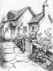
This pencil sketch beautifully captures the essence of a quaint cottage with its intricate details and soft shading. The technique creates a sense of depth and texture, especially in the thatched roof and stone pathway.
To apply this style to a completely different subject, you might consider urban scenes or industrial landscapes. Imagine sketching a bustling city street with the same attention to architectural details, or an old factory with its pipes and machinery rendered in delicate lines and shading. The key is to maintain that balance between precise linework and atmospheric shading, regardless of the subject matter. I’ve found that unexpected juxtapositions – like using a gentle, romantic style for a gritty urban scene – can lead to really compelling artwork.
Cottage Near Pine Trees
![](https://brightercraft.com/wp-content/uploads/2024/08/tall-pine-trees-226x300.png)
The artist has already done a beautiful job capturing the rustic charm of this woodland cottage scene through delicate linework and shading. To elevate the texture even further, I’d suggest experimenting with cross-hatching techniques, especially in the foreground foliage and on the stone chimney. This would add depth and a sense of roughness to those elements.
For the evergreen trees, try incorporating some stippling – tiny dots clustered more densely in shadowed areas. This can create a wonderful textural effect that mimics the look of pine needles. On the cottage’s roof, some parallel hatching following the slope could suggest the texture of wooden shingles or thatch. These additional techniques would complement the existing soft shading nicely while bringing out more tactile qualities in the scene.
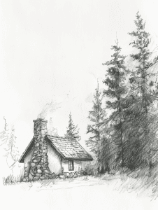
This pencil sketch beautifully captures a sense of peaceful solitude in nature. The small cottage nestled among towering evergreens creates an intimate, almost storybook-like scene. I’m particularly drawn to how the artist has rendered the textures – the rough stone chimney contrasts nicely with the softer, wispy pine needles.
The use of light and shadow here is quite skilled for a beginner. Notice how the trees on the right cast long shadows, suggesting late afternoon or early evening light. This subtle detail adds depth and a touch of melancholy to the mood. The loose, sketchy quality of the lines in the foliage gives a sense of movement, as if a gentle breeze is rustling through the branches. It’s a technique that can be tricky to master, but it really brings the scene to life.
Seaside Cottage
![](https://brightercraft.com/wp-content/uploads/2024/08/seaside-cottage-perched-on-a-cliff-226x300.png)
The current perspective in this coastal scene creates a powerful sense of drama and isolation. The house perched right on the cliff’s edge draws the eye immediately, emphasizing its precarious position. You could play with this tension by shifting to a view from below, looking up at the cliff face. This would amplify the feeling of the house’s vulnerability and make the sea feel more menacing.
Alternatively, pulling back for a wider view might reveal more of the surrounding landscape. This could contextualize the house within its environment, perhaps showing a string of similar dwellings along the coast. It might lessen the immediate impact, but could tell a broader story about coastal living. As an artist, I’m always fascinated by how perspective choices can completely transform the emotional resonance of a scene.
Looking at this coastal scene, I’m struck by the delicate balance between detail and suggestion. You know, an interesting technique to recreate this ethereal quality might be using erasers as drawing tools. Start with a fully shaded surface and gradually lift the graphite to create highlights and textures. This subtractive method could beautifully capture the misty atmosphere and weathered cliff face.
For the house perched on the edge, try experimenting with unconventional mark-making tools. A jagged piece of cardboard dipped in ink could create those rough, windswept textures in the grass and rocks. And for those seagulls? A splatter of white paint flicked from an old toothbrush might give just the right sense of movement and spontaneity. The key is embracing imperfection – let those happy accidents contribute to the sketch’s overall mood.
Riverside Cottage
![](https://brightercraft.com/wp-content/uploads/2024/08/riverside-cottage-226x300.png)
The contrast in this sketch really brings the scene to life. Notice how the artist has used darker, bolder lines for the foreground elements like the boats and reeds. This creates a sense of depth, pulling those objects forward visually. Meanwhile, the house and willow tree in the background are rendered with lighter, softer strokes, making them recede into the distance.
I’m particularly impressed by the way shadows are handled. The deep blacks under the boats and in the water reflections provide stark contrast against the white of the paper, anchoring the composition. At the same time, the gentle shading on the house and foliage adds subtle dimensionality without competing with the focal points. As an artist myself, I find this balance of bold and delicate mark-making quite skillful – it’s not easy to achieve such a range of values with just graphite.
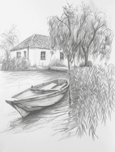
The negative space in this drawing plays a crucial role in creating depth and atmosphere. Notice how the artist has left areas around the willow tree’s drooping branches untouched, allowing the white of the paper to suggest light filtering through. This technique gives the tree a sense of airiness and movement.
The same approach is used effectively with the reeds in the foreground. The negative space between the pencil strokes implies individual stalks without having to draw each one meticulously. It’s a smart way to suggest detail without overworking the piece. I’d recommend practicing this technique – it takes restraint to know when to let the paper show through, but it can really elevate a sketch. The calm water surface is another great example, where minimal marks imply reflections and ripples.
Cottage Under The Rain
![](https://brightercraft.com/wp-content/uploads/2024/08/rainy-scene-226x300.png)
Looking at this pencil sketch, I’m struck by the serene, almost sleepy mood it evokes. To inject more life into the scene, I’d suggest emphasizing movement in the surrounding elements. The trees and grass could be drawn with more sweeping, dynamic lines to suggest a breeze. Even exaggerating the rain’s diagonal slant would create a sense of motion.
Another approach would be to play with contrasts. Darkening the shadows under the porch and around the windows would add depth and drama. You might also consider adding a light source – perhaps a warm glow from one of the windows. This contrast between the cozy interior and the rainy exterior could really bring the scene to life. What do you think about incorporating these elements to breathe more energy into your drawing?
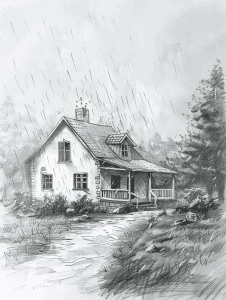
The rain in this drawing immediately catches my eye. Those fine, diagonal lines create a palpable sense of atmosphere – you can almost feel the drizzle. It’s not easy to convey rain without overwhelming the rest of the scene, but here it’s done with a light touch that adds mood without obscuring details.
Looking closer, the textures on the house itself are quite impressive. The shingles on the roof have a wonderful irregularity to them, suggesting age and weathering. And check out how the artist handled the wooden siding – those subtle variations in line weight give it depth and character. It’s those kinds of nuanced details that can really bring a sketch to life.
Cottage In Autumn Forest
![](https://brightercraft.com/wp-content/uploads/2024/08/in-an-autumn-forest-226x300.png)
This pencil sketch has a lovely, atmospheric quality that could translate beautifully into watercolor. The misty background and delicate tree branches would lend themselves well to soft washes and wet-on-wet techniques. You could start by laying down a pale gray wash for the sky, then build up layers of increasingly darker values for the trees and foliage.
For a completely different take, this scene could make for an interesting linocut print. The strong contrasts between the cabin and the surrounding forest would work nicely in black and white. You’d need to simplify some of the finer details, but that could actually enhance the moody, isolated feeling of the piece. Carving out those tree trunks would be satisfying too – you could really play with the textures there.
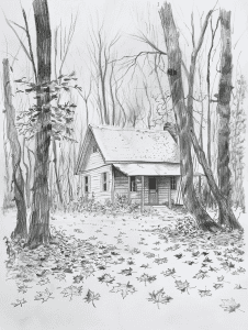
This sketch has a lovely sense of depth and atmosphere already. The artist has clearly put a lot of thought into their linework and shading to create the forest scene.
To add some additional texture, I’d suggest experimenting with cross-hatching techniques, especially in the foreground areas. This could bring out more detail in the leaf litter and undergrowth. You might also try dabbing the paper with a kneaded eraser to create subtle highlights on the tree bark or cabin’s weathered wood siding.
Another option would be to incorporate some stippling. This dotting technique could work beautifully to suggest dappled light filtering through the trees or to add texture to the cabin’s roof. It takes patience, but the results can be really striking. Just be careful not to overdo it – sometimes less is more when it comes to texture.
Cottage Surrounded By Sunflowers
![](https://brightercraft.com/wp-content/uploads/2024/08/in-a-sunflower-field-226x300.png)
The repetition in this sketch really brings the rustic scene to life. Look at how the artist uses parallel lines to create the wooden fence – it’s not just a few planks, but a whole series of vertical strokes that give a sense of weathered, uneven texture. That same technique carries through to the roof, where the shading lines suggest worn shingles or metal sheeting.
I’m particularly impressed by the rhythm established in the vegetation. Those tall stalks – maybe sunflowers? – have a lovely swaying quality thanks to the repeated curved lines. And notice how the grass in the foreground uses short, varied strokes to suggest wild growth. It’s a great way to add depth without overworking the foreground. If you’re trying this yourself, don’t aim for perfection in these repeated elements. The slight irregularities are what make it feel organic and hand-drawn.
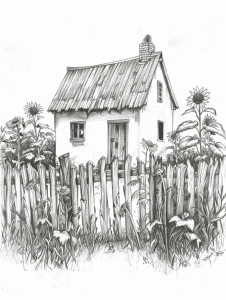
This quaint cottage scene has a straightforward, head-on perspective that works well for capturing its rustic charm. But imagine if we shifted the viewpoint slightly to one side – it could add more depth and dimension to the composition. The roof angles would become more pronounced, and we’d get a better sense of the building’s shape against the backdrop of sunflowers.
Playing with a lower angle could really amplify the towering effect of those sunflowers. They’d loom larger, framing the cottage in a more dramatic way. It might make the scene feel a bit more immersive, like we’re peeking through the overgrown garden. On the flip side, a higher angle looking down could emphasize the cozy, nestled quality of the home amidst the wildflowers and grasses. Each perspective shift brings out different aspects of the scene’s character.
Cottage At The Foot Of The Mountain
![](https://brightercraft.com/wp-content/uploads/2024/08/foot-of-a-mountain-226x300.png)
The majestic mountain peak immediately grabs my attention in this sketch. Its jagged, snow-capped outline dominates the background, creating a powerful focal point that draws the eye upward. The artist has done a great job capturing the rugged texture and imposing presence of the mountain through careful shading and linework.
Below the mountain, the quaint cabin nestled in the foreground provides a wonderful sense of scale and contrast. I’m impressed by the details here – the pitched roof, the chimney, and what looks like a small fence or garden area. The surrounding trees and vegetation help frame the cabin nicely. If I were advising on improving this sketch, I might suggest adding a bit more depth to the mid-ground to really emphasize the distance between the cabin and the mountain. Overall though, it’s a beautifully composed scene that effectively conveys the grandeur of an alpine landscape.
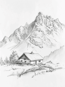
The artist has done a fantastic job using contrast to create depth and focus in this mountain landscape sketch. The stark white of the snow-capped peaks against the darker shading of the rocky mountainsides really makes those jagged summits pop. It’s a great way to draw the eye upward and emphasize the majestic height of the mountains.
Down in the foreground, there’s a more subtle play of light and shadow around the little cabin. The roof looks brighter, catching more light, while deeper shadows collect under the eaves and in the surrounding foliage. This varying contrast helps give the scene a sense of atmosphere and dimension. I particularly like how the artist has used lighter, more delicate lines for the grasses in the foreground – it creates a nice balance against the bolder strokes of the mountains.
Cottage In A Foggy Morning
![](https://brightercraft.com/wp-content/uploads/2024/08/foggy-morning-226x300.png)
If I were sketching this quickly, I’d start with the cabin. It’s the focal point and has the most defined edges in this misty scene. I’d rough out its basic shape and proportions first, paying attention to the angle of the roof and that little chimney poking up.
The surrounding forest and fog are crucial for atmosphere, but they’re less defined. I’d suggest blocking those in with light, loose strokes after getting the cabin down. Don’t worry about individual trees yet – focus on the overall masses and the way the fog obscures the background. The contrast between the solid cabin and the soft, hazy surroundings is what really makes this image striking. Getting that balance right is trickier than it looks, but it’s what gives the piece its haunting quality.
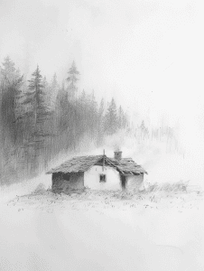
Looking at this atmospheric pencil sketch, I’m struck by the stillness it conveys. To inject more dynamism, you might consider adding some movement to the scene. Try incorporating wind effects – perhaps show the trees bending slightly, or add some swirling mist around the cabin. Even a few well-placed lines suggesting blowing snow could really bring the scene to life.
Another approach would be to play with contrast and depth. Right now, the fog creates a soft, uniform feel. By darkening some foreground elements and crisply defining a few key details, you could create more visual interest and a sense of dimensionality. This would draw the eye through the image, making it feel less static. Don’t go overboard though – part of the beauty here is in the misty, dreamlike quality.
Cottage With Flower Garden
![](https://brightercraft.com/wp-content/uploads/2024/08/flower-garden-226x300.png)
One technique that really stands out in this drawing is the artist’s use of stippling to create texture and depth, particularly in the foliage and on the cottage’s roof. It’s a time-consuming method, but it adds a wonderful sense of detail and dimension to those areas.
The perspective and composition are also quite skillful. Notice how the stone path draws your eye right up to the cottage, creating a strong focal point. The way the fence frames the scene adds to this effect. It’s a great example of using leading lines to guide the viewer’s gaze.
I’m impressed by the variety of line weights used throughout. The delicate, thin lines for the flowers and grass contrast nicely with the bolder strokes defining the cottage’s structure. This variation adds visual interest and helps separate the different elements of the scene. If you’re looking to improve your own sketches, experimenting with line weight is definitely worth exploring.
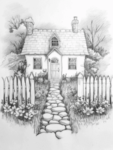
This pencil sketch has a lovely sense of depth and texture. The intricate details in the cottage, fence, and foliage would translate beautifully into a watercolor painting. You could start by lightly sketching the main elements, then build up layers of transparent washes to capture the soft, ethereal quality of the scene.
For a bolder interpretation, consider adapting it into a linocut print. The strong lines of the fence and cottage would carve well, while the varied textures of the plants and stones could be achieved through different cutting techniques. It’d be an interesting challenge to simplify some of the finer details while maintaining the cozy, inviting atmosphere. Personally, I’d be tempted to experiment with a two-color print, maybe using a warm gray for the cottage and a soft green for the surrounding greenery.
Cottage In A Dense Forest
![](https://brightercraft.com/wp-content/uploads/2024/08/dense-forest-226x300.png)
As an experienced artist, I’d say the intricate textures in this cottage scene could really trip up a beginner. Those ivy vines creeping up the stone wall? They’re a beast to render convincingly. You’ve got to capture the organic, winding nature without making it look like a mess of scribbles.
The perspective on the cottage itself is another tricky bit. Getting those angles right on the roof and chimney takes a keen eye. And don’t get me started on the stonework – each of those rocks needs its own personality, but they still have to look cohesive as a wall. I remember struggling with that balance when I was starting out. The key is patient observation and not rushing the details.
Shading is where a lot of beginners falter too. This piece has such a lovely range of tones, from the deep shadows under the eaves to the soft gray of the distant trees. Achieving that depth without muddying everything takes practice. My advice? Start light and build up your darks gradually. It’s much easier to darken an area than to try and lighten it later.
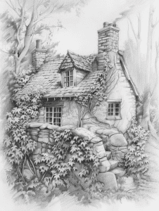
The repetition of textures really brings this cottage scene to life. Look at how the artist uses short, overlapping strokes to create the foliage on the vines climbing up the walls. That same technique is echoed in the trees behind the house, giving a cohesive feel to the natural elements.
There’s a lovely pattern in the stonework too. The irregular shapes of the stones in the wall and chimney are carefully rendered, with subtle shading to give depth. It’s not an exact repetition, but the overall effect creates a unified texture that contrasts nicely with the smoother surfaces of the cottage walls. The roof shingles follow a similar principle – individual shapes that form a larger pattern when viewed as a whole. Mastering these repeating elements takes practice, but it’s what gives the drawing its rich, detailed character.
Cottage By A Tranquil Lake
![](https://brightercraft.com/wp-content/uploads/2024/08/by-a-tranquil-lake-226x300.png)
Let’s focus on that charming little dock jutting out into the water. For a great exercise, try sketching just the dock and its reflection. Pay attention to how the straight lines of the planks contrast with the organic shapes of the ripples. This will help you practice perspective and reflections in water, which can be tricky but rewarding to master.
The trees in this scene provide an excellent opportunity to work on texture and shading. Pick one tree and really study how the artist suggested leaves and branches with quick, light strokes. Try recreating just that single tree, experimenting with different pencil pressures to achieve varied tones. It’s a great way to loosen up your hand and develop a more fluid drawing style.
The dock immediately draws my eye in this sketch. It creates a strong diagonal line that leads right into the scene, pulling the viewer’s gaze toward the cottage. That’s a clever compositional choice that really helps guide the eye.
The contrast between the detailed textures in the foreground and the softer, hazier background is quite striking too. I’m impressed by how the artist captured the reflections in the water with just a few well-placed lines. As a beginner, you might find it helpful to start with the major structural elements like the dock and cottage before moving on to those finer details. The way the trees frame the scene on both sides adds a nice sense of depth as well.
Cottage Near A Babbling Brook
![](https://brightercraft.com/wp-content/uploads/2024/08/bubbling-brook-226x300.png)
The shading and texture work in this drawing really stand out to me. The artist has done an excellent job creating depth and dimension, especially in the foliage and the weathered wood of the bridge. Those gnarled tree branches in the background have such a tangible, rough quality to them.
I’m also impressed by the composition and how it draws the eye. That winding stream leads you right into the scene, past the rustic bridge, and up to the cozy cottage. It’s a classic technique, but it’s executed beautifully here. The contrast between the soft, hazy background and the sharper details in the foreground really enhances that sense of depth too.
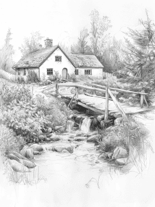
For a quick sketch of this scene, I’d start with the cottage. It’s the focal point and gives structure to the whole composition. Rough in its basic shape and roof lines first – that’ll anchor your drawing and help place everything else.
The stream is another key element. I’d sketch its meandering path next, using loose, flowing lines to capture its movement through the landscape. This will naturally lead you to add the bridge, which connects the two sides of the scene. Don’t fuss over details at this stage – just get the main shapes and flow down.
Trees and foliage can be suggested with quick, gestural strokes. No need to draw individual leaves; focus on overall shapes and the way they frame the cottage. As you work, keep an eye on the balance of light and dark areas. This pencil drawing has a lovely tonal range that really brings depth to the scene. Even in a quick sketch, a few well-placed darker areas can make a big difference in the overall impact.
Cottage In A Forest
![](https://brightercraft.com/wp-content/uploads/2024/08/at-the-edge-of-a-forest-226x300.png)
This pencil sketch captures the rustic charm of a woodland cottage beautifully. The textures and shading create a sense of depth, especially in the foliage surrounding the structure. I’m particularly impressed by the attention to detail in the weathered wood of the cabin and the overgrown path leading to the door.
If I were to suggest adding one element to enhance this drawing, I’d recommend incorporating a subtle light source. Perhaps a warm glow emanating from one of the windows? This would create an interesting contrast with the shadowy forest backdrop and add a hint of life to the scene. It could also provide an opportunity to play with more dramatic shadows, giving the piece additional dimension and intrigue.
The artist’s use of varied line weight really brings depth to this rustic cabin scene. Notice how the foreground elements, like the path and nearby foliage, have bolder, more defined lines. As your eye moves towards the background, the lines become lighter and more delicate, especially in the trees. This technique creates a strong sense of perspective and draws the viewer into the image.
I’m particularly impressed by the texture work here. The cabin’s weathered wood siding and thatched roof are rendered with careful crosshatching and short, layered strokes. It gives a tactile quality that makes you want to reach out and touch the rough surfaces. The surrounding vegetation is handled more loosely, with gestural marks suggesting leaves and branches rather than defining each one. This contrast in rendering styles adds visual interest and keeps the focus on the cabin itself.
Snow Covered Cottage
![](https://brightercraft.com/wp-content/uploads/2024/08/a-snow-covered-cottage-in-a-winter-wonderland-226x300.png)
When tackling a scene like this, many beginners tend to get caught up in trying to draw every single leaf and twig. That’s a surefire way to burn out quickly! Instead, focus on capturing the overall shapes and forms of the trees and structures. Notice how the artist here has used loose, gestural lines to suggest the bare branches rather than meticulously rendering each one.
Another common pitfall is neglecting the foreground. In this sketch, the artist has cleverly used some simple lines in the lower portion to suggest a path or disturbed snow, which adds depth and draws the eye into the scene. Don’t forget to give some attention to these foreground elements – they can really make or break the composition. And speaking of composition, take note of how the house is slightly off-center. That asymmetry creates visual interest and keeps the eye moving around the image.
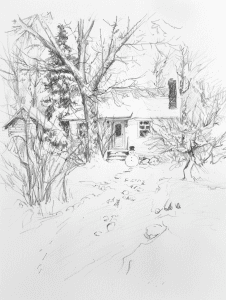
This scene presents quite a few challenges for a beginner artist. The intricate details of the bare tree branches against the sky require a delicate touch and careful observation. Getting the proportions and perspective of the house right, especially with its angled roof and steps leading up to it, could be tricky too.
Capturing the depth and atmosphere of the winter landscape might also prove difficult. The subtle variations in shading to suggest snow on the ground and create a sense of distance takes practice. And let’s not forget about all those background trees – rendering them to look natural without overworking the drawing is an art in itself. I remember struggling with similar scenes when I was starting out. It takes time to develop the eye for which details to emphasize and which to simplify.
As you complete these 20 charming cottage sketches, take a moment to appreciate the cozy and inviting world you’ve brought to life on paper. Each sketch, with its warm details and serene settings, reflects your artistic talent and love for the simple joys of cottage living. You’ve transformed blank pages into charming retreats that radiate comfort and tranquility. Keep your sketchbook close and your creativity flourishing, and let the cozy vibes of cottage life continue to inspire your art. Happy sketching!