Get into the spooky spirit and fill your sketchbook with these 25 creative Halloween drawing ideas! Whether you’re a beginner or an experienced artist, these fun and festive sketches are perfect for celebrating the season. From eerie haunted houses to cute pumpkins, friendly ghosts, and magical witches, these drawing ideas will spark your imagination and help you capture the essence of Halloween. Let your creativity run wild and bring the spooky, quirky, and charming vibes of Halloween to life with these sketchbook-worthy designs!
All artwork provided is original and can be used as a reference for your own drawings.
Table of Contents
Witch Hat On Broomstick
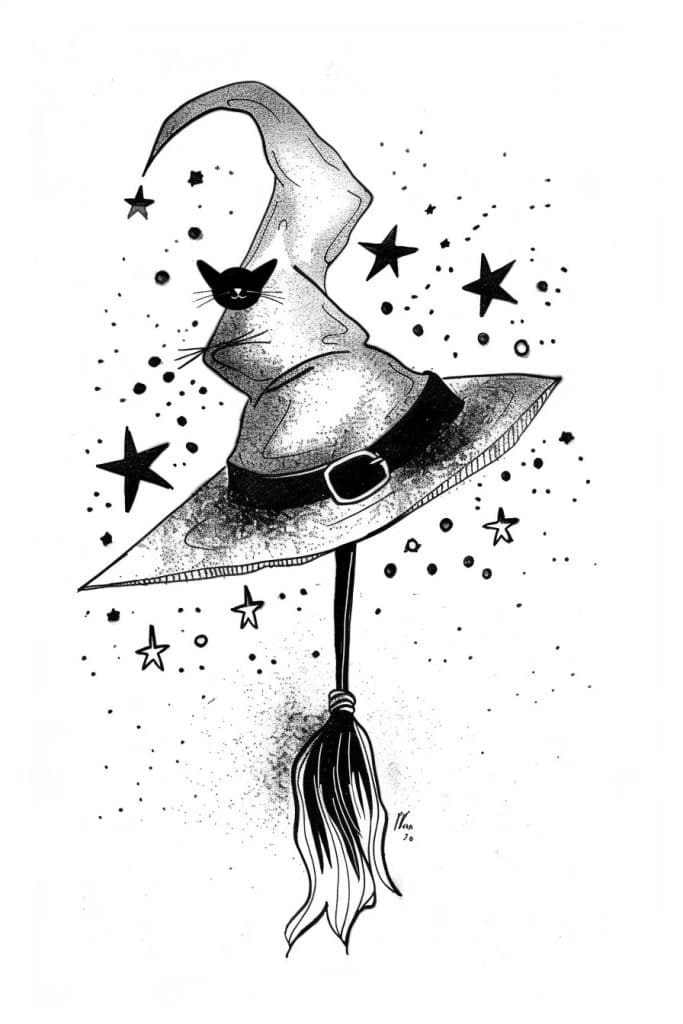
Hey there! I gotta say, this witch’s hat drawing is pretty darn impressive. I’m not gonna lie – the first thing that caught my eye was the cat face peeking out. The artist nailed those whiskers – they’re so delicate and wispy, really gives the cat some personality.
But if we’re talking attention to detail, check out the texture on that hat brim. See how it’s got those little lines all along the edge? That’s some serious dedication right there. Reminds me of when I was learning to draw hats – I’d always forget the texture and end up with this weirdly smooth flying saucer looking thing (not my finest hour). The shading on the hat is pretty sweet too – gives it depth, ya know?
Oh, and those stars scattered around! They’re not just boring ol’ five-pointers – the artist threw in different sizes and styles. That’s the kinda thing that elevates a piece from good to great. Speaking of which – is that a signature I see in the bottom right? Huh, can’t quite make it out. Anyway, from what I’ve seen, it’s those tiny details that really make a drawing pop. Keep an eye out for opportunities to add those little flourishes – they can totally transform your work.
Witch Flying On Broomstick
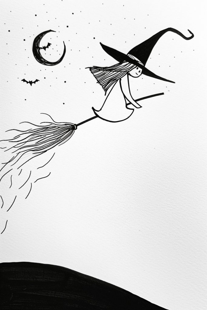
So, looking at this witch sketch, I’m digging the clean lines and simple style. But yeah, let’s talk texture! You could totally amp this up with some crosshatching – I’m a sucker for that technique. Maybe add some fine lines on the witch’s cloak or the broom bristles? It’d give it this cool depth without losing that minimalist vibe.
I remember when I first tried crosshatching on a Halloween piece years ago. Man, I went overboard and it looked like a furball exploded on my paper! But with practice, it became my go-to for adding subtle texture. Speaking of Halloween, is that what inspired this? The moon and bats are giving me major spooky season vibes.
Anyway, another idea – and this might sound weird – but what about stippling? Tiny dots could add some awesome texture to the night sky or even shadows on the witch. It’s time-consuming as heck, but the effect can be pretty rad. I once spent like three hours stippling a tree bark texture and my hand was cramping for days after, but it looked sweet in the end. Oh, and you could maybe try some wavy lines for the wind or the witch’s hair? Just a thought. Whatever you do, keep that light touch you’ve got going – it’s working great for the overall mood.
Howling Woof
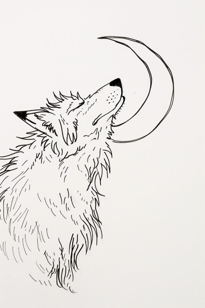
Alright, let’s take a look at this wolf howling at the moon. Pretty cool sketch! The perspective here is pretty straightforward – side view of the wolf, head tilted up. But switching it up could totally change the vibe.
Imagine if we drew this from above, looking down on the wolf. You’d see the curve of its back, the ears all pinned back. Might make it feel more vulnerable, y’know? Or go the other way – draw it from below, like you’re a little critter looking up at this massive beast. Talk about intimidating! I tried that angle once in a workshop and totally botched the foreshortening. The wolf’s snout looked like a balloon animal, haha. But hey, that’s how ya learn.
And speaking of learning, I’m actually prepping for a workshop on animal sketches next week. Gotta figure out how to explain negative space without putting everyone to sleep. Anyways, back to this drawing – the moon’s interesting. It’s just two curved lines, but it works. You could play with making it more detailed, or even go abstract. Maybe the wolf’s howl becomes the moon? Or the moon becomes part of the wolf’s outline? Just spitballing here. The cool thing about art is there’s no wrong answer, ya know?
Grinning Vampire

Wow, this is a striking piece! The contrast is killer. Black and white, no gray tones – that’s gutsy. I love how the artist uses negative space to define the figure. Those sharp, angular lines against the white background really make it pop.
Honestly, I’m blown away by the expressiveness they achieved with such a minimalist approach. The face is creepy as hell, but in a good way. Reminds me of when I was trying to draw villains for my comic book as a teenager. I’d spend hours getting the eyes just right, but could never nail that sinister grin like this artist did.
And those wing-like shapes! They add so much movement and drama. The way they curve around teh figure creates this cool sense of depth. But I gotta say, I’m not totally sure what’s going on with that hand. Is it meant to be clawed? Or maybe holding something? Eh, doesn’t matter – it works. The overall effect is what counts. Shoot, I should really get back to organizing these brushes, but this piece is way more interesting. Reminds me why I love black and white illustration so much in the first place.
Trick Or Treat Bag

Wow, this drawing’s got a ton of cool stuff going on! But y’know what would really make it pop? Motion lines. I’m talking swooshy curves and dashes around that overflowing candy bucket. Make it look like those sweets are tumbling out.
And speaking of tumbling, why not tilt that bucket a bit? Give it some lean, like it’s about to topple over from all those goodies. I remember when I was starting out, I’d always draw everything so stiff and straight. Then my old art teacher (cranky guy, but brilliant) made me spend a whole week just drawing things at weird angles. Changed my whole perspective, literally.
You could also play with the scale a bit. Maybe make some of those candies in the foreground bigger, like they’re closer to the viewer. Oh, and don’t forget about shading! A few well-placed shadows could really bring out the depth. Though I gotta admit, I’m not totally sure what that skull-looking thing is supposed to be. A lollipop maybe? Whatever it is, it’s pretty cool. Anyway, the key is… ah crap, I said I wouldn’t use that phrase. Just have fun with it, yeah? Art’s supposed to be messy and alive, not perfect.
Stack Of Pumpkins
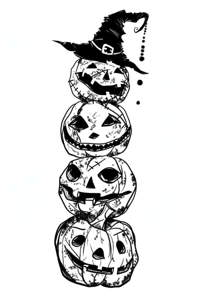
Whoa, this stacked pumpkin design is wicked cool! I’m not gonna lie, it’s giving me major Halloween vibes. You could totally adapt this into a sweet linoleum block print. The stark black and white contrast would work perfectly for that medium.
I remember trying something similar back in art school – a stack of skulls instead of pumpkins. Honestly though, pumpkins are way more fun to carve into a block. The witch’s hat on top is a nice touch too. It adds some visual interest and breaks up the symmetry a bit.
You know what might be cool? Turning this into a 3D sculpture. Maybe out of clay or even papier-mâché. I’m picturing each pumpkin as a separate piece that you could stack and rearrange. The textures would be awesome to play with – smooth areas contrasting with the rough, stitched-up parts. Oh, and you could add some glow-in-the-dark paint to really make it pop! Honestly, the possibilities are endless with a design like this. What do you think? Wanna give sculpture a shot?
Spooky Tree
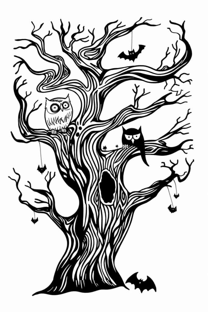
So, looking at this drawing, the first thing that jumps out is how the artist uses those swirling, curvy lines over and over to create the tree trunk and branches. It’s like they couldn’t stop their pen once they started! I’m not gonna lie, I’ve totally gotten lost in that kind of repetitive line work before – it’s almost meditative.
The patterns in the tree bark are really mesmerizing. See how they use those same curvy lines but vary the thickness and spacing? That creates this awesome wood grain texture. It reminds me of this time I was sketching an old oak tree in the park and I got so focused on drawing every little crevice in the bark that I completely lost track of time. My coffee got cold and everything!
Oh, and check out those little bats and spiders dangling from the branches. The artist repeats those simple shapes to create a spooky vibe without going overboard. Although… now that I look closer, are those actually spiders or just generic creepy shapes? Hard to tell. Anyway, the owls are a cool contrast with their more detailed patterns. The way the artist uses repeeated lines for the feathers really makes them pop against the swirly tree. Overall, it’s a great example of how repetition can create texture and mood in a black and white piece. Makes me wanna grab my sketchbook and try something similar!
Skeleton Playing Guitar

Wow, that skeleton guitarist really grabs your attention right away! The way it’s belting out a tune while strumming that acoustic guitar… it’s just so dynamic. I love how the artist used bold, chunky lines to make it pop off the page.
Y’know, this reminds me of when I was first learning to draw action poses. I kept making everything too stiff, like mannequins. But this skeleton’s got real energy – the way it’s leaning back, mouth wide open. You can almost hear it wailing out some bluesy lament. The musical notes floating around really sell that vibe too.
I’m digging the little details here. That tombstone it’s sitting on is a nice touch, though I can’t quite make out what’s etched on it. Maybe a lil fish skeleton? And there’s this tiny stick figure dude off to the side that I almost missed at first. Kinda makes me wonder what his deal is, haha. Oh! And the cross-hatching on the guitar gives it some nice texture. When I was starting out, I’d always forget to add those sorta touches that really bring a piece to life. Anyway, this whole thing’s got a rad Day of the Dead meets punk rock poster vibe going on. Really cool stuff for a beginner to study – lots of personality packed in there!
Scarecrow On Pumpkin Patch
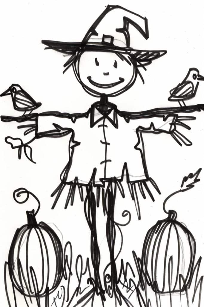
Okay, so if I had to sketch this quickly, I’d definitely start with that scarecrow’s head and hat. That’s the focal point, y’know? Big round smiley face, pointy witch hat – it grabs your eye right away. I’d rough those out with some quick circles and triangles.
Speaking of witch hats, this reminds me of a Halloween drawing challenge I did last year. Man, I must’ve drawn like 50 different witches and scarecrows. Got so sick of pointy hats by the end! But it really helped me nail down the proportions…
Anyway, after the head, I’d probably sketch out the stick figure body and those outstretched arms. Gotta get the overall pose down. Then I’d add those birds – cute touch, by the way. Not totally sure if they’re crows or what, but they add some nice balance to the composition. Oh, and don’t forget those big ol’ pumpkins at the bottom! They help ground the whole thing.
Y’know, the more I look at this, the more I’m digging the energy of it. It’s kinda messy and scribbly, but in a good way. Reminds me of the stuff I used to doodle in my school notebooks. Sometimes I think we get too caught up in making everything perfect and forget how fun it is to just scribble something out, ya know? Like, who cares if the lines aren’t straight or whatever. It’s got character!
Pair Of Skeleton Hands
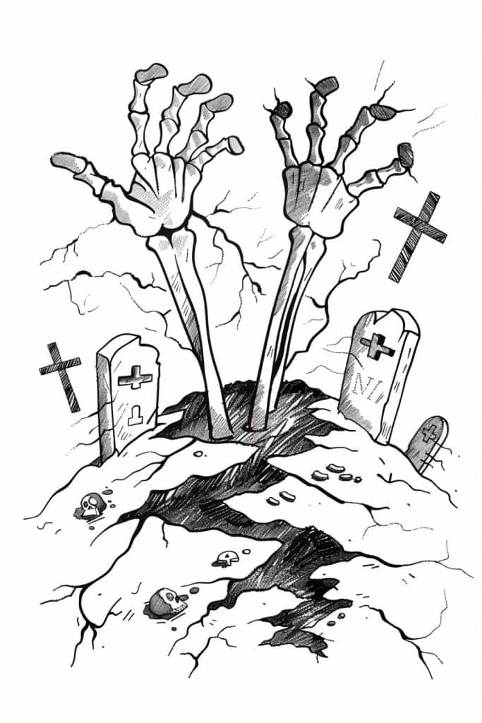
Okay, so check this out – the artist is using some pretty cool hatching and cross-hatching techniques here to create depth and texture. I’m not gonna lie, I’m kinda impressed with how they’ve used it, especially on those skeleton hands bursting out of the ground. The way the lines build up to create shadows and form is really effective.
You know what’s interesting? The contrast between the detailed, intricate linework on the bones and gravestones compared to the more loose, organic lines used for the cracks in the ground. It gives the whole piece this eerie, unsettling vibe. I remember when I was first learning to draw, I struggled so much with getting that balance right. I’d either overdo everything or make it all too sketchy. It took me ages to figure out how to vary my line weight and density to guide the viewer’s eye.
One thing I’m not totally sure about is whether they used a brush pen or a regular pen for this. The lines have a nice flow to them, but there’s also some really fine detail work. Either way, I dig how they’ve captured that spooky graveyard atmosphere. It’s making me think I should do a Halloween-themed lesson in my upcoming workshop. Like, maybe have everyone try drawing their own creepy scene using different line techniques? Anyway, if you’re trying to recreate this style, I’d say start by practicing your hatching on simple shapes first. Get comfy with building up shadows before diving into all the intricate details. And don’t be afraid to push the contrast – that’s what really makes this piece pop!
Flying Mummy
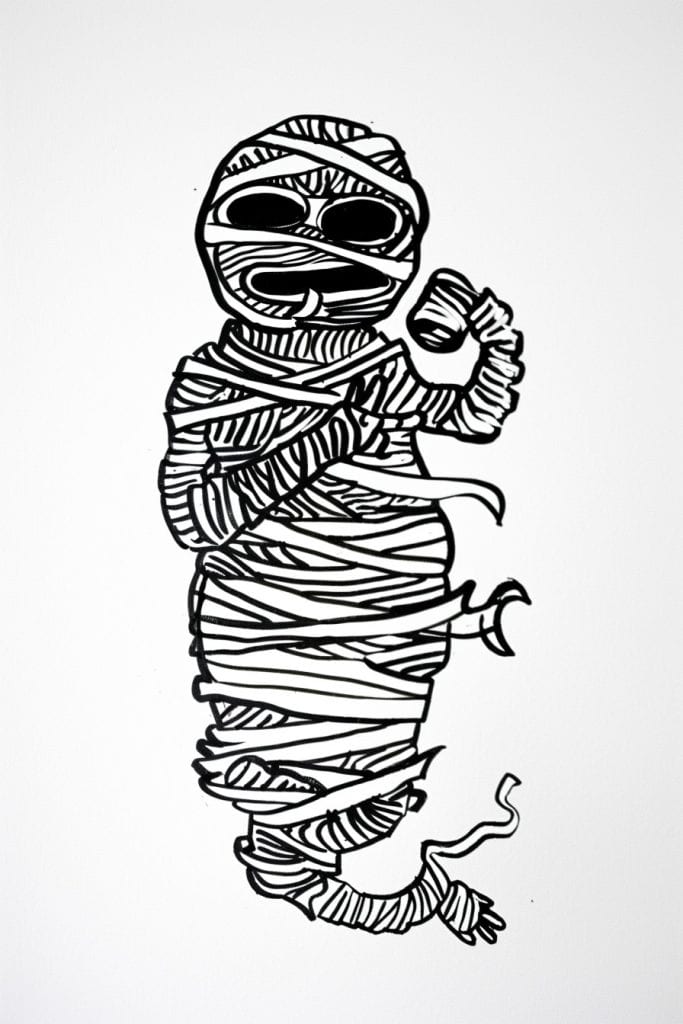
Whew, just finished a mummy drawing myself. This one’s a doozy though! Those bandages are gonna be tricky for a beginner. All those overlapping lines and curves – it’s enough to make your eyes cross. I remember when I first tried something like this, I got so frustrated I nearly chucked my sketchbook across the room.
The big challenge here is keeping all those bandage strips consistent, y’know? You gotta maintain the right thickness and spacing as they wrap around. And don’t even get me started on the shading. Trying to show volume with just black and white lines is… well, it’s a pain in the butt, honestly. I still struggle with it sometimes.
Oh, and those eye sockets! They’re deceptively simple looking, but getting the proportions right can be a real headache. I’d say start with the basic shape first, then worry about adding all the little details. Speaking of details, is that supposed to be a fist the mummy’s making? It’s kinda hard to tell. Anyway, hands are always tough. I’d probably save those for last. Just take it slow, and don’t be afraid to erase and start over. We’ve all been there!
Magic Crystal Ball
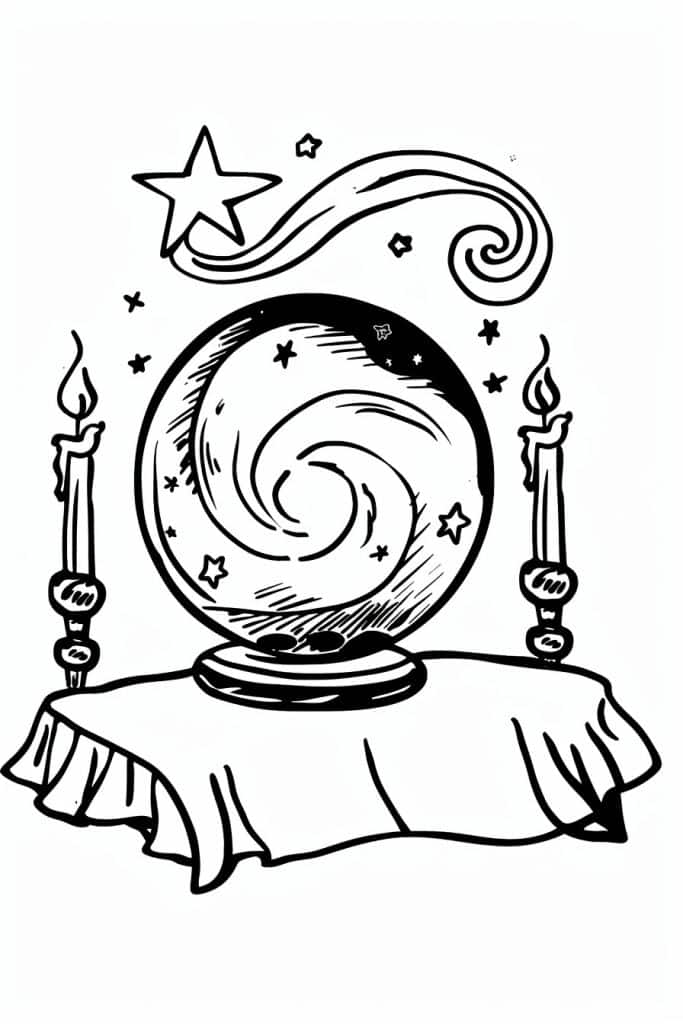
So, looking at this image, I’m seeing a lot of cool circular shapes and swirls. A great exercise to practice would be to just focus on those spirals and curves. Grab a pencil and start drawing loops – big ones, tiny ones, overlapping ones. Don’t worry about making them perfect, just let your hand flow. I remember when I first started, I’d doodle spirals everywhere – notebooks, napkins, you name it. Got to the point where my friends would joke about my “swirly obsession.”
Now, those candles on either side… they’re a bit tricky. The flames are prob the hardest part. What I’d suggest is breaking them down into simple shapes. The base is basically a cylinder, right? And the flame is kinda like a teardrop shape. Start with those basic forms and then add the details. Oh, and don’t forget the little drips of wax! Those always add a nice touch.
You know what’s funny? I’m not entirely sure what that swooshy thing at the top is supposed to be. A shooting star maybe? Whatever it is, it’s got a nice flow to it. Anyway, for practice, you could try drawing different versions of that – make it longer, curlier, add more stars. Play around with it. The cool thing about sketching is there’s no wrong way to do it. Just let your imagination run wild and see what happens. Trust me, you’re gonna surprise yourself with what you come up with!
Haunted House
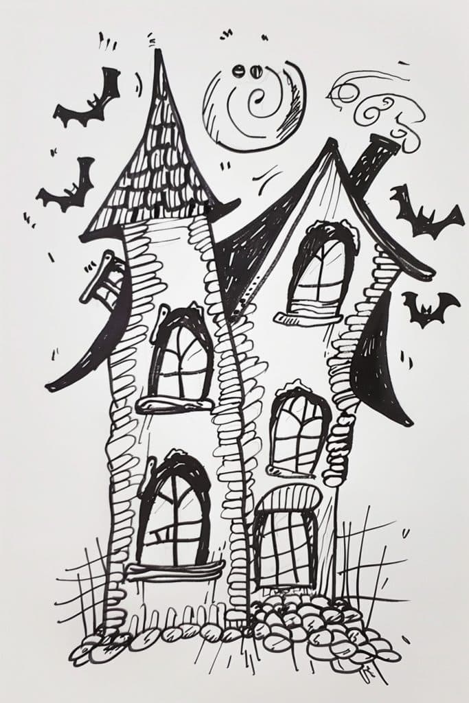
So, looking at this drawing, the thing that really jumps out at me is how the artist nailed the texture on those walls. The way they’ve used all those little lines to create this kinda… scaly, uneven surface is just spot-on for a spooky haunted house vibe. It reminds me of this time I was trying to draw an old crumbling castle, and I just couldn’t get the stonework to look right. Spent hours erasing and redrawing, drove myself nuts. But this artist here, they’ve got it down.
The composition is pretty killer too. The way the house is all wonky and off-kilter, with those crooked windows… it really adds to the unsettling feel. And those bats! Placing them around the edges was a smart move. Gives the whole thing this sense of motion, like the house is alive or something. Though I gotta say, I’m not totally sure what that swirly thing at the top is supposed to be. A moon maybe? Or some kinda ghostly apparition? Hard to tell.
One last thing – the contrast between the detailed linework on the house and the simpler shapes of the bats and that swirly thing… that’s def working for me. It’s like, your eye gets drawn into all the intricate bits of the house, but then you’ve got these stark black shapes floating around to balance it out. From what I’ve seen, a lot of beginners struggle with balancing detail and simplicity, but this artist seems to have a good handle on it. Makes me wanna grab my sketchbook and try my hand at a spooky house drawing myself…
Grinning Jack O Lantern
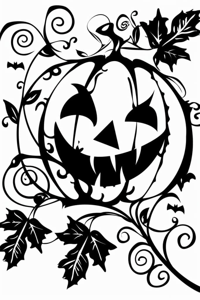
Wow, this is a really cool Halloween-themed illustration! The way the jack-o’-lantern dominates the center is eye-catching. I’m digging those swirly vines and leaves around it – gives it a nice organic feel.
If I were to add one element, I’d probably throw in some color. Just a pop of orange for the pumpkin and maybe some deep purples or greens for the vines. I remember when I first started out, I was so scared of using color in my line drawings. But then I took this class where the instructor made us use at least 3 colors in every piece, and it totally changed my perspective. Anyways, color can really make certain elements pop, you know?
Looking at those little bats in the background… are those bats? They’re a bit hard to make out. But they got me thinking – maybe adding some texture could be cool too. Like, some crosshatching or stippling to give the pumpkin some depth. Or even just varying the line weight in places. From what I’ve seen, that can really take a flat image and make it feel more three-dimensional. I used to spend hours just practicing different texturing techniques. Got a bit obsessed with it for a while there, to be honest. But it definitely paid off in the long run.
Cute Ghost
Man, this little ghost dude is adorable. But when you’re drawing something like this, watch out for making everything too stiff and symmetrical. I see that a lot with beginners – they’ll draw the tombstones all lined up perfectly or make the ghost totally balanced. But nature’s messy, you know?
I actually just finished a spooky graveyard sketch the other day. Lemme tell you, getting the grass to look natural was a pain. I kept wanting to draw each blade individually, which looked way too fussy. What worked better was loose, scribbly strokes to suggest the texture. And don’t be afraid to let things overlap! See how the grass kinda creeps over the bases of the tombstones? That’s the good stuff.
But back to this drawing – I dig how they’ve got those little stars or sparkles scattered around. Adds a nice bit of whimsy. Though I gotta say, I’m not totally sure what that heart thing is next to the ghost. Is it supposed to be floating? Or maybe it’s attached somehow? Eh, doesn’t really matter I guess. The overall vibe is what counts. Just remember to keep things loose and organic when you’re doing this kinda style. Perfect lines are boring as hell.
Ghost Popping Out Of Pumpkin
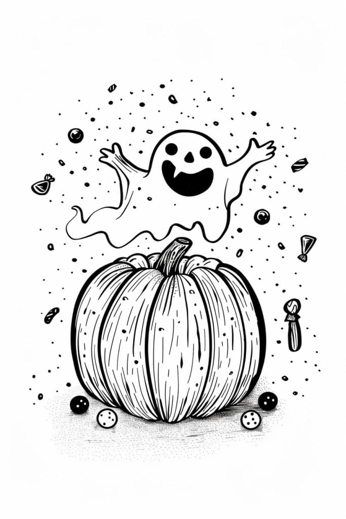
Okay, so this drawing is all about capturing that Halloween vibe, right? The big pumpkin and the cute ghost really nail it. I’d say one of the most important skills to nail here is linework – especially getting those smooth, confident curves on the pumpkin. It’s trickier than it looks! I remember when I first tried drawing pumpkins, I kept making the lines all wobbly and uneven. Took me ages to get it right.
The shading is another key thing to focus on. See how the artist used those little lines to create texture on teh pumpkin? That’s a technique called hatching, and it’s super useful for adding depth. I kinda struggle with it sometimes still, to be honest. Oh, and the way they did the ghost is pretty clever – just a simple outline, but it really pops against the detailed pumpkin. Creates this nice contrast, you know?
Speaking of contrast, I got a bit sidetracked there – but the use of negative space around the ghost and pumpkin is really effective. Reminds me of this time I was trying to draw a spooky forest scene and couldn’t figure out why it looked so cluttered. Turns out I needed to leave more empty space to make the important bits stand out. Anyway, back to this drawing – the scattered dots and little objects floating around add to the whimsical feel. They’re like, what do you call it… atmospheric elements? Something like that. Really ties the whole thing together, though.
Full Moon With Witch Silhoutte
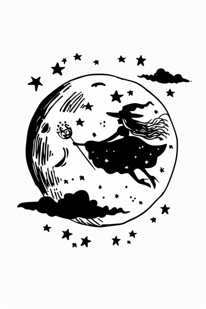
Alright, let’s break this down for a beginner. I’m not gonna lie – this image has a lot going on, but it’s totally doable if we simplify it.
First thing I’d do? Focus on the big shapes. You’ve got that big moon circle – that’s your base. Then you’ve got the witch silhouette floating there. Start with those two elements and forget the rest for now. Get those basic shapes down and you’re halfway there already. I remember when I first tried drawing a witch on a broomstick – man, I made that broom look like a mop! But practice makes perfect, right?
Now, for the details – this is where it gets tricky. Those stars and clouds? Don’t sweat ’em too much at first. Just dot in a few stars here and there – you can always add more later. And those clouuds – wait, did I spell that right? Anyway, clouds can be super simple. Just a couple of wavy lines. Oh, and the moon’s face? That’s honestly kinda hard to get right. Maybe leave it out completely when you’re starting out. Or – here’s a thought – what if you made the witch bigger and skip the moon face entirely? That could look pretty cool too.
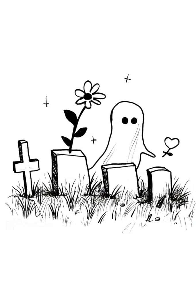
Friendly Ghosts
Hey there! So I’m looking at this cute octopus drawing and something that really jumps out at me is the way the artist played with the eyes. See how one octopus has these big round eyes, but the other one has kinda squinty eyes with a little shine? That tiny detail gives each character its own personality.
And you know what? The curly tentacles are pretty awesome too. I remember when I was first learning to draw sea creatures, I’d always make the tentacles too stiff and straight. But these have this great flowing movement that makes the whole image feel alive. It’s not easy to get that natural, curvy look – took me ages to figure it out!
Oh, and check out how they’re holding hands! Or tentacles, I guess. It’s such a sweet little touch that gives the whole thing an emotional punch. Makes me think of some drawings I did of my kids when they were little… always trying to capture those tender moments, y’know? Anyway, keep an eye out for those small details that tell a story. They’re what takes a drawing from good to great!!!
Monster Peeking Out From Bed
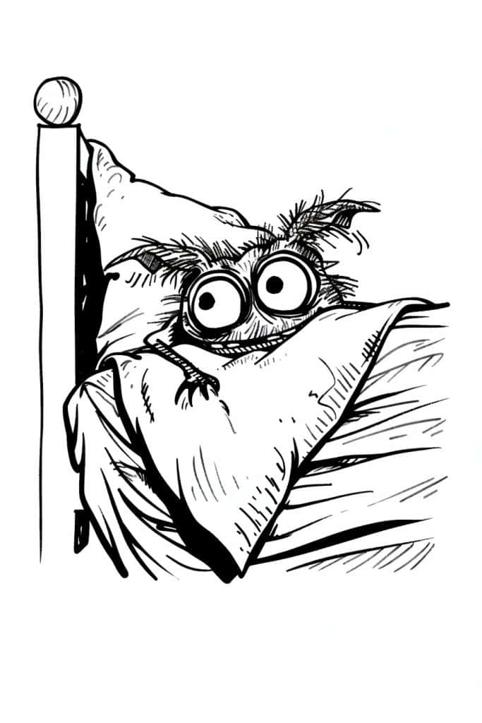
Alright, so you’re tackling this funky little critter peeking out from under the covers, huh? Honestly, the first thing I’d say is don’t stress about getting those eyes perfect right away. Those big ol’ peepers are the star of the show, but they can be tricky.
I remember when I first tried drawing something like this – man, I must’ve erased those eyes a hundred times! What worked for me was starting with the basic shapes. Get that round head and those circular eyes roughed in, then build up the details. The fur’s gonna be your next challenge. It’s all about capturing that messy, scruffy vibe without going overboard. I like to use quick, sketchy lines to suggest the fur texture rather than trying to draw every single hair.
Oh, and don’t forget about the bedding! The way those covers are bunched up really sells the whole “I’m hiding but also totally watching you” feeling. Play around with different line weights to give it some depth. Thicker lines for the main folds, lighter ones for the smaller wrinkles. Honestly though, the best advice I can give is just have fun with it. This lil guy’s got so much personality – let that come through in your drawing. And if it doesn’t turn out perfect? No biggie. That’s how ya learn!
Cute Frankenstein
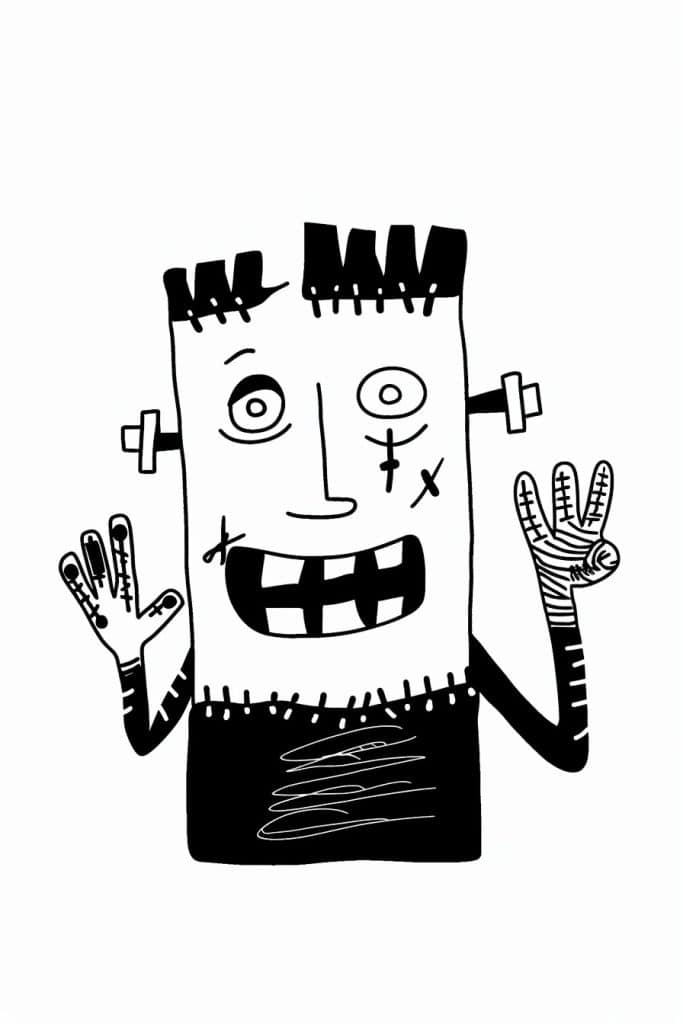
So, the first thing that jumps out at me is how this artist uses bold, simple lines to create such an expressive character. It’s like they’re channeling a kid’s crayon drawing but with way more intention, you know? The wonky proportions and asymmetry give it this raw energy that’s hard to fake.
Honestly, I love how they’ve played with texture here. Those jagged hair spikes and the scratchy shading on the hands… it reminds me of when I was first learning to draw and would just go wild with my pencil, not worrying about making everything look “perfect.” I once did a whole series of monster portraits using only straight lines and zig-zags – prob not my best work, but it was fun to break outta the usual constraints.
The face is def the focal point though. Those mismatched eyes and that big toothy grin… it’s unsettling but kinda endearing at the same time? I’m not totally sure what that mark on the cheek is supposed to be – a scar maybe? Or just another quirky detail. Either way, it adds to the overall vibe. Honestly though, the best advice I could give to a beginner trying this style is to just let loose and not overthink it. Embrace the weird, ya know? Sometimes the “mistakes” end up being the most interesting parts of a piece.
Overflowing Cauldron
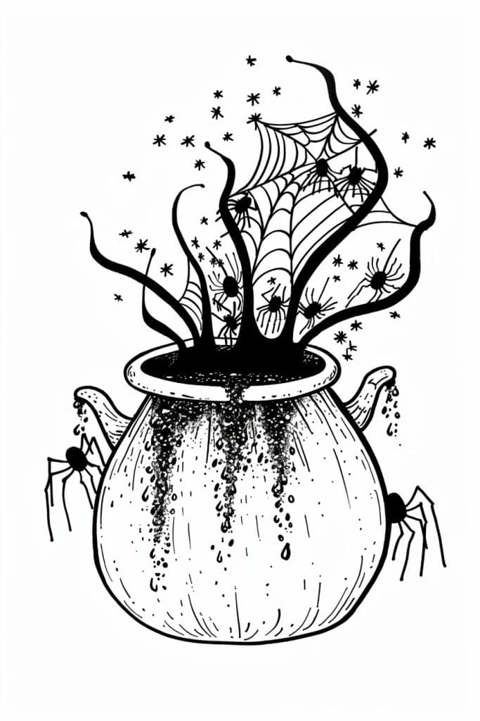
So, looking at this piece, the artist does a really cool job creating depth through a few key techniques. First off, the way they’ve drawn that cauldron or pot thing – it’s got this rounded shape with shading that makes it pop out. And then all those spiderweb-y tendrils coming out the top? They curve and overlap in a way that gives a sense of space.
I remember when I was first learning to draw, I’d always struggle with making things look 3D. Like, I’d draw a vase and it’d end up looking totally flat. But then I figured out that overlapping elements is key. See how the spiders are crawling up the sides of the pot? That instantly tells your brain there’s depth there.
The other thing that’s really working here is the varying line weights. The pot has these thick, bold outlines, while the spiderwebs and little star thingies (are those supposed to be magic sparks or something? I’m not totally sure) are way more delicate. It’s kinda like… you know when you’re looking at something in real life, and the stuff that’s closer looks more defined? Yeah, same principle.
(Speaking of spiders, I once tried to draw a tarantula and it ended up looking like a mutant dust bunny. Not my finest moment, haha.)
Oh, and one last thing – the way the artist’s drawn those drips coming down the sides of the pot? That’s basically creating these vertical lines that follow the curve, which reinforces the rounded shape. It’s a neat little trick to keep in mind.
Candy Corn Holding Goodies
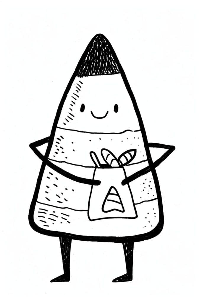
Okay, so this little triangle dude is pretty simple but kinda tricky at the same time. I’m not gonna lie, getting those proportions right can be a pain. From what I’ve seen, a good way to practice is to break it down into basic shapes first. Start with a big triangle, then divide it into thirds horizontally. The top third is the pointy hat part, middle is the face, bottom is the body.
And here’s a weird trick I learned years ago – turn your reference image and your drawing upside down! I know it sounds crazy but it really works. It helps your brain see the shapes and lines without getting hung up on what they’re supposed to be. I remember when I first tried this, I was organizing my art supplies just like I am now and knocked over a whole jar of brushes, what a mess! But anyway, it def made a huge difference in my proportion skills.
But back to this lil guy – pay attention to how the arms stick out from the sides. They’re not coming straight out, there’s a slight angle. And those legs, they’re pretty stumpy compared to the body. Oh, and don’t forget that cute little smile! Getting facial expressions right on cartoony characters like this can be tough. I usually practice drawing different mouth shapes over and over til I get it juuust right. Prob wouldn’t hurt to do some hand studies too for those little mitten hands.
Bubbling Witch Cauldron
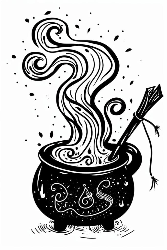
Alright, so this drawing’s got a really strong vertical flow going on. The swirling smoke or steam or whatever it is (I’m not totally sure what to call it) pulls your eye right up from the cauldron. It’s pretty clever how the artist used those curvy lines to create movement.
I remember when I was first learning to draw, I struggled with directing the viewer’s gaze. This piece does it so well – everything leads to that billowing shape in the center. The little droplets and splatters around it add to that sense of energy and motion too.
The contrast between the solid black cauldron and the intricate linework of the smoke is really striking. It anchors the whole composition. Oh, and did you notice that weird stick or wand thing poking out? That’s an interesting detail that sort of breaks up the flow a bit (in a good way). It reminds me of this time I was doodling during a boring meeting and ended up with a similar magical-looking pot… though mine wasn’t nearly as cool as this one.
Anyway, if you’re trying to recreate something like this, I’d say focus on those flowing lines first. Get the general shape down, then add in all those little curls and swirls. And don’t be afraid to go bold with the black areas – they really make the linework pop. Just be careful not to overdo it, y’know? Sometimes less is more when it comes to contrast.
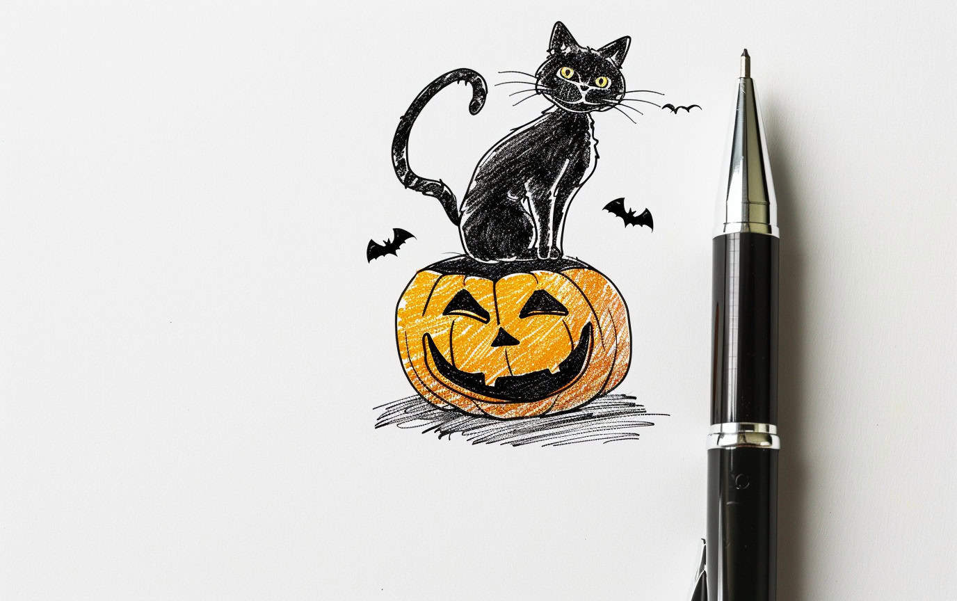
Cat Atop A Carved Pumpkin
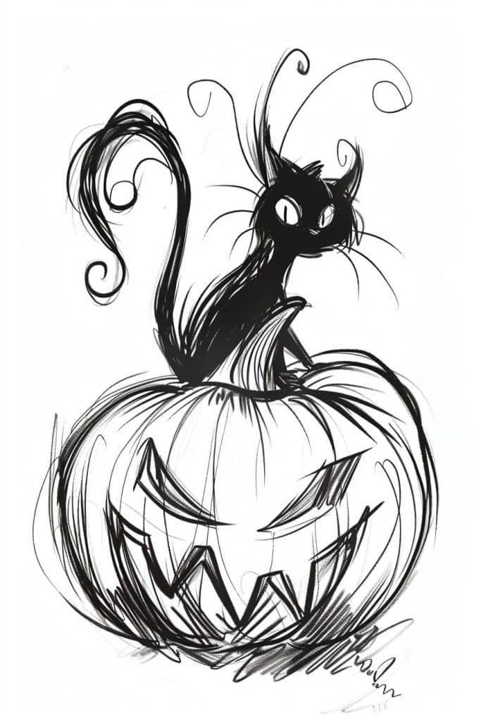
Okay, so this drawing is pretty cool – I love the spooky Halloween vibe with the black cat and jack-o’-lantern. The linework is really expressive, kinda reminds me of Tim Burton’s style a bit.
For a creative variation, how about flipping the whole thing upside down? Imagine the pumpkin hanging from a gnarly tree branch, with the cat perched on top looking down. You could add some bats flying around too. I tried something similar once for a Halloween art fair and it was a hit! People kept saying it made them feel dizzy in a fun way, haha.
Oh, and you could play with teh negative space more. Maybe have the pumpkin’s face glow and cast eerie shadows? That’d add some cool depth. Speaking of depth, I’m teaching a workshop on creating atmosphere next week and I’m kinda nervous about it… Anyway, back to the drawing – another idea is to make it more abstract. Break up the shapes, exaggerate the swirls and curves. Go wild with it! Art’s all about pushing boundaries, y’know?
Bat Hanging Upside Down
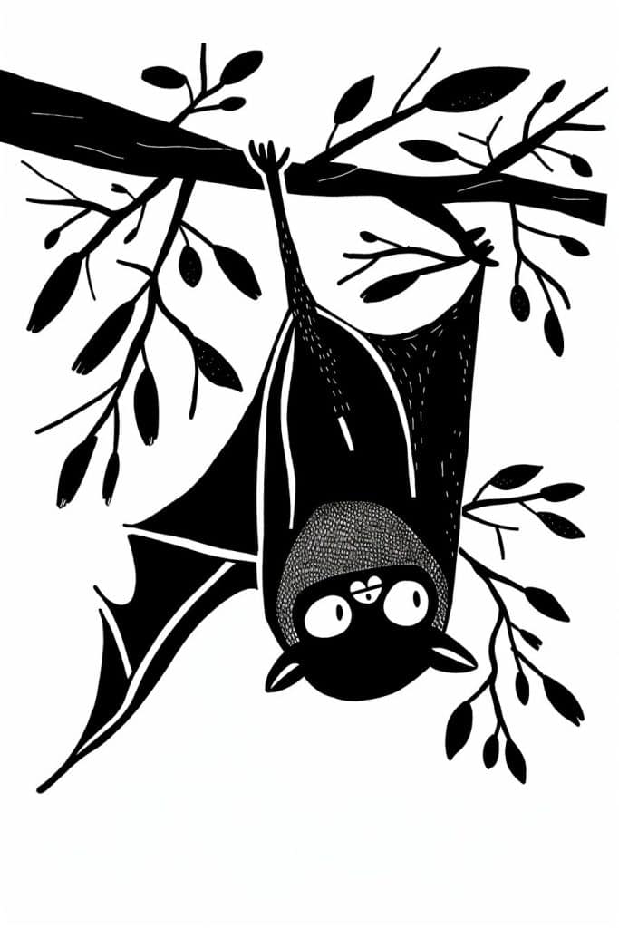
Wow, this bat illustration is super cool! I love the stark black and white contrast. It’s pretty striking.
You know, you could totally apply this style to like… underwater scenes. Imagine a jellyfish or an angler fish done up in this bold silhouette style. The tentacles could be all spindly like the tree branches here. I tried something similar once with an octopus and it turned out pretty rad, if I do say so myself. Though I messed up one of the arms and it looked more like a weird noodle than a tentacle, haha.
The texture on the bat’s body is interesting too. It’s kinda hard to tell exactly what technique they used there. Maybe stippling? Or some sorta crosshatching? Anyway, you could use that to add depth to all kinds of subjects. Like imagine doing a cityscape with all the buildings as black silhouettes, but then adding that texture to certain areas to make ’em pop. Oh man, now I’m getting ideas!!! Might have to try that out myself tomorrow. If I can drag myself outta bed after staying up way too late drawing again tonight.
With these 25 creative Halloween drawing ideas, your sketchbook will be brimming with festive spirit and spooky charm. Whether you’re looking to improve your drawing skills or simply want to embrace the holiday fun, these ideas will keep your artistic inspiration flowing all season long. So, grab your pencils, and let your imagination lead the way as you create your own spooky masterpieces this Halloween!