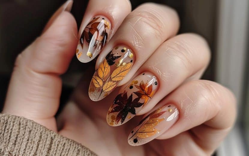
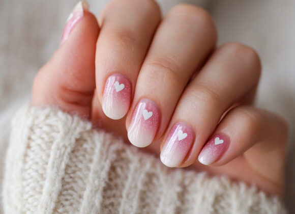
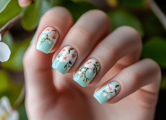
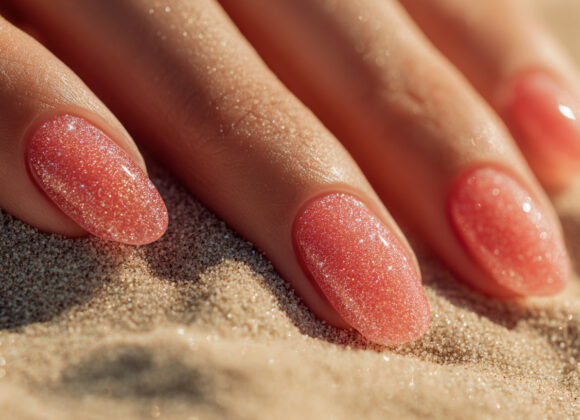
Embrace the essence of autumn with these 25 cool fall nail inspiration ideas! This season, let your nails be the ultimate accessory, showcasing everything we love about fall — warm tones, earthy textures, and playful autumn patterns. Whether you’re into classic colors, cozy sweater designs, or trendy pumpkin accents, these ideas will give your nails a seasonal upgrade. Perfect for a DIY session or a salon visit, these fall-inspired nail ideas are sure to make you feel stylishly festive.
All photos provided are original and can be used as a reference for your own nail art.
Table of Contents
Whimsical Autumn Doodles
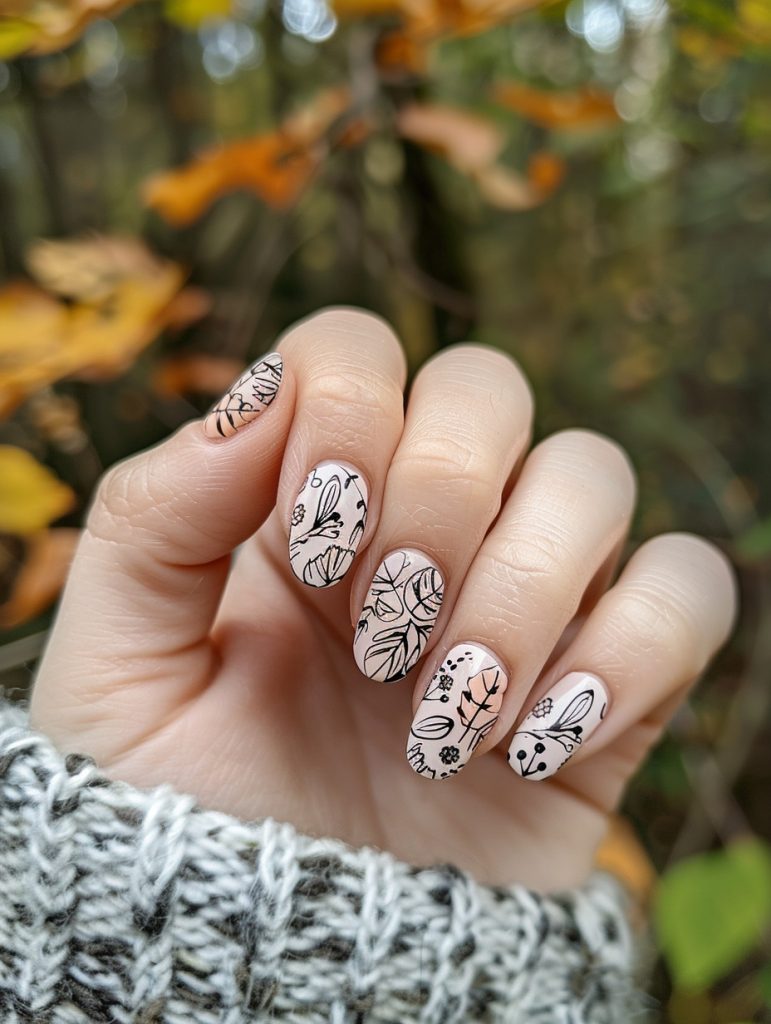
Alright, so these nails are giving me major botanical sketch vibes. The light nude base with those black line drawings is super striking – it’s like having a little art gallery on your fingertips, you know?
Honestly, achieving this look is all about precision. You gotta start with a really smooth nude base, maybe two coats to get that perfect canvas. Then the tricky part – those freehand botanical designs. I’d probably use a super fine nail art brush, the kind where you’re like “is this even a brush or just a single hair?” Haha.
I remember this one client who wanted something similar, but with, like, tropical flowers. Took forever to get those hibiscus petals just right. Anyway, for these, you’d wanna start with the larger leaf shapes and then add in all those little details – the veins, the little buds, those cute dotted elements.
Speaking of dots, I’m seeing some variation in the dot sizes which adds nice depth. Probably used a dotting tool for those – or honestly, sometimes I just use the end of an old brush handle. Works just as well in a pinch.
The placement of the designs is really thoughtful too. Each nail has its own little composition, but they all work together. It’s giving me major cottagecore energy, like you could be sipping tea in a garden somewhere.
Oh, and I almost forgot! To seal in all that delicate linework, you’d definitely want a good top coat. Something that won’t smudge all your hard work, you know?
Honestly though, the thing that really makes these pop is the contrast. That stark black against the soft nude is just *chef’s kiss*. It’s funny, I was just people-watching earlier and saw someone with a tote bag that had a similar vibe. Guess botanical sketches are having a moment!
One thing I’m not totally sure about is whether they used a matte or glossy top coat. It’s hard to tell from the pic, but either way could look amazing.
Anyway, these nails are definitely a showstopper. Perfect for someone who wants something artistic but not too in-your-face. Just be prepared to spend some quality time at the nail station – this isn’t a quick in-and-
Pumpkin Patch Inspired
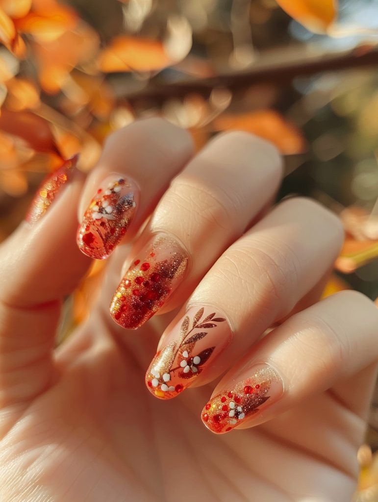
So, looking at this gorgeous autumn-inspired nail design, what really strikes me is the beautiful gradient effect and those intricate floral details. The way the red and gold blend together is just *chef’s kiss*.
To recreate this, I’d actually suggest using a makeup sponge – yeah, like the ones for foundation. It’s an unconventional tool, but I’ve found it works wonders for creating that seamless ombre effect from the deep red to the shimmery gold. You’d start with a base coat, then dab on the colors with the sponge, blending as you go.
For those delicate leaf and flower designs, I’d probably use a super fine brush – maybe even one meant for watercolor painting. And here’s a trick I picked up at a workshop last year: mix a bit of rubbing alcohol with the polish to thin it out. Makes it way easier to get those crisp, delicate lines.
Oh! This reminds me of a client I had last fall who wanted something similar. She brought in a actual leaf as inspiration – it was cute, but also kinda messy. Ended up with bits of leaf all over my station. But the end result was worth it!
The speckled effect is interesting – I’m not 100% sure, but it looks like it might be achieved with a dry brush technique? Basically, you’d load up a brush with polish, wipe most of it off, then lightly drag it across the nail. Creates those cool, random splatters.
And those little white flower accents – I’d probably use a dotting tool for the centers, then drag out the petals with a toothpick. It’s not fancy, but it gets the job done.
Finishing touches would definitely include a good top coat – something with a high-shine finish to really make those metallics pop. And don’t forget cuticle oil! Keeps everything looking fresh and healthy.
But yeah, this design is giving me all the fall vibes. Makes me wanna grab a pumpkin spice latte and go leaf-peeping or something. Maybe I should do my own nails like this for the weekend…
Anyway! Hope that gives you some ideas on how to tackle this look. Let me know if you want me to clarify anything –
Mushroom Forest
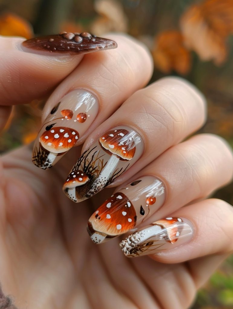
Okay, so this mushroom nail art is honestly pretty darn impressive. The way they’ve used the negative space on some nails to create depth and contrast with the detailed mushroom designs is really clever. It makes the whole look feel more dynamic, ya know?
From a technical standpoint, this design is no joke. You’re looking at some serious freehand work here – those little white dots on the mushroom caps require a super steady hand and probably a dotting tool or fine brush. I remember when I was first learning to do detailed nature scenes like this, I’d get so frustrated trying to keep my hand still enough!
The gradient on the mushroom caps is giving me flashbacks to a workshop I took on color blending a few years back. We spent like three hours just practicing smooth transitions from orange to white. It’s trickier than it looks, especially on that curved nail surface.
For the grass-like details at the base of the mushrooms, I’d probably use a really fine liner brush. Maybe even cut down some of the bristles to get those super thin lines. (I may or may not have ruined a few good brushes experimenting with that technique back in the day, oops.)
Oh, and see how they’ve got those little water droplets scattered around? That’s a cool way to fill some of the negative space without overwhelming the design. I’d probably use a clear gel topcoat to create those – gives ’em a nice 3D effect.
The color palette here is spot-on for a fall/autumn vibe. I’m guessing they used a warm orangey-brown for the base of the mushrooms, then gradually added white to create that ombre effect up to the polka dots.
You know, this reminds me of a client I had last year who was really into foraging and wanted a whole woodland theme on her nails. We ended up doing a similar mushroom design, but with some little acorns and leaves mixed in. Took forever, but she loved it.
When it comes to finishing a design like this, you wanna make sure you seal everything with a good top coat. Sometimes intricate designs like this can chip easily if they’re not protected properly. I usually go for a gel top coat for extra durability.
One thing I’m not totally sure about is whether they
Purple With Gold Accents
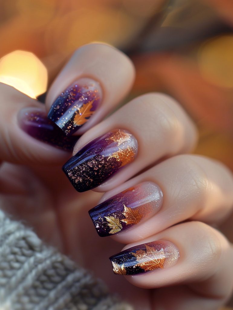
Honestly, the attention to detail in this nail art is just stunning. The way the artist blended those deep purples and golds with that shimmery effect? It’s giving me major galaxy vibes, but with an autumnal twist.
One part that really showcases the artist’s skill is the precise placement of those little gold maple leaves. Getting those tiny details right takes a steady hand and lots of practice. I remember when I first tried doing micro-art like that – let’s just say there was a lot of smudging and frustrated clients!
The gradient application here is on point too. You can see how they seamlessly transition from that rich purple base to the shimmery gold tips. It’s not easy to get that smooth fade, especially when you’re working with such contrasting colors. I usually use a makeup sponge for gradients like this – helps blend everything together without any harsh lines.
Speaking of blending, can we talk about that glitter placement? It’s not just randomly sprinkled on – you can see how it’s more concentrated at the tips and fades out towards the cuticle. That takes some serious patience and planning.
Honestly though, the thing that impresses me most is how well-balanced the overall design is. Each nail is unique, but they all work together as a cohesive set. It’s giving me major inspiration for some fall-themed sets I wanna try out.
Oh! This reminds me of a client I had last week who wanted something similar. She brought in a picture of some galaxy nails but wanted to “autumn-ify” them. We ended up doing a deep blue base with orange and gold accents. It wasn’t quite as intricate as this, but it had a similar vibe.
One thing I’m not 100% sure about is whether they used a stamping technique for those leaves or if they’re hand-painted. Could go either way, ya know? If it’s stamping, that’s some pro-level placement. If it’s freehand… well, color me impressed!
I gotta say, looking at nails like this always gets me excited to try new things. Just finished a set myself that was kinda similar – not as fancy as this one, but it had that same moody fall vibe. Makes me wanna break out my detail brush
Maple Leaves

Wow, those fall-inspired nails are gorgeous! The maple leaf designs really pop against that soft, shimmery base. To add some extra texture, I’d suggest trying out a velvet powder technique on parts of the leaves. It gives this amazing fuzzy, tactile effect that clients go crazy for.
I remember this one time, I had a regular come in asking for “cozy sweater nails” right as the weather was turning crisp. We ended up doing a similar maple leaf design, but I used a fine-tipped brush to add these teeny knit-like patterns. Took forever, but man was it worth it!
Anyways, for these nails, I’d start by applying the base coat as shown – looks like they used a peachy nude with some sparkle mixed in. Then for the leaves, you could use a thin brush or maybe even try nail stamping (though getting the placement just right can be tricky). The key is building up layers of oranges and reds to get that realistic fall coloring.
To add the velvet texture, you’d sprinkle the powder over still-wet sections of the leaf design. It sticks to the tacky polish and creates this soft, almost 3D effect. Just be careful not to go overboard – a little goes a long way!
Oh, and speaking of textures, I’m actually prepping for a workshop on unconventional nail materials next week. Been experimenting with everything from crushed shells to tiny dried flowers. Sometimes it’s a total mess, but that’s half the fun, right?
For finishing touches on these fall nails, I might add a few more scattered leaf fragments or maybe some gold foil accents to mimic those sparkly autumn sunbeams. And of course, seal it all in with a good top coat to make sure that texture lasts.
What do you think? Would you want to try something like this? I swear, once you start playing with textures, it’s hard to go back to plain old smooth nails!!!
Warm Toasted Almond Leaves
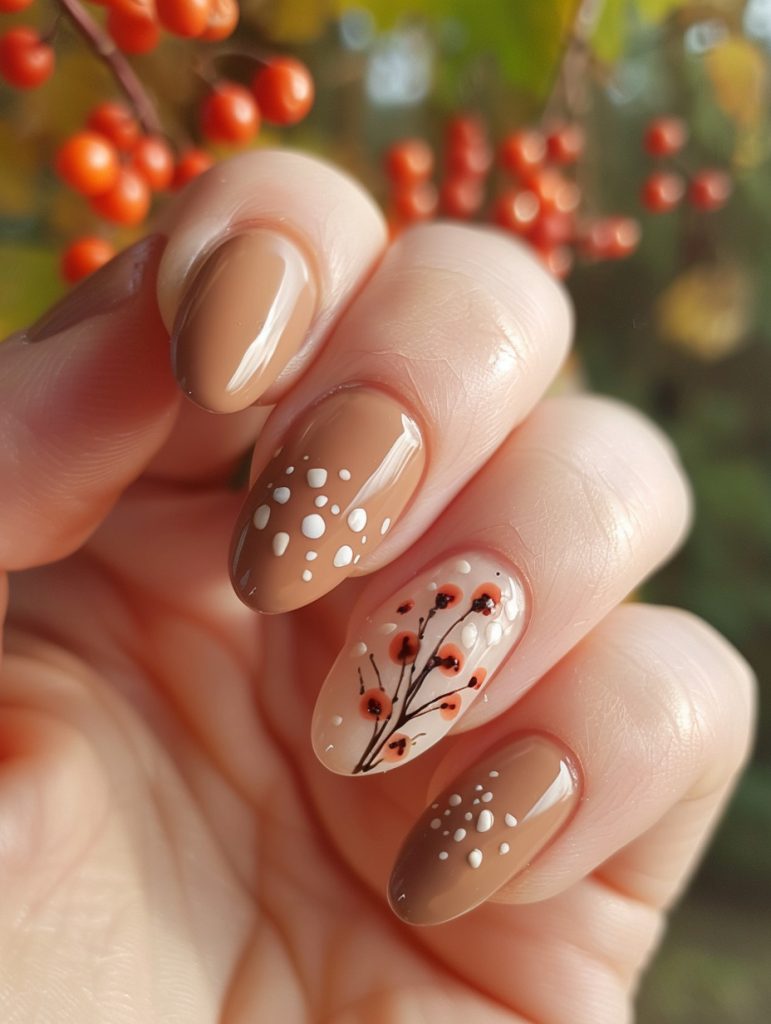
Honestly, this nail design is just gorgeous. The soft nude base with those delicate white dots and that stunning floral accent nail – it’s giving me major fall vibes. Changing the perspective could really amp up the impact, especially if we played with the placement of that accent nail.
So here’s the thing – getting those thin branches and tiny flowers to look natural is trickier than it seems. I’ve had clients request similar designs, and let me tell you, freehand work like that takes a steady hand and lots of practice. But the payoff is so worth it.
One time, I had this client come in wanting something “autumnal but not basic” (her words, not mine). We ended up doing a design pretty similar to this, but I placed the accent nail on the ring finger instead. It totally changed the whole look. And honestly, I think I might even prefer it that way? But hey, to each their own.
For the base, you’d want to start with a nice even coat of that nude shade. Then for teh dots, I’d probably use a dotting tool – helps keep things consistent, you know? Though I gotta admit, sometimes I still struggle to get them perfectly spaced. Practice makes perfect, I guess.
The flower nail is where things get real fun. You’d want to start with the branches using a super fine brush. And then those little red blossoms… I’m not 100% sure, but it looks like they might’ve used a teeny tiny dotting tool for those. Gives them that perfect round shape.
But here’s a pro tip – if you’re doing this at home and don’t have all the fancy tools, you can totally use a toothpick for the fine details. It’s not ideal, but in a pinch it’ll do the job.
And speaking of tools, remind me to tell you about the time I forgot my dotting tools at home and had to improvise with Bobby pins all day. Talk about a mess!
Anyway, back to this design – the key to making it really pop would be playing with the angles. Maybe have the branches curving more dramatically across the nail, or even extending onto multiple nails for a more cohesive look.
Oh! And I almost forgot – a good top coat is crucial for sealing in all those delicate
Vintage Floral Motif
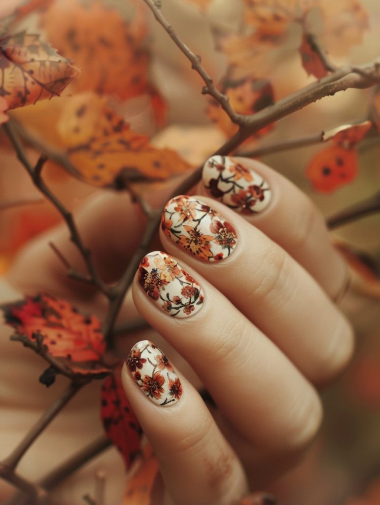
Wow, this nail design is seriously stunning! The artist has absolutely nailed the autumn vibes with those warm, rich colors. The contrast between the delicate floral pattern and the bold orange background is super effective.
From what I can see, they’ve used a white base coat and then hand-painted those intricate flowers and leaves. That takes some serious skill – I remember when I first tried freehand florals like this, I was a hot mess! My poor client ended up with what looked like blobs instead of petals. But practice makes perfect, right?
The technique here looks like it might involve some fine brushwork for the petals and stems, then possibly dotting tools for the little details. I’ve found that using a really thin brush and watering down the polish a bit can help get those crisp lines. Oh, and speaking of polish, I’m betting they used a gel polish for this – it gives that super glossy finish that really makes the design pop.
You know, this reminds me of a workshop I took last year on botanical nail art. We spent hours perfecting our tiny leaf shapes. I thought my hand was gonna fall off by the end of it! But it was totally worth it when I could finally offer designs like this to my clients.
One thing that’s really clever here is how they’ve varied the size and density of the flowers. It gives the whole design more depth and interest. I’m not totally sure, but it looks like they might have used a stamping plate for some of the smaller background elements to save time. That’s a trick I love using when I’m in a rush but still want something intricate.
The color palette is spot-on for fall too. Those oranges and browns with hints of deep red – it’s like the nails are covered in fallen leaves. I had a client last week who wanted something similar, but she insisted on adding some glitter. Let me tell you, trying to place glitter precisely around a design like this is no joke!
One little imperfection I notice – and this happens to the best of us – is that the design on the pinky nail seems slightly less detailed. Probably because it’s such a small surface to work on. But honestly, when you look at the overall effect, it’s still gorgeous.
If I were doing this design, I’d probably finish it off with
Textured Cork In Earthy Tone
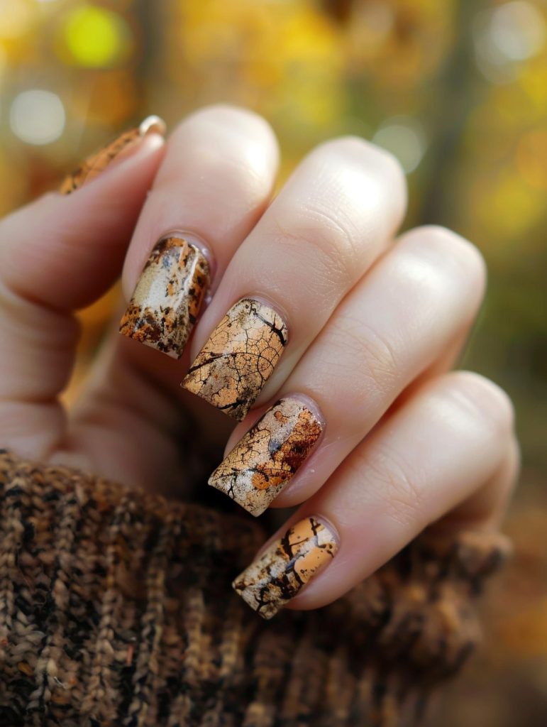
Wow, these nails are absolutely gorgeous! The marbled effect with those golden tones and dark veining is just *chef’s kiss*. To make this static image more dynamic, I’d suggest adding some subtle sparkle or shimmer to catch the light.
So, analyzing what makes this design pop – it’s all about that organic, natural stone look. The variation in color and those delicate cracks are spot-on. Executing this prob took some serious skill with alcohol inks or maybe water marbling.
To amp up the liveliness, I’d recommend a super fine gold glitter topcoat. Not all-over, mind you, but strategically placed to mimic the way light hits natural stone. You know, like, a gradient effect from the cuticle outwards on just 2-3 nails.
I remember this one client who wanted something similar – she brought in a picture of agate slices. Anyways, we ended up using a dotting tool to add tiny gold ‘veins’ throughout the design. It looked amazing when she moved her hands!
For application technique, I’d start with a neutral base, then go in with alcohol inks in various amber and brown shades. Let those bad boys bloom and blend naturally. Once that’s dry, use a thin brush to add those darker veins. A matte top coat would really sell the stone effect, but then go back in with that sparkle I mentioned.
Oh! And don’t forget cuticle oil at the end. I swear by jojoba – makes everything look so much more polished and healthy.
I gotta say, I’m not 100% sure how they got that perfect color gradation in the image. Maybe it’s just the lighting? But it’s really, really well done.
Anyways, this kind of look is def on trend right now. I’ve been doing tons of nature-inspired designs lately. People just can’t get enough of that organic vibe, you know?
Just remembered – if you want to add even more depth, you could try embedding some actual gold leaf under the top coat. It’s finicky to work with, but the effect is out of this world.
Ok, I need more coffee before my first client shows up. Hope this helps inspire some ideas for livening up that already stunning design
Speckled Terrazzo Inspired
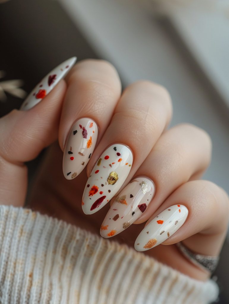
Okay, so looking at this nail design, what really pops is the way they’ve used these little flecks of color on a neutral base. It’s like confetti on your nails! I’ve done similar looks before, but this one’s got a really nice balance to it.
To adapt this into a different medium, you could totally go for like a resin art piece. You know those cool pour paintings people do? Imagine doing that but with a clear resin base and then dropping in those little bits of color. It’d be kinda like making those nails, but on a bigger scale.
Now, to break down the nail technique – first off, you’re gonna want a nice even base. I usually go for a gel polish for this ’cause it’s more durable, you know? Then for those flecks, you’ve got options. You could use a dotting tool and carefully place each one, or if you’re feeling brave, try flicking a small brush to get that random scattered look. I had a client once who wanted something similar but with all gold flecks for her wedding – took forever but looked amazing!
Oh, and don’t forget the importance of a good top coat! It’s basically what makes or breaks these delicate designs. I swear by the one we use in the salon – it’s a bit pricey but totally worth it for how glassy it makes everything look.
One thing I’m not 100% sure about in this pic is whether they used actual gold leaf for some of those flecks or if it’s just a really good metallic polish. Either way, it adds a nice touch of luxury.
You know what’s funny? I actually just did a set kinda like this yesterday! But I went a bit overboard with the flecks on one nail and had to start over. It happens to the best of us, right?
Anyway, if you’re gonna try this at home, my big tip is to work in thin layers. Build it up slowly, ’cause if you glob on too much at once, you’ll end up with a lumpy mess. Trust me, I learned that the hard way when I first started out!!!
So yeah, that’s my take on this design. It’s pretty versatile – you could adapt the colors for any season or occasion. Just remember to
Speckled Birds Egg
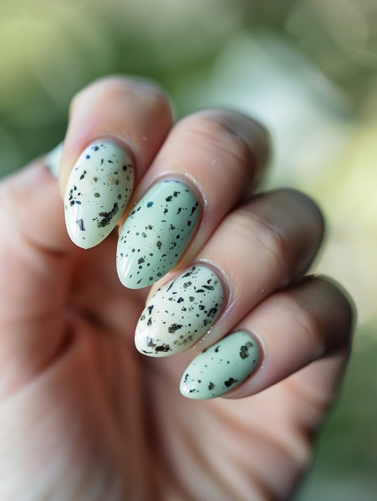
Alright, let’s dive into this eye-catching nail design! The artist is really playing with a speckled, almost bird’s egg-like pattern here. It’s giving me major springtime vibes.
Honestly, achieving this kind of organic, random-yet-cohesive look can be trickier than it seems. The key technique I’d use is a combination of splattering and careful placement of those larger flecks. I’d probably start with a pale mint base coat – looks like they used a nice creamy formula that gives full coverage.
For the speckles, I’d mix a deep forest green or black polish with a bit of acetone to thin it out. Then comes the fun part – flicking the brush to create those tiny dots! It takes practice to get the right consistency and pressure (I may or may not have accidentally splattered a client’s forehead once when I was first learning this technique… oops).
The larger flecks look like they might be done with a small dotting tool or even the tip of a toothpick. I’d dip it in undiluted polish and carefully place those bigger spots.
You know, this reminds me of a set I did for a client last Easter. She wanted robin’s egg nails but with a twist – we ended up doing a pale blue base with chocolate brown speckles and then added tiny gold flecks to make it extra fancy. It was a hit at her family brunch!
One thing I’m not totally sure about is whether they used a matte topcoat here or if it’s just the lighting. The finish looks pretty smooth, but there’s a softness to it that could be matte.
Honestly though, the thing that makes this design work so well is the color combo. That soft mint green with the dark speckles is *chef’s kiss* – it’s nature-inspired without being too literal.
Oh! And I almost forgot – make sure you’re working in a well-ventilated area when you’re doing splatter techniques. I once got so caught up in perfecting a galaxy design that I didn’t realize how fume-y my studio had gotten. Nearly passed out reaching for my glitter topcoat!
Speaking of topcoats – I’d finish this look with a good quality one to seal in the design
Holographic Glitter Topper

Wow, the first thing that catches my eye is that insane holographic glitter! It’s like a galaxy exploded on those nails. The way it shifts and sparkles in the light is seriously mesmerizing.
From a technical standpoint, achieving that level of sparkle without it looking chunky or overwhelming is no small feat. I’d bet they used a super fine holographic glitter mixed into a clear base to get that smooth application. Probably did a few thin layers to build up the intensity without losing the clarity.
Speaking of challenging techniques, this reminds me of a bride I had last summer who wanted something similar but was worried it’d be “too much” for her wedding. We ended up doing a subtle ombre effect with the glitter, concentrating it more at the tips. Turned out gorgeous and she was over the moon.
For something like this, I’d start with a sheer pink or nude base to give it that warm undertone. Then I’d use a small makeup sponge to dab on the glitter polish, working from the tip towards the cuticle to create that slight gradient effect. The key is building it up slowly – you can always add more, but taking it off without messing up the base is a nightmare.
Oh! And before I forget, make sure you’re using a good quality top coat that won’t dull the sparkle. I swear by Seche Vite for these types of looks. It’s a bit pricier, but man does it make a difference in the final result.
Anyways, I’m actually working on some designs for an upcoming nail art workshop I’m teaching next month. Might have to include something like this as an advanced technique demo. People go crazy for that sparkle!
One thing I’m not totally sure about from the pic is whether they used any kind of chrome powder underneath. It almost looks like there might be a rose gold shift happening, but it could just be the lighting playing tricks.
But yeah, overall this is a killer look. Def gonna be saving this for inspo later. Now if you’ll excuse me, I gotta go dig through my glitter stash and see if I can recreate this magic!
Metallic Bronze And Amber
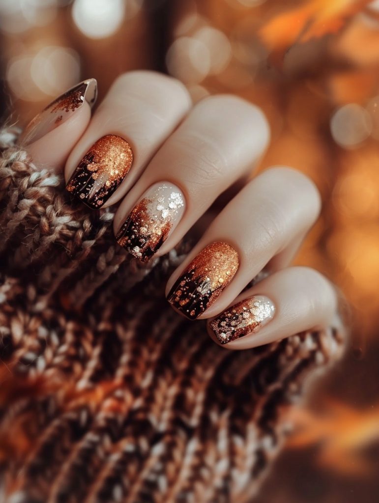
Alright, let’s dive into this gorgeous autumn-inspired nail design! Honestly, if I had to sketch this quickly, I’d start with the base gradient. That warm copper-to-black fade is the foundation everything else builds on.
For the gradient, I’d use a makeup sponge – yeah, those little triangular ones work great. Dab the colors on in layers, blending as you go. I remember a client who wanted something similar for her fall wedding… took me forever to get the fade just right, but man, was she thrilled with the result!
Next up, the glitter placement. That’s where things get a bit tricky. I’m not gonna lie, getting that perfect scattered look takes practice. I’d probably use a thin brush to place larger glitter pieces strategically, then go in with a fan brush to dust finer glitter for that sparkly dimension.
Oh! Speaking of brushes, I gotta organize my kit after this. It’s a disaster area right now, haha.
Anyway, back to the nails. The silver accent nails add a nice pop. I’d use a base of sheer white or pale champagne, then layer on silver glitter in varying sizes. Kinda reminds me of the time I spilled an entire pot of silver glitter in the salon… took weeks to get that stuff outta the carpet!
For the finishing touches, a good top coat is key. Gotta seal in all that glitter so it doesn’t snag on everything. I usually do two layers, letting each one dry completely.
Y’know, looking at it again, I’m not 100% sure if there’s a subtle stamping pattern under the glitter or if it’s just the way the light’s catching. Might need to see it in person to be certain.
Honestly though, what makes this design so striking is how it captures that cozy fall vibe while still being glam. It’s like… if a pumpkin spice latte wore sequins, ya know?
Oh! Almost forgot – cuticle oil at the end. Gotta keep those cuticles happy, especially with all the dry air in fall. Your clients will thank you!
Holographic Chrome Accent Nail
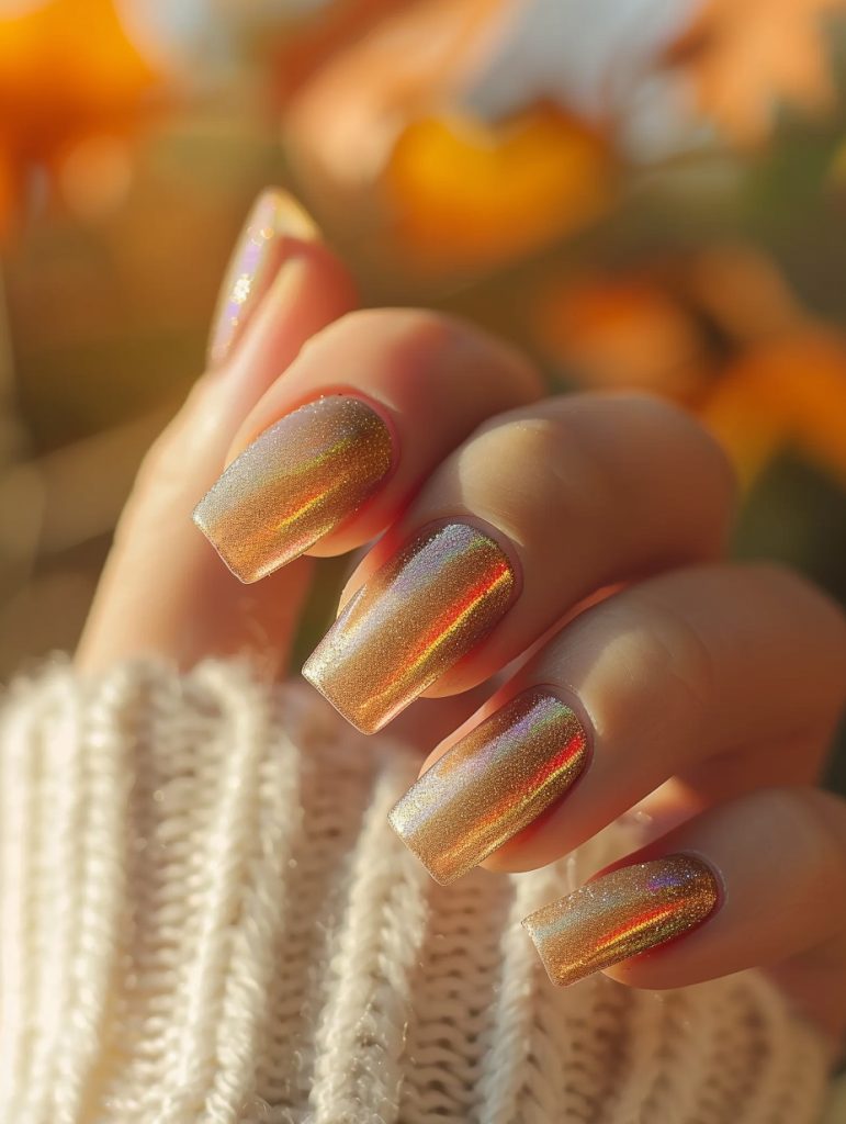
Wow, these nails are absolutely stunning! The holographic effect is super eye-catching. It looks like the artist used a chrome powder or perhaps a special holographic polish to create that mesmerizing rainbow shine.
The technique that really stands out to me is the perfect gradient from a cooler silvery tone at the base to warmer golden hues at the tips. Getting that seamless color transition can be tricky – I remember struggling with it when I first started out. These days I use a makeup sponge to dab on thin layers, building up the gradient gradually.
One thing I’m not totally sure about is whether they used a gel or regular polish as the base. The shine makes me lean towards gel, but it’s hard to tell for sure from just this pic.
Oh! This reminds me of a client I had last summer who wanted something similar for a beach wedding. We ended up doing a more subtle version with just a hint of holo sparkle at the tips. It was gorgeous, but man did that fine glitter get EVERYWHERE. I was finding sparkles in my hair for days after!!!
For this level of holographic intensity, you’d definitely want to use a good quality chrome powder. Apply it over a dark base coat – I like using black or deep navy – then really buff it in to get that mirror-like finish. The key is thin, even layers… oops, I said I wouldn’t use that phrase! Old habits die hard I guess.
You know, looking at this again, I wonder if they might have used some kind of overlay or nail wrap to get such a perfect effect. I’ve been meaning to experiment more with those…
Anyway, to finish off a look like this, I’d recommend a super thick, glassy top coat. Really flood the nail to smooth out any texture from the chrome powder. And make sure your client knows to be gentle with them – holographic finishes can be a bit delicate.
Oh shoot, I just realized I’ve been rambling on while trying to organize my gel polish rack. What a mess! But yeah, these nails are absolutely gorgeous. Your clients would definitely turn heads with a mani like this!
Speckled Caramel And Cream

Alright, so this nail design is pretty eye-catching! The base is a soft, almost milky white, and then there’s this gorgeous sprinkle of what looks like copper and maybe some darker flecks. It’s giving me major cozy autumn vibes.
For a beginner, I think the trickiest part would be getting that perfect oval shape. Shaping takes practice, you know? And then there’s the challenge of applying those tiny flecks evenly. It’s not just about dumping glitter on – you gotta have a light touch.
I remember when I first started out, I had a client who wanted something similar. But instead of copper, she wanted gold flecks. And let me tell you, I made a mess! Glitter everywhere. (Still finding bits of it in my kit to this day, I swear.)
But anyway, back to this design. The key here is layering. You’d start with a good base coat, then build up thin layers of that milky white. Maybe use a makeup sponge to dab it on for a softer look? And then for the flecks, you could try using a small brush to place them individually, or maybe a dotting tool.
Oh! And speaking of dotting tools, I just remembered this cool technique I learned at a workshop last year. You can actually use the round end of a bobby pin as a makeshift dotting tool in a pinch. Saved my butt once when I forgot my kit at home and had to do an emergency mani at a friend’s wedding.
But I digress. The finish on these nails looks pretty smooth, so you’d definitely want to seal it all in with a good top coat. Probably two layers, actually, to make sure all those little flecks stay put.
One thing I’m not totally sure about is whether they used a special kind of glitter or if it’s just regular polish. Sometimes it’s hard to tell in photos, you know?
Anyway, if you’re gonna try this at home, just remember – patience is key. And don’t beat yourself up if it doesn’t look perfect the first time. Heck, I still mess up sometimes and I’ve been doing this for ages!
Mosaic Stained Glass
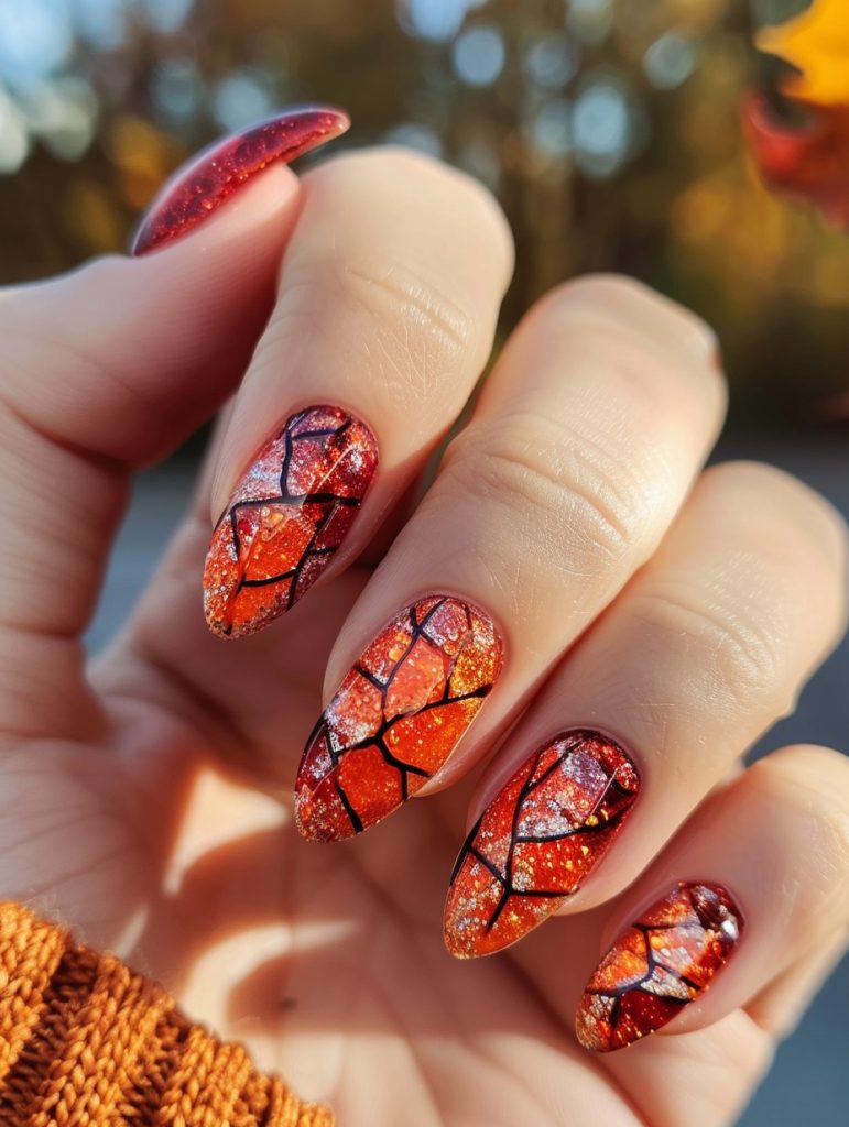
Alright, let’s dive into this gorgeous autumn-inspired nail art! Those warm oranges and reds with the black geometric overlay are giving me major fall vibes. Reminds me of a client who wanted something similar for her October wedding – talk about perfect timing!
To practice this look, I’d suggest starting with a simple gradient exercise. Grab a makeup sponge and three shades of orange/red polish. Dab them onto the sponge in overlapping stripes, then gently press and roll onto a nail wheel or practice sheet. It takes some trial and error to get the blending just right, but that’s half the fun!
Once you’ve got your gradient down, the tricky part is gonna be those crisp black lines. For beginners, I’d recommend using thin striping tape to create the geometric pattern. Pros can freehand it with a detail brush, but let’s be real – even after 8 years, I still reach for the tape sometimes. No shame in that game!
Oh, and don’t forget the sparkle! That subtle shimmer really elevates the whole look. I like to mix a bit of fine glitter into a clear topcoat for an easy application. Just be careful not to go overboard – had a client once who insisted on piling on the glitter until her nails looked like disco balls. Not my favorite look, but hey, the customer’s always right. Sort of.
One thing I’m not totally sure about is whether they used a matte or glossy topcoat here. The finish looks somewhere in between, which is super interesting. Might be worth experimenting with different ratios of matte and glossy topcoats to find that perfect satin finish.
Anyway, the key to nailing (haha, nail pun!) this look is patience. Layer your colors slowly, let each coat dry completely, and take your time with the detailing. And if you mess up? No biggie. That’s what acetone’s for, right?
Hope this helps! Let me know if you wanna see any other fall-inspired designs. I’ve got a maple leaf technique that’s to die for, though it’s a bit more advanced. Baby steps!
Moody Ombre Gradient
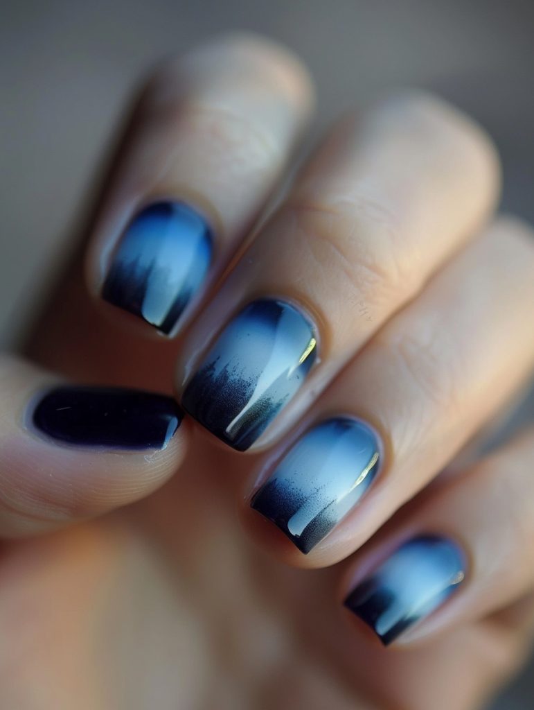
Wow, those ombre nails are seriously eye-catching! The gradual shift from that icy blue to deep navy is pretty stunning. I’m loving how they nailed the smooth transition between shades – that’s not easy to pull off, lemme tell you.
When I see designs like this, I’m instantly reminded of a technique I’ve perfected over the years called “sponge gradients.” You basically use a makeup sponge to dab on layers of polish, blending as you go. It takes some practice to get it juuust right, but the results can be amazing.
Speaking of practice, this one time I had a bride come in wanting something similar for her wedding day. We must’ve done like 5 test runs before we got the perfect blue ombre to match her “something blue” theme. By the end, my fingers were stained blue for days! But man, seeing her face light up when we finally nailed it? Totally worth it.
One thing that’s really catching my eye here is how they’ve added that hint of shimmer or metallic to the lighter blue parts. It gives the whole look this extra dimension, ya know? I wonder if they used a special chrome powder or if it’s just a really finely milled shimmer polish…
Anyway, if I was recreating this look in the salon, I’d probably start with a white base to make those blues really pop. Then I’d go in with the sponge gradient technique, working from light to dark. The trickiest part would be getting that perfect fade at the tips – you gotta be super careful not to overblend.
Oh! And speaking of blending, I just took this cool workshop on advanced gradients last month. They taught us this neat trick using acetone to soften the edges of the colors. It’s kinda messy, but it gives you this buttery smooth transition that’s just *chef’s kiss*.
But yeah, overall this is a gorgeous set. It’s giving me major “winter wonderland” vibes. I bet it would look killer with some delicate snowflake stamping on the accent nail… not that it needs it, the ombre stands perfectly on its own!!!
Moody Forest Green

Okay, so looking at this gorgeous green French mani, I’m loving the depth of that forest green – it’s giving me major holiday vibes! If I were to add one element to enhance this, I’d probably go for some subtle gold leaf accents along the curve where the green meets the white tip. It would add just a touch of festive sparkle without overwhelming the elegant simplicity.
You know, executing that crisp French line can be pretty tricky, especially with such a dark base color. I remember when I first started out, I totally botched a similar design for a bride-to-be (talk about stress!). But over the years, I’ve perfected using those little French tip guide stickers – they’re like, a total game-changer.
Speaking of game-changers, I was at this nail art workshop last month where they showed us this cool reverse stamping technique. I bet it would look amazing with this design – you could stamp some delicate leaf patterns in gold onto clear nail foils, then apply them over the green. It gives this amazing 3D effect that clients go nuts for.
Oh! And while we’re on the subject of stamping (I know, I know, I’m getting off track here), have you tried those new extra-large stamping plates? They’re basically…wait, where was I? Right, enhancing this design.
So yeah, I’d probably start by prepping the nail with a good base coat – that green looks like it might stain otherwise. Then I’d do two coats of the green, making sure to get nice even coverage. The white French tip would come next – that’s where those guide stickers I mentioned come in handy. Once that’s dry, I’d carefully apply some gold leaf with a small brush, just along that green-white border.
(Hang on, gotta take a sip of my latte – people-watching at this café is seriously distracting!)
Anyway, to finish it off, I’d seal everything with a super glossy top coat. That’ll really make the colors pop and give it that salon-perfect shine.
Oh, and one last thing – make sure you’re using a good cuticle oil after! With dark colors like this, any dryness around the nail really stands out. I’ve got this amazing lav
Hand Painted Leaf Garland
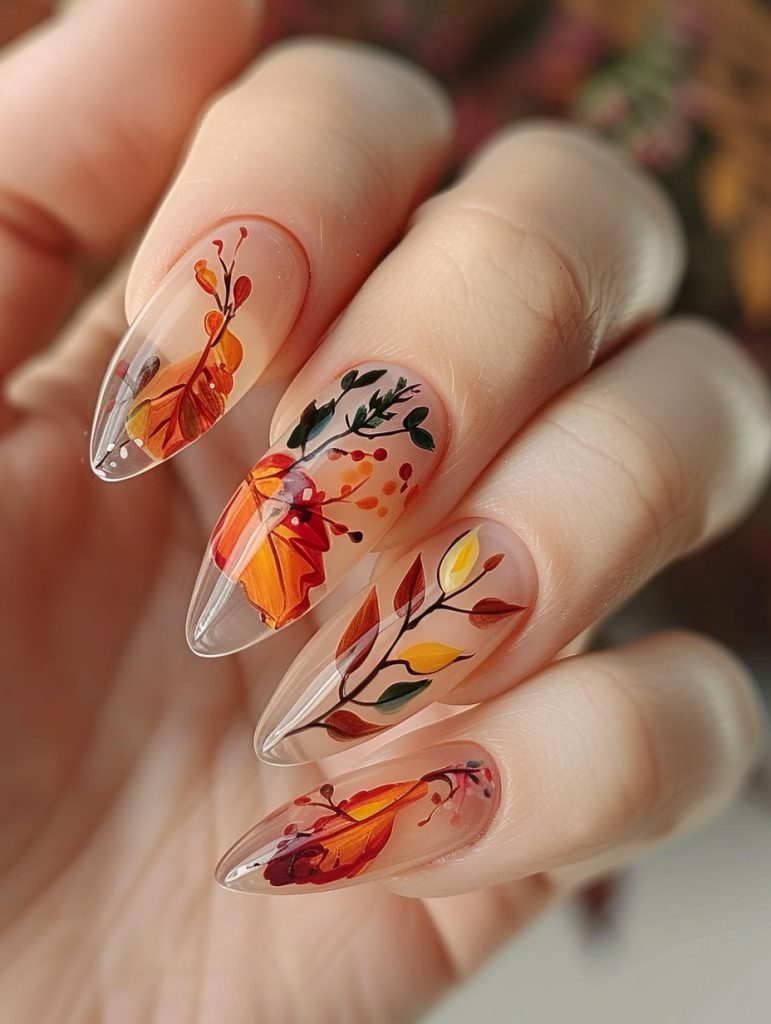
Alright, so these autumn-inspired nails are gorgeous but can be tricky to pull off without the right approach. The key pitfall to avoid is overcrowding the design – you gotta let those leafy elements breathe, ya know?
When I look at this, I’m struck by the delicate balance of negative space and intricate details. The gradient base is crucial – I usually start with a sheer nude and build up thin layers of orange and red to get that faded fall look. Then comes the fun part – the freehand leaf work.
I remember a client who wanted something similar last October. We were chatting about her upcoming trip to Vermont to see the foliage, and I got so into teh conversation that I accidentally made one leaf way too big! Rookie mistake. But we just incorporated it as an accent nail and it turned out pretty cool.
Anyway, back to technique – the key is using a super fine brush for those thin branches and veins. I’ve found that a mix of acrylic paint and gel polish works best for the leaves – gives you more control over the opacity and flow. Oh, and don’t forget to seal it all with a good top coat – nothing worse than spending an hour on detailed work only to have it chip the next day!
One thing I’m not totally sure about in this pic is how they got such crisp edges on some of those larger leaves. Might be some kind of vinyl stencil situation? I’ve been meaning to experiment more with those.
Speaking of experiments – last week I tried recreating this style using only stamping plates and it was… let’s just say it’s back to the drawing board on that one, haha. Sometimes you just can’t beat good old-fashioned freehand work.
But yeah, overall, I’d say the biggest challenge here is nailing that delicate, almost watercolor-like quality of the leaves while still keeping teh shapes defined. It takes practice, but once you get it down – man, it’s so satisfying. Clients eat this stuff up in the fall!
Hand Drawn Autumn Tree
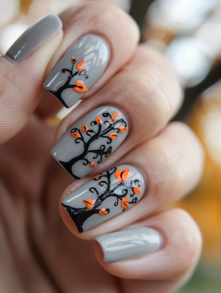
Alright, so looking at this nail design, the key skill beginners should really focus on is freehand detailing – especially those delicate tree branches. It’s all about steady hands and precise brush control.
The gray base is pretty straightforward, but those black branches with the little orange leaves? That’s where the magic happens. I remember when I first started out, I was terrible at thin lines like that. Kept globbing on too much polish and making a mess. (Speaking of messes, I totally smudged a similar design on a client last week – thank goodness for quick-dry topcoat!)
Anyway, to get those crisp lines, you gotta thin out your polish a bit. I usually mix a drop of acetone right on my palette – helps the polish flow better off the brush. And don’t be afraid to go in with a super thin detail brush. I’ve got this teeny tiny one I use for stuff like this – cost me a fortune, but it’s worth it.
The orange dots are pretty simple once you’ve got the branches down. Just need a dotting tool or the end of a bobby pin in a pinch. Though getting them evenly spaced can be tricky – I still struggle with that sometimes, if I’m being honest.
Oh, and make sure you’ve got good lighting! Can’t tell you how many times I’ve thought my work looked perfect, only to step outside and see wonky lines in natural light. Ugh.
One thing I’m not totally sure about is whether they used a matte or glossy topcoat here. The finish looks kind of in-between – might be intentional, or could just be the photo.
Anyway, practice those thin lines and you’ll be golden. Just don’t get discouraged if it takes a while to master. Nail art’s all about patience – both for the artist and the poor client sitting there for hours, haha.
Deep Navy With Silver Glitter
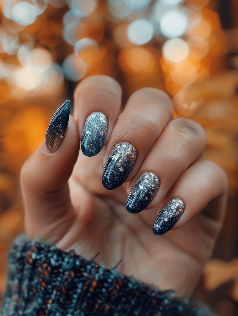
Alright, so this celestial nail design is gorgeous but def a bit complex for a beginner. To simplify it, I’d start with the base – that deep blue gradient is key. You could prob get away with just two shades of blue instead of the full ombré effect.
For the starry effect, I’d suggest using a thin brush or dotting tool to create larger “stars” first, then filling in with smaller dots. And you know what? Skip the constellations on a few nails – it’ll still look stellar (haha, get it?) but be way easier to execute.
I remember when I first tried a galaxy design years ago – man, I made such a mess! But here’s a pro tip I learned: use a makeup sponge to dab on the lighter blue parts. It gives that soft, misty look without needing perfect brush control.
The glitter placement is tricky. I’d say focus on concentrating it at the tips and fading it down, rather than trying to get that perfect scattered look. And honestly? Sometimes I cheat and use a glitter polish instead of loose glitter – it’s not quite as dramatic but way more forgiving for beginners.
Oh! And speaking of cheating – there are some really cool nail stickers out there with star and constellation designs. I had a client once who insisted on hand-painted stars, but like… girl, ain’t nobody got time for that on a busy Saturday! So we compromised with stickers on 3 nails and I painted the rest. She loved it and I saved my sanity.
But I digress. Back to simplifying – I think the key elements to keep are:
1. The dark-to-light blue base
2. Silver/white “stars” (dots) of varying sizes
3. A touch of glitter, focused mainly at the tips
And def skip that suuuper pointy shape. Oval or even square would be easier to work with and still look great with this design.
Oh, and one last thing – make sure to seal it all with a good top coat. Nothing worse than spending hours on galaxy nails only to have a star chip off when you’re reaching for your coffee the next morning. Trust me, I’ve been there!
Deep Forest Green With Gold Accents
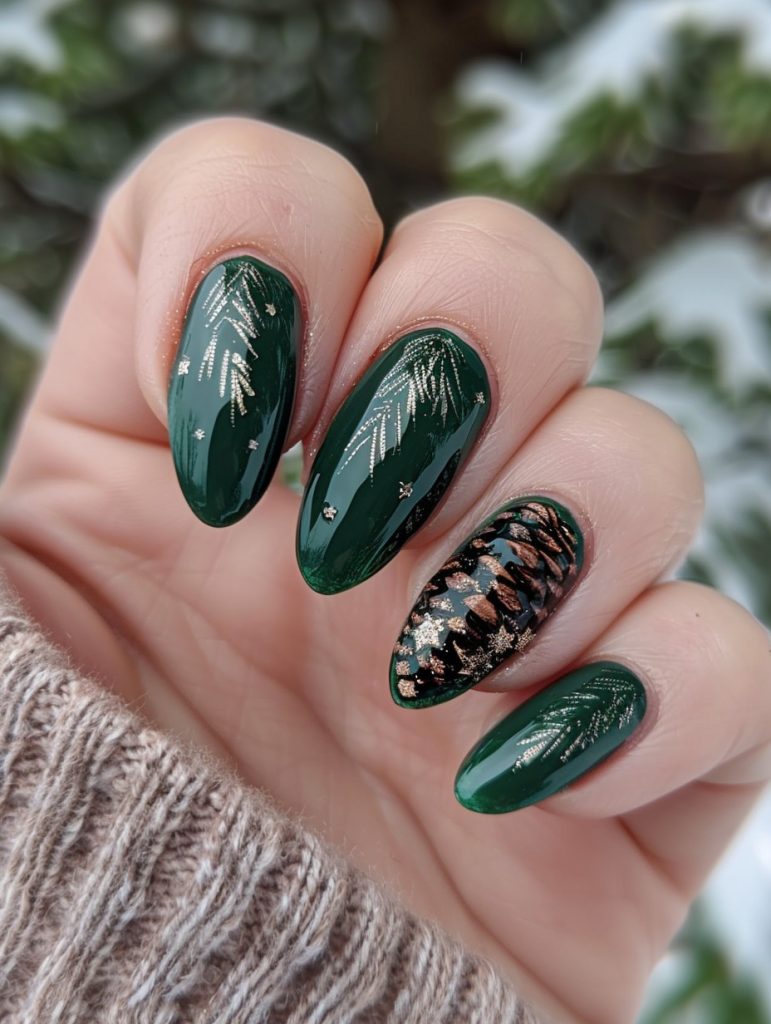
Okay, so these nails are absolutely gorgeous – the deep green base is super striking, and I’m loving the gold pine needle accents. It’s giving me major winter forest vibes!
One subtle detail that really elevates this design is the tiny gold stars scattered among the pine needles. They add this ethereal, magical quality that takes it from just “pretty holiday nails” to something really special.
When I’m doing designs like this, I usually start with a good base coat and then two layers of that rich green. Getting it opaque and glossy is key. Then for the gold accents, I’d probably use a super fine brush – maybe even a striper brush if I’m feeling fancy. The key is to keep your hand steady and work in thin, deliberate strokes.
This reminds me of a set I did last winter for a regular client. She wanted something festive but not too “Christmas-y” and we ended up with a similar vibe. Though I gotta admit, my pine needles weren’t quite as delicate as these – still working on perfecting that technique!
The pinecone accent nail is what really caught my eye though. It looks like they might have used a stamping plate for the basic shape, then added some freehand detailing with gold foil or a metallic polish. I’ve been experimenting with combining stamping and freehand lately – it’s tricky to get the balance right but can create some really cool effects.
One thing I’m not totally sure about is how they got that perfect gradient on the pinecone. Maybe a sponging technique? Or possibly airbrushing if they’re real fancy. I’d have to play around with it to figure out the exact method.
Anyway, I really really love how this set turned out. It’s elegant but still has that cozy winter feel. Perfect for sipping hot cocoa by the fire – or showing off at holiday parties!
Oh shoot, I almost forgot – make sure to seal it all with a good top coat. Nothing worse than chipping those intricate designs after all that work!
Now if you’ll excuse me, I need to go reorganize my polish collection. Again. It’s a never-ending battle, I swear.
Warm Brown And Muted Green
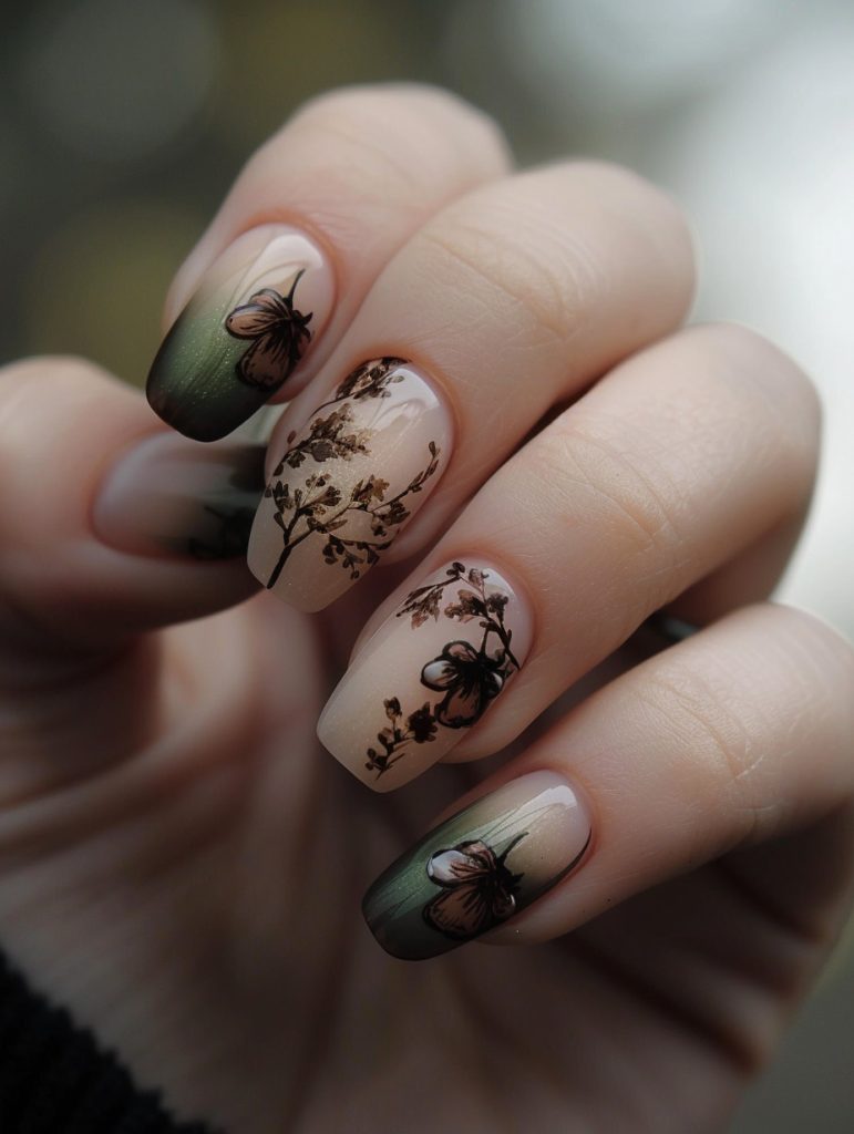
Alright, so for someone trying this design for the first time, my top tip would be to start with the base gradient. Honestly, that green-to-nude fade is gonna be the foundation for everything else.
I remember when I first tried a similar look years ago – totally botched the gradient and had to start over like three times. Ugh. But here’s the trick I’ve learned: use a makeup sponge to dab on the colors, don’t try to brush them. Way easier to blend smoothly that way.
For the branches and flowers, you’re gonna want a really fine detail brush. Like, the tiniest one you can find. I once had a client ask for something similar but with, get this, little birds on each branch. Talk about a challenge! But I digress.
Anyway, for the actual technique, start with the larger branches and work your way to the smaller details. Use a dark brown or black for contrast against that soft base. The flowers look like they might be stamped on, but honestly I can’t tell for sure from the pic. If you’re going freehand, less is more – just a few delicate strokes to suggest the petals.
Oh, and don’t forget to seal it all with a good top coat. Nothing worse than spending an hour on intricate art only to have it chip the next day. Been there, done that, learned my lesson the hard way.
One last thing – when you’re doing the green tips, try using a small piece of sponge or even a q-tip to get that soft, faded edge. It’ll blend better with the overall gradient look.
Hope that helps! Just remember, practice makes perfect. And maybe don’t try this for the first time on a client who’s in a rush. Trust me on that one.
Bold Geometric Accented Nail
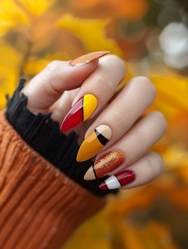
Wow, these nails are absolutely stunning! The most unique stylistic choice here is definitely the bold geometric color blocking with those autumnal shades. It’s giving me major Mondrian vibes, but with a fall twist.
From a technical standpoint, achieving those crisp lines between colors is no joke. I’ve found that using striping tape is key for getting those clean edges. Though, I’ll admit, I still sometimes mess up and have to start over on a nail or two (especially if I’ve had too much coffee that morning, haha).
The mix of finishes is really eye-catching too. You’ve got glossy solids, that gorgeous glittery orange, and what looks like a matte nude base on some nails. Balancing different textures like that adds so much visual interest.
Oh! This reminds me of a client I had last fall who wanted something similar. She brought in this inspiration pic of geometric pumpkins, and we ended up doing this whole abstract autumn theme on her nails. It was a blast to work on, even though I totally smudged one nail right at the end and had to redo it. You know how it goes sometimes!
For application, I’d start with a good base coat (obvs), then use a detail brush for the color blocking. Getting those points nice and sharp takes a steady hand. I usually have to take a breather halfway through to shake out my fingers, lol.
That glittery orange is gorgeous – looks like it might be a jelly base with fine gold glitter? I’d probably build that up in thin layers to get that depth. And for the matte sections, a good matte top coat is crucial. I swear by the one from… shoot, I’m blanking on the brand name. It’s the one in the square bottle. You probably know which one I mean.
Anyway, this design is perfect for fall, but honestly, you could rock this any time of year. It’s edgy but still wearable, you know? I’m actually thinking of using a similar concept for my demo at this nail art workshop I’m prepping for next month. Might swap out the oranges for some cool-toned blues and purples though. Gotta keep it fresh!
Oh, and before I forget – make sure to
Autumnal Leaf In Earthy Brown

Wow, these nails are absolutely gorgeous! The artist has really nailed that autumn vibe with the leaf designs and warm color palette. As someone who’s done countless fall-inspired manis, I gotta say this one stands out.
To create depth, they’ve used a combination of techniques. First off, the base is this beautiful milky white that allows the leaf designs to really pop. Then they’ve layered on those leaves using what looks like a mix of stamping and freehand work. The leaves have this watercolor effect that gives them dimension – probably achieved with a mix of regular polish and gel for different opacities.
I remember trying something similar last year for a bride who wanted subtle fall touches for her October wedding. Took forever to get those leaf veins just right! But man, was it worth it when she teared up seeing the final result.
One thing that really makes these pop is the variation in leaf sizes and placement. You’ve got some larger focal point leaves, then smaller ones filling in the negative space. And the way they’ve got some leaves kinda trailing off the edges of the nails? *chef’s kiss*
Color-wise, they’ve nailed that autumnal palette. Looks like they used a mix of oranges, reds, and browns – probably started with a lighter base color then built up layers for the darker tones. I’d bet money they used a tiny brush for those delicate leaf outlines.
Oh! And see how some of the leaves have this almost translucent quality? That’s prob achieved by mixing a bit of clear topcoat with the color before applying. Gives it that gossamer look, ya know?
One thing I’m not totally sure about is whether they used decals for any of the leaves or if it’s all hand-painted. Could go either way, honestly. Sometimes with intricate designs like this, a combo approach works best.
Speaking of combos, this reminds me of the time I had a client insist on combining fall leaves with, get this, tiny pumpkin spice latte cups. Talk about a challenge! But hey, that’s what keeps this job interesting, right?
Anyway, to finish off a design like this, I’d definitely recommend a good thick layer of topcoat to smooth everything out and give it that glossy finish. Makes
These 25 fall nail inspiration ideas offer endless ways to celebrate the season with your own unique style. From rich autumn hues to cozy, textured designs, each idea brings the warmth and charm of fall right to your fingertips. So grab your favorite colors, add some seasonal flair, and enjoy the ultimate fall makeover for your nails this autumn!
