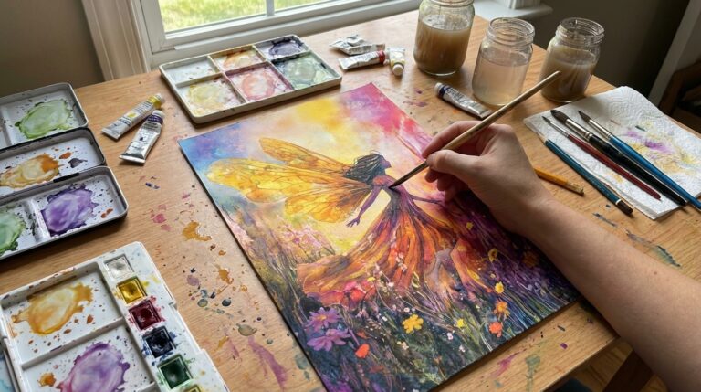
Wrap yourself in the warm and cozy vibes of autumn with these 25 fall-themed wallpapers that will instantly transform your device into an autumnal wonderland. Perfect for those who adore the rich hues of fall, from golden leaves to pumpkin spice tones, these wallpapers capture the essence of the season’s beauty. Whether you’re dreaming of misty mornings in the woods, craving the comfort of a warm cup of cocoa, or simply love the cozy aesthetic of fall, you’ll find the perfect design to match your autumn mood. Get ready to surround yourself with the charm of the season, one wallpaper at a time!
All artwork provided is original and can be used as a reference for your own drawings.
Table of Contents
Village Square

Looking at this watercolor cityscape, one subtle detail that really elevates the piece is the use of speckled paint to create texture in the sky and on some of the buildings. It adds a sense of atmosphere and grit to the scene, making it feel lived-in and authentic.
I’m also drawn to how the artist captured the glow of warm light from the storefronts. Those touches of orange and yellow create focal points that guide the eye through the composition. It’s a small thing, but it adds life to what could otherwise be a static street scene. As you develop your own style, pay attention to how light interacts with different surfaces – it can make or break the mood of a painting.
Tranquil Riverside
When tackling this serene autumn scene, I’d suggest starting with loose, fluid washes to capture the overall mood and atmosphere. The soft, muted color palette is crucial here – focus on blending warm oranges and cool blues to create that misty, ethereal quality. Don’t fuss over details initially; instead, build up layers gradually to achieve depth.
For the trees and foliage, try using a combination of wet-on-wet and dry brush techniques. This will help you create those beautifully diffused edges that give the impression of leaves without having to paint each one individually. The boats are a focal point, so take your time with their subtle reflections in the water. Remember, less is often more when it comes to watercolor – let the white of the paper do some of the work for you, especially in capturing that gentle light filtering through the scene.
Garden Filled With Chrysanthemums

The most striking stylistic choice in this drawing is the use of negative space. The artist has cleverly left large portions of the canvas untouched, allowing the delicate floral elements to dance across the composition. This creates a sense of lightness and movement, as if the flowers and petals are floating or falling through the air.
I’m particularly drawn to the way the colors blend and bleed into each other, especially in the upper right corner. It’s reminiscent of wet-on-wet watercolor techniques, giving the piece a soft, dreamy quality. The loose, organic shapes of the flowers contrast beautifully with the more defined leaves and stems. As a beginner, you might try experimenting with different brush pressures and water ratios to achieve similar effects in your own work.
Serene Forest Path
The artist really nails the depth in this autumn scene through their masterful use of perspective and color. That path winding through the trees immediately draws your eye into the distance, creating a strong sense of three-dimensional space. I’m particularly impressed by how they’ve captured the misty, atmospheric feel in the background – those lighter, more faded tones make the far trees seem to recede into the distance.
Layering plays a huge role here too. Notice how the trees and fallen leaves in the foreground have more detail and saturated color, while things get progressively hazier as you look deeper into the forest. It’s a classic technique, but executed beautifully. The bench placement is clever as well – it gives a clear sense of scale and adds to that inviting, three-dimensional feel of the scene. If I were teaching someone to paint like this, I’d suggest starting with a strong vanishing point and building outward from there.
Scenic Valley

When tackling a landscape like this, I’d suggest starting with a quick thumbnail sketch to nail down the major compositional elements. Focus on the relationship between the hills, the winding path, and those vibrant autumn trees. Getting those proportions right from the start will set you up for success.
For practice, try using a viewfinder – you can make a simple one by cutting a rectangle out of cardboard. Hold it up to the scene and move it around to isolate different sections. This helps train your eye to see the relationships between elements more clearly. Pay special attention to how much space the sky takes up compared to the land, and how the path curves through the composition. Those proportions are crucial for capturing the essence of this dreamy autumn scene.
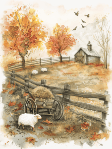
Rustic Farmyard
Quaint Bookshop
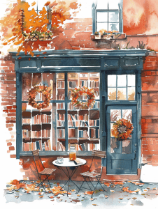
The vibrant autumn colors immediately draw the eye in this watercolor sketch. Those warm oranges and reds create a focal point around the bookshop’s entrance, contrasting beautifully with the deep blue of the storefront. I’m impressed by how the artist used loose, gestural strokes to suggest falling leaves and seasonal decorations, adding movement and life to the scene.
Looking closer, the composition guides us inward through the shop windows. Those enticing glimpses of bookshelves spark curiosity about what literary treasures might be found inside. The small table and chairs in the foreground provide a nice anchoring element, inviting the viewer to imagine sitting there with a new book purchase. Overall, there’s a cozy, inviting mood that makes me want to step right into this autumnal bookshop scene.
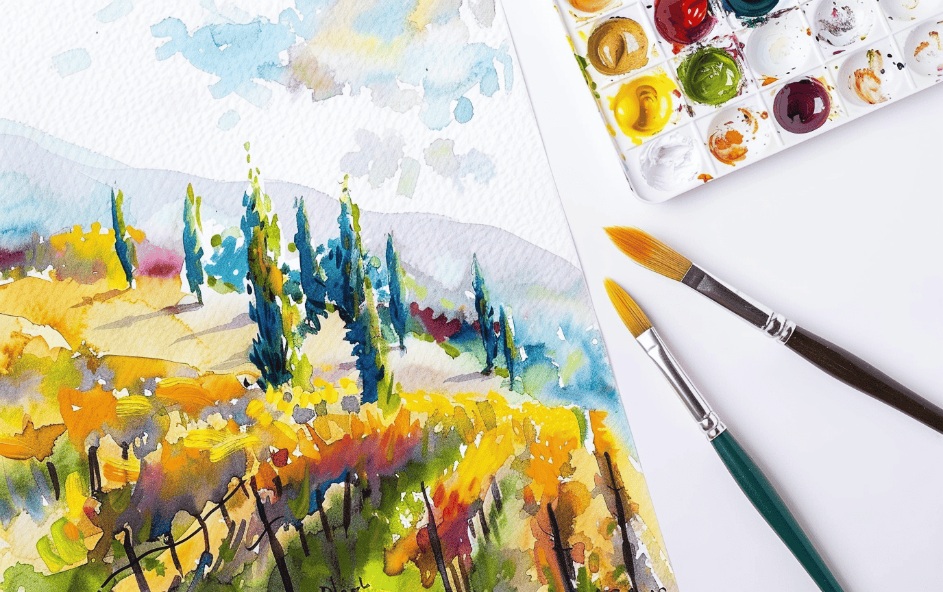
Picturesque Vineyard
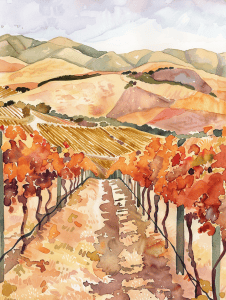
Looking at this vibrant watercolor vineyard scene, I’m immediately drawn to the warm autumn colors and rolling hills. The rows of grapevines lead the eye nicely into the distance. To create a distinctly different variation, why not try shifting the perspective dramatically?
Imagine viewing this same vineyard from directly above, like a bird’s eye view. You could create an abstract pattern of interlocking shapes formed by the rows of vines. The hills could become subtle undulations of color, with the fall foliage creating pockets of bright oranges and reds amidst the golden landscape. This aerial perspective would offer a fresh take on the familiar vineyard motif.
Another interesting variation could involve experimenting with time of day. Picture this scene at twilight, with deep purples and blues washing over the hills. You might add twinkling lights from nearby buildings or perhaps the glow of harvesting equipment moving through the vines. The shift in lighting would completely transform the mood while maintaining the core elements of the composition. What do you think about playing with perspective or lighting to reimagine this lovely vineyard scene?
Tranquil Lake

This watercolor style is beautifully suited to capturing the soft, hazy quality of an autumn scene. The loose, flowing brushstrokes and blended colors create a dreamy atmosphere that perfectly evokes the season. To apply this technique to a different subject, you might consider urban landscapes at twilight or misty coastal scenes.
The reflection in the water is particularly striking. Notice how the artist uses a combination of defined edges and blurred areas to suggest movement and depth. This approach could work wonderfully for depicting rainy city streets or foggy forests. The key is to embrace imperfection and let the colors blend organically. Don’t be afraid to let your pigments run and mix on the paper – that’s where the magic happens in watercolor.
Rural Farm

The tranquil, autumnal atmosphere in this watercolor really shines through. The artist has captured that perfect golden hour light you often see in rural landscapes just before sunset. Those warm ochres and oranges in the wheat field practically glow, contrasting beautifully with the cooler blue-grays of the mountains.
I’m particularly impressed by how they’ve suggested texture in the foreground grasses with just a few well-placed brushstrokes. It’s a great reminder that you don’t need to painstakingly render every blade to create a sense of depth and detail. The red barn adds a perfect focal point, grounding the composition and giving that quintessential farmland feel. If I were to offer one suggestion, I might play with pushing the shadows a bit deeper in places to add even more drama to the scene.
Peaceful Orchard

Hmm, this autumnal scene has such a delicate, ethereal quality. You know what might capture that lightness beautifully? Trying coffee or tea washes as a base layer. Brew up some strong coffee or black tea, let it cool, then use it to create those soft, warm tones in the background and tree trunks. The natural variations in the liquid would add subtle texture too.
For those vibrant pops of red and orange leaves, I’d actually suggest experimenting with natural dyes. Turmeric for yellows, beet juice for reds – you could even try crushing actual fall leaves to extract their pigments. It’s messy, but the results can be stunning and totally unique. Plus, it really connects you to the seasonal essence of the piece.
What about using a toothbrush to splatter tiny droplets for those scattered leaves on the ground? Flicking the bristles would give you that random, organic distribution. And for the delicate branches, try using a thin twig dipped in ink instead of a brush. It’ll give you those imperfect, natural lines that perfectly suit this dreamy forest scene.
Lake With Wooden Dock

The negative space in this autumn lakeside scene plays a crucial role in creating depth and atmosphere. Look at how the reflections in the water mirror the vibrant foliage, but with subtle differences that give the lake a sense of movement and life. The artist cleverly used the calm surface as a canvas within the canvas, doubling the visual impact of those fiery fall colors.
I’m particularly drawn to how the dock extends into the water, breaking up the reflections and leading the eye into the scene. The empty space around and beyond the dock gives a feeling of solitude and tranquility. It’s a great example of how leaving areas relatively untouched can be just as powerful as adding detail. As a beginner, it’s tempting to want to fill every inch of your drawing, but restraint often yields more compelling results.
Outdoor Cafe
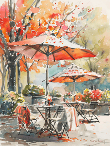
The way the artist captured the dappled light and shadows under the umbrellas really stands out to me. Those little touches of bright spots and darker areas give such a sense of sunlight filtering through the canopy. It’s not always easy to convey that effect, but they nailed it here.
I’m also impressed by the looseness in how they rendered the foliage in the background. Those splatters and gestural strokes suggest leaves and branches without getting bogged down in unnecessary detail. It takes confidence to know when to let the viewer’s imagination fill in the gaps. As a beginner, don’t be afraid to experiment with more abstract techniques like that – it can really bring energy to a piece.
Cabin Nestled In A Forest

This piece already has some wonderful texture, especially in the rocks and foliage. The artist has done a great job capturing the rugged landscape. But to take it up a notch, I’d suggest experimenting with dry brush techniques for the trees and cabin. It can add a scratchy, organic feel that really brings out the rustic charm of a woodland scene.
For the stream, consider using a palette knife to apply paint in thin, transparent layers. This can create a sense of depth and movement in the water that’s hard to achieve with brushes alone. I’ve found it particularly effective for depicting the interplay of light on flowing water. Just be careful not to overdo it – a light touch often works best.
Fireplace With A Stone Hearth

The perspective in this drawing creates a cozy, intimate feel by placing the viewer directly in front of the stone fireplace. It’s a classic composition that works well, but altering the perspective could dramatically change the mood.
Imagine shifting to a side angle view – we’d see more of the mantel’s length and get a sense of the room’s depth. This could make the space feel larger and less confined. Or picture a view from above, looking down at the hearth. That unusual angle might emphasize the circular shape of the fireplace opening and create interesting shadows from the decorations. It could give a more stylized, less traditional vibe to the scene.
Playing with extreme close-ups could be fascinating too. Zooming in on just a portion of the stonework or focusing tightly on a cluster of pumpkins and leaves would create a more abstract, textural piece. The current straight-on view is lovely, but don’t be afraid to experiment! Changing perspective can completely transform a familiar subject.
Farmers Gathering Crops
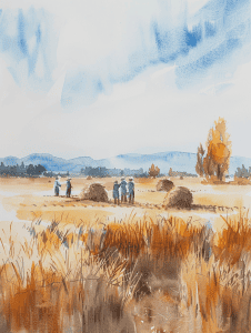
The contrast in this watercolor landscape is beautifully subtle yet effective. Notice how the artist uses a soft, muted palette for the sky and distant hills, creating a hazy atmospheric effect. This contrasts nicely with the bolder, warmer tones in the foreground wheat field. The golden hues of the wheat really pop against the cool blues and grays of the background.
I’m particularly impressed by the contrast in detail and definition. The hay bales and human figures are rendered with just enough specificity to be recognizable, while the surrounding field is suggested with loose, gestural brushstrokes. This varying level of detail draws the eye to the focal points without overworking the entire scene. It’s a great example of knowing when to add definition and when to let the viewer’s imagination fill in the gaps.
Autumn Fair
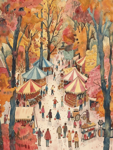
This autumn scene already has a lot of life to it, with the colorful trees and bustling fairground. To amp up the dynamism even more, I’d suggest incorporating more varied movement into the figures. Right now, most people are standing or walking upright. Try adding a few running children, someone bending to pick something up, or a person with arms raised in excitement.
Another way to increase visual energy is through more dramatic lighting. While the warm autumnal palette is lovely, you could push the contrast by adding stronger shadows cast by the tents and trees. This would create more depth and visual interest. Maybe even experiment with a few beams of sunlight breaking through the foliage, spotlighting certain areas of the scene. That interplay of light and shadow can really make a static image come alive.
Cozy Kitchen
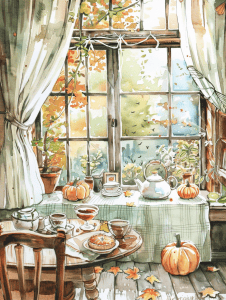
This watercolor scene has such a cozy, autumnal feel. I could see it translating beautifully into an oil painting, where you’d really be able to build up rich texture and depth in those colorful fall leaves outside the window. The soft drapery of the curtains would take on a lovely dimensionality in oils too.
For a completely different take, why not try adapting it into a paper collage? You could have fun layering different patterned papers for the tablecloth and curtains. Little 3D elements like miniature ceramic teacups or tiny paper pumpkins could add whimsical touches. The window panes would create a nice structural element to anchor the composition. Just imagine how satisfying it would be to build up all those autumn leaf shapes with torn bits of golden and russet paper!
Cozy Campfire
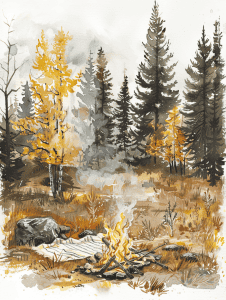
The repetition of vertical lines in the evergreen trees creates a strong sense of rhythm in this forest scene. Notice how the artist varies the thickness and spacing of these lines to add visual interest while maintaining the overall pattern. This technique effectively conveys the dense, towering nature of the pine forest.
In contrast to the evergreens, the artist uses a different repetitive approach for the yellow foliage. Here, we see clusters of shorter, more organic strokes repeated throughout the composition. This creates a lovely interplay between the rigid verticals of the pines and the softer, more dynamic forms of the deciduous trees. It’s a great way to add depth and variety to the forest landscape.
The campfire in the foreground introduces another subtle pattern – concentric circles of warm colors radiating outward. This circular motif provides a nice counterpoint to the predominantly vertical elements in the rest of the drawing. As you practice landscape scenes like this, experiment with combining different types of repeated elements to create a cohesive yet dynamic composition.
Cozy Bedroom
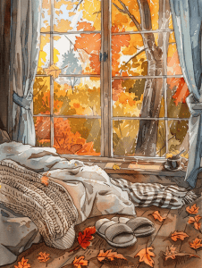
The warm, vibrant oranges and yellows of the autumn foliage outside the window immediately draw the eye. That explosion of color creates a striking contrast with the cool, muted tones of the interior scene. It’s a masterful use of color to create depth and focus.
Looking closer, I’m impressed by the texturing in the cozy blankets and pillows on the window seat. The artist has done a great job conveying different fabric textures through varied brush strokes and shading. As a beginner, I’d suggest really studying how they’ve achieved that tactile quality – it adds so much richness to the composition. The scattered leaves on the windowsill are a nice touch too, bringing that autumn feeling indoors.
Autumn Picnic
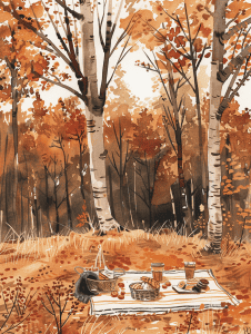
Let’s dive right into this autumn scene. If I were sketching it quickly, I’d start with those striking birch trees in the foreground. Their pale, vertical lines create a strong structural element that anchors the whole composition. Plus, they’re a great way to establish scale and depth right off the bat.
The warm color palette is crucial here, so I’d probably block in those rich oranges and browns next. Don’t get bogged down in details at first – broad strokes to capture the essence of those fall leaves will do the trick. The picnic setup on the blanket adds a lovely focal point. I’d rough that in early to help balance the composition, but leave the finer points for later if time allows. What really catches my eye is how the light seems to filter through the trees, creating that dappled effect on the forest floor. That’s something I’d want to capture to really bring the scene to life.
Autumn Cottage

The watercolor technique in this autumn scene is particularly striking. The artist has masterfully blended warm hues to create a vibrant, glowing effect, especially in the foliage. Notice how the reds and oranges seem to bleed into each other, giving the trees a sense of movement and life. This wet-on-wet approach allows colors to mingle organically, capturing the essence of fall’s changing leaves.
Another interesting choice is the use of negative space for the sky and smoke. Instead of painting these elements directly, the artist has left areas of the paper untouched, allowing the white to shine through. This creates a soft, dreamy quality that contrasts beautifully with the bold colors of the landscape. It’s a clever way to suggest light and atmosphere without overworking the piece.
Charming Gazebo

The intricate details in this autumn gazebo scene could be quite daunting for a beginner. Those delicate leaves floating through the air and the complex shadows cast by the gazebo’s structure require a keen eye and steady hand. I’d suggest starting with the basic shapes – get that octagonal gazebo form down first before diving into the ornate railings and roof.
The color palette might trip up newcomers too. Capturing those vibrant oranges and yellows of the fall foliage without muddying them is tricky. You’ve got to resist the urge to overblend. And don’t forget about those pumpkins in the foreground – their round forms add an interesting contrast to the angular gazebo. Personally, I always find curved objects a bit challenging to render realistically.
Charming Country Inn

Let’s focus on those beautiful autumn trees as a great starting point. Try sketching just the basic shapes of the foliage using loose, circular motions. Don’t worry about details yet – capture the overall form and how the branches extend outward. Pay attention to how the artist used warm oranges and yellows to convey the seasonal feel.
For a slightly more advanced exercise, practice drawing the architectural elements of the house. The front porch is a good challenge – work on getting the perspective right for the railing and columns. Notice how the artist suggested details like the chairs without overworking them. That loose style really adds to the painting’s charm and energy. When you’re ready, try combining both elements to create a simplified version of this cozy autumn scene.
Autumn Street
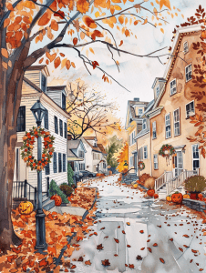
The use of warm autumn colors in this scene is particularly striking. The oranges and yellows of the foliage create a cozy, inviting atmosphere that immediately draws the viewer in. I’m impressed by how the artist captured the way sunlight filters through autumn leaves, giving everything a golden glow.
The perspective down the street is well-executed, with the buildings receding naturally into the distance. It’s not an easy technique to master, but it really adds depth to the composition. The scattered leaves on the ground are a nice touch too – they bring movement to an otherwise static scene and reinforce the seasonal theme.
I appreciate the attention to architectural details on the houses. The varied styles and little touches like pumpkins on porches give each building its own personality. As a beginner, you might focus on nailing those fundamental shapes first before diving into the finer points. Overall, this piece has a lovely nostalgic quality that makes me want to take a stroll down that leaf-strewn street.
As you explore these 25 cozy fall-themed wallpapers, you’ll find yourself enveloped in the warm, nostalgic hues of autumn. Each design brings a touch of the season’s magic right to your screen, creating a comforting atmosphere wherever you go. Whether you switch them out to match your mood or find a favorite to keep, these wallpapers offer endless inspiration for celebrating fall’s cozy charm. So, let the beauty of autumn stay with you all season long with these delightful, warm-toned backgrounds. Happy fall!