

Looking for a fun way to celebrate Halloween through art? Try these 30 easy Halloween watercolor paintings perfect for artists of all ages! From charming pumpkins and spooky ghosts to playful black cats and magical moons, these watercolor ideas bring a festive touch to your painting sessions. Whether you’re new to watercolors or a seasoned artist, these Halloween themes are simple to create and full of seasonal spirit. Gather your paints, embrace the spooky season, and let your creativity flow with these hauntingly delightful designs!
All artwork provided is original and can be used as a reference for your own drawings.
Table of Contents
Bubbling Witch Cauldron
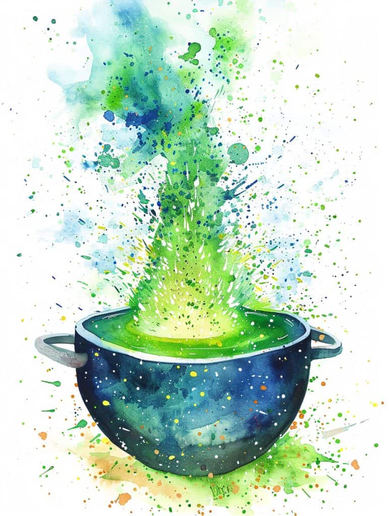
Wow, this piece is really eye-catching! The way the artist has captured that explosive burst of color and energy coming out of the pot is technically impressive. The transparency of the watercolors, especially in those airy blue and green splatters, shows some serious skill with pigment control.
Honestly, I’m kind of in awe of how they’ve managed to create such a dynamic effect. It reminds me of when I was first experimenting with splatter techniques in my own work – I made such a mess of my studio, you wouldn’t believe it! But it was worth it to figure out how to get that perfect spray of droplets.
Now, as for adding texture… hmm. You know, I think a really interesting approach here could be to use some salt technique on the background. It would create this subtle, crystalline effect that could mimic stars or cosmic dust, playing off that galaxy-like quality of the pot. I’ve found that kosher salt works best for this – table salt just doesn’t have the same oomph, you know?
(Speaking of cosmic effects, I once did a whole series inspired by nebula photos. Talk about a challenge in layering translucent colors!)
To apply the salt technique, you’d want to sprinkle it on while the background wash is still damp, but not soaking wet. It’s a bit of a Goldilocks situation – too wet and the salt just dissolves, too dry and you don’t get any effect at all. I mean, I still sometimes misjudge the timing, even after years of practice!
Another thought – and this might be a bit out there – but what about using some masking fluid to create fine, delicate lines radiating out from the pot? It could add a sense of magical energy to the piece. You’d want to apply it before the initial washes, then remove it after everything’s dry to reveal crisp white lines.
Honestly though, the more I look at this piece, the more I appreciate the artist’s control over wetness and pigment load. See how the bottom of the pot has those crisp edges, while the splatter gets more diffuse as it rises? That’s some masterful wet-on-wet work right there.
What do you think about the color choices? I’m digging how they’ve used that
Witch’s Accessories
Wow, this watercolor is just gorgeous! I’m not gonna lie, the way the artist has captured the transparency and vibrancy of the purple in that witch’s hat is incredible. The pigment choices really make the whole piece pop.
From a technical standpoint, the control of water and pigment here is masterful. You can see how they’ve used wet-on-wet techniques to create those soft, ethereal edges on the hat and potion bottle, while employing more controlled dry brush work for the texture of the book. It reminds me of when I was first learning to balance wet and dry techniques – I used to always overwater everything and end up with a muddy mess!
Changing the perspective on this could be really interesting, though. Right now we’re looking at it head-on, which creates a nice, balanced composition. But imagine if we shifted to a low angle, looking up at the hat and bottle – it could create this towering, almost ominous feeling. Or a bird’s eye view might make it feel more whimsical and playful.
One thing I always tell my workshop students is to experiment with glazing to build up rich, luminous colors like we see in that potion bottle. Start with a light wash of yellow, let it dry completely, then layer on some orange, and finally some deeper amber tones. It takes patience, but the results are worth it.
Speaking of patience, I remember spending weeks trying to perfect my technique for painting glass objects. I kept getting frustrated because my bottles looked flat and lifeless. Then one day it just clicked – I realized I needed to focus on the reflections and distortions rather than trying to paint the glass itself. Game changer!
The splatter technique used here for the magical energy is something I’m still perfecting myself. It’s all about getting the right consistency of paint and controlling the flick of the brush. I’ve ruined more than one painting by getting too enthusiastic with my splatters!
One area where I’m a bit uncertain is how they achieved that gorgeous galaxy-like effect in the hat. It almost looks like they might have used some salt or alcohol to create those star-like textures, but I’d have to see it up close to be sure.
If I were to suggest any refinements, I might push the contrast a bit more in the
Full Moon
Wow, this watercolor is really stunning! The artist’s use of contrast is incredibly effective here, and there’s so much to unpack technically.
First off, the transparency in those autumn trees is just gorgeous. Getting that balance of pigment density and water control can be so tricky – I remember struggling for years to achieve that delicate, translucent look without everything turning to mud. The way the orange and rust tones fade into the sky is really masterful.
One technique that really stands out to me is the wet-on-wet work in the sky. Those soft, billowing clouds have that dreamy quality you can only get by dropping pigment into a wet wash. I’ve found that timing is absolutely crucial here – wait too long and you lose that effortless blending.
Speaking of timing, can we talk about that moon for a second? The artist has done an amazing job with lifting techniques to create those lunar details. I’d bet money they used a rigger brush to get those fine lines. It reminds me of a workshop I taught last fall where we focused on nocturne scenes. One student was really struggling with lifting, and we spent a whole afternoon just practicing on scrap paper. By the end, she was creating these incredible celestial effects.
The contrast between the soft, atmospheric background and the crisp details in the foreground pumpkins is really striking. It looks like they might have used a dry brush technique for those jack-o’-lantern faces – that’s something I’m still perfecting myself. Getting the right amount of paint on the brush without overworking it can be such a challenge.
One thing I’m not totally sure about is how they achieved that texture in the grassy foreground. It almost looks like they might have used salt or maybe even plastic wrap? That’s a technique I’ve been meaning to experiment with more in my own work.
Oh! And I almost forgot to mention the use of negative painting around those tree branches. That’s a technique that can really make or break a piece. I remember one time I was working on a similar autumn scene and I got so caught up in the details that I completely forgot to leave enough white space. Ended up with this dense mess of branches that looked more like a tangle of yarn than a tree. Live and learn, right?
Anyway, if I were giving feedback in a
Witch Brewing Potions
Wow, this watercolor is just stunning! The way the artist has captured the magical atmosphere is really impressive. The transparency in the witch’s robe and the vibrant splashes of color throughout are technically challenging to achieve.
You know, to make this even more dynamic, I’d suggest pushing the contrast in the cauldron area. Maybe use some wet-on-wet technique to create more swirling, active steam rising up. I remember struggling with that myself when I first started painting witchy scenes – getting that ethereal smoke effect took me ages to master!
Anyways, the color choices here are fantastic. Those little bottles in the foreground? Gorgeous. I’d probably wanna intensify some of the highlights on those to really make them pop. A dry brush technique with a touch of white gouache could work wonders.
Oh! Speaking of dry brush, that reminds me of a workshop I taught last fall. We were working on autumn scenes, and I was demonstrating how to create texture in fall leaves. One student kept getting frustrated because her brush strokes were too wet. I showed her how to really work the paint out of the brush before applying it, and you should’ve seen her face light up when she got it! It’s moments like that that make teaching so rewarding.
But back to this piece – I’m loving the loose, expressive quality of the flowers and foliage at the bottom. To amp up the energy even more, you could try adding some splatters or flicks of paint aroudn the edges. Just load up a brush with watery pigment and tap it against your finger – instant magic!!!
One thing I’m not totally sure about is the background. It’s beautifully subtle, but I wonder if pushing some darker values in the upper corners might create more depth? Though that could also detract from the ethereal quality… hmm, it’s always a balancing act, isn’t it?
Oh, and don’t even get me started on that witch’s hat. The way they’ve captured the texture and form is *chef’s kiss*. If I was gonna suggest anything there, maybe some stronger cast shadows to ground it more firmly on her head? But that’s really nitpicking at this point.
Anyways, I should probably get back to organizing these paintbrushes before I go down another rabbit hole
Swirling Cauldron Of Potions
Wow, this watercolor piece is absolutely stunning! The explosion of colors from the cauldron is just mesmerizing. As a watercolor artist, I’m immediately drawn to the incredible control of pigment and water that the artist has demonstrated here. The way the colors blend and flow into each other while still maintaining distinct hues is pretty impressive.
One of the most challenging aspects of this piece would be achieving that perfect balance between letting the colors mix naturally and guiding them to create specific shapes and patterns. I remember struggling with this myself when I first started out – I’d either end up with a muddy mess or colors that looked too rigid and controlled.
The wet-on-wet technique is clearly at play here, allowing those gorgeous color transitions. But what’s really interesting is how the artist has combined that with some more controlled detailing, like those little white splatters and the crisp outlines of the bats. I’d bet they used a combination of masking fluid and maybe even a white gel pen for some of those highlights.
You know, this piece actually reminds me of a workshop I taught last year where we focused on creating “magical” scenes. One student was really struggling with getting her colors to pop like this, and we ended up experimenting with different pigment concentrations until she got that vibrant effect. It was a real breakthrough moment!
If we were to adapt this into a different medium… hmm, that’s an interesting question. I think it could translate really well into digital art, actually. You could recreate those fluid color transitions using gradient tools and then layer on texture and splatters to mimic the watercolor effect. Or maybe even try it as an acrylic pour painting – that could capture some of that same fluid, organic quality.
But honestly, part of what makes this piece so captivating is the transparency and luminosity you can achieve with watercolors. It’s hard to replicate that exact quality in other mediums. I mean, you could probably get close with alcohol inks, but it wouldn’t have quite the same depth.
Oh! Speaking of depth, I just noticed how the artist has created a sense of cosmic space inside the cauldron itself. That’s such a cool detail. It adds this whole other layer of magic to the piece.
You know, if I were teaching this in a workshop, I’d probably start
Graveyard At Dusk
Honestly, this watercolor piece is technically fascinating, especially in how the artist handles transparency and atmospheric effects. The way they’ve built up layers of translucent washes to create that moody, misty atmosphere around the graveyard scene is something I’ve struggled with myself for years.
One of the key techniques I’m seeing here (and that I’ve def spent way too many hours perfecting) is wet-on-wet application for those dreamy, soft edges in the sky and background. It’s prob combined with some glazing to build up depth in the darker areas. The dry brush work on those spindly tree branches really makes them pop against the softer background – that’s a technique I always tell my students to practice obsessively.
As for repetition and patterns, the artist uses the silhouettes of the gravestones to create a strong visual rhythm across the bottom third of the piece. The repeated shapes of the crosses and headstones guide your eye through the scene. The bare tree branches also create a repeating pattern that adds to the eerie mood.
You know, this reminds me of a workshop I taught last fall where we focused on nighttime scenes. I had this one student who just couldn’t get the hang of creating luminous moons without making them look flat. We spent like an hour just working on building up subtle layers of pale yellow and white to get that glow. Honestly though, I still struggle with it sometimes myself – getting the right balance of pigment and water to create that perfect lunar glow can be tricky.
One thing I’m not totally sure about is how they achieved that intense orange glow in the background. It could be a combination of wet-in-wet technique with some really vibrant pigments, or maybe they used masking fluid to preserve the lighter areas before washing in the darker tones. I’d have to see it in person to really figure it out.
If I were giving feedback on this piece (not that it needs much improvement!), I might suggest pushing the contrast a bit more in the foreground elements. A touch more definition on those closest gravestones could really make them pop and create more depth in the scene. But that’s just my personal preference – I tend to like a bit more drama in my own work.
Anyway, it’s getting late and I’m starting to ramble. Overall,
Castle Perched On A Cliff
Honestly, the first thing that catches my eye in this image is the stunning use of light and shadow to create an atmospheric, almost ethereal haunted house scene. The way the artist has handled the glowing windows against the dark, shadowy structure is technically impressive.
From a watercolor perspective, what’s really interesting here is the layering of transparent washes to build up that moody purple sky. It looks like they’ve used a wet-on-wet technique for the background, letting colors bleed and blend organically. I remember struggling with this myself when I first started out – I’d always end up with muddy messes instead of these beautiful soft transitions.
The control of water is crucial here. You can see how teh artist has allowed some areas to stay wet and bleed, while others have crisp edges. This takes a lot of patience and practice to master. I still sometimes get impatient and rush things, ending up with unwanted blooms or hard edges where I don’t want them.
Anyways, one technique that really stands out to me is the use of negative painting around the bats and trees. It’s a great way to create silhouettes and add depth. I teach this in my workshops and students always have an “aha!” moment when they see how effective it can be.
The luminosity of the windows is probably achieved through glazing – layering thin, transparent washes of warm colors over dried layers. It’s a technique I’m still perfecting myself, to be honest. Sometimes I go overboard and lose that translucent glow.
Oh! And I can’t not mention the dry brush work on the house itself. Those textured strokes really add character and dimension. It’s a fun technique to play with, though it can be tricky to get right without overworking the paper.
You know, this reminds me of a painting I did years ago of an old abandoned farmhouse. I was so focused on getting the structure right that I completely forgot about creating atmosphere. My instructor at the time – gosh, what was her name? Anyway, she showed me how to soften edges and use lost and found lines to create more mood. It was a game-changer for my architectural subjects.
If I were to give advice on refining this kind of piece, I’d suggest maybe pushing the values a bit more
Skeleton With Candy Corn Boquet
Alright, let’s dive into this wild watercolor skeleton! Honestly, if I had to sketch this quickly, I’d prob start with the skull shape and that top hat. The contrast between the dark hat and the luminous skull is gonna be key for establishing the overall composition.
What makes this technically interesting is the way the artist has balanced transparent washes with more opaque areas, especially in the flowers bursting out of the hat and in the skeletal hand. It’s a tricky balance to maintain that ethereal watercolor feel while still having areas of punch and vibrancy.
One technique I’d definitely use here is wet-on-wet for the skull itself. You wanna get that smooth gradation of tones, ya know? Then I’d use some dry brush techniques for the textural elements in the ribcage and flowers. Speaking of flowers, those vibrant oranges and reds are super eye-catching – I’d bet money the artist used some cadmium pigments there for that intensity.
Honestly though, the trickiest part for me would be nailing those transitions between the more defined areas and the looser, abstract bits at the bottom. It reminds me of a workshop I taught last year where we focused on balancing control and chaos in watercolor. One student was getting so frustrated trying to keep everything precise, and I had to be like, “Sometimes you gotta let the water do its thing!”
Oh man, that reminds me – I should really organize my cadmium pigments. They’re all over the place in my studio right now. Anyway, back to the painting…
For the refinement stage, I’d focus on adding those tiny details that really make it pop – the teeth in the skull, the delicate stem structures in the flowers. A super fine brush with a bit of white gouache could add some highlights too.
One thing I’m not totally sure about is how they achieved that misty effect around the edges of the skeleton. Could be a wet-on-wet technique with some lifting, or maybe even a bit of salt texturing? I’m still perfecting my mist effects, to be honest.
If I was teaching this in a workshop, I’d definitely emphasize the importance of layering. You can see how the artist built up the depth in the skull and ribcage through multiple glazes.
Scarecrow In A Field Of Haystacks
Wow, this watercolor is pretty impressive! The artist’s use of controlled chaos really stands out to me. They’ve mastered that tricky balance between loose, expressive strokes and deliberate detail work.
One technique that jumps out is how they’ve used wet-on-wet blending for the scarecrow’s clothing, especially that vibrant red shirt. It creates this gorgeous, fluid effect that suggests fabric without being too literal. I remember struggling with this technique early on – I’d always end up with muddy colors or hard edges where I didn’t want them. Took me ages to figure out the right water-to-pigment ratio.
The dry brush work on the straw hat and around the edges of the figure is really effective too. It adds texture and a sense of weathering that’s perfect for a scarecrow. I often tell my students to practice this technique on scrap paper first – it’s deceptively tricky to get right.
And can we talk about that crow? The way the artist has rendered it with just a few precise brushstrokes is *chef’s kiss*. It’s a great example of how less can def be more in watercolor. I’m still working on achieving that level of confidence in my own bird paintings.
One thing I’m not totally sure about is how they achieved that splatter effect around the figure. Could be flicking a loaded brush, or maybe using a toothbrush? Might have to experiment with that in my next workshop.
Oh, and speaking of workshops – this reminds me, I need to finish prepping for next week’s class on atmospheric landscapes. But anyway, back to this piece…
The color choices are really interesting here. The warm, autumnal palette in the foreground contrasts beautifully with the cooler blues in the pants. It creates depth and draws the eye up to the figure.
If I were to offer any refinement suggestions (not that this needs much!), I might consider pushing the values a bit more in the background. A slightly darker wash behind the scarecrow could make it pop even more.
Overall, this is a great example of how to combine tight control and loose expression in watercolor. It’s the kind of piece I’d love to deconstruct with my students to show how different techniques can come together to create a cohesive whole.
House Decorated For Halloween
Wow, this watercolor is just packed with interesting challenges for a beginner! The first thing that jumps out at me is the gorgeous transparency in the pumpkins and the subtle shading on teh house. That kind of luminosity takes some serious practice to achieve.
From my experience, one of the trickiest parts here would be balancing the wet-on-wet technique for the soft edges of the house with the more controlled dry brush work needed for details like the window panes and pumpkin stems. I remember struggling with that myself when I first started out. You want that looseness, but also precision. It’s a tough balance.
The color mixing here is pretty complex too. Getting that perfect autumn orange? Trickier than you’d think! I spent a whole weekend once just experimenting with different red and yellow combos to nail the right pumpkin shade. Still not sure I’ve totally mastered it, if I’m being honest.
Oh, and don’t even get me started on teh wreaths and foliage. That kind of loose, gestural brushwork looks effortless but it’s anything but. You’ve gotta really let go and trust the paint to do its thing. Easier said than done when you’re just starting out and want to control everything.
Speaking of control, the varying levels of detail here are crucial. Like, the crisp edges on the door compared to the softer treatment of the background foliage. That contrast really makes the composition pop. But knowing when to tighten up and when to let things bleed… that’s something that comes with tons of practice.
Y’know, this reminds me of a workshop I taught last fall. We were doing autumn scenes and this one student was getting so frustrated trying to paint realistic pumpkins. I had to convince her to loosen up and just suggest the shape with a few brush strokes. Sometimes less really is more in watercolor.
Anyway, if I was teaching a beginner how to approach this, I’d probably start with the basic house shape using a light wash. Then build up layers, working from big shapes to small details. The key is… wait, no, I don’t wanna say “the key.” Let’s just say it’s really important to let each layer dry completely before adding the next. Otherwise you end up with mud.
Pumpkin Family
Alright, so looking at this pumpkin watercolor, what really jumps out is the fantastic use of wet-on-wet technique to create those soft, glowing edges around the pumpkins. It’s pretty challenging to get that luminous quality without overworking the paint.
For a simple exercise to practice elements from this image, I’d suggest starting with just one pumpkin shape and focusing on building up layers of transparent washes to create depth and dimension. Here’s a quick breakdown:
1. Sketch a basic pumpkin outline lightly in pencil.
2. Wet the entire pumpkin shape with clean water.
3. Drop in some yellow ochre or light orange while the paper is still damp.
4. Let that dry slightly, then go in with a more saturated orange, leaving some lighter areas.
5. Once that’s mostly dry, use a smaller brush to add in some darker orange or red-orange shadows.
The key (oops, I said I wouldn’t use that phrase!) – I mean, the tricky part is def getting the timing right between layers. Too wet and everything bleeds together, too dry and you lose that soft-edged glow.
I remember when I was first learning this technique, I kept getting frustrated because my colors would turn muddy. It took me ages to figure out that I was using too much water and not letting each layer dry enough. (Still working on my patience, tbh.)
Oh, and speaking of patience – have you ever tried painting pumpkins from life? Last fall, I set up a still life for my workshop students, and let me tell you, those things start to rot pretty quick under hot studio lights! We had to keep swapping them out, which was… interesting. But it did force us to work faster and looser, which actually led to some really cool, expressive results.
Anyway, back to the exercise – once you’ve got the basic pumpkin shape down, you can start playing with adding tthose fun jack-o’-lantern faces. The artist here has done a great job of using negative painting to create the eyes and mouths. It’s a bit counterintuitive at first, but you’re essentially painting around the shapes you want to keep light.
For the splatters and loose background elements, a
Giant Spider
Wow, this spider watercolor is pretty impressive! The artist really nailed the delicate transparency of the web – that’s no easy feat. Honestly, I’m always in awe of artists who can capture that gossamer quality.
The use of wet-on-wet technique for the background is particularly effective here. It creates this dreamy, atmospheric quality that contrasts beautifully with the crisp detail of the spider. I remember struggling for months to get that kind of soft edge control when I first started out. There was this one painting where I just kept overworking the background until it turned to mud. Lesson learned!
The way teh artist handled the spider’s body is really interesting – looks like they used a combination of dry brush for texture and some precise wet-in-wet for the subtle color variations. That level of control takes serious practice.
Honestly though, what really catches my eye is the frame. The way it’s rendered gives this great sense of depth and decay. It almost feels like you could reach out and touch the splintering wood. I’d be curious to know if they used masking fluid to preserve the white areas of the web, or if that was all careful brush control.
You know, this reminds me of a workshop I taught last summer on painting textures. We did a whole session on spiderwebs and I swear half the class was ready to give up by the end! It’s deceptively difficult to get that delicate balance of detail and suggestion.
Oh, before I forget – I’ve been meaning to try out some new techniques for creating weathered wood textures. This painting is giving me all sorts of ideas for my next demo piece. Maybe I’ll work that into next week’s lesson plan…
If I had to offer one suggestion for improvement, I might push the contrast in the background a bit more. But that’s really nitpicking – this is a solid piece overall.
Speaking of which, I should probably get back to prepping for my workshop tomorrow. Still haven’t quite figured out how I want to explain glazing techniques… Anyway, hope this breakdown was helpful! Let me know if you have any other questions about watercolor techniques.
Playful Skeleton Under The Moonlight
Wow, this watercolor is super dynamic! The way the artist has captured the movement of the skeleton and those swirling autumn leaves is honestly impressive. The transparency of the yellows and oranges against that big moon is def a technical challenge – I’ve struggled with that myself.
As for enhancing it… hmm. You know, I think adding some subtle blue-violet shadows could really make those warm tones pop even more. I’d prob use a wet-on-wet technique to softly blend them into the existing washes.
The pigment choices here are really interesting – looks like they’ve used some granulating ochres and burnt siennas to create texture in the ground. That’s a technique I love teaching in my workshops. Honestly though, it took me years to figure out how to control those pigments without making mud!
One time, I was painting a similar autumn scene and I kept overworking the leaves. They just looked like blobs! I finally had a breakthrough when I started using a dry brush technique to add in some crisp edges. It’s all about knowing when to let the water do the work and when to take control.
If I were to suggest one addition, I might consider adding some subtle splatters of white gouache to suggest a bit of atmospheric mist or maybe even some ghostly energy around the skeleton. But that’s just me – I’m a sucker for a little mixed media action!
The way the artist has handled the brush strokes on the skeleton is really skillful. Those thin, precise lines contrast beautifully with the looser washes in the background. It reminds me of a demo I did last fall where I… oh shoot, I’m getting off track. Back to the painting!
One thing I’m not totally sure about is how they achieved that texture in the moon. It almost looks like they might have used some salt or maybe even plastic wrap? That’s def a technique worth experimenting with.
Anyways, this piece is killer (pun intended, ha!). The artist has really nailed the balance between control and letting the medium do its thing. It’s the kind of painting that makes me wanna grab my brushes and start sloshing some paint around!!!
Overflowing Trick Or Treat Candy
Wow, this candy watercolor is pretty eye-catching! The transparency and vibrancy of the colors are really impressive – that’s always a challenge with watercolors, especially when you’re dealing with so many different hues in one piece.
One of the biggest pitfalls to avoid when tackling a subject like this is definitely overworking the candy shapes. It’s so tempting to try and render every little detail, but that can quickly lead to muddy colors and loss of that translucent quality that makes candy look so appealing.
From my experience, the key here is mastering wet-on-wet technique for those juicy, translucent candy pieces. You wanna get that initial wash down and then drop in your darker values while everything’s still damp. It takes practice to get the timing right – I remember struggling with this for ages in my early days!
And speaking of struggles, there was this one workshop I taught where we were painting jelly beans, and I totally botched the demo trying to show how to layer colors for that shiny effect. Talk about embarrassing! But it actually turned into a great teaching moment about embracing happy accidents in watercolor.
For the wrapper, dry brush technique is your friend. It’s tricky to get those crinkles and folds just right – I’m still perfecting my approach if I’m being honest. But layering thin, dry strokes can really capture that papery texture.
Oh, and don’t forget about negative painting for defining some of those overlapping candy shapes! It’s a technique that can really make things pop.
One thing I’m not 100% sure about is how the artist handled the shadows here. They look pretty subtle, which works well, but I’d be curious to know if they glazed those in afterwards or worked wet-in-wet.
Anyway, when I teach this kinda subject in workshops, I always tell my students to loosen up and have fun with it. Candy is playful, so your painting process should be too! Don’t get too precious about every little detail – sometimes a suggestion of shape is more effective than trying to paint every single gummy bear perfectly.
But yeah, overall this piece is a great example of how to handle complex, colorful subjects in watercolor. The way the colors blend and pop is just *chef’s kiss*.
Pair Of Witch’s Boots
Wow, this piece is technically fascinating! The way the artist has captured the transparency of the witch’s skirt and the texture of those lace-up boots is super impressive. As a watercolorist, I’m particularly drawn to the loose, expressive brushwork in the broom and fallen leaves.
For beginners tackling a complex scene like this, I’d say mastering water control is absolutely crucial. It’s all about finding that sweet spot between too wet and too dry. I remember struggling with this myself when I first started out – I’d either end up with muddy puddles or harsh edges everywhere. Took me ages to get the hang of it!
One technique that really helps here is wet-on-wet for those soft, atmospheric areas like the skirt. You want to load your brush with plenty of water and pigment, then let it flow naturally on the dampened paper. It’s kinda like… oh hang on, just knocked over my palette. Anyways, as I was saying, it’s like conducting an orchestra of water and pigment – you guide it, but don’t try to control every little detail.
For the crisp edges of the boots and leaves, a dry brush technique would work wonders. Load up your brush with pigment but very little water, then drag it lightly across the surface. It takes practice to get the right pressure and consistency, but it’s so satisfying when you nail it!
Speaking of leaves, I love how the artist has used a variety of warm colors to create that autumnal feel. I’d suggest experimenting with different pigments to achieve those rich oranges and reds. Personally, I’m a big fan of using Quinacridone Gold as a base and then layering other colors on top.
Oh, and don’t forget about negative painting! It’s perfect for defining those individual leaves against the background. I actually teach a whole workshop on this technique… remind me to tell you about the time I accidentally used my coffee mug instead of my water cup during a demo. Talk about a happy accident!
One thing I’m not entirely sure about is how they achieved that speckled effect on the boots. Could be salt, could be splattering… might have to try recreating that myself to figure it out.
The key to a piece like this is really in the details, but also
Spooky Eyes Lingering In Forest
So, this watercolor is technically fascinating – the way the artist has blended the dark, almost silhouette-like trees with those piercing eyes is really striking. The transparency in the background trees contrasted with the opacity of the foreground elements shows some serious skill.
For a beginner, I’d suggest simplifying this by focusing on just a few key elements. Maybe start with just the basic tree shapes and one eye, leaving out all the intricate details. Honestly, when I first tried something like this years ago, I got way too caught up in trying to paint every little branch and ended up with a muddy mess.
One technique that could really help here is wet-on-wet for the background trees. You’d want to wet the paper first, then drop in some diluted pigment and let it spread naturally. (I remember a student in one of my workshops having an “aha” moment with this – it’s so satisfying to watch that lightbulb go off!)
For the darker foreground trees, a dry brush technique would work well. Load up your brush with less water and more pigment, then drag it lightly across the paper. This gives you those nice textured edges.
The eyes are tricky though – I’m still perfecting my technique for painting realistic eyes in watercolor. But for a beginner, I’d suggest starting with a basic circular shape and then building up layers of color to create depth.
Oh, and speaking of eyes – I was people-watching earlier at this café, and there was this guy with the most intense blue eyes I’ve ever seen. It made me think about how I might try to capture that kind of intensity in a painting… but I digress.
Honestly though, the key to simplifying this for a beginner would be to focus on value contrasts rather than trying to replicate all the intricate details. Start with your lightest lights and darkest darks, then gradually build up the mid-tones.
One thing I’m not quite sure about is how the artist achieved those splattery effects in the background. It could be masking fluid, or maybe they used a toothbrush to flick paint… I’d have to experiment to figure that out.
Remember, watercolor can be unpredictable – that’s part of its charm! Don’t get discouraged if your first
Cat Staring At Crystal Ball
Wow, this watercolor really caught my eye! The way the artist has handled the transparency and luminosity of that crystal ball is just stunning. It’s not easy to achieve that kind of glow and depth in watercolor, you know?
One subtle detail I’m really impressed by is the faint starry sparkles scattered around the image. They’re so delicate, but they add this magical quality that really ties the whole piece together. I’m guessing the artist used a fine brush or maybe even splattered some white gouache for those.
Speaking of techniques, the fur texture on that black cat is something else. Getting dark values like that while still maintaining the fur’s softness is tricky. I remember struggling with this for years in my own work. There was this one time I was painting my neighbor’s black lab, and I kept overworking the fur until it looked like a blob. But eventually I figured out that layering thin glazes and then using a dry brush technique for the highlights really does the trick.
And can we talk about those potion bottles for a sec? The way the artist has captured the translucency of the glass and the liquid inside is really impressive. It looks like they’ve used a combination of wet-on-wet for the initial shapes and then some careful negative painting to define the edges. I still struggle with negative painting sometimes – it’s like my brain gets all twisted trying to paint around shapes instead of, you know, actually painting them.
But I digress. One thing I always tell my students in workshops is to pay attention to the overall composition. Here, the artist has done a great job of using the crystal ball as a focal point, with the cat’s gaze drawing our eye right to it. It’s a really effective way to create a sense of mystery and intrigue.
Oh, and I’m loving the limited color palette they’ve used. It’s mostly cool tones with those pops of warm orange in the crystal ball. That kind of restraint can be really hard to maintain, especially when you’re itching to throw in more colors. (Trust me, I know the feeling – my studio looks like a rainbow exploded sometimes!)
If I were to offer any suggestions for refinement, I might consider pushing the contrast just a tad more in the foreground elements. But honestly, that’s just nitpicking. This piece is already
Cat Peeking Out From Pile Of Candy
Wow, this piece is super eye-catching! The contrast between the black cat’s intense gaze and the explosion of colorful candy wrappers is really striking. For someone attempting this for the first time, I’d say the biggest challenge (and opportunity) is mastering the balance between loose, fluid techniques and precise control.
The cat’s fur is a great example of wet-on-wet technique, where you’d want to lay down a base wash of black and then drop in touches of white and gray while it’s still damp. This creates those soft, fuzzy edges that give the cat its depth and texture. But then you’ve got those piercing yellow eyes that require a steadier hand and maybe even some dry brush work for the fine details.
And don’t even get me started on those candy wrappers! They’re a masterclass in color mixing and edge control. From what I’ve seen, the key here is to embrace happy accidents. Let those colors bleed and blend in unexpected ways, but then come back in with some precise linework to define the wrapper shapes.
I remember struggling with a similar piece years ago – trying to paint my own cat surrounded by autumn leaves. I kept overworking the background, making it too muddied and losing that fresh, spontaneous feel. It took me ages to learn that sometimes less is more, especially with watercolor.
One technique I’d suggest (that I’m still perfecting myself) is using masking fluid to preserve the white highlights on the wrappers. It can be a bit fiddly to apply, but it really helps maintain that crisp, reflective quality that makes the candies pop.
But honestly, the most important tip I can give is to have fun with it! This subject matter is inherently playful, so don’t get too bogged down in perfectionism. Let the paint do its thing, and…
Oh! I almost forgot – make sure you’re using good quality paper. The way the pigments granulate and settle in this piece suggests it’s probably on cold-press paper with a bit of texture. That’ll make a huge difference in achieving those rich, vibrant colors.
When I teach workshops, I always tell my students to start with the cat’s eyes. They’re the focal point, and getting them right will give you confidence as you tackle the rest of the piece. Just remember
Witch Flying Through The Sky
So, looking at this watercolor, what immediately jumps out is the incredible use of color splatter and fluid movement to create this magical, witch-like figure. The artist has masterfully employed a wet-on-wet technique to achieve those beautiful color bleeds and gradients, especially in the lower part of the figure where the blues transition into oranges and yellows.
Honestly, the control of water and pigment here is pretty impressive. I remember when I first started trying to do these kinds of explosive, energetic pieces – I’d end up with a muddy mess more often than not! It took me years to really get the hang of letting the water do its thing while still maintaining some semblance of control.
One thing that’s particularly interesting is the use of negative space to define the witch’s silhouette. It looks like the artist may have used masking fluid or a resist technique to keep those areas white while applying the vibrant washes around it. I’m still perfecting my masking fluid game, to be honest – sometimes I get impatient and peel it off too soon, ruining the edges.
The splatters and dots scattered throughout add so much life and movement to the piece. It reminds me of a workshop I taught last summer where we focused on creating “controlled chaos” in watercolor. One student got so into it, she accidentally flung paint across the entire room! We had a good laugh about that one.
I’m curious about the artist’s choice of paper here. The way the pigments have settled and the crispness of some of the edges makes me think it might be a cold-press paper, but I could be wrong. The texture really adds to the overall magical feel of the piece.
Oh, and can we talk about that witch’s hat for a second? The way it’s defined with just a few simple strokes is brilliant. It’s a great example of how sometimes less is more in watercolor. You don’t always need to paint every little detail – letting the viewer’s imagination fill in the gaps can be really powerful.
If I were to offer any suggestions for pushing this piece further, I might consider adding a touch more contrast in a few key areas. Maybe darkening the witch’s silhouette just a tad to make it pop even more against that explosion of color. But honestly though, it’s a stunning piece
Jack O Lantern On Porch
Alright, let’s dive into this spooky Halloween watercolor! I’m not gonna lie, this piece is pretty impressive in how it creates depth and atmosphere.
The artist here has done a fantastic job with transparency and layering, which is one of the trickiest aspects of watercolor. The way the pumpkin glows from within? That’s some serious skill with preserving the white of the paper and building up transparent washes.
One technique that really stands out is the use of wet-on-wet for the background. See how the colors bleed and blend together? That’s a hallmark of watercolor, but it’s not easy to control. I remember struggling with this for years in my own work. (One time, I actually flooded an entire painting trying to get this effect – ended up with a soggy mess!)
The dry brush technique on the pumpkin’s texture and the wood grain is really well executed. It adds so much character and dimension. Speaking of dimension, the artist has used a combination of hard and soft edges to create depth. The pumpkin has crisp edges that make it pop, while the background fades into softer, more atmospheric washes.
You know what’s really clever here? The use of complementary colors. The orange of the pumpkin against the blue-gray background? That’s color theory 101, but it’s executed beautifully. It makes the pumpkin really stand out.
I’m particularly impressed with the glowing effect inside the pumpkin. That’s achieved through glazing – laying down multiple transparent layers to build up color and luminosity. It’s a technique I teach in my workshops, and let me tell you, students always struggle with patience on this one. You’ve gotta let each layer dry completely before adding the next, or you’ll end up with mud.
The reflections on the floor are a nice touch too. They add to the sense of atmosphere and ground the pumpkin in the space. Although… I’m not entirely sure about that reddish reflection. Is that supposed to be from the pumpkin or something outside the frame? It’s an interesting choice, but I’m a bit uncertain about its source.
Oh, and can we talk about the brushwork for a second? The varied strokes – from broad washes in the background to fine details on the leaves
Haunted House On A Hill
Wow, this haunted house watercolor is really striking! The way the artist captured those glowing windows against the dark silhouette is just fantastic.
Okay, so to practice getting the proportions right on something like this, I’d suggest starting with a light pencil sketch to nail down the basic shapes and angles. The tricky part here is balancing the various tower heights and window placements – it’s easy to get those wonky if you’re not careful.
One technique I’ve found super helpful for complex subjects like this is to use a viewfinder. You can make a quick one by cutting a rectangle in a piece of cardboard. Hold it up and move it around to isolate different sections of the reference image. This helps break things down into more manageable chunks.
Speaking of chunks, I’m kind of craving one of those chocolate chip cookies they have here at the café. But I digress!
Anyway, what makes this watercolor technically interesting is the gorgeous interplay between the transparent washes in the background and the more opaque, velvety black of the house itself. To achieve that effect, I’d recommend starting with a wet-on-wet approach for the sky, letting those warm oranges and cool blues mingle naturally on the paper. Then, once that’s dry, go in with a much more concentrated pigment mix for the house – maybe a combo of Payne’s Gray and Indigo to get that deep, rich black.
One struggle I had when I first attempted nighttime scenes like this was getting the windows to really glow. The breakthrough came when I realized I needed to leave those areas completely white while painting the house, then go back in with a tiny brush and some Yellow Ochre mixed with a touch of Cadmium Red. It’s all about preserving those highlights!
For the bats, a dry brush technique would work well to get those crisp edges. Though honestly, I’m still perfecting my ability to paint tiny details like that – sometimes my hand isn’t as steady as I’d like!!!
Oh, and here’s a little trick I picked up from one of my students (proof that teaching is a two-way street): use a toothbrush to splatter some watered-down white gouache for stars. It adds a bit of magic to the scene.
Remember, when you
Haunted Forest Path
Wow, this watercolor piece is pretty stunning. The way the artist has used transparency and layering to create depth in the misty forest scene is really impressive. I’m particularly drawn to how they’ve managed to capture the ethereal quality of light filtering through the trees.
The composition is genius in how it directs the viewer’s gaze. Those glowing lanterns along the path are like little beacons, drawing your eye through the piece. And the way the trees frame that central light in the background – it’s just… perfect.
You know, this reminds me of a workshop I taught last fall on nocturnal scenes. We were working on balancing warm and cool tones, and man, did some students struggle with that. I remember one woman who kept overworking her darks until everything turned to mud. But when she finally got it… the look on her face was priceless.
Anyway, back to this piece. The artist has clearly mastered wet-on-wet technique for those soft, misty trees. And the dry brush work on the tree trunks adds such nice texture and contrast. I’m still trying to figure out exactly how they achieved that glow around the lanterns – maybe a combination of masking fluid and glazing? I’d love to experiment with that.
One thing I might suggest to push this even further would be to add just a touch more contrast in the foreground. Maybe darken those shadows a bit to really make those lanterns pop. But then again, sometimes less is more with watercolor. It’s always a balancing act.
And speaking of balance, the way they’ve handled the water reflections is just… *chef’s kiss*. Getting that right amount of ripple and distortion without overworking it is so tricky. I remember spending weeks trying to perfect that technique when I was first starting out. Lots of frustrated paper crumpling in those days!
But you know what? The thing that really makes this piece sing is the atmosphere. It’s got that spooky-yet-enchanting vibe that’s so hard to nail down. I bet this artist has spent a lot of time observing real foggy forests. There’s just no substitute for that kind of observational skill.
Oh! And I almost forgot to mention the pigment choices. Those hints of warm orange against the cool
Jack O Lantern On A Fence
Alright, so this watercolor of jack-o’-lanterns is pretty cool – the transparency in those pumpkins is really well done. You can see how the artist layered washes to build up that glowing effect. It’s not easy to get that luminous quality, especially with orange which can get muddy real quick.
One way to put a creative spin on this would be to go for a more dramatic lighting setup. I’m thinking about using a wet-on-wet technique to create a deep, moody background – maybe purples and blues bleeding into each other. Then you could use some dry brush strokes to suggest moonlight or flickering candles catching the edges of the pumpkins.
You know, this reminds me of a workshop I taught last fall where we focused on nocturne scenes. One student was really struggling with getting the right balance of dark values without everything turning to mud. We ended up doing this exercise where we painted the same scene in full daylight, then twilight, then deep night. It was fascinating to see how the color palettes shifted.
But anyway, back to this piece – I think it could be cool to experiment with some negative painting techniques around the pumpkins. Like, you could mask off the pumpkin shapes and then build up layers of spooky mist or fog around them. Maybe even try splattering some masking fluid first to create the effect of stars or fireflies in the background.
One thing I’m not totally sure about is how the wood grain texture was achieved in the foreground. It looks like maybe a combination of wet-in-wet and dry brush, but I’d have to see it up close to be certain. That’s always the tricky thing about watercolor – there’s so many ways to achieve similar effects.
Oh, and speaking of effects, you could totally lean into the Halloween vibe by adding some ghostly figures or witches silhouetted against that background. I’ve been experimenting lately with using salt to create interesting textures for spiritual or otherworldly elements. It’s hit or miss, but when it works it’s pretty darn cool.
The thing with watercolor is, you gotta be willing to embrace happy accidents. Like, I remember this one time I was demoing a sunset scene and my brush was way too wet – ended up with this big
Ghost Holding Jack O Lantern Balloon
Alright, let’s dive into this adorable Halloween watercolor! The first thing that catches my eye is the beautiful transparency in the ghost figure – that’s not an easy effect to achieve, especially while maintaining the crisp edges.
The artist has done a fantastic job with pigment control here. The pumpkin’s vibrant oranges and yellows really pop against the ghost’s soft whites and grays. It reminds me of when I was first learning to balance warm and cool tones in my own work – took me ages to get it right!
One technique that stands out is the wet-on-wet application in the pumpkin. You can see how the colors blend and bleed into each other, creating that soft, glowing effect. I’d bet they used a pretty saturated brush for that initial wash, then dropped in darker pigments while it was still damp. (I once accidentally used way too much water trying this and ended up with a blob instead of a pumpkin, though!)
The spattering technique around the edges adds a nice whimsical touch. It’s a fun way to introduce some randomness and texture. I like to use an old toothbrush for this sometimes – gives you more control than flicking a brush, in my experience.
Now, applying this style to a different subject… hmm. You could use a similar approach for, say, a series of dreamy celestial bodies. Imagine a crescent moon with that same transparent quality as the ghost, floating next to a vibrant, wet-on-wet planet. The spattering could represent stars or cosmic dust.
The key to translating this style is maintaining that balance between loose, fluid areas and more defined shapes. It’s pretty challenging to nail that sweet spot, but it’s so satisfying when you do.
Oh! Speaking of challenges, this reminds me of a workshop I taught last year where we focused on creating ethereal figures. One student was really struggling with the transparency, so we spent a whole session just on layering ultra-thin washes. It’s amazing how much you can learn from teaching others!
Anyway, back to technique – if you’re trying this out, I’d recommend starting with a limited palette. Maybe 3-4 colors max. It’ll help you focus on the wet-on-wet blending without getting overwhelmed by
Ghost Flying With Jack O Lanterns
Wow, this Halloween-themed watercolor really catches the eye! The mood is playful and spooky, but not too scary – perfect for capturing that festive autumn spirit.
What’s technically interesting here is the artist’s use of transparency and opacity. The ghost is beautifully translucent, achieved through careful layering of very diluted white paint. In contrast, the pumpkins have a nice opacity that makes them pop against the background. I’m always telling my students that mastering this balance is key to creating depth in watercolor.
The wet-on-wet technique in the background is particularly striking. Those warm autumn colors bleeding together create such a lively, organic feel. It reminds me of when I was first learning to let the water do the work – I used to try to control everything too much! But there’s a real magic in letting those pigments mingle on their own.
And speaking of pigments, the color choices here are spot-on. The warm oranges and reds against that cool, ethereal blue of the ghost – it’s a classic complementary color scheme that really makes the composition sing. Though I gotta say, I’m still perfecting my own ability to get such vibrant oranges without them turning muddy.
One thing I’d suggest to push this even further would be to play with some dry brush technique in the foreground foliage. It could add some nice texture and really ground those pumpkins. But that’s just my personal preference – watercolor is all about finding your own style, ya know?
Oh! This reminds me of a workshop I taught last fall where we did Halloween scenes. One student was so frustrated trying to get her ghost to look ethereal, she ended up throwing water at her paper in frustration. Surprisingly, it created this amazing splatter effect that totally worked! Sometimes our “mistakes” lead to the best discoveries.
The brush control here is really impressive, especially in those delicate jack-o’-lantern faces. Getting clean lines with watercolor can be tricky, but it looks like they’ve mastered the right water-to-pigment ratio. I’m still working on my steady hand for details like that, though I’ve found that holding my breath while painting tiny features helps (probably not the healthiest technique, but hey, whatever works!).
But yeah, overall this
Ghost Floating Above Pumpkin Patch
Wow, this piece is really interesting from a watercolor perspective! The transparency of the ghost and those glowing pumpkins are super eye-catching. I’m particularly drawn to how the artist handled the luminosity – it’s not easy to get that kind of glow with watercolors.
One unconventional technique I’d suggest for recreating this would be using masking fluid in an unusual way. Instead of just preserving white areas, you could build up layers of masked areas to create that ethereal ghost effect. I remember struggling with this myself when I first started teaching – I’d always end up with hard edges until I figured out how to feather the masking fluid.
For the pumpkins, I’d probably start with a wet-on-wet technique to get that soft glow, then build up layers with glazing. Oh! And you know what might be cool? Using some sea salt on the wet background to create a bit of texture in the grassy areas. I’ve been playing around with that in my own work lately and it can give some really interesting effects.
The color choices here are really striking too. I’m guessing they used a limited palette – maybe something like cadmium orange, phthalo blue, and a touch of burnt umber? It’s amazing how much depth you can get with just a few colors when you know how to mix them.
One thing I’m not totally sure about is how they achieved those tiny floating pumpkins at the top. Maybe some kind of spatter technique? I’d probably need to experiment a bit to figure that out.
Oh, speaking of experimenting – I once tried to do a whole Halloween-themed workshop and totally underestimated how long it would take everyone to draw all those pumpkin faces. We barely got to the painting part! Lesson learned – always factor in extra time for intricate linework.
Anyway, if I were recreating this, I’d definitely focus on building up those layers gradually. Start light, let each layer dry completely, then slowly build up the intensity. And don’t be afraid to lift color back off for highlights – a clean, damp brush can work wonders for adding that magical glow.
One last thing – and this is something I’m still perfecting myself – is really pushing the contrast in the foreground pumpkins. Like, making them super dark
Cute Vampire Bat
Wow, this little bat character is adorable! The watercolor work here is really impressive, especially the way the artist has handled the transparency in those delicate wings. You know, achieving that level of translucency while still maintaining form is no easy feat.
I’m particularly struck by the pigment choices – that vibrant orange against the cool grays of the bat’s body creates such a striking contrast. It reminds me of a piece I was working on last fall, trying to capture the essence of autumn leaves against a stormy sky. Man, I struggled with getting those oranges to pop without overwhelming the composition.
Anyways, to address the question about negative space – it’s actually not a huge factor in this particular piece. The artist has filled most of the canvas with the subject. But you know what? That’s not always a bad thing. Sometimes a more intimate, close-up approach can really draw the viewer in.
Now, if we’re talking techniques, I’d bet my favorite sable brush that the artist used a combination of wet-on-wet for those soft body transitions and some dry brush work for the fur texture. Those eyes? Probably a glazing technique to get that depth and shine.
Oh, speaking of eyes – I once had a student in one of my workshops who was terrified of painting animal eyes. She’d always leave them till last and then panic. I showed her this neat trick with masking fluid and… wait, where was I? Right, techniques.
One thing I’m not entirely sure about is how they achieved that subtle color variation in the wings. Could be a salt technique, but it might just be really skillful water control. That’s something I’m still perfecting myself, to be honest.
If I were giving feedback in a workshop setting, I might suggest experimenting with loosening up some of the edges, particularly around the claws. A little lost and found can add so much life to a piece. But like, that’s just my opinion based on personal style preferences.
Basically, what makes this piece sing is the confident brush handling and the bold color choices. It’s got personality, you know? And at the end of the day, that’s what we’re all aiming for in our work, right?
Oh, looks like my coffee’s ready. I should probably wrap this up. But before I go – if you
Cat Sitting On Crescent Moon
Wow, this piece really showcases some beautiful watercolor techniques! The part that immediately catches my eye is the crescent moon – the way the artist has handled the transitions between the warm yellows and oranges into those cooler blues is just stunning. It’s a great example of wet-into-wet technique, where you’re laying down pigment into an area that’s still damp.
You know, I remember struggling with this exact kinda thing when I first started painting night skies. I’d always end up with muddy colors or hard edges where I didn’t want ’em. It took me ages to figure out the right balance of water and pigment to get that soft, dreamy effect.
The spatter work around teh moon is another nice touch – it adds a bit of texture and whimsy without overpowering the main subject. I bet they used a toothbrush or maybe flicked the brush to get those tiny stars. I still have trouble getting the right consistency for spatter sometimes – too watery and it just makes a mess, too thick and you end up with blobs instead of stars.
Oh, and check out the cat’s fur! The artist has done a great job using dry brush technique to suggest the texture without overworking it. It’s sort of tricky to know when to stop with fur – you want enough detail to make it look furry, but not so much that it looks stiff or unnatural.
I gotta say, the color choices here are really effective too. The contrast between the deep black of the cat and the vibrant colors of the moon and sky really makes the whole composition pop. It reminds me of this workshop I taught last summer where we focused on nocturnal scenes – getting students to embrace those rich, dark colors without making everything look flat was a real challenge.
If I had to nitpick (and honestly, I’m not sure I should because this is such a lovely piece), I might suggest a bit more variation in the washes of the background sky. Maybe some subtle glazing to add depth? But then again, sometimes simplicity is best, and the artist clearly knew what they were going for here.
You know what? This piece is kind of making me want to break out my paints and try something similar. I’ve got this old sketchbook full of half-finished night sky
Cat And Full Moon
Wow, this piece is really captivating! The transparency and luminosity achieved in that moon is seriously impressive. The artist has done a fantastic job with pigment control, especially in how they’ve handled the warm oranges and yellows to create that ethereal glow.
One technique that jumps out at me is the wet-on-wet approach used for the moon’s surface. It’s a tricky thing to pull off without muddying the colors, but they’ve nailed it here. I remember struggling with this myself when I first started painting celestial subjects. I’d always end up with a muddy mess until I finally figured out the right balance of water and pigment.
But to answer your question about adding texture – you know, I think some subtle salt technique could work wonders here. Sprinkling a bit of coarse salt on the still-wet moon surface could create some interesting crystalline effects that mimic lunar craters. I’ve used this in my own night sky paintings and it can add a whole new dimension.
And speaking of texture, the dry brush work on that cat’s fur is pretty spot-on. It’s not easy to get that level of detail without overworking it. I actually teach a whole workshop on animal fur techniques, and this artist has clearly mastered the basics.
You could also consider using some masking fluid to create more defined whiskers on the cat. Just a thought – I’m still perfecting that technique myself, to be honest. It’s one of those things that looks easy but takes a ton of practice to get right.
One thing I’m not totally sure about is how they achieved that speckled effect around the edges. Could be spattering, could be some digital work. Hard to tell from just the image.
But man, those potion bottles are giving me flashbacks to a still life class I taught last year. We had this whole witchy theme going, and let me tell you, getting that glass transparency right is no joke. Took me years to really nail down the glazing technique for that.
Anyway, if I were to suggest one more way to amp up the texture, I might consider using some light scraping or scratching techniques on the wooden shelf. You could use the edge of a credit card or even your fingernail to create some wood grain while the paint is still damp. Just
Bat With Wings Open
Wow, this bat watercolor is really something else! The transparency in those wings is just stunning – achieving that level of delicacy with watercolors is no easy feat. I’m particularly impressed by the pigment choices for the body, creating that rich, velvety texture that really captures the essence of bat fur.
As for changing the perspective, I think it could dramatically alter the impact. Right now, we’ve got this frontal view that’s kind of in-your-face (in a good way!). But imagine if we saw this little guy from below, wings spread against a night sky. That could really amp up the drama and give a whole new sense of scale.
One technique that really stands out here is the wet-on-wet work in the wings. I remember struggling with this for years – you know, trying to get that perfect balance of water and pigment. I once ruined an entire painting of a hummingbird because I got the wings too wet and everything just turned into a muddy mess. But practice makes perfect, right?
And speaking of practice, I’ve found that glazing can be super helpful for building up those subtle color variations you see in the bat’s body. It’s all about patience, letting each layer dry completely before adding the next. I mean, I still sometimes get impatient and mess it up, but that’s part of the learning process.
Oh, and dry brush! That’s a technique I’m still perfecting, to be honest. But it could add some really nice texture to the fur if used sparingly. Just gotta be careful not to overdo it – less is definitely more with dry brush.
But back to the perspective thing – I think one of the coolest things about watercolor is how it can capture movement. Like, imagine if this bat was mid-flight, twisting in the air. You could really play with the flow of the water on the paper to create a sense of motion. It’s something I’ve been experimenting with in my own work lately.
You know, looking at this piece reminds me of a workshop I taught last summer. We were focusing on nocturnal animals, and bats were a popular choice. One student was really struggling with getting the eyes right – they kept coming out too human-like. We ended up spending like, half the class just on eyeball techniques. It
With these 30 fun and easy Halloween watercolor paintings, you’re all set for a creative celebration of the season! These ideas offer a wonderful mix of spooky and cute themes, perfect for artists of all skill levels. Whether you’re painting solo, with friends, or as a family activity, these watercolor pieces are sure to bring out the Halloween magic. Grab your brushes, add a touch of imagination, and enjoy the festive vibes as you create your own Halloween masterpieces!


