Graduation watercolour card ideas are everywhere but most tutorials show you one design and send you off. The hardest part isn’t the painting. It’s deciding what to paint.
Most watercolour tutorials show you how to make one specific card and then send you off. That’s fine once you’ve picked a direction. But if you’re staring at a blank card and three brushes wondering whether to go florals or abstract wash or something with a cap on it, you need an idea bank first.
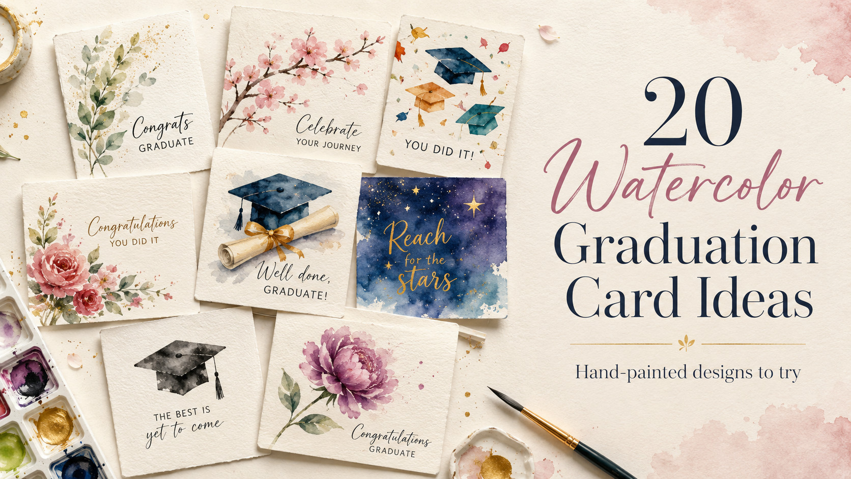
That’s what this is. 20 designs, grouped by style, each with a difficulty label and a 3-colour palette so you can grab the right supplies before you start. Some are doable in 20 minutes with a pan set from the craft shop. A few take a little more patience. All of them look like you meant it.
If you’re completely new to watercolour, 25 Easy Abstract Floral Painting Ideas for Beginners is worth a look first. Good practice for the loose brush work that shows up across a lot of these designs.
Floral graduation watercolour card ideas
Florals are the most forgiving graduation card designs you can attempt. The looseness that makes watercolour tricky to control is exactly what makes painted flowers look good. A slightly wobbly rose edge reads as organic, not wrong.
They also photograph well, work for any graduate regardless of subject, and are never the wrong call.
Idea 1: Loose botanical spray
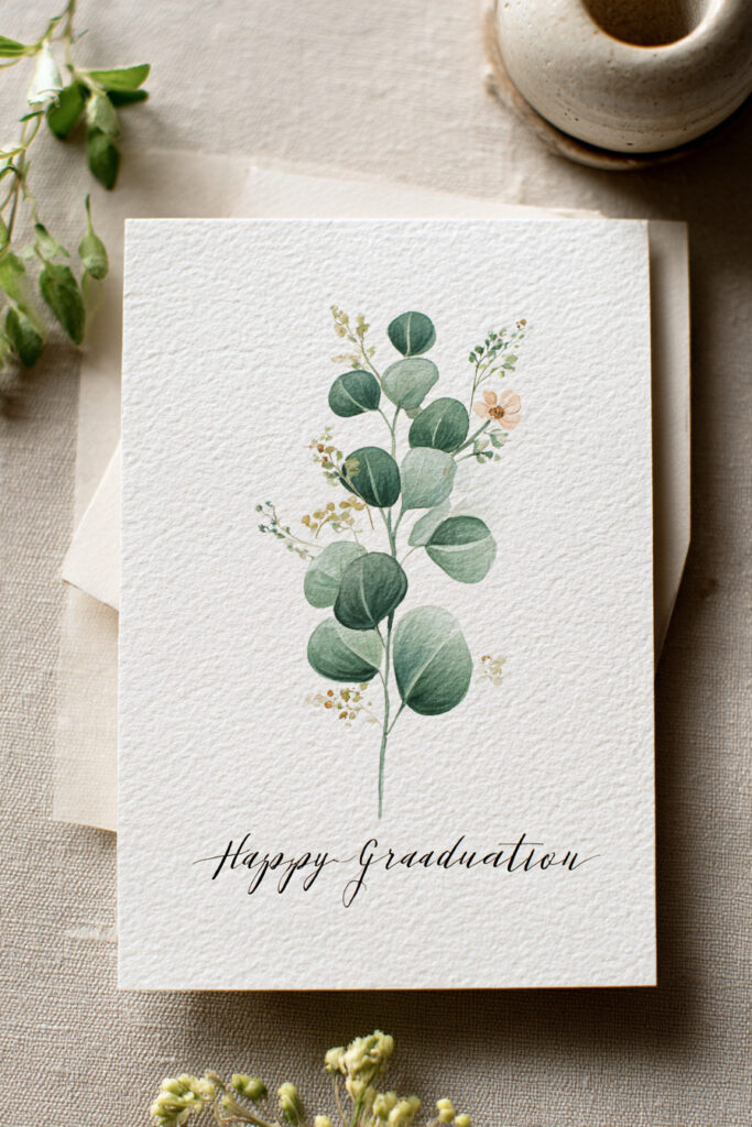
Difficulty: Beginner Palette: Sage green, pale blush, warm white
A single eucalyptus or wildflower stem on a plain white card. That’s it.
The negative space does most of the work here, which means there’s very little painting required. Use a dry brush on dry paper for clean edges. If you want one point of interest, add a single wet-on-wet bloom where the stem branches. Let the pigment spread however it wants.
Idea 2: Rose cluster corner

Difficulty: Intermediate Palette: Dusty rose, muted coral, deep burgundy
A dense cluster of loose roses anchored to one corner, leaving the rest of the card open for your message. Classic but not generic.
Paint the darkest petal first while the paper is still damp. Lighter petals will bleed outward naturally. Don’t chase them. Let the water do it.
Idea 3: Cherry blossom branch
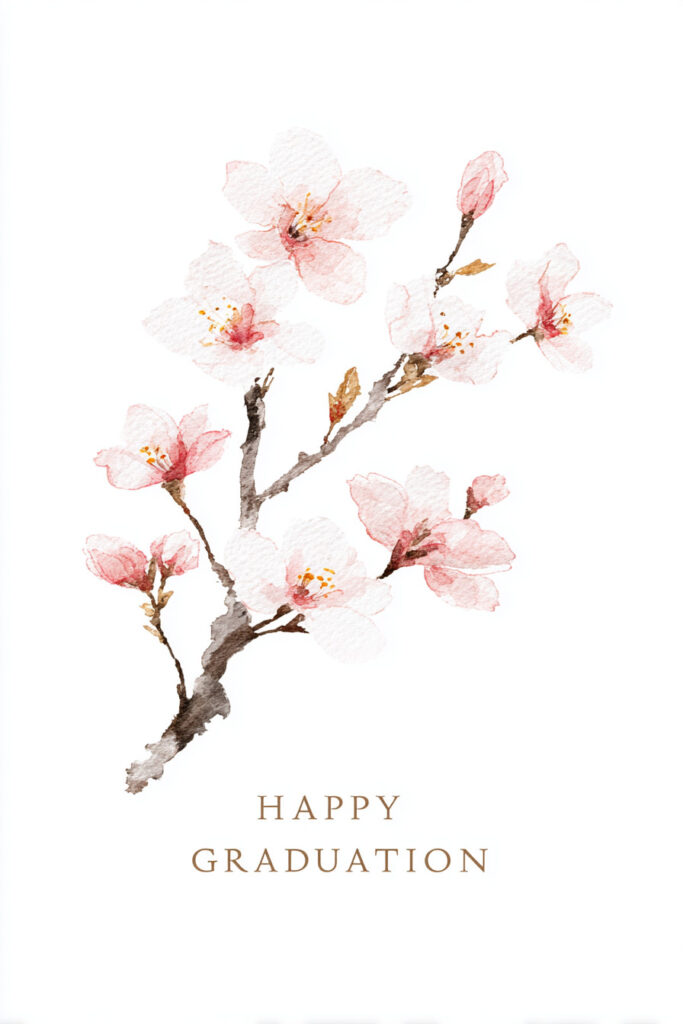
Difficulty: Beginner Palette: Pale pink, white, light grey-brown
A diagonal ink branch with soft watercolour blossoms. Japanese minimalism without any real technical difficulty.
Paint the blossoms first. Add the branch in ink once everything’s dry. If you reverse the order the ink bleeds, and it doesn’t look good.
30 Cherry Blossom Spring Watercolors for Inspiration has solid reference photos if you want to study the petal shapes before committing to card stock.
Idea 4: Wild meadow border

Difficulty: Intermediate Palette: Cornflower blue, soft yellow, pale green
Loose scattered florals around the card perimeter, like something pressed from an actual field. The trick is making it feel random without being chaotic: work in clusters of 3 across the border rather than spacing everything evenly. Uneven gaps feel intentional. Even gaps feel like a pattern that went wrong.
Idea 5: Single peony
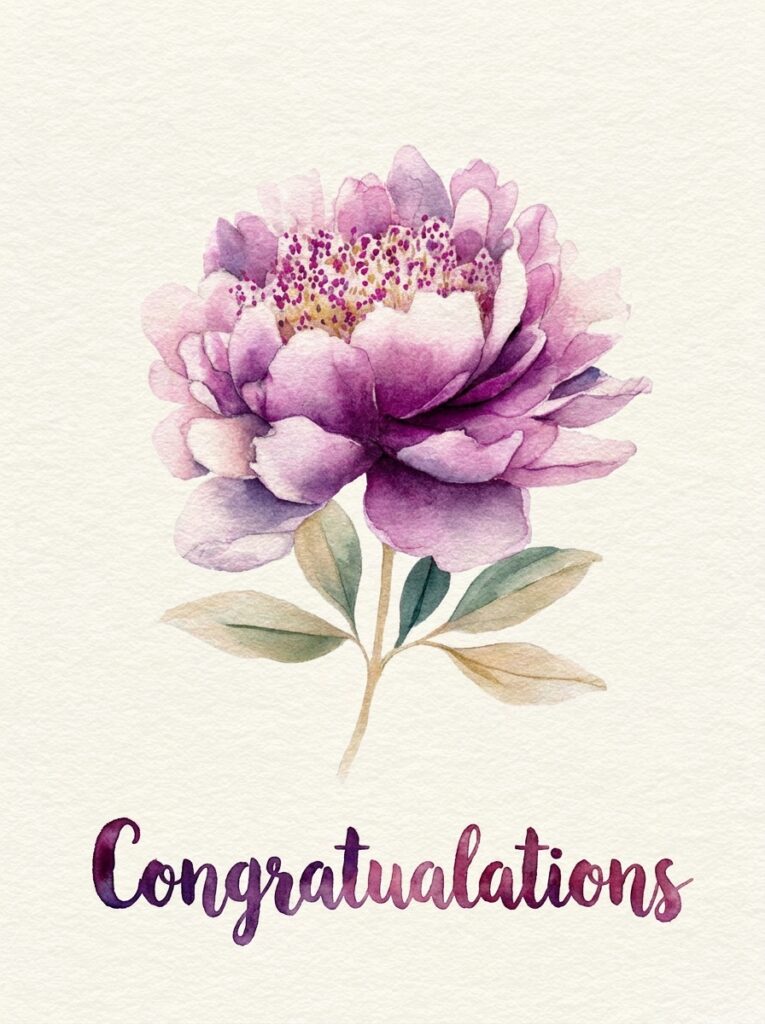
Difficulty: Intermediate Palette: Magenta, soft lavender, cream
One large centred peony. Bold, simple, hard to mess up badly enough to matter.
A single oversized bloom is more forgiving than a full composition. There’s nothing else competing for attention, so the flower can be a little imperfect and still carry the card.
Graduation cap watercolour card designs
If you want the card to be unmistakably about graduation, the mortarboard cap is the direct route. These designs skip florals entirely and lean into the occasion.
Idea 6: Minimalist cap silhouette

Difficulty: Beginner Palette: Navy, gold, white
A simple flat cap shape with tassel against a loose watercolour wash background.
Apply masking fluid over the cap shape before you paint the wash. Once the paint’s dry, peel off the masking fluid and you’ve got a crisp white cap with zero fuss. Add the tassel in gold ink or a gold brush pen.
Idea 7: Cap with floral wreath

Difficulty: Intermediate Palette: Dark green, ivory, gold, blush
A mortarboard cap surrounded by a loose circular flower wreath. Combining the 2 most-used graduation motifs in one design sounds obvious, but almost nobody does it well in a DIY card.
Paint the wreath first, position it loosely, and add the cap last in ink. That order gives you control over placement without having to plan the geometry upfront.
Idea 8: Flying caps confetti

Difficulty: Beginner Palette: School colours, or a bright multicolour mix
Multiple small caps scattered across the card at different angles. Works especially well with hand lettering as a centrepiece since the caps frame text without competing with it.
Vary the size of the caps to give the scatter some depth: a few larger ones in the foreground, smaller ones towards the edges.
Idea 9: Cap and diploma scroll

Difficulty: Intermediate Palette: Gold, parchment, deep teal
A loosely painted cap beside a rolled diploma. The diploma adds a narrative detail that a cap alone doesn’t have. It reads as “moment of completion” rather than just “graduation.”
Idea 10: Stars-and-cap night sky

Difficulty: Intermediate Palette: Prussian blue, violet, gold
A cap floating against a deep wet-on-wet night sky wash. Drop salt onto the wet wash to create star texture without painting each star individually. The salt granules push the pigment aside and leave pale speckled spots when they’re brushed off after drying.
For inspiration on painting that kind of atmospheric depth, 25 Fairy Watercolor Art Ideas That Look Like Magic has some good examples of glowing-sky effects done simply.
Abstract watercolour graduation card designs
The most beginner-accessible graduation watercolour card ideas in this list. No drawing skill required. The background is the design, and a simple ink detail or hand-lettered message does everything else.
Idea 11: Wet-on-wet rainbow wash

Difficulty: Beginner Palette: Blues, greens, purple (or school colours)
This is the technique from Knit Paint Sew’s tutorial and it works every time. Wet the entire card surface first. Drop colour in while it’s still damp. The pigments spread and bleed into each other. Stop adding colour before you think you should. On a small card, restraint wins.
Apply masking fluid to the text area beforehand so you end up with a clean white rectangle to write in once the wash dries.
Idea 12: Two-tone gradient

Difficulty: Beginner Palette options: Peach to coral / lavender to deep violet / sky blue to navy
A soft horizontal colour fade from one hue to another. Clean and modern. Looks more considered than it is.
Start with the lighter colour and work while it’s wet, pulling the second colour up from the opposite edge. The wet paper blends them in the middle without you having to manage the merge point manually.
Idea 13: Ink-splatter background

Difficulty: Beginner Palette: Gold ink splatter over deep teal wash
Apply the wash first and let it dry. Load a stiff brush with gold ink, hold it over the card, and flick the bristles with your finger. The spatters land randomly and the irregularity is the point. It hides any wash imperfections and looks deliberately festive.
Idea 14: School colours wash

Difficulty: Beginner Palette: Whatever the graduate’s school uses
Full bleed wash in the graduate’s school colours, with a tassel drawn in ink at the corner. The most personalised option that requires the least technical skill. Anyone who knows the school will recognise it immediately.
25 Easy Abstract Floral Painting Ideas for Beginners covers the loose wash and blending techniques that make backgrounds like this land well.
Personalised watercolour graduation cards by degree
What colour is my graduate’s academic hood?
According to the Intercollegiate Code of Academic Costume, hood colours have been standardised across US universities since 1893.
Personalised watercolour graduation cards by degree
What colour is my graduate’s academic hood?
Medicine
Dark green
Law
Purple
Education
Light blue
Engineering
Orange
Arts & Humanities
White / light blue
Music
Light pink
Philosophy
Navy
Business
Brown / drab
Fine Arts
Brown
Idea 15: Medicine and science card

Difficulty: Beginner Palette: Dark green, white, gold
Deep emerald wash with white text area, a simple cross or stethoscope detail added in ink. The green alone signals the field to anyone who knows what it means. Add a note inside explaining it if the graduate doesn’t.
Idea 16: Law card

Difficulty: Beginner Palette: Deep purple, gold, off-white
Rich violet wash with a gavel or scales detail in ink. Law graduates tend to get generic cards. This one won’t be generic.
Idea 17: Arts and humanities card

Difficulty: Beginner Palette: Pale blue, blush, white
Soft pastel wash with a delicate floral border. The palette matches the academic hood colour for humanities disciplines and the aesthetic suits the field. Coincidence of form and content.
Mixed-media watercolour graduation card designs
These are the designs that look the most impressive. They’re all still achievable without advanced skill. Each one just uses one extra material that most of the above designs don’t need.
Idea 18: Watercolour with gold leaf accents

Difficulty: Intermediate Palette: Deep jewel tone (navy, burgundy, forest green) + gold
Apply a jewel-toned wash and let it dry fully. Brush gold leaf adhesive onto the corners or along one edge. Press gold leaf sheets down, let the adhesive tack, then brush away the excess. The leaf sticks where the adhesive is and flakes everywhere else.
The gold leaf does the decorative work. The wash just needs to be a single clean colour underneath it.
Idea 19: Watercolour with embossing powder

Difficulty: Intermediate Palette: Any wash colour (the embossed area provides the contrast)
Stamp a graduation cap or message in embossing ink, dust with embossing powder, and heat-set it. Then paint a wash over the entire card surface. The embossed areas resist the paint and stay crisp. You end up with a raised, glossy motif against a painted background.
White embossing powder on a coloured wash looks like resist painting without the masking fluid step. Faster and more reliable for people who find masking fluid frustrating.
Idea 20: Watercolor background with printed text

Difficulty: Beginner Palette: Anything
Hand-paint a wash background. Let it dry completely, then press it flat overnight between the pages of a heavy book. Feed it through a home printer and print your text directly onto the painted surface.
For people who like the painted look but don’t want to hand-letter, this is the right answer. The combination of an obviously hand-painted background with clean printed text reads as intentionally mixed-media rather than a shortcut.
30 Easy Valentine Watercolor Paintings Anyone Can Try covers loose wash techniques that work well as printed-text backgrounds. The Valentine formats translate directly to card-scale painting.
Supplies you’ll need
What supplies do you need for a watercolour graduation card?
Nothing on this list requires a specialist shop trip.
- Watercolour paper card blanks (Strathmore or similar; pre-scored cards are easiest to work with)
- Watercolour paints (any student-grade pan or tube set; professional grade adds nothing at card scale)
- Round brushes in sizes 6, 8, and 10 (covers every design in this list)
- Masking fluid and a ruling pen (for designs that need white text areas; the ruling pen gives you more control than a brush and won’t ruin it)
- Masking tape (for clean white borders around the edge)
- Black brush pen or fine-liner (for ink details)
- Optional: gold ink, embossing ink and powder, gold leaf sheets
Strathmore’s 300 Series Watercolour Cards are the most beginner-friendly option: pre-scored, correct paper weight, and they come with envelopes.
Before you start
Pick 1 design. Gather the 3 colours listed for it. Don’t try to adapt a palette you don’t have. Mismatched substitutions are usually why a design doesn’t land.
If you’re worried about practising on the actual card, run the technique once on a scrap of watercolour paper cut to the same size. The paper weight matters more than people expect.
And if you want to spend more time with watercolour painting before committing to a card, 25 Dreamy Spring Watercolor Landscapes to Spark Creativity is a good place to warm up. The same wet-on-wet and loose wash techniques appear throughout.
Frequently asked questions
What supplies do I need to make a watercolour graduation card?
Watercolour paper card blanks, a student-grade watercolour set, round brushes in sizes 6, 8, and 10, masking fluid with a ruling pen, masking tape, and a black brush pen for ink details. Gold ink, embossing powder, and gold leaf are optional for the mixed-media designs.
What is the easiest watercolour graduation card to paint?
The wet-on-wet rainbow wash (idea 11), the loose botanical spray (idea 1), and the school colours wash (idea 14). All 3 require no drawing skill and can be done in under 30 minutes.
What colours should I use for a graduation watercolour card?
Navy and gold for a classic look, dusty rose and burgundy for florals, Prussian blue with violet for an atmospheric night-sky design. For something more personal, use the graduate’s school colours or their academic discipline’s hood colour: dark green for medicine, purple for law, orange for engineering.
Can I feed a hand-painted watercolour card through a printer?
Yes. Let the wash dry completely, press it flat overnight under a heavy book, then run it through a standard home printer. The painted background and clean printed text look intentionally mixed-media.
What is the academic hood colour for different degrees?
Medicine is dark green, law is purple, education is light blue, engineering is orange, arts and humanities is white or light blue, music is light pink, philosophy is navy, business is brown, and fine arts is brown. Using the right colour for the graduate’s field turns a generic card into a genuinely personal one.