

Bring the warmth of autumn to your phone with these 25 creative lockscreen wallpapers inspired by the cozy charm of the season! From golden leaves and misty forests to pumpkin patches and plaid patterns, these wallpapers capture the essence of fall in beautiful, eye-catching designs. Whether you love earthy tones, playful fall motifs, or scenic autumn landscapes, these lockscreen ideas will keep your phone looking festive and stylish all season long. Get ready to welcome fall at your fingertips with these stunning wallpapers!
All artwork provided is original and can be used as a reference for your own drawings.
Table of Contents
Wheat Field Silhouette
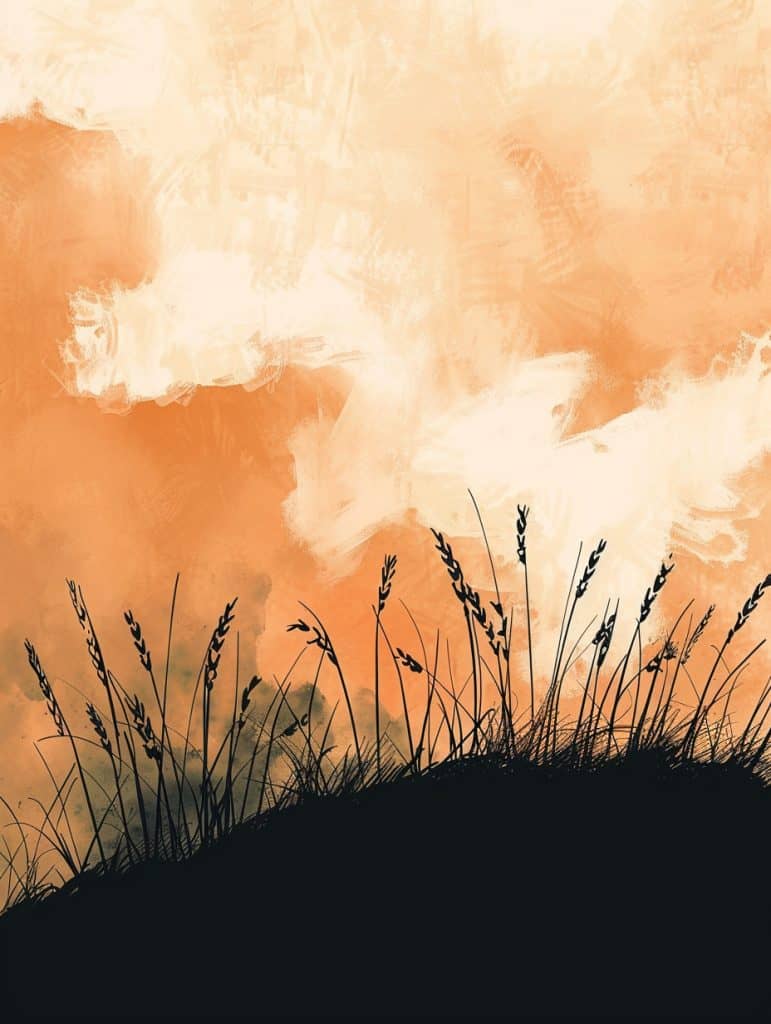
Wow, this wallpaper’s got a really cool vibe. The silhouette of the wheat against that orangey sky is pretty striking. You know what might be an interesting way to recreate this? Using actual wheat or grass clippings to make a stencil. I tried something similar once with leaves for a fall-themed design, and it was a mess but kinda fun.
The color palette here is gorgeous – all those warm peachy tones. It reminds me of sunsets I’ve seen in the countryside. But getting those subtle variations in the sky might be tricky. Maybe you could experiment with watercolors or even coffee stains to get that organic, cloudy look? And then overlay the grass silhouette digitally.
Speaking of the grass, the detail in those wheat stalks is impressive. It’s making me think… what if you used a bunch of thin wires or threads to create the grass texture? Could give it an interesting 3D effect. Though I guess that might be a pain to photograph well for a phone wallpaper. Hmm. Oh! Random thought – wonder how this would look with a parallax effect on newer phones? The grass could sway slightly as you tilt the device. Anyway, I dig how the composition draws your eye upward. It’s simple but has impact, you know?
Lantern Glowing Softly
Wow, this is a killer wallpaper design! The negative space is doing some heavy lifting here. That deep, dark background really makes the glowing lantern and those vibrant autumn leaves pop. It’s like they’re floating in this inky void, which gives the whole thing this dreamy, ethereal vibe.
I actually just finished a similar piece myself last night – was going for that moody fall aesthetic too. But I gotta say, this one’s way more polished than mine. The way they’ve scattered those little moths and butterflies throughout is *chef’s kiss*. Adds this subtle layer of movement and life to the whole composition. And those wispy smoke trails? Genius touch.
Anyways, back to the negative space thing. It’s not just about the dark background – see how there’s all this empty space around the lantern? That’s deliberate. Makes your eye zoom right to it as the focal point. And those leaves aren’t evenly distributed either – there’s more empty space at the top, which kinda draws your gaze down. It’d prob look awesome on a phone screen, esp with those OLED displays that can do true blacks. Though I’m not 100% sure how well some of those finer details might translate on smaller screens. Might lose some of those teeny butterflies. But overall? Def a standout design. Makes me wanna up my game!
Weathered Books
Wow, this wallpaper design is gorgeous – the attention to detail in those autumn leaves is insane. The way the artist captured the delicate veins and texture in each maple leaf really jumps out at me. I’m especially drawn to that big orange leaf right at the top – you can practically feel the crispness of it.
The stack of books is pretty cool too. I love how they mixed some darker, more weathered-looking volumes with lighter ones. It reminds me of this book-themed cafe I designed a logo for last year – I went way overboard trying to get the book spines to look realistic, but it was worth it in the end. Anyway, the subtle shading and highlights on the book edges here really sells the depth and dimension.
But you know what’s really clever? The little splatters and smudges of color scattered throughout. It’s like… basically gives it this painted, slightly messy vibe that contrasts nicely with the crisp outlines of the leaves and books. Though I gotta admit, I’m not totally sure if those are meant to be paint splatters or like, coffee stains or what. Either way, it adds this cool organic element. Man, now I’m craving a latte and a good book – maybe I should make that my next personal project. A cozy reading nook illustration or something. But yeah, for a phone wallpaper this would look sick. The vertical composition would work great, and those warm fall colors would pop so nice against app icons.
Vertical Stack Of Stones
Wow, this is a pretty striking design! I love how the artist balanced the zen-like rock stack with those vibrant autumn leaves. It’s giving me major fall vibes.
You know what could really make this pop even more? Adding some subtle paper texture to the background. I actually just finished a similar piece myself – was going for that whole minimalist nature thing – and I threw in this really cool handmade paper texture I found online. It gave it this awesome tactile feel, even tho it’s just a digital image. Anyways, for this one, I think a light cream-colored paper texture would work great. It’d add depth without overwhelming teh delicate balance they’ve got going on.
The color palette is spot-on for a phone wallpaper – those oranges and reds will really stand out against app icons. Though I gotta say, I’m not totally sure about that dark grey rock in the middle. It’s a bit heavy? Maybe lightening it up a tad would help it blend better. Or hey – what if they added some gold leaf texture to parts of the leaves? That could be pretty sick, especially on those higher-end phones with the fancy OLED screens. It’d make the whole thing feel extra luxe without going overboard.
Japanese Maple Branch
Wow, this maple leaf design is gorgeous! The red and pink tones against that off-white background really pop. Changing the perspective could totally switch up the vibe though. Like, imagine if we zoomed way in on just a couple leaves – you’d lose that nice circular framing, but it might feel more immersive. Or tilting the angle could make it more dynamic.
I actually did something similar for a client last fall… tried like 20 different angles before we landed on the right one. What a pain that was. But worth it in the end.
The composition here is really nice – how the branches kinda sweep across the screen. It’s got this serene, floaty feel. Makes me think it’d work great as a lock screen. Though I wonder how it’d look on different phone sizes? Might get a bit cramped on smaller screens.
Oh man, speaking of screens, I just knocked over my mug reaching for a pencil. Gotta clean that up real quick… Anyway, where was I? Oh yeah – maybe playing with the negative space could be interesting too. Like, what if the circle was white and the leaves were on a colored background instead? Just spitballing here. Ultimately though, this design is pretty spot-on as is. Sometimes you just nail it on the first try, y’know?
Steaming Coffee
Wow, this wallpaper design is super eye-catching! The artist really nailed the contrast between the warm, swirling background and that crisp white coffee cup. It’s like the cup is floating in this dreamy coffee-colored universe.
The latte art in the cup is a great focal point. And that wispy steam? Chef’s kiss. It adds this ethereal quality that ties the whole thing together. Honestly, I’m a sucker for designs that play with negative space like this. The way the steam curls up and fades into the background is *chef’s kiss*.
But here’s the thing – I’m not totally sure how this would look on different phone screens. Like, would those subtle marbled textures in the background get lost on lower-res displays? I had a similar issue with a coffee-themed design I did last month. Ended up having to bump up the contrast way more than I wanted. Anyway, I dig how they kept the color palette really simple here. It’s basically just shades of brown and white, but it works. Def gives me cozy vibes. Perfect for a morning motivation wallpaper, ya know?
Deep Twilight Transitioning To Harvest Moon
Wow, this wallpaper’s already pretty dynamic – those birds really give it some life! But if we wanna kick it up a notch, I’d suggest adding some subtle animation to the birds. Maybe have them slowly flap their wings or drift across the screen. That’d make it pop on newer phones with always-on displays.
The color palette is gorgeous – those warm oranges and reds remind me of a project I did last year for a sunset-themed app. It was a nightmare to get the gradients just right, but man, the end result was worth it. Anyway, for this one, we could play with the contrast a bit. Darken those trees in the foreground to make the bright sky stand out even more. It’d create this sorta layered effect that’d look sick on high-res screens.
Oh, and speaking of layers – what if we added some parallax scrolling? Like, have the moon move slower than the birds as you scroll. It’d give it this awesome sense of depth. Though… I’m not sure how that’d affect battery life. Might need to test that out. But yeah, overall this is a solid design. It’s got that dreamy vibe that people love for their lock screens. Just needs that extra oomph to make it really stand out in the app store, ya know?
Single Dramatic Maple Leaf
Wow, this maple leaf design is stunning. I’m not gonna lie, I’m a sucker for these soft, dreamy watercolor vibes. The way the leaf seems to be dissolving into that misty pink background… it’s giving me all the cozy autumn feels.
I could totally see this adapted into a mixed media piece. Maybe start with a watercolor base, then layer on some pressed real maple leaves for texture. Ooh, or what about a digital illustration that incorporates some subtle animated elements? Like tiny water droplets slowly sliding down teh leaf veins. I tried something similar once with a dandelion design, but the file size got way too big for most phones to handle smoothly.
Anyways, the color palette here is *chef’s kiss*. That gradient from deep coral to blush pink is so soothing. It’d look gorgeous on an OLED screen – those deep blacks would make the leaf pop even more. Though I wonder if the edges might get a bit lost on smaller devices… Maybe bump up the contrast just a tad? Or add a super subtle glow effect around the leaf edges to make it stand out. Just spitballing here. What do you think?
Rustic Door With Wreath
Oh man, this is such a cool design for a phone wallpaper! The repetition of those vertical wood planks creates this awesome rustic texture that would look killer as a background. I love how the artist used those deep, rich browns – it gives it this warm, cozy vibe that’s perfect for fall or winter.
The focal point is definitely that wreath smack in the middle. It’s like a pop of color against all that wood. Speaking of which, I tried making a wreath like that last Christmas and lemme tell ya, not as easy as it looks! Anyways, the way the twigs and berries kinda spill out adds some nice organic shapes to break up all those straight lines.
You know what’s interesting? The subtle repetition of those cobweb-looking things in the corners. Adds a slightly spooky element that… well, I’m not totally sure if it was intentional or not. But it works! It reminds me of this haunted house wallpaper I designed last Halloween – went for a similar vibe but maybe pushed the creepy factor a bit too far. This one’s way more subtle. The muted color palette would probably look awesome on most phones, especially ones with OLED screens where those deep blacks would really pop. Though I guess it might be a bit dark for some people’s tastes? Eh, can’t please everyone!
Pumpkin Silhoutte
So, the first thing that grabs me about this image is that intense, fiery red background. It’s like looking at a sunset on steroids. The way it fades from deep red to a lighter orangey-red creates this sense of depth that’s really eye-catching. I’ve messed around with similar color gradients before, but never quite nailed that smoldering effect.
And then there’s that black silhouette thing at the bottom. At first glance, it kinda looks like a weird plant or maybe smoke? But the more I look at it, the more I think it might be some kinda stylized cauldron with swirly tendrils coming out. Pretty cool how it anchors the bottom of the image. Reminds me of this Halloween-themed wallpaper I made last year with a spooky tree silhouette – totally different vibe, but same idea of using a dark element to ground everything.
But what really makes this pop is the texture. The whole thing looks kinda weathered and scratched up, like it’s been through some stuff. Gives it this grungy, edgy feel that I’m digging. Not sure how they achieved that effect exactly – maybe some overlay layers with noise and stuff? I’d have to play around to recreate it. Anyway, overall it’s a pretty badass design. Would look sick as a lock screen, especially on those OLED displays where the blacks are super deep. Might be a bit much as a home screen tho, could make icons hard to see. Just my two cents!
Leaves And Keys
Wow, this wallpaper is gorgeous! I’d definitely start with those vibrant autumn leaves – they’re the star of the show here. The rich oranges and golds against that deep black background are just stunning. It’s funny, I was actually working on a similar fall-themed design last week, but mine didn’t turn out nearly this good.
For sketching this quickly, I’d probably rough out the overall leaf shapes and placements first. Getting that composition balanced is key. Then I’d add in those cool vintage keys as focal points – they give it such a unique vibe. The intricate detailing on the leaves would be the last step, that’d take forever to get right!
And speaking of those keys, aren’t they just perfect?? They add this whole mysterious, almost magical element. Like maybe they unlock some secret autumn realm or something. I dunno, my mind always wanders to fantasy stuff with designs like this. But anyway, color-wise, I’m pretty sure they used a limited palette of maybe 4-5 shades. That’s a super smart choice for making it work as a phone wallpaper – keeps it from getting too busy on a small screen. Though I gotta say, I’m not 100% sure how well all that detail would show up on my ancient iPhone. Might lose some of the leaf texture. But overall, this is just *chef’s kiss* perfection for fall vibes!!!
Morning Frost
Wow, this wallpaper is gorgeous! The artist nails that dreamy autumn vibe with those warm oranges and reds. But what really catches my eye is how they blend the sharp, defined leaf shapes with these misty, abstract splatters at the bottom. It’s like the leaves are dissolving into pure color. Super cool effect.
I actually just finished a similar piece yesterday, funny enough. Was trying to capture that same ethereal feeling, but I went with a blue winter theme instead. Didn’t turn out nearly as nice as this one though, haha. I really struggle with getting that perfect balance between structure and chaos.
And speaking of chaos, can we talk about that texture? The way they’ve layered different opacities and added those tiny speckles throughout… it adds so much depth. Makes me wanna reach out and touch it, y’know? Though I gotta admit, I’m not totally sure how they achieved that effect. Maybe some kind of digital brushwork? Or could be a scanned watercolor texture. Either way, it’s killer.
But yeah, this would look amazing as a phone wallpaper. The vertical composition is perfect for it. Only thing is, I wonder how it’d look with all those app icons cluttering it up. Might lose some of the subtlety. Still, I’d totally use it. It’s got that wow factor that’d make me smile every time I unlocked my phone.
Moonlit Window Scene
So, looking at this wallpaper design, the first thing that jumps out is the crazy amount of detail. Like, wow. As a beginner, nailing all those tiny elements would be a real challenge. The falling leaves, the rain drops, the string lights – it’s a lot to juggle.
The color palette is gorgeous though. Those warm oranges and reds against the dark background – it’s giving me major cozy autumn vibes. Reminds me of this book cover I designed last year for a mystery novel set in New England. Anyway, getting those colors to pop just right on different phone screens could be tricky. You’d need to test it out on a bunch of devices to make sure it looks good.
The composition is really interesting too. The way the window frame kinda frames the moon, and then you’ve got teh cozy reading nook in the foreground. It’s like… multiple layers of coziness, if that makes sense? Oh man, I just knocked over my pencil cup. Anyway, balancing all those elements without it feeling cluttered would definitely be a challenge for someone new to this. You gotta know when to stop adding stuff, you know? But overall, it’s a super cool design. Makes me wanna curl up with a good book and some hot cider.
Misty Forest Path
Wow, this wallpaper is stunning – I’m not gonna lie, I’m kinda jealous of whoever created it! The way they’ve captured that magical forest vibe is just *chef’s kiss*.
For practicing elements from this, I’d say start with those swirling tree shapes. They’re key to creating that tunnel effect. Maybe try sketching just the outlines of the trees first, focusing on how they curve and overlap. Then practice adding in bits of foliage and texture. I remember struggling with tree shapes when I first started out – kept making them too stiff and symmetrical. Took me ages to get that organic flow right.
Color-wise, this is a masterclass in using warm tones. That fiery orange and red palette really pops against the darker tree silhouettes. Oh – speaking of palettes, I should prob finish organizing my watercolors after this. Anyway, for practice, you could try making little color swatches mimicking the gradients here. Start with the lightest creamy tones in the center and work your way out to those deep reds. Might be tricky to get that misty effect on a phone screen tho. Maybe experiment with some subtle blurring or transparency layers??? Not totally sure how that’d work, tbh.
Minimalist Mushroom Garden
Wow, that color palette is just gorgeous. The warm autumnal tones – those deep reds and oranges – they really pop against the off-white background. It’s giving me major cozy fall vibes. I actually just finished a similar mushroom illustration yesterday, but mine was way more muted. Kinda wish I’d gone bolder with the colors now!
The composition is really effective too. The way the mushrooms are arranged, with that big red one as the focal point – it draws your eye right in. And then you’ve got all these little details to discover as you look closer. Those speckles on the mushroom caps, the delicate leaves and plants… it’s the kind of wallpaper that’d be fun to stare at while you’re waiting for the bus or something.
Honestly though, I’m not totally sure about those little red splatters in the background. They add some nice texture, but I wonder if they might be a bit distracting on a phone screen? Might depend on the device. But overall, this is the sort of design that’d look amazing on a high-res OLED display – all those rich colors would really shine. Makes me think of some of those watercolor wallpapers Apple used to do, but with a more whimsicial, illustrative vibe. Man, now I’m tempted to try something like this myself!
Mushrooms and Leaves
Alright, so this wallpaper’s got a real autumnal vibe going on. Love the warm color palette – those oranges and reds are spot-on for fall. The composition’s pretty balanced, with the leaves and mushrooms scattered nicely across the canvas.
If I was gonna add one thing to enhance it… hmm. Maybe some subtle texture in the background? Like, a light canvas or paper grain effect. That could give it a bit more depth without overpowering the main elements. I did something similar on a project last year – added this barely-there linen texture to a minimalist design and it just gave it that extra oomph, y’know?
Oh, speaking of projects – this reminds me of this time I was designing a book cover with a similar fall theme. I got so carried away with the leaves that I completely forgot about the title! Had to do a last-minute redesign at like 2 AM. Anyway, back to this wallpaper – I dig how the mushrooms break up all the leaf shapes. Gives your eye somewhere else to land. Though I’m not 100% sure about that white mushroom in the top right… feels a tad floaty? But maybe that’s just me being picky after staring at screens all day. Overall, it’s a def solid design that would look great on a phone. Might need to tweak the scale a bit for different devices, but that’s always the case with wallpapers.
Rising Harvest Moon
So, when it comes to drawing a scene like this, one of the biggest pitfalls is overdoing the detail on the trees. You gotta resist the urge to meticulously render every single branch, y’know? This designer nailed it – the silhouettes are simple but still evocative.
The color palette here is just *chef’s kiss*. That deep teal sky against the golden moon? Perfection. It’s giving me major nostalgia for this Halloween wallpaper I made years ago… spent hours tweaking the colors and ended up scrapping the whole thing cuz it looked too busy. Lesson learned!
Composition-wise, the way the branches frame the moon is super effective. It draws your eye right to the focal point. But here’s where it gets tricky on phones – you gotta consider how it’ll look with notification banners and stuff cluttering up the top. I’d maybe nudge that moon down juuust a tad. Or not, idk. Sometimes you just gotta go with your gut.
Oh, and speaking of moons, did you hear about that super blood wolf moon eclipse thing last year? Wild stuff. Anyway, back to the design – the texture on the moon surface adds nice depth without being distracting. Overall, this is the kinda minimalist vibe that works great for wallpapers. Clean, moody, eye-catching. Just my two cents though!
Geometric Fox
Wow, this fox design is super cool! The geometric style is really eye-catching. For beginners trying to create something like this, I’d say mastering shape manipulation is key. You gotta get comfortable breaking down complex forms into simple polygons.
The color palette here is fire – all those warm oranges and reds with black accents. It’s giving me major autumn vibes. I remember when I first started out, I was terrible at color theory. Like, embarrassingly bad. I’d throw together these garish combinations that hurt to look at. But over time I learned to limit my palette and play with shades of similar hues, kinda like what’s happening in this piece.
Oh man, speaking of foxes, I was at the zoo last week and saw the cutest little fennec fox. Totally unrelated, but it made me think about how nature inspires so much great design. Anyway, back to the wallpaper – the composition is really strong. The way the leaves frame the fox draws your eye right to it. I think it’d look amazing on a phone screen, though you might loose some of the finer details on smaller devices. Maybe simplifying it a bit more could help? Not sure though, it might loose some of its charm if you simplified too much. What do you think?
Silhouetted Forest
Wow, this wallpaper is gorgeous! The sky is on fire with those oranges and reds. For a beginner, I’d say focus on the silhouettes of the trees first – that’s the easiest part to nail down. Just some basic triangular shapes lined up along the bottom. Then maybe simplify that crazy constellation network in the sky to just a few key lines and dots.
The color palette is what really makes this pop though. I remember trying to recreate a sunset like this in Photoshop years ago and totally butchering it. Ended up looking more like a weird lava lamp than a sky, haha. But for a beginner, you could probably get away with just doing a gradient from dark at the bottom to that bright orange-yellow at the top.
Oh, and those little floating lights or fireflies or whatever they are – those add such a cool magical vibe. Kind of reminds me of that scene in Tangled… wait, was that Tangled or Brave? One of those Disney movies with the floating lanterns. Anyway, those would be super easy to add as little dots. Though I guess technically they should only be below the treeline? Not sure if they’re supposed to be stars or fireflies. Either way, it looks awesome.
(Sorry, got distracted by someone’s cute dog walking by outside the cafe window.) But yeah, overall I think this could work great as a phone wallpaper. Might need to crop it a bit to fit different screen sizes. The vertical format is perfect though – love how it draws your eye up from the dark forest to that explosion of color in the sky.
Close Up Sweater Texture
Oh man, this wallpaper design is intense! The intertwining textures and colors are really grabbing my attention. I’m not gonna lie, at first glance it almost looks like some kind of alien landscape or something.
The subtle detail that’s really catching my eye is the way the designer sprinkled those tiny orange flecks throughout the dark background. It adds this cool depth and almost makes it feel like the image is moving or shimmering slightly. Reminds me of this abstract painting I saw at a gallery last month – had a similar vibe with contrasting textures.
The color palette is killer too – that deep orange against the creamy white and inky black. It’s bold but not, like, overwhelming? I did a phone wallpaper project last year with a similar color scheme and it looked awesome on both light and dark mode. Though I gotta say, this one might be a bit busy for some people’s taste as a wallpaper. Could maybe work better as a lock screen? I dunno, what do you think?
Oh, and speaking of textures – is it just me or does that knitted/woven look give it almost a cozy vibe despite the intensity? Makes me wanna curl up with a blanket and some hot cocoa. Maybe I just need more coffee this morning lol. Anyway, overall it’s a super eye-catching design. The way the shapes flow and intertwine keeps drawing my eye around the whole image. Pretty damn cool.
Cosmic Pumpkin Patch
Okay, so for someone trying to draw this Halloween-y forest scene for the first time, I’d say start with the sky. That deep blue with all those glowing orange lanterns floating up – it’s gonna set the whole mood. You wanna nail that contrast between the dark trees and the bright sky.
Speaking of those trees, don’t get too hung up on making them perfect. I remember when I was first learning to paint night scenes, I’d spend forever on each little branch. But the key is to keep ’em kinda loose and silhouette-y. It’s all about dat atmosphere.
Now for the pumpkins – holy cow, there’s a ton of ’em! I’d probably sketch out the basic shapes first, then go in and add the glowy faces. Oh, and don’t forget those little orange flowers scattered around – they add a nice pop of color. Actually, now that I’m looking closer, are those flowers or more tiny pumpkins? Hard to tell. Either way, they work great to fill in the space.
One last thing – the overall composition is super important here. Notice how your eye gets drawn down that path of pumpkins? It’s like a river of orange light flowing through the dark forest. I tried something similar in a piece I did last fall, but I think this artist nailed it better than I did. Ugh, now I wanna go back and redo mine…
But yeah, start with the big shapes and work your way down to the details. And don’t be afraid to go heavy on the glow effects – that’s what really makes this pop as a phone wallpaper. Good luck with it!!!
Continuous Falling Leaves
Oh man, this wallpaper is gorgeous! I’m not gonna lie, I’m a sucker for autumn vibes and this nails it. The way the leaves are cascading down – it’s like they’re actually falling on your screen. Clever stuff.
The color palette is what really makes it pop. Those warm oranges and reds fading into softer peaches and creams? *chef’s kiss* It’s got this dreamy watercolor effect that I bet would look amazing on an OLED display. Reminds me of a project I did last year for a cider company – went for a similar vibe but it didn’t turn out nearly this good.
One thing that’s kinda bugging me though – are some of those leaves a bit too detailed for a phone wallpaper? Might get lost on smaller screens. But hey, what do I know? I just finished a leaf drawing myself and now I’m seein em everywhere!!!
The composition is pretty smart too. More dense at the top, sparser at the bottom – gives you space for icons and stuff. You know what would be cool? If it was animated so the leaves actually drifted down when you unlocked your phone. Wait, can wallpapers even do that? I should probably google that…
Anyway, I dig it. It’s giving me all sorts of ideas for my next project. Maybe I’ll try something with a winter theme? Snowflakes could be fun to play with. But I’m getting ahead of myself – gotta finish this dang autumn series first!
Interconnected Autumn Elements
Wow, this is a seriously cool wallpaper design! The artist really nails that sense of depth through a bunch of clever techniques. Those wavy lines snaking through the image create these amazing layers, kinda like you’re peering down into a dreamy autumn forest floor. And the way they overlay different elements – leaves, mushrooms, abstract shapes – at various sizes totally sells that 3D effect.
The color palette is *chef’s kiss* – all those warm oranges and reds with pops of darker tones. It reminds me of this project I did last fall for a cider company’s packaging. We went for a similar vibe, but I gotta say, this artist takes it to another level. The way they use lighter and darker shades strategically really makes certain elements pop forward while others recede.
You know what’s interesting? The use of negative space. Like, there’s these kinda empty areas between the swirls that add this airy quality. It keeps the whole thing from feeling too cluttered on a phone screen. Speaking of which – I’m sorta wondering how this would look on different devices. Might be a bit busy on a smaller phone, but on a tablet? Gorgeous. Oh, and before I forget (I’m prepping for this workshop I’m teaching next week and my brain is everywhere), the varied line weights are another clever depth trick. Thicker lines push forward, thinner ones pull back. It’s subtle but effective, ya know?
Close Up Owl
So, this owl design is pretty intense! Those eyes are just staring right into your soul. To practice capturing the proportions, I’d start by breaking it down into basic shapes. The eyes are these perfect circles, right? And then you’ve got those triangular feather patterns radiating out.
I remember when I was first learning to draw owls, I kept making the eyes way too small. Rookie mistake. But owls have these massive peepers that dominate their faces. And this design really nails that. The color palette is fire too – all those warm oranges and reds. It reminds me of this album cover I designed back in college for my friend’s band. We went for a similar vibe, but with a phoenix instead of an owl. Man, that was a fun project.
Anyway, back to proportions. You could try the grid method, dividing the image into squares and recreating each square individually. Or – and this is what I do sometimes when I’m feeling lazy – just trace the main shapes digitally and then refine by hand. Oh, and pay attention to the negative space too! Like how the white feathers kinda form a mask shape. That’s a cool detail that really ties it all together. This would look sick as a phone wallpaper, especially on those new OLED screens where the blacks are super deep.
Tree Trunk Growth Rings
Wow, this is a stunner! The way the composition draws your eye right to the center of those tree rings is just *chef’s kiss*. I’m loving how the warm oranges and golds radiate outward, creating this mesmerizing spiral effect. It’s like you can’t help but get sucked in.
I actually just finished a similar piece for a client’s phone wallpaper last week – talk about coincidence! Mine was more blue-toned though, going for an ocean vibe. Anyways, what really makes this pop is the contrast between the super detailed rings and that dark, kinda moody background. It gives it this depth that I think would look amazing on a phone screen.
You know what might be cool? Imagining this as like, a portal to another dimension or something. The rings could be ripples in space-time… okay, maybe I’m getting carried away here. But that’s what good design does, right? It sparks your imagination! I’m not totally sure how they achieved that textured look on the outer edges – maybe some kind of digital brush effect? Whatever it is, it really really adds to the organic feel. Man, now I’m itching to fire up Photoshop and play around with some tree ring textures myself!!!
With these 25 autumn-inspired lockscreen wallpapers, you’ll have a touch of fall magic every time you unlock your phone. From cozy vibes to classic fall colors, each design brings a little seasonal beauty to your everyday. Download your favorites, switch them up throughout the season, and enjoy the warm hues and nostalgic charm of autumn!

")
