Colors play a huge role in art and indeed, everyday life. The colors we see affect our perception of our surroundings without us ever really realizing it.
We have all walked into a blue room and immediately felt cooler at some point. This is because color temperature affects our brain. Every color conveys different feelings, and these can be very personal. What they mean to us can be different because of our life experiences.
Personal preferences
For me, the color red is my real favorite. I find it invigorating, and it helps me keep focused and driven throughout the day. Blue and green, I find to be more calming colors. They al-low my brain to switch off easier and let me relax.
As we have discussed in our article on secondary colors, complementary colors have a very specific interaction between each other. All colors interact with each other in some way, and our brain can process that in strange, confusing, and wonderful ways at times.
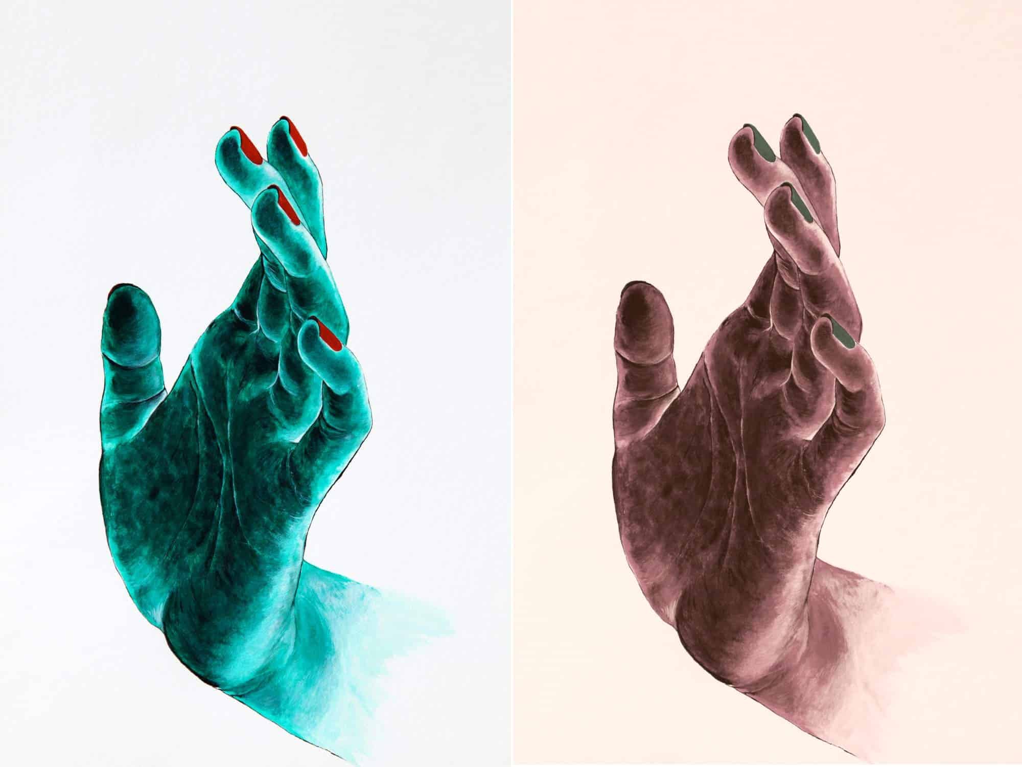
Not all colors work well together, but this can be very personal. Some people see color in a very different way to others. This was was demonstrated by the dress that swamped the internet because some people saw it as blue and burgundy while others saw it as white and gold.
A Scientific perspective on color
Scientifically it gets complicated because what we see is actually the color that is reflected back to our eyes. So in some ways, you could say the color you see is not actually the color of the object at all.
Because light, whatever the color, is a waveform, it interacts with other similar waveforms. Imagine the ripples in a pond moving out after you have thrown a pebble in. they are fairly even and concentric, so in color terms, they would probably be seen as a single color.
Now imagine the way the waves interact if you throw 2 pebbles in at the same time. The waves interact with each other and change the overall waveform completely. In color terms, this could be a secondary color.
Finally, imagine throwing in 2 stones that are very different sizes. The waveforms get even more erratic and complicated. In color terms, this would be a tertiary color.
Final thoughts
Learning to see the color as waves and seeing the different component colors used to mix a more complicated color will take time and effort. However, it will give you a much more rounded understanding of how you can use color in your art.
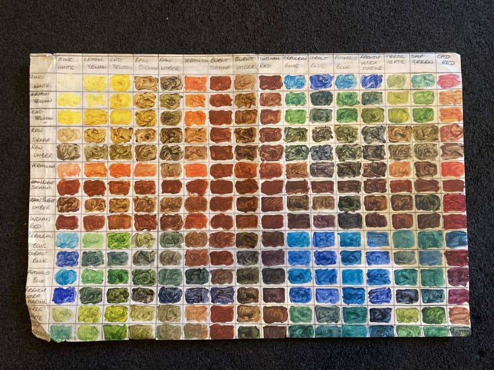
Believe me when I say it is one of the most useful skills any artist can learn. One of the most useful things i ever did to try and understand color better was to paint the chart below. You can see it has been well used.
I took every color I could find and mixed them together in equal amounts to see what happened. Some of the colors were not what I expected at all.