Color temperature is a way of describing the ‘feel’ a color gives to a painting. Different colors can create both warmth and cold in the same painting.
Learning to use the colors you have to create the feel you want in a painting. It can seem an insurmountable task at first, but there are some easy lessons that will help you create the effects you want. As with anything worthwhile, it will take time and effort, but anyone can learn.
You can see from the 2 painting of a door below. By introducing more blue to the various colors used, it gives the painting quite a different feel.

What makes a color warm?
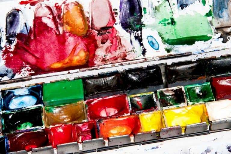
Red pigment is the warmest color. Adding red pigment to any paint will warm that color up. Yellow can warm other colors up too, but it is more of a transition color. You can get very warm yellows like a true Cadmium yellow, or cool yellows like a lemon yellow.
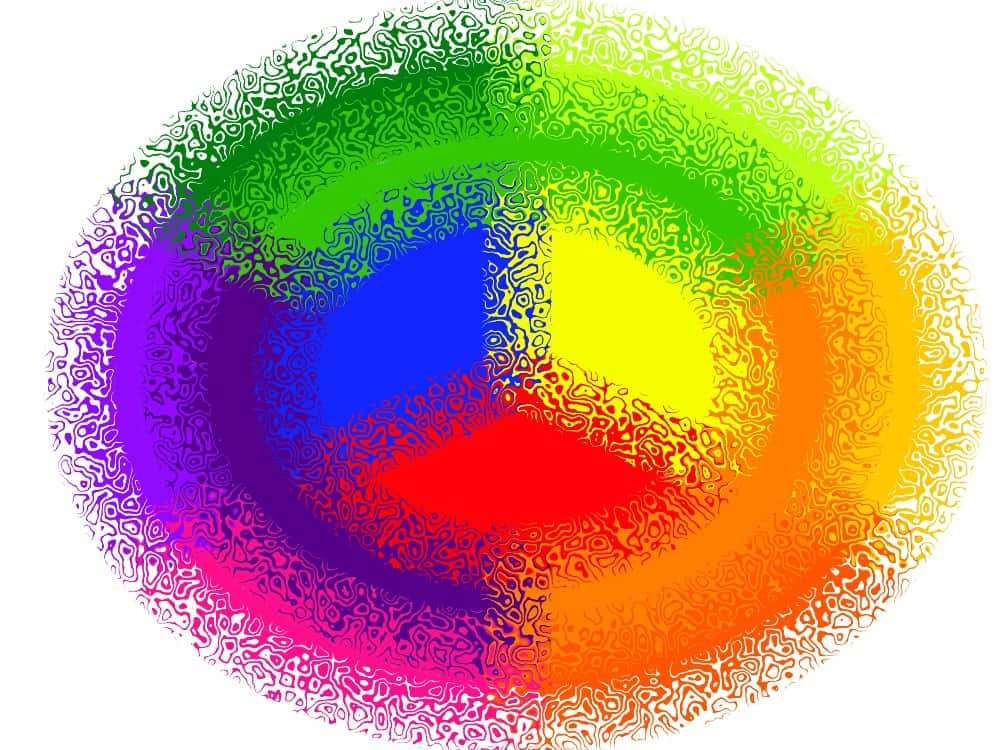
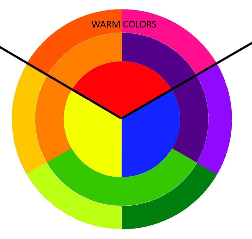
Look at the color wheel below and you will see it is split into sections. The upper picture shows the warm colors.
Personally, I would say that the colors directly outside the triangle formed by the red primary color are the colors I consider truly warm. That includes orange and the yellows that have more red in. It also includes the purples that have more red than blue pigment in.
Remember; You can ‘warm up’ colder colors and ‘cool down’ warmer colours. The boundary between what is a warm or cold color is not fixed.
What makes a color cold?
Blue pigment is the coldest color. The more blue pigment a color has in the colder it will ‘feel.’ Adding blue pigment to any paint will cool that color down.
You can see below that the colors in the area below the line can all be used to ‘cool down’ colors that are above the line. However, it is blues that will cool the painting down most of all.

Understanding warm and cool colors
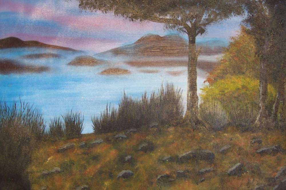
In a finished painting, the ‘feel’ of the painting comes not from any single color used. The color we see is affected by the colors around it. The painting itself will give you a context for the colors, and your brain compiles an overall feel from the image and the colors used.
You may have done a painting with a deep warm red focus point. If you surround it by cooler blues, then the overall feel of the painting will be less intensely warm and more balanced.
The reverse is also true. Maybe you are painting a cold, desolate landscape. The bulk of the painting might be blues greys and whites, but a hint of red like the reflection of a flash of sunlight can transform the feel of the finished painting.
Remember, red colors will always make a painting feel warmer. Even blues within the painting can be ‘warmed up’ by adding a little red to the paint. Blue may be a cool color, but, for example, Ultramarine blue has much more red in it than say, a Cobalt blue. So a painting that uses more ultramarine will look warmer than a painting that uses more cobalt blue.