
To mix purple paint you will need red and blue. Alizarin crimson mixed with cyan will give you a deep rich reddy purple because the alizarin crimson is a high pigment color which will try to dominate the colors it is mixed with.
Using a deep ultramarine with a light cadmium red will give you a darker royal purple color. Using a cerulean blue with a little red ochre will give you a softer more lilac purple as the cerulean blue contains more white pigment than many blue colors.
Each combination will give you a slightly different purple so experiment until you get the color you need. In time it will become obvious to you. When you see a color you will start to break it down into its component colors. Over time this will get easier and easier until it just becomes natural.
Purple is one of the secondary colors and as with any other colors you can mix different combinations to achieve the exact effect you want.
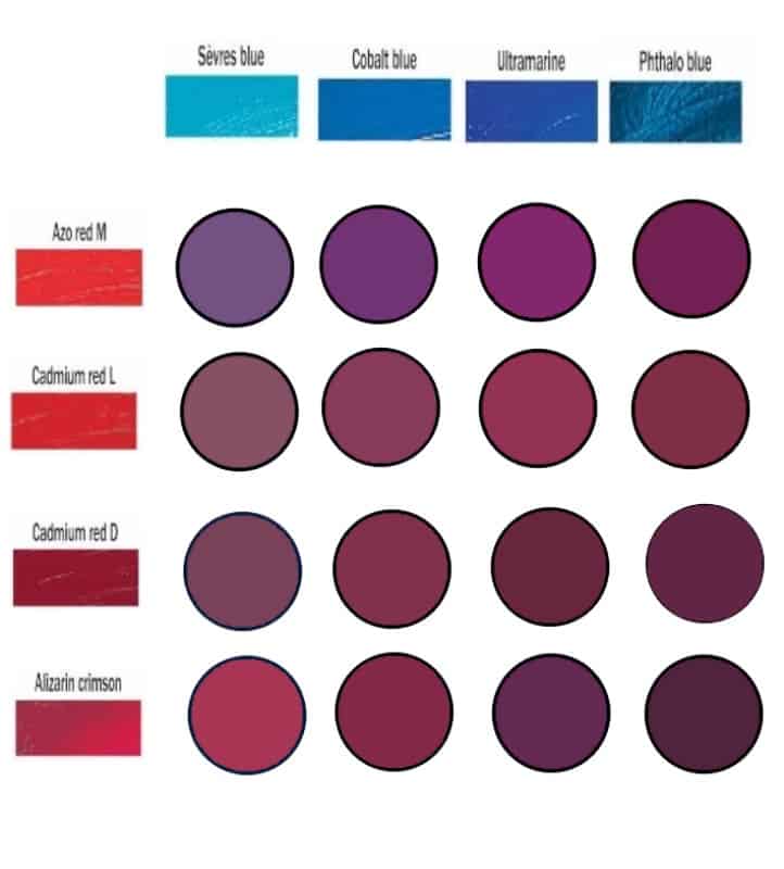
Make a purple paint chart
Making a paint chart just with red’s and blue’s will help you understand the effect of mixing the different colors more easily. You can use blue’s in all the columns and red’s along the rows. It will reveal a real variety of purple colors that can be mixed quickly and easily easily.
Because you mix purple from red and blue primary colors it can be either a warm or cool color. The color temperature will vary depending how much blue or red you use.
Mix the different red’s and blue’s you have in your chart to see the variety of colors you can create. If you spend time practicing you will begin to understand how the amount of each primary color affects the final mixed color. It will save you a lot of time mixing the exact colors you want when you are painting.
Authors note
Please note, the colors in the chart are representative. Computers will render them according to set up so the colors will vary from one screen to another. The idea is to give you an idea of the different effect that mixing slightly different colors can have on the mixed color.
Mixing purple with acrylic paints
Using acrylic paint you will need to work fast. Because the paint dries quickly you should mix a purple base color on your palette first. You can adjust the final tone on the canvas or by mixing in a little white or a darker color at the last minute if you need to. Make sure you have some clean water for mixing and a pot of water to wash the brush handy.
The colors you start with will determine the purple you get. If you want a dark purple then start with a dark blue to make it easier. Add a similar amount of a deep red until you get the purple you want.
If you want a lighter shade then add a little white until you get the exact shade you want. To darken the tone you have several options. Burnt Umber will give you a nice warm shadow, but Indigo or Prussian Blue will cool and darken the color which can be great for creating depth in your painting.
If you have a solid base color it makes it a lot easier to add thin washes, or use dry-brushing, to get the tonal differences you need. You will always have small amounts of the colors you are mixing that are left on your palette. You can use it to highlight an area that is in sunlight, or darken an area if it is in the shade.
Mixing purple with oil paints
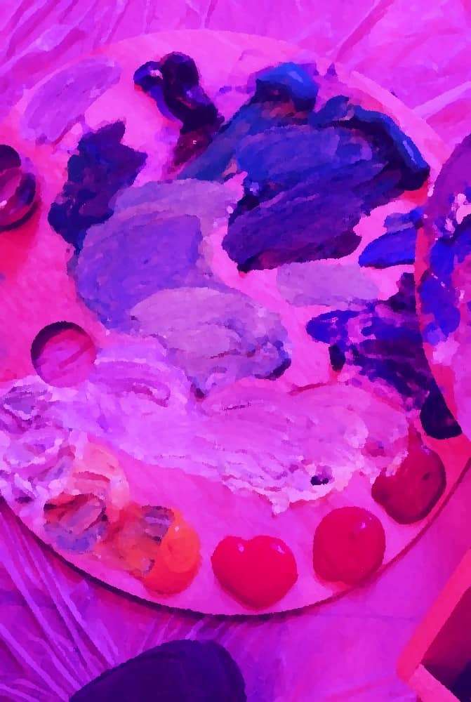
Oil paint makes mixing paint much easier because it doesn’t dry out for a long time. You can mix a chart just like the one you did for acrylics, by putting a blob of each color on some primed paper (you will need to prime the paper). After cleaning your brush, you simply blend the two colors together until they are mixed. Don’t forget to clean your brush after mixing each section of the chart.
Another trick is to run a big line of the blue oil paint you want to use across the top of the page with a palette knife. Put a blob of one red in the left bottom corner and a blob of a different red in the right bottom corner.
Scrape areas of the blue downwards until you have an uneven layer of blue paint over the upper half of the paper. Then clean the palette knife and spread the red from each corner towards the centre of the page. Where the colors get close to each other mix them. Blend them in different ways and you will learn what is possible with oil paints.
You can blend them gently and evenly with a fan brush, or mix them roughly to leave streaks of the original colors as well as the purple you have mixed.
If you add different amounts of each color and mix them in a small area then you can run that paint into the other colors to adjust the tone again.
Mixing color gradients with oil paints
Similar to how we did above take a palette knife and put a blob of the red and blue paint you are using on a primed piece of paper, then put a smear of white across the top of the page and a smear of Burnt Umber across the bottom. Mix the red and blue across the middle roughly to begin with and spread the colors gradually out towards the white and Burnt Umber.
Study the different colors you end up with closely and you will start to see how much of each color you need to get the purple you want.
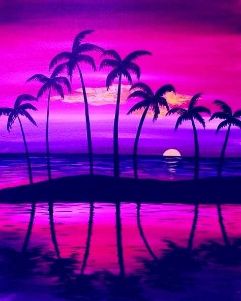
Blend in the light and dark to give yourself a complete tonal range for the purple color you have mixed. You can do this with any combination of blue and red. You will discover dark moody purple’s made from Alizarin Crimson and Prussian Blue. These are perfect for stormy skies.
Cadmium Red and Ultramarine Blue will give a dark Lavender shade. Cobalt Blue with Napthol Crimson gives you a much cooler purple, but you may not see the real difference in many of the colors until you start adding a little white.
Mixing purple with watercolors
You need to remember the paper is your white with watercolors. Don’t add too much pigment all at once.
If you use plenty of water you can mix the paint on the paper if you find that easier. I tend to mix the paint on my palette a little first. Remember you don’t need the exact color because you can add and adjust the tone as long as it isn’t too dark.
With most colors I try to mix the tones lighter at first and then darken them gradually as I paint.
Don’t paint dark areas too big, too quickly. It can be difficult to lift paint off if it gets too dark. When you do need to lift some paint off, dampen some kitchen roll and squeeze out any excess water, then gently dab on the areas that have got too dark and it should lift some of the color off the paper.
With watercolors it is easy to use thin washes. You can gradually adjust the tone as you paint. Adding a little Burnt Umber to your red and blue should give you a color dark enough for most of the shadow. If you need more highlights then try to lift pigment off as I describe above to leave the paper showing through.
Discover the variety of purples you can make
Different blue’s and reds really do give you a dramatic variety of colors. Ultramarine blue is on the very edge of purple and has a lot of red pigment already in the mix so will always give you a redder purple when used in the mix of colors.
Prussian Blue is one of my favourite colors and has a very different effect on the same red’s. It is a dark, high pigment content paint and is very dominant unless used with another strong color like Alizarin Crimson.
Using a lighter red like Cadmium red with a lighter blue like Cyan will give you a lighter brighter purple. It sounds simple and in many ways it is, it just takes practice to recognise the colors you need to start with.
If you need a more earthy purple then mixing Red Ochre and Ultramarine blue can work, but be careful. Adding too much of the Red Ochre can quickly send the mixed color too brown.
Final thoughts
Purple is a color that was once restricted in its use. It could only be used by royalty or the religious leaders. In many cultures it has played a pivotal role with countries becoming rich because they were the only source of purple dye and pigment.
Luckily today it is available to everyone so we can all enjoy it. Enjoy your journey discovering the many different purple colors you can mix
Try to understand the effects the different blue’s and red’s have and as your skills grow you will find it easier to mix the exact colors you want, quickly and easily.