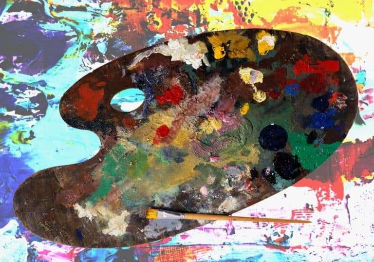
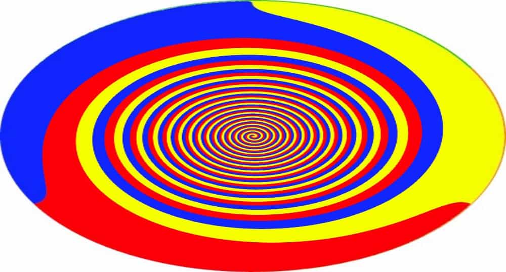
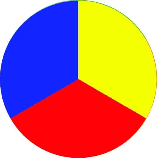
Primary colors are the 3 basic colors blue, red and yellow that all other colors are mixed from. You cannot mix them by using other colors. By using different proportions of each pure color you can actually mix any color you want.
You will find them at the centre of any color wheel. A color wheel is an easy way to represent the way colors interact with each other. This is something that will help you understand how to use color to help you with every painting you do
What Are Primary Colors?
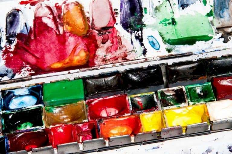
There are 3 primary colors. They are red, blue and yellow, but most commercial colors are not a pure color. For example, Ultramarine blue has reds within the primary blue tone.
Some companies do make colors they label as primary red, primary blue and primary yellow. These are usually pretty close to a pure color. and make color mixing much easier if you decide you want to work from a basic 3 color, white and black palette.
How to use primary colors
With these basic but important three colors you can mix any color you will ever need. Learning to mix colors like this will give you a better understanding of color overall. You will see colors in a different way. Mixing them well will take practice, but it will improve your color control and give your painting new life.
Learning to mix all your colors from 3 tubes of primary paint can save you money too. You will need a white and a black (or dark grey) to adjust tones but every other color can be mixed like this.
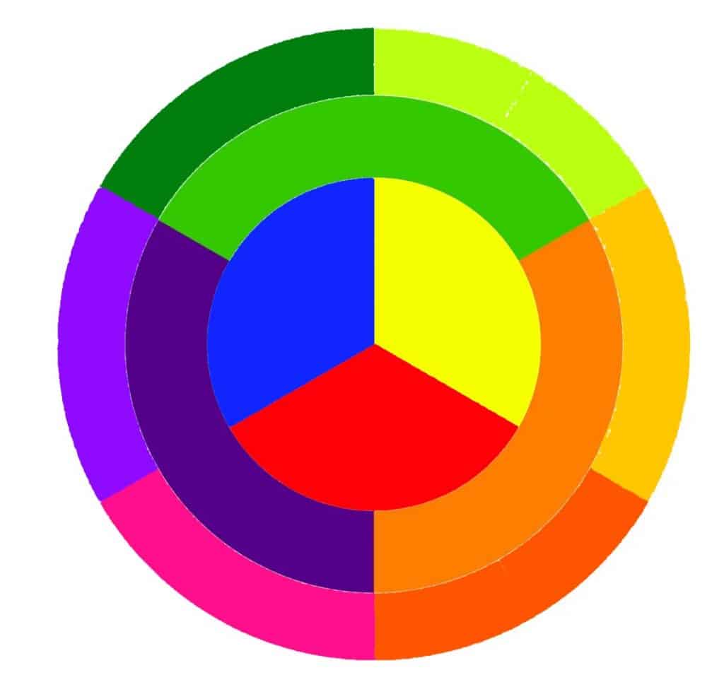
To start with you should try to mix some secondary colors. You can read more about these in our article ‘Secondary Colors: What They Are and How to Create Them’. Experiment and look at the effect of adding a little more or a little less of each primary color.
In our article ‘Understanding Warm and Cool Colors’ you will learn how color temperature affects the way we see things too. Learning how to ‘Warm up’ a cool blue or ‘Cool down’ a rich warm red will help you create depth in your pictures as well as create the ‘Feel’ you really want.
Make yourself a color chart. Draw a grid on a piece of primed paper and compare the results you get by mixing each of the colors in varying amounts.
Mistakes people make when using primary colors for color mixing
If you mix all 3 primary colors together you will often just end up with a muddy brown color. These browns are great when you are painting something brown like the earth in a landscape, but it is easy to end up with a painting looking like a dog has run across it with muddy paws.
If you are painting wet on wet with oil paints this can be a particular problem. You will need to think carefully about the colors you want to create before trying to mix them. Try using 2 of the colors and then adding small amounts of the 3rd color very slowly. This way you will understand how to achieve the results you want.
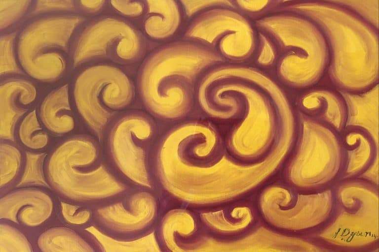
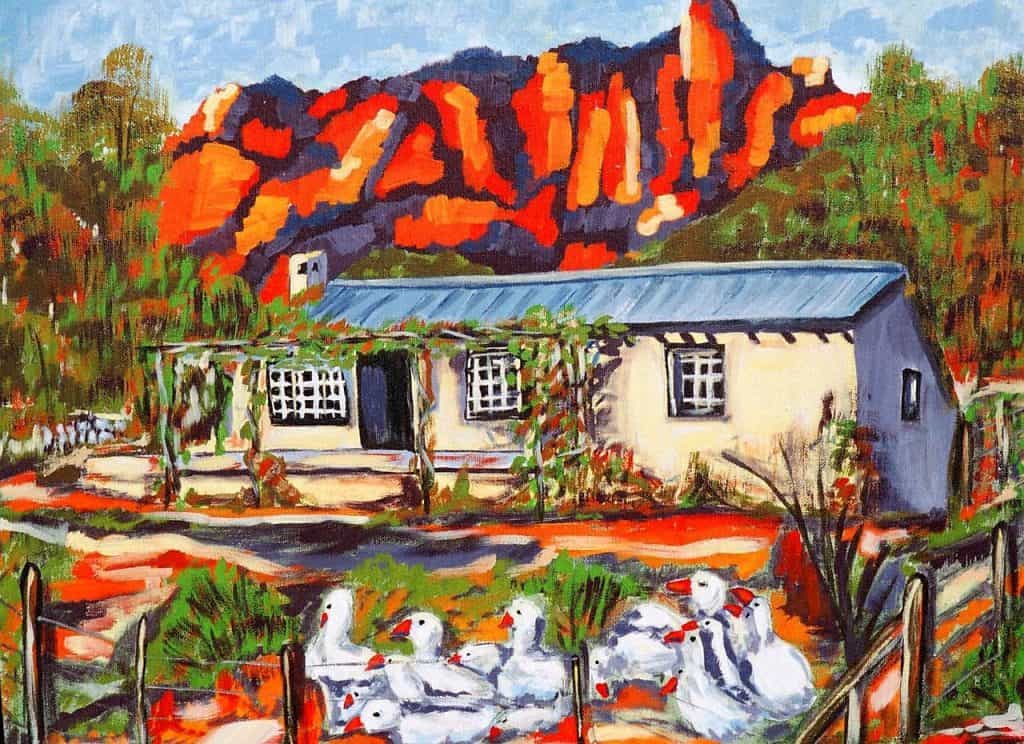
Understand the difference between color and tone so that you can darken or lighten the paint to get the results you really want. Learn how to use the darker and lighter shades of the same color and you will see how it can help you create a real 3-dimensional effect in your paintings. You can see how in the painting below, the artist wanted to make the cliffs in the background really prominent. By using the warm reds they have made them really stand out.
Final Thoughts
Understanding primary colors and the way they can be used will save you a lot of time and effort if you practice. It can be hard, but over time your ability to create exactly the color and shade you want from just 3 tubes of paint will get better and better.
You will never have every color you need in a tube, however many tubes you have. Learning to mix your own colors allows you to find those exact shades you want in a way you simply cant do if you don’t learn how to use color well.
One thing to consider is that these lessons apply to paint pigment colors. Colors on a computer monitor and digital design suite work differently.
This is because in essence you are mixing light not pigment. To understand this you need to work on a slightly different color wheel.
Different artists will use different systems. The most common are called RGB or CMYK based color systems. RGB is based on using red, green and blue as the primary colors. CMYK uses cyan which is a fairly light blue, magenta which is a deep red, yellow and black as what is called the ‘key color’. I will explain this in more detail in a future article.
Take a look at our painting tutorials and our other articles about understanding how to improve your use and understanding of color in paintings.
If you have any other questions or would like information about a particular art topic then feel free to ask using the comments below. If we can help we will.