Creating depth in a painting can seem difficult. It can be a little daunting, but there are several ways to make it easier. Whether you are painting a portrait or a landscape, creating depth will make the painting look more real and alive. Even with abstract paintings creating layers of interest can add a lot to the painting.
There are some basic, easy to implement rules, which will help you achieve realistic depth within your pictures. They will help you emphasize the shape of objects within the painting too.
There are some extra points from one of our resident experts below too that I am sure will help.
Here is a list of points that will help you re-shape your paintings. Some can be applied to drawings too. Without color the best methods to use will be slightly different but most techniques can be applied equally to a drawing as a painting.
Perspective
Understanding how to use perspective in a painting is vitally important if you want the painting to appear realistic. It is a huge and complicated subject misunderstood by many.
In short, the further something is away the smaller it will appear. This is what some people will call a scale shift. To really understand perspective though, this is only the beginning. Understanding perspective properly will take time. You will have to spend time trying to grasp the basic concepts and training your eye to see the way perspective works when painting any given subject.
The principle may be the same but how perspective is applied to a portrait is different to how it is applied when painting a landscape. This does warrant a complete article of its own so for more a detailed description of how to understand perspective see our other article here. It will give you a much better understanding.
As objects get larger so will the gaps between them
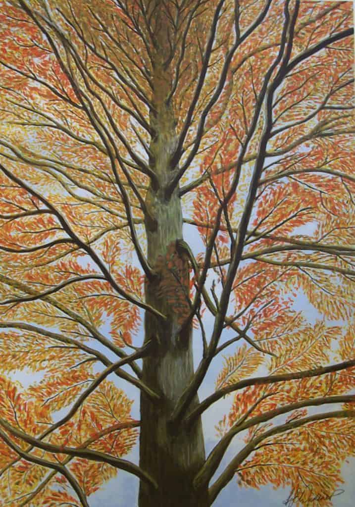
As with objects getting smaller as they get further away, so will the spaces between those objects. This really shows when the objects are evenly spaced. With a road the white lines will look shorter with smaller gaps as they run into the distance.
Trees planted in orderly lines will look closer together as they run into the distance and further apart the closer they get. Being careful with this gradual change will help give the illusion of depth. You can use diagonal lines to help define the sizes of objects but don’t forget the change in the size of the gaps.
Use tonal differences
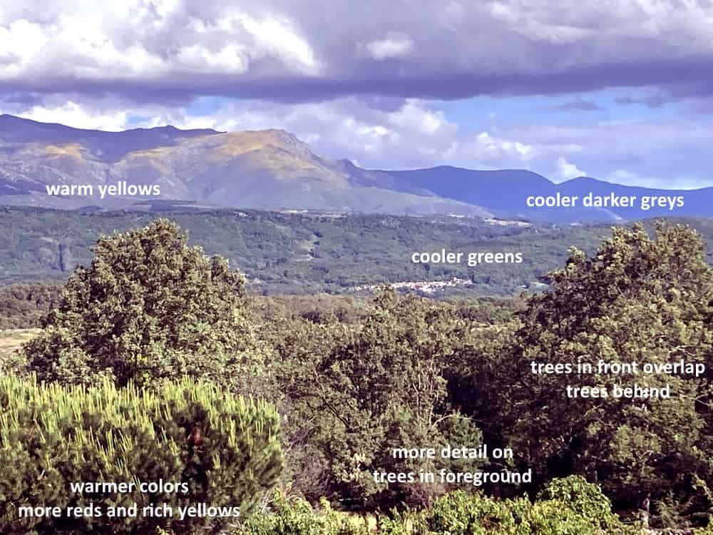
Objects that are closer will have more extremes of light and dark. Whereas objects that are further away will have less extremes of color. For example, black to white in the foreground becomes light grey to darker grey in the background.
This is something a lot of people overlook. As things get further away the color should be more washed out. The tones less intense.
If you look at a forest stretching off into the distance you really can see the difference. In the foreground the greens will be much more intense.
You will see the differences from dark to light much more clearly in the trees closest. The trees that are further away will still have a color difference in the canopy of leaves. However, what you see will be less distinct changes in tone.
Look for the shadows and highlights
The shadows will not be so dark in the distance and the highlights wont be as bright. This is another area that is sometimes hard to see unless you really study it.
Our brain knows what colors are there because it compares them to the similar trees in the foreground and fills in the color. Try to see what is actually there rather than what you know the colors would be if they were closer.
Try to train your brain to see the colors as they are. This will take time and a lot of concentration, but it is possible. You will never switch off the effect your brain has completely, but it is important to see beyond that.
Use color temperature
Warm colours appear closer, cooler colours appear more distant. Remember this rule, it is another really important skill to master. It will help you at times when nothing else seems to work.
Maybe it may sound ridiculous to add reds to the leaves in a tree. However, If it is a bright sunny day then there may well be flashes of reds and warm yellows where the sunlight actually hits the leaves.
Adding warm colors will bring objects in the painting forward
Adding a warm yellow may brighten up the whole color too much. If so, when you have added the yellows to warm up the color you can always take the tones back, leaving just a hint of the warmer color.
This works really well when you start to wash out the colors more in the distance too. As the trees get further away if you add a little light blue or even blue grey, the tonal intensity will become more subdued.
Cooler tones will move the object back into the distance
Instead of a mass of similar greens you will see the warmer more intense tones in the foreground stand out much better. At the same time, the more subdued, cooler tones will make the trees in the background look further away.
There will always be exceptions. Like when a flash of bright sunlight hits a hill far in the distance and the whole area appears flooded with color, but this is where your observation skills come in. Practice just looking around you and seeing how distance affects the colors in your own environment.
If you live in an area where the buildings are built of a clean bright stone, you will notice as they get further away they begin to look slightly darker. The light hitting them has further to travel before it reaches your eyes and so will be slightly less intense.
Include detail and texture in the foreground
Objects in the background will show less detail and texture. Objects in the foreground will be much more detailed with sharper clearer lines. You see the individual leaves in a tree close to you. In the distance you will just see the tonal changes within the trees canopy. The individual leaves wont be visible at all.
Whatever you are painting, the details will get less defined as they move into the distance. Edges will be less sharp too. Study the landscape as you pass and try to see the subtle but distinct difference in the way the details look.
Study the paintings and drawings of some of the grand masters to see how they have captured this. Keep the small details for anything in the foreground. Always practice your observation skills. They will reveal a lot to you and you can then apply that to any painting.
How to overlap and layer objects
If an object overlaps another, it becomes obvious that the object is in front of the object it overlaps. This might sound basic and it is. However, you will be surprised how often simple mistakes slip through when you are painting.
Using the example of a tree again. The branches that stretch out towards you may not be obvious, but the leaf clusters on the end of them will always be the thing that overlaps the rest of the trees canopy.
Our experts advice
Frederic P. Lebeuf, Owner and founder of Bombing Science and accomplished Graffiti Artist added something here that I think gives a slightly different perspective.

“Adding depth to your artwork or images is something that can be done relatively easily in GIMP. You can make something look like it is farther or closer to the viewer by adjusting these settings.
First, you can adjust the shadows and the contrast. Increasing the contrast makes the visible elements in your pictures darker and the hidden elements lighter. This makes your picture appear to have more depth.
Another setting is the gradient layer. You can create more depth by making the top of your image lighter than the bottom of your image.
Lastly, leaving white backgrounds and edges on your images can make your art look more realistic. It can create the notion that your picture is popping out from the background.”
Words from another expert

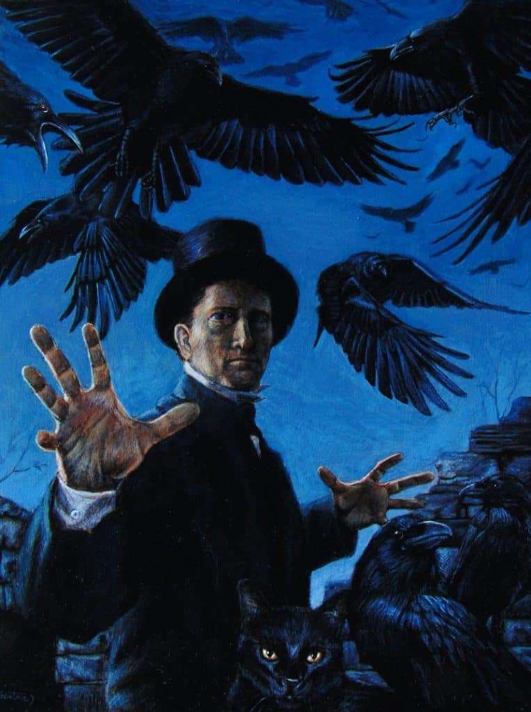
A more in depth analysis comes from Chris Semtner, Visual artist, author, and Curator of the Edgar Allan Poe Museum, Chris Semtner has curated and designed critically acclaimed exhibits for museums and galleries across the country.
“If the painter is a magician, there are several different tricks at his disposal for creating the illusion of depth in a picture.
In the painting An Unkindness of Ravens, the hand outstretched toward the viewer is significantly larger than the other one. This produces the impression that the forward hand is closer to you.”
Chris continues, “Another trick is atmospheric perspective. This is about the way objects in the distance appear paler, hazier, and cooler than objects closer to the foreground. Take a drive in the country and notice how different the colors of the trees on the horizon
Remember that objects in nature don’t have sharp transitions between light and shadow. Shadows have soft edges, so make sure all of your edges are just a little blurred. Blurring is not just for backgrounds, either. If you want to achieve the illusion of depth, get rid of all the hard edges in your painting. With oils, you can just blend them with a soft brush while the paint is still wet.
With acrylics, which dry almost immediately, you can paint the foreground first, and then, when you back the background around it, just drag just a tiny bit of the background color over the edges of the foreground objects.
Then there is contrast. Rembrandt made light figures stand out against a dark background, and Vermeer made dark figures stand out against light backgrounds. In the attached painting, the black ravens, the jacket, and the top hat appear to be in the foreground because they stand in sharp contrast against the blue sky.
The greatest trick of all is creating the illusion of light. The realistic depiction of light striking a surface goes a long way to adding a sense of depth to a painting. Take a look at the painting Maria. The sense of depth is achieved without linear or atmospheric perspective. Instead, I simply used the light.
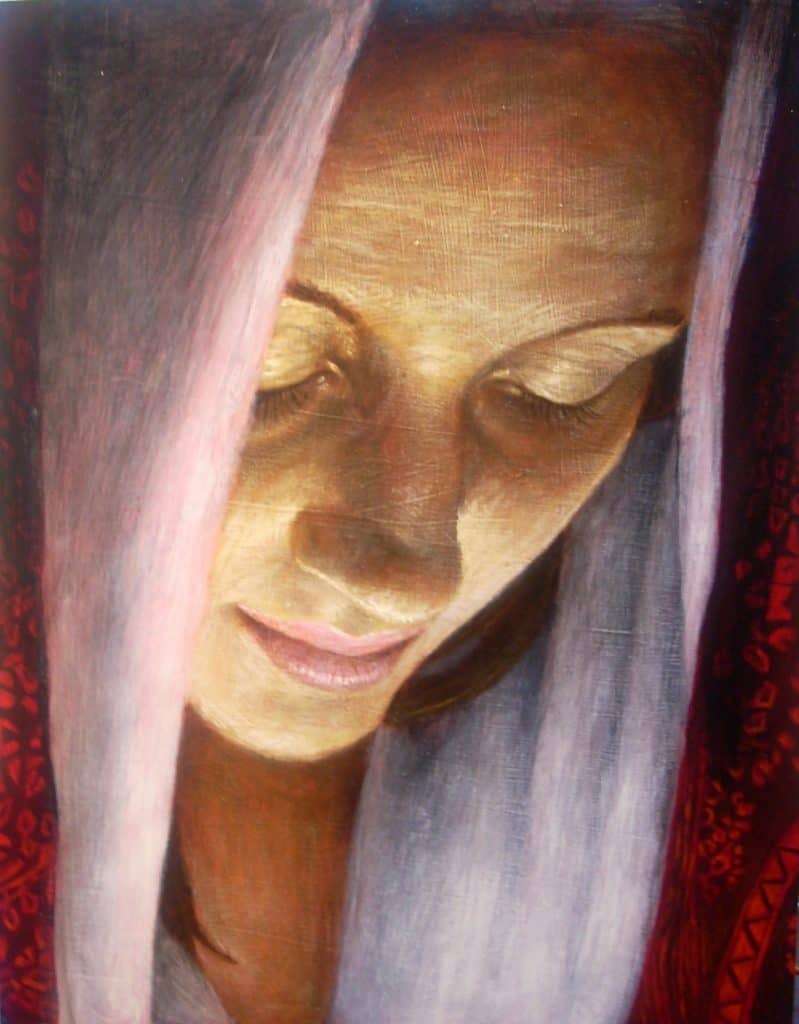
More specifically, I thought about the direction from which the light was coming. Since the light striking an object is brighter the closer it is to the light source, you can tell the light is coming from beneath Maria because her chin is brighter than her forehead.
When composing your picture, think about the direction the light is traveling and how it will reflect off of each of the objects it strikes along the way. Even if you don’t draw very well, you can still create convincing depth in your paintings by getting the light right.
Making a flat surface covered in paint fool the eye into seeing depth and distance requires just a little bit of magic but using linear and atmospheric perspective, blurred edges, contrast, value range, shadows, highlights, directional light, and gloss varnish will help you conjure up a convincing illusion.”
Final thoughts
Experiment a little and look at how each point works individually. Then you can think about how you can use them all together in the same piece of artwork. Once you grasp the basics, every painting will become easier to construct. This will make the end product more 3-dimensional and much more interesting to look at.
Remember, As objects move further away colors will have less contrast. The tones will also get weaker and cooler. You will also see less details and there will be less definition with hazy edges instead of clear lines
As objects come closer, colors will have more contrast. Tones will also get stronger and warmer. Ant details in the foreground will be much sharper and more defined, will clear crisp lines.
There are other factors that help. Observation is the key to many of these points and should be something you practice constantly. Even if you paint in a surrealist style, you can use the rules to create that surrealist atmosphere within the painting.
To paint in a realist style requires you to exercise those observational skills and put them into action. To paint in a surreal style, you must first observe reality to replace it with the surreal.
And always remember, enjoy practicing. Celebrate the mistakes you make. They are what you will learn most from. Art should be a joyous thing. Happy painting everyone.