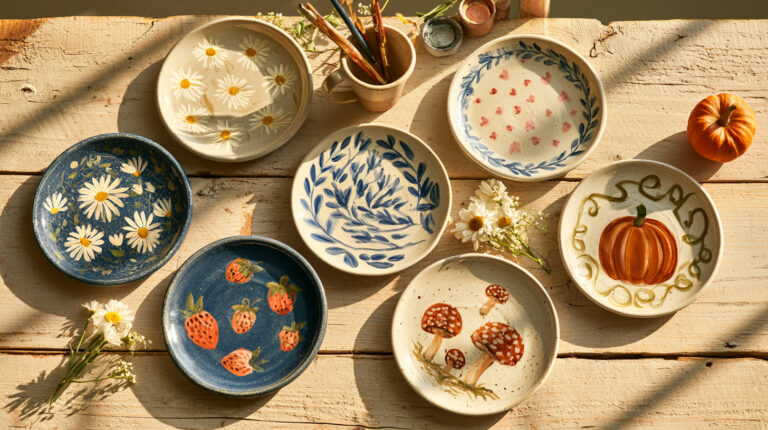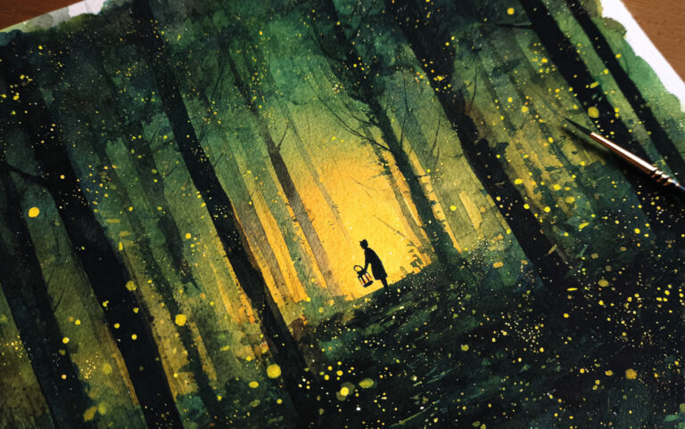

Watercolor can completely change the feel of a bullet journal page without making the layout complicated. A pale wash behind a heading, a few loose flowers around a calendar, or one bright splash of color can be enough to make an ordinary spread feel much more personal.
You do not need advanced watercolor skills either. Some of the most effective ideas below use simple washes, loose shapes, and small painted details rather than full illustrations.
If you are just getting started, keep the water fairly controlled and test your paint on a spare page first. You can also use watercolor brush pens when you want the softness of watercolor with a little more control.
Can You Use Watercolor in a Bullet Journal?
Yes. Watercolor works well in a bullet journal as long as the paper can cope with the amount of water you are using.
Start with light washes rather than soaking the page, and let each area dry before adding another layer or writing over it. If your journal paper buckles easily, keep the painted areas small or create the watercolor element separately and add it to the page once it is dry.
The goal is not to turn every journal page into a watercolor painting. Often, a small painted accent gives you all the color you need.
Simple Ways to Use Watercolor in a Bullet Journal

Watercolor can do more than decorate a page. Used deliberately, it can separate sections, emphasize important information, link facing pages through a shared palette, or simply change the mood of a spread.
Use a light wash behind a title block or heading to make important information stand out without adding a heavy border.
Replace thick divider lines with pale watercolor borders when you want to separate sections more softly.
Repeat the same two or three colors across facing pages to connect different layouts and illustrations visually.
Let one layer dry before adding another when you want deeper, richer color without flooding the paper.
Pair black lettering with bright or contrasting washes for stronger impact, or use muted tones when you want the page to feel gentler.
You also do not have to paint realistically. Loose washes, partial sketches, and suggested flowers or leaves can be enough to give a page atmosphere and personality.
25 Watercolor Bullet Journal Ideas
Watercolor works especially well in a bullet journal because you can use as much or as little of it as you like. Some of these pages make the painting the main feature, while others use flowers, leaves, seasonal motifs, or soft washes simply to frame the practical parts of the layout.
The ideas below range from weekly planners and trackers to relaxed notes pages, so you can borrow the whole layout or simply take a color palette, flower, or border you like and make it your own.
1. Blush Peony Monthly Calendar
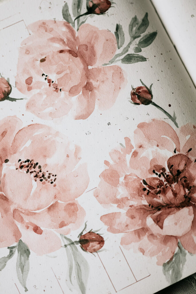
Soft blush peonies make a monthly calendar feel decorative without hiding the structure underneath.
The flowers take up the outer areas of the page while the calendar grid remains lightly drawn and easy to use. The muted pink, green, and burgundy palette also makes this a lovely option for spring or an understated floral monthly theme.
If you want to recreate the look, keep the calendar lines thin and let the watercolor flowers provide most of the visual weight.
2. Lavender Watercolor Weekly Planner
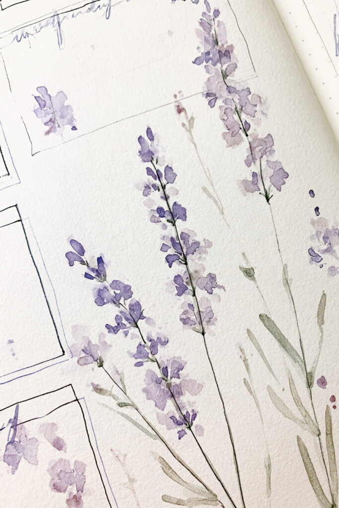
Lavender is a natural fit for a calm weekly spread.
Here, loose purple flower stems grow between and around simple planner boxes rather than being confined to a separate illustration. That gives the page a relaxed sketchbook feel while still leaving plenty of space for plans and reminders.
A limited palette of lavender, soft green, and a little blue helps the layout stay cohesive even when several boxes are used.
3. Pansy Watercolor Mood Tracker
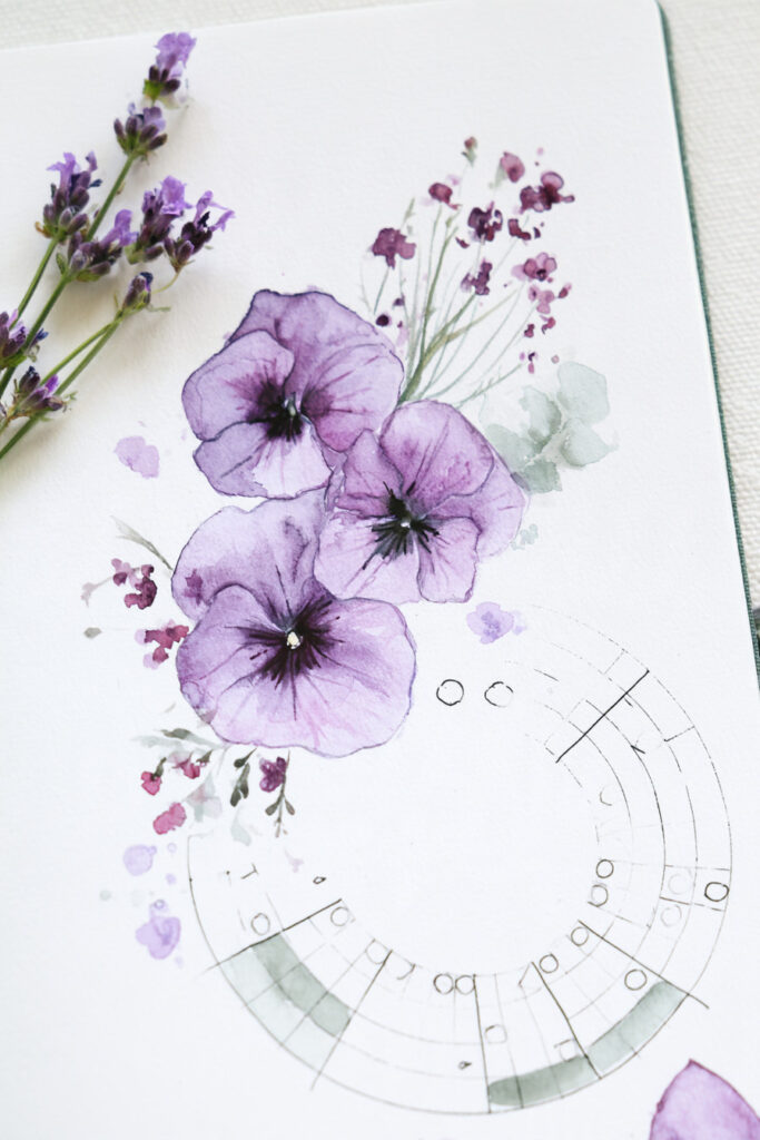
A circular mood tracker becomes part of the artwork when it is surrounded by large watercolor pansies.
The segmented ring gives you a clear place to record each day, while the purple flowers soften what could otherwise feel like a very structured chart.
This is a good example of letting the functional part of a bullet journal remain simple while putting the creative detail around it.
4. Eucalyptus Minimal Weekly Columns
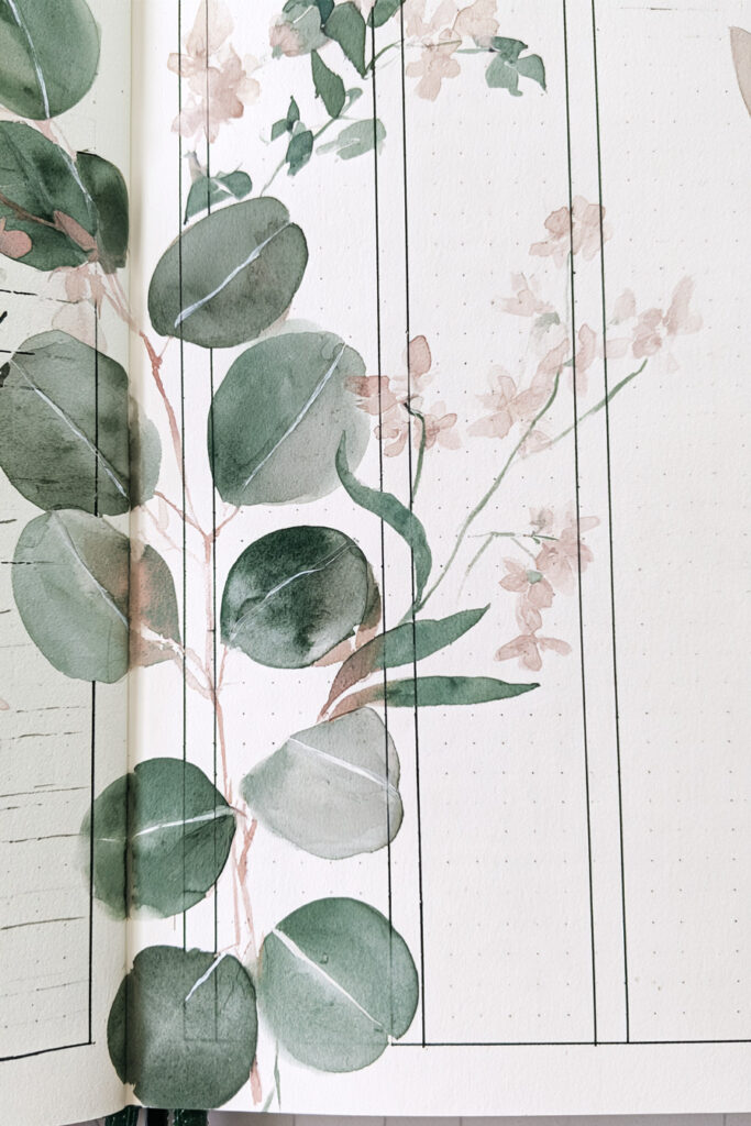
If you prefer cleaner bullet journal layouts, try pairing watercolor with a simple column structure.
Tall weekly columns leave most of the page open for writing, while eucalyptus leaves and a few pale blossoms create a botanical layer across the layout.
The muted green palette keeps the artwork noticeable without making the spread feel busy. It is an especially useful approach when you want watercolor in your journal but still need plenty of practical writing space.
5. Anemone Circular Tracker
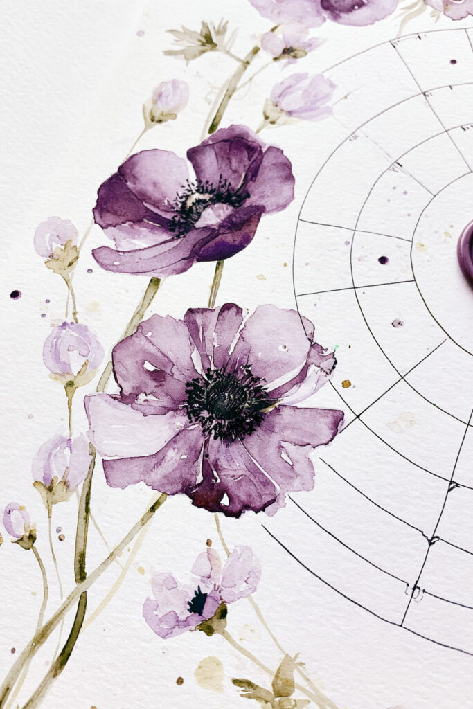
Deep purple anemones give this circular tracker a much bolder floral look.
The tracker itself uses concentric rings divided into small sections, while the flowers sit alongside the chart rather than covering it. That contrast between precise lines and loose watercolor is what makes the page interesting.
A circular layout like this could work for habits, routines, wellness tracking, or another month-long goal.
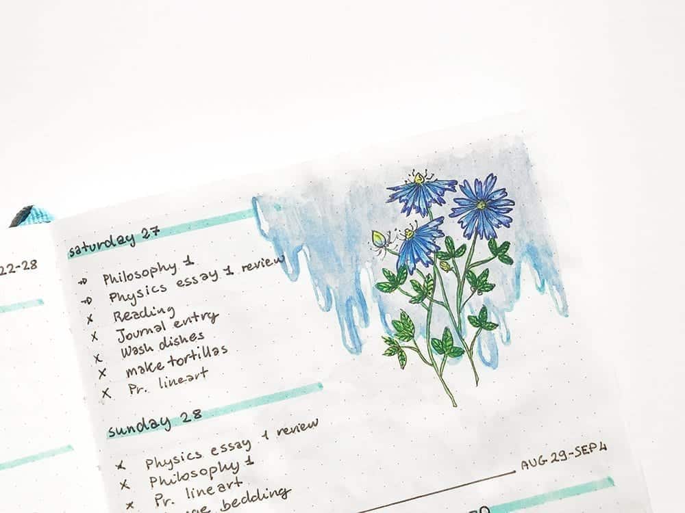
6. Blue Cornflower Habit Tracker
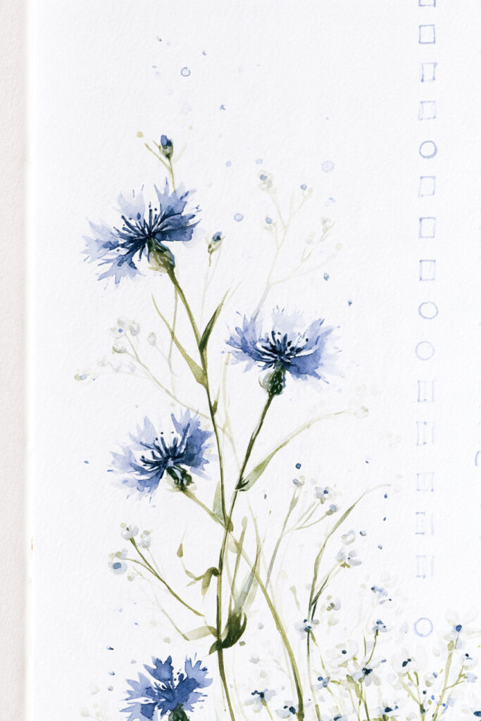
This habit tracker uses rows of small boxes alongside airy blue cornflowers.
Because the painted flowers stay concentrated along one side of the page, the tracker remains easy to scan. The thin stems and scattered blue pigment also keep the layout feeling light rather than heavily illustrated.
It is a nice format to borrow if you want a practical tracker with just one strong botanical focal point.
7. Purple Iris Tracker Grid
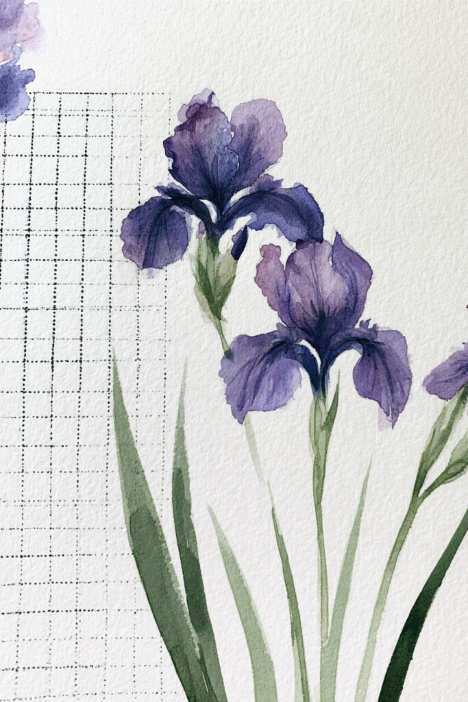
A watercolor tracker does not have to be surrounded by tiny decorations.
Large purple irises create a dramatic focal point beside a fine grid, giving the page the feeling of a botanical study while preserving the practical tracking area.
The tall flower shape works particularly well beside vertical grids and lists because it follows the natural direction of the layout.
8. Magnolia Progress Tracker
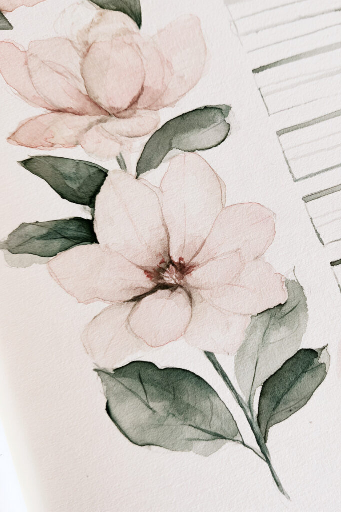
Soft magnolia blossoms pair beautifully with simple progress bars.
The flowers bring movement and softness to the page, while the narrow horizontal bars provide clear spaces for tracking progress toward different goals.
This could be adapted for reading goals, project milestones, savings, study progress, creative challenges, or anything else that is easier to understand visually as it moves toward completion.
9. Pink Cosmos Checklist Page
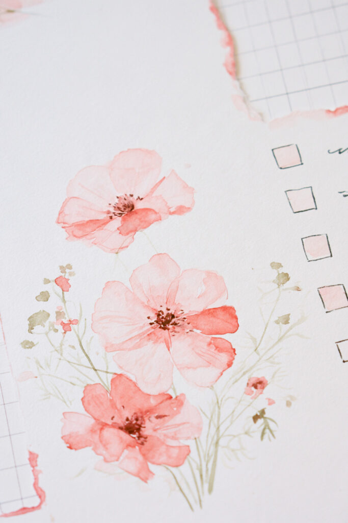
A basic checklist instantly feels more personal when a loose cluster of pink cosmos and tiny wildflowers grows around it.
The boxes themselves remain uncomplicated. Most of the personality comes from the translucent pink petals, fine stems, and tiny scattered flowers surrounding the list.
This is one of the easiest layouts in the collection to adapt because you can use the same idea with almost any flower or color palette.
10. Autumn Leaves Checklist
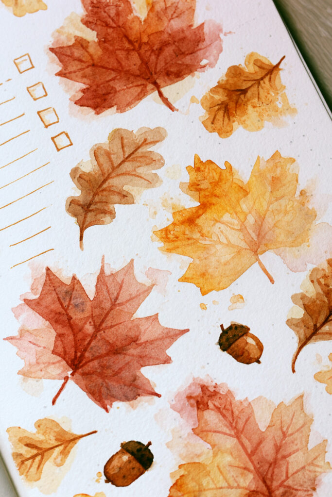
For an autumn bullet journal theme, let the seasonal artwork become the border around a simple checklist.
Loose maple and oak leaves in rust, ochre, orange, and muted red fill the page, with a few tiny acorns adding another woodland detail.
The checkbox list stays deliberately plain. That balance keeps the page functional even though the watercolor takes up a large amount of visual space.
11. Daisies and Wildflowers Notes Page
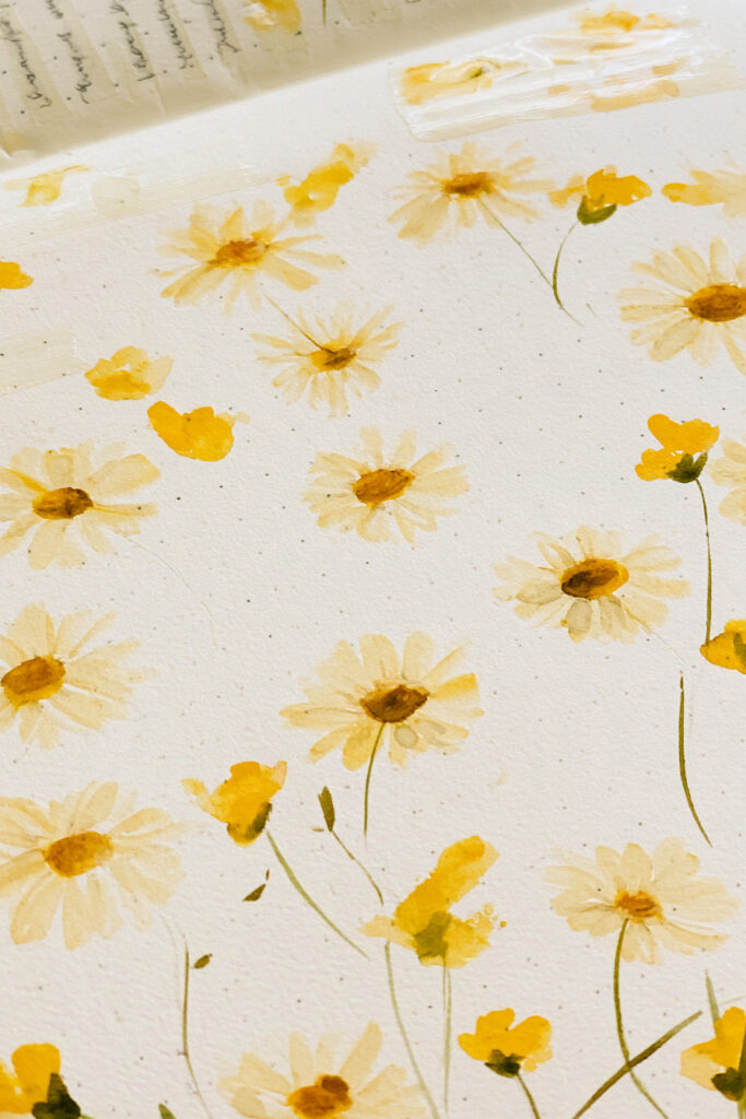
Yellow daisies and tiny meadow flowers create a cheerful background for simple bullet-point notes.
Rather than placing the flowers in one neat bouquet, they are scattered loosely across the page. That makes the spread feel more like a watercolor sketchbook than a formal planner template.
You could use this format for ideas, reminders, things to research, monthly highlights, or a running list of anything you want to remember.
12. Sweet Pea Numbered List
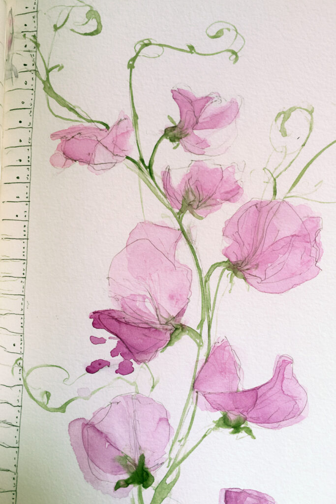
Delicate pink sweet peas are a lovely match for a long numbered list.
The climbing stems naturally follow the edge of the page, creating decoration without using up the central writing area. Their loose, translucent petals also keep the whole spread soft and informal.
This layout would work well for goals, books to read, project ideas, seasonal plans, or a numbered challenge.
13. Rose Watercolor Page Border
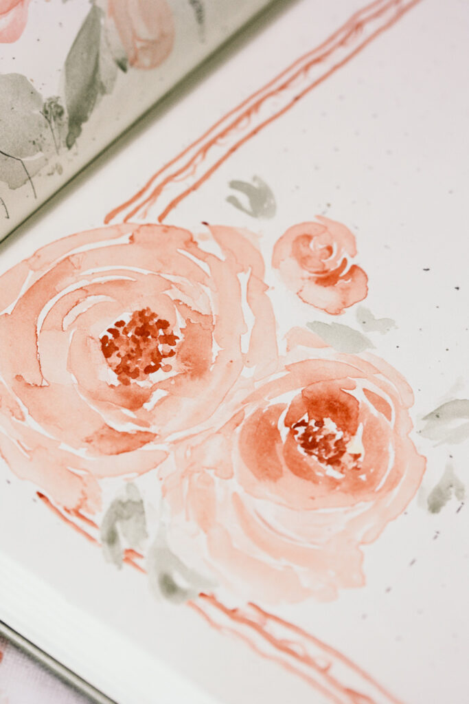
Sometimes the watercolor itself can provide the structure of a journal page.
Large peachy-pink roses and loose green leaves create a decorative border while the center remains relatively open for writing.
You could use the same idea around a quote, monthly reflection, journal entry, title page, or even a simple weekly plan. Keeping the flowers mainly around the perimeter stops the decoration from competing with your notes.
14. Tiny Hydrangea Calendar Corner
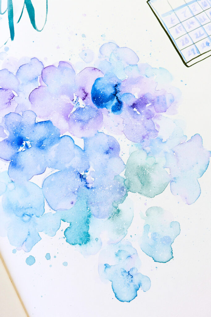
A small calendar does not need to dominate the entire page.
This layout places a compact grid in one corner while a loose cluster of blue, lilac, and turquoise hydrangeas becomes the main visual feature.
It is a useful idea for journal pages that need a quick date reference but are primarily being used for notes, reflections, or creative writing.
15. Butterfly Watercolor Notes Page
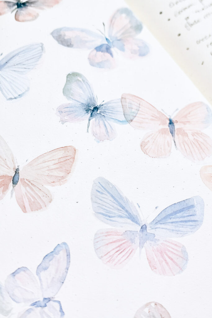
Soft blue and blush butterflies create a wonderfully light notes page.
Instead of using one large illustration, the butterflies are scattered across the paper at different angles and sizes. Their translucent wings leave plenty of white space between them, so the page never feels crowded.
This would be an easy theme to adapt for spring journaling, personal notes, quotes, or a simple brain-dump page.
16. Bird and Branch Journal Page
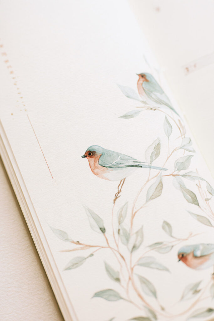
A few small birds perched among thin leafy branches create a much quieter kind of watercolor bullet journal page.
The soft greens, warm peach details, and generous white space make the illustration feel calm and almost storybook-like.
This style is especially suited to reflection pages, morning journaling, gratitude lists, or personal writing where you want the artwork to create atmosphere rather than organize information.
17. Citrus Watercolor Planner Page
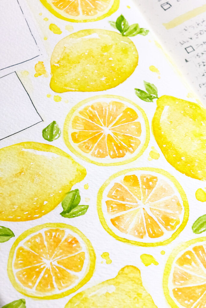
Bright lemons bring instant energy to a planner spread.
Whole fruits, lemon slices, green leaves, and small splashes of yellow watercolor surround the more structured planner elements. Because the artwork uses such a limited palette, the page still feels coordinated despite the bold color.
This would make a fun summer bullet journal theme, particularly if you repeat small yellow accents across the month’s weekly pages and trackers.
18. Coastal Watercolor Journal Page
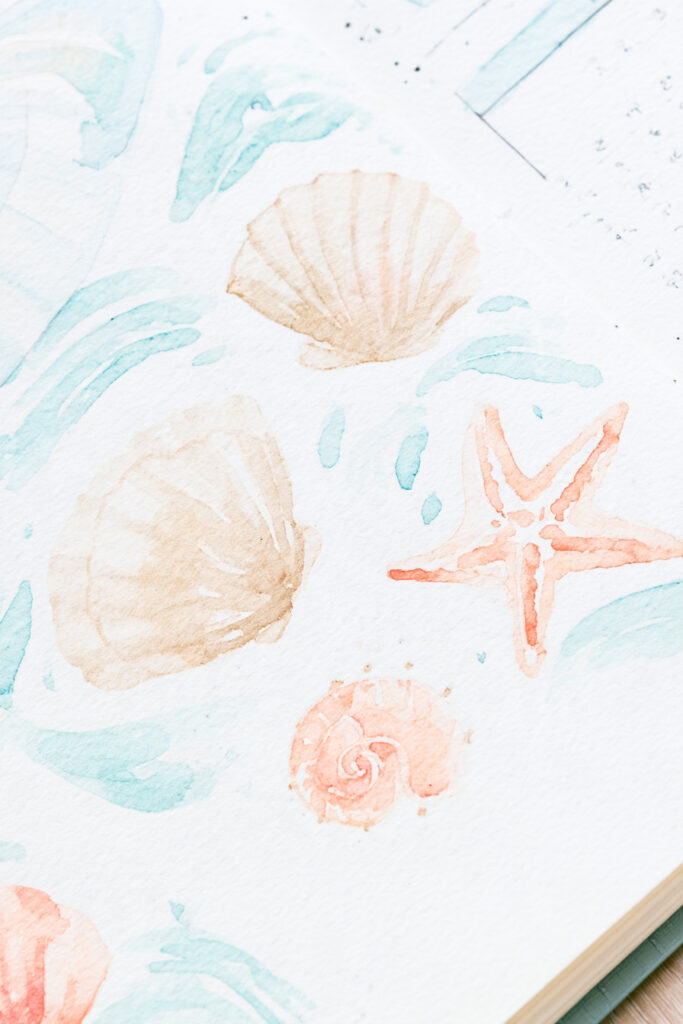
Shells, a starfish, and pale blue water-inspired brushstrokes create an easy coastal journal theme.
The washed-out aqua and peach palette keeps the page gentle rather than turning it into a brightly colored beach illustration.
It would work nicely for summer journaling, holiday memories, a coastal-themed monthly cover, or simply as inspiration for a softer blue-and-sand color palette.
19. Travel Watercolor Journal Layout

Tiny painted travel motifs can tell a whole story without one large illustration.
Passports, stamps, globes, stars, tickets, and other small objects are scattered across this page in muted blue, teal, peach, and ochre.
A layout like this works especially well for travel memories because you can add different little objects as the trip unfolds. Leave gaps between the illustrations for dates, places, short notes, and memorable moments.
20. Forest Mushroom Bullet Journal Layout
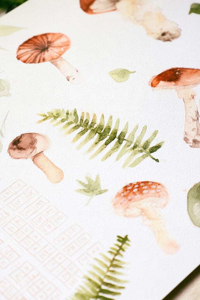
Mushrooms and fern fronds give a tracker or planning page an earthy woodland feel.
Rather than painting one large scene, the page uses separate mushroom studies mixed with greenery and a lightly drawn grid. The individual illustrations feel collected, almost like entries in a nature journal.
This is an especially good theme for autumn, cottagecore, botanical, or woodland-inspired bullet journals.
21. Woodland Autumn Planning Page
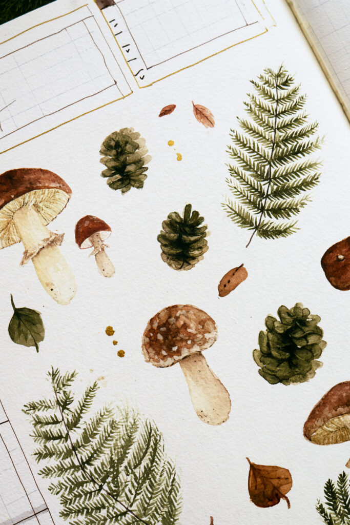
This woodland layout takes the autumn theme further with mushrooms, pinecones, fern leaves, and fallen foliage.
Earthy browns and deep greens make the page feel seasonal without relying on bright orange everywhere. The planning boxes remain lightly drawn around the illustrations, allowing the botanical details to weave naturally through the spread.
If you like autumn bullet journals but prefer forest colors to pumpkins and orange leaves, this is a strong alternative.
22. Pumpkin and Plaid Journal Page
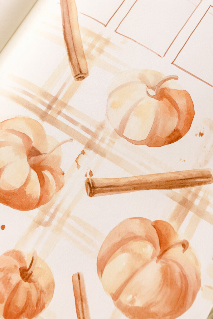
Watercolor pumpkins paired with a loose plaid pattern create a cozy autumn page with plenty of personality.
The warm cream, rust, and soft brown palette keeps it gentle, while cinnamon-stick shapes and the irregular painted checks add extra seasonal texture.
You could carry the plaid pattern into headings, dividers, or small boxes throughout an entire October or November bullet journal theme.
23. Cozy Sweater Weather Timeline
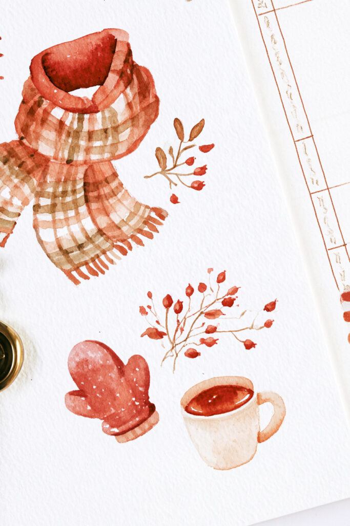
A scarf, mittens, warm drink, and tiny autumn branches turn a simple timeline into a cozy seasonal spread.
The narrow timeline sits along the edge of the page, leaving the larger watercolor illustrations to create the mood.
It could be adapted for autumn plans, a seasonal bucket list, monthly memories, upcoming events, or a visual countdown through the colder months.
24. Cozy Tea and Reading Tracker
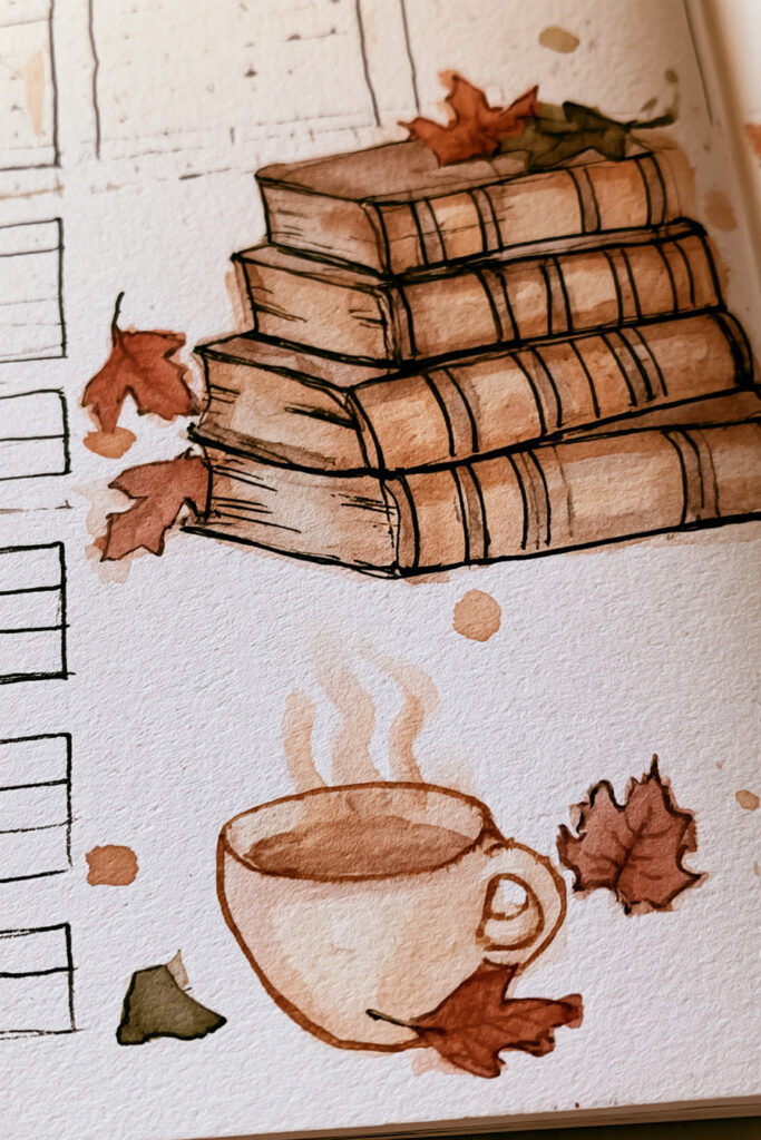
A steaming cup beside a pile of old books immediately gives this tracker a warm reading-journal feel.
Fallen leaves and warm brown watercolor reinforce the cozy autumn palette without adding too many separate elements.
Use this concept to track books, reading sessions, pages read, tea-and-reading evenings, or simply as inspiration for a literary-themed bullet journal spread.
25. Celestial Watercolor Tracker
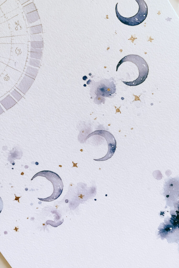
Moons, tiny gold stars, pale flowers, and midnight-blue watercolor create a softer take on a celestial bullet journal theme.
The moon phases become part of the tracker rather than sitting there purely as decoration. Small splashes of blue and lavender fill the surrounding white space without making the page feel heavy.
This theme can easily continue into sleep trackers, monthly covers, habit pages, or nighttime reflection spreads.
Easy Watercolor Bullet Journal Tips for Beginners
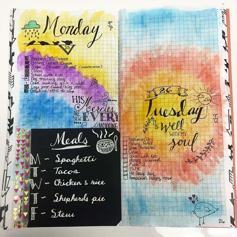
The easiest way to start is to keep the paint secondary to the journal itself. You do not need to cover a full page to make watercolor feel intentional.
Use a light pencil sketch when you need placement guides, and start with small areas of watercolor rather than a full-page wash. Let the paint dry completely before adding pen details, especially when working with black fineliners or lettering.
A small palette is often easier to control than a large one. Two or three colors can be enough for an entire spread, especially when you repeat them in headings, borders, flowers, or tracker keys.

- Test the paper on a spare page before committing to a large wash.
- Use less water for thin journal paper and build color gradually.
- Let watercolor dry before drawing or lettering over it.
- Keep planning areas clear enough to stay easy to write in and scan.
- Repeat a small palette across a spread to make different elements feel connected.
If mixing colors is the part you find difficult, you can check our watercolor mixing guide is a useful next step.
For a more controlled way to add painted florals and washes, try the waterbrush pen guide.
If you would rather combine paint with small drawings, there are also 25 easy bullet journal doodle ideas that pair naturally with these layouts.
For tools and paper basics, see the bullet journal supplies guide and the bullet journal pens guide.
Start Small and Build From There

You do not need to recreate the most detailed spread in this collection first.
Pick one part of your next page – a heading, border, flower, or tracker – and add watercolor there. Once you know how your journal paper responds and how much water feels comfortable, you can gradually use the same techniques across full weekly spreads and monthly themes.
The best watercolor bullet journal pages still work as journals first. The paint should make the page feel more like yours, not make you afraid to write in it.



Watercolor Bullet Journal FAQs
Can you use watercolor in any bullet journal?
You can try watercolor in most journals, but the result depends heavily on the paper and how much water you use. Test a small area on a spare page first. If the paper reacts badly, use less water, try watercolor brush pens, or paint the artwork separately.
How do you stop watercolor from bleeding through bullet journal pages?
Use less water and build color gradually instead of saturating the paper in one go. Let each wash dry before adding more paint. Testing the paper first is the safest way to see how your particular journal behaves.
Are watercolor brush pens good for bullet journals?
Yes, especially when you want more control than you get from a traditional wet brush. They work well for small flowers, lettering, gradients, and watercolor-style accents.
What is the easiest watercolor bullet journal idea for beginners?
Start with a simple wash behind a heading or a small watercolor border. You do not need to draw anything complicated, and the imperfect edges are part of the look. Once you feel comfortable controlling the amount of water, move on to flowers, trackers, and larger backgrounds.