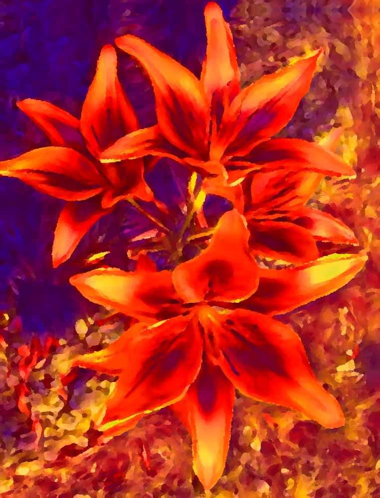
Orange is one of the secondary colors and is made by mixing yellow and red. If you want a deep rich orange you could start with a dark cadmium red and a cadmium yellow. If you want a more earthy orange the Venetian red and yellow ochre can make a great combination.
As with your any other colors try different combinations to achieve the effect you want. The orange color of a classic Seville orange will need different colors than you would need to mix a deep rich Vermillion.
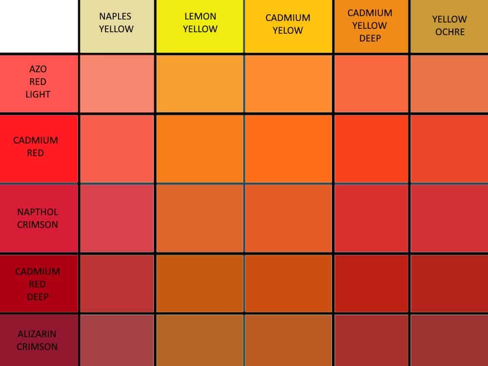
Make an orange paint chart
Making a paint chart will help you understand the effect of mixing different colors much better. You can create an orange only color chart like the one below by using yellow’s in all the columns and red’s along the rows. It will show you the wide variety of orange colors you can create easily.
If you look at a color wheel you will see the relationship orange has to the other colors. Because it is mixed from red and yellow primary colors it is inherently a warm secondary color. However the color temperature can be adjusted within a certain range to help add depth to your paintings.
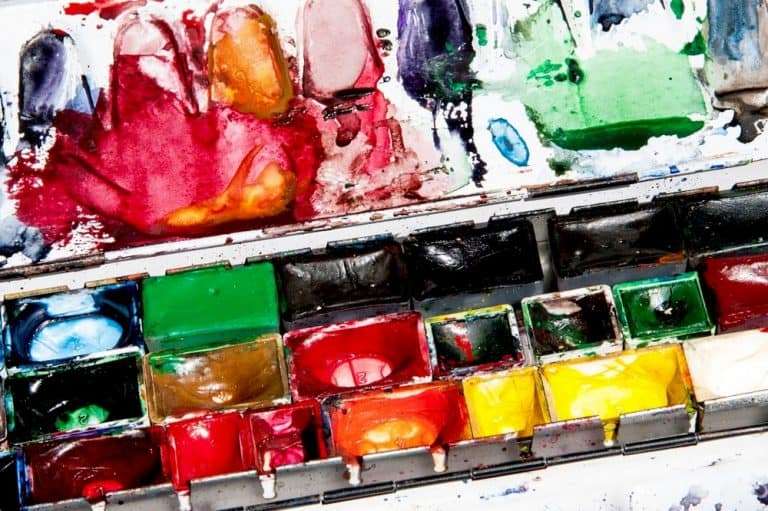
Try mixing the different red’s and yellow’s in your paint box to see the different colors you can achieve. Time spent practicing and understanding the amount of each color needed here is well spent. It can save you hours of time when it comes to getting the colors you want on a painting.
Please note, the colors in the chart are representative. Computers will render them according to set up so the colors will vary from one screen to another. The idea is to give you an idea of the different effect that mixing slightly different colors can have on the mixed color.
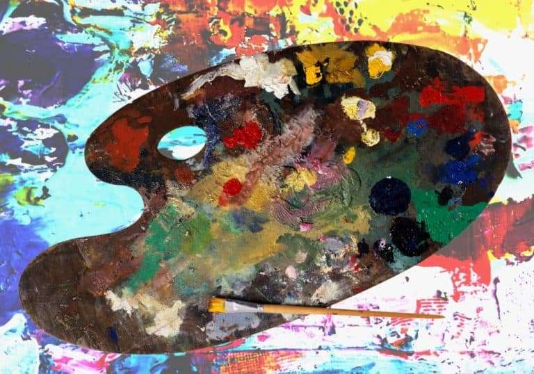
Make mixing your colors easy
Take a pallet knife and spread a thick line of Cadmium yellow oil paint across a primed piece of paper, then put a small blob of each red you have next to the line about an inch apart. Mix the red across into the yellow gradually using less red as you move across the line to the next color.
Clean you knife or brush and do the same with the next red and carry on until you have done them all. Study the different colors you end up with closely and you will start to see which colors give the effect you want.

The options are endless
You can then do the same but using lemon yellow. The lemon yellow will cool down the red’s a little. Study the different effect the lemon yellow has when you compare it to the line of colors made using cadmium yellow.
Chrome yellow is one of my favourite colors and has a different effect on the red’s again. It is a really vibrant yellow with a strong pigment and is great if you need a really bright warm orange.
Please note. Cadmium yellow hue and chrome yellow hue are different colors. They are both lighter and less intense than cadmium yellow and chrome yellow. The hue colors have a higher white content and are a little more opaque. If you are painting washes they just don’t work as well. The oranges they produce are lighter and more opaque.
Using a heavy red like napthol crimson with Chrome yellow hue you will make an opaque orange that is great for underlying color but will need thinning a lot for washes.
Alizarin crimson and chrome yellow are both intense but translucent colors. They are fantastic for washes and for painting wet on wet. The orange they produce is warm and vibrant and can give a painting a beautiful glow.
If you want an earthy orange then mixing red ochre and yellow ochre is a great place to start. It really does make a fantastic natural orange color. Adding a little alizarin crimson will give it a deeper richer tone, or adding chrome yellow will give it a more vibrant glow.
Final thoughts
The possibilities really are endless. Your imagination is the only limit. See how many different oranges you can make with the red’s and yellow’s you have in your paint box. You will be surprised.
This all works with oil paints acrylic paints and watercolors so just experiment and enjoy the fun.
Experiment and try to understand the results. As your knowledge grows it will get easier and easier to mix the exact colors you want quickly. Adding a little ultramarine blue will give you darker cooler tones for shadowed areas, but be careful not to add too much or you will just end up with a muddy brown.