
Secondary colors are the colors created by using equal amounts of any 2 of the 3 primary colors. When you are painting, these secondary colors are orange, mixed from red and yellow, green, mixed from blue and yellow, and purple mixed from blue and red. Understanding what both primary colors and secondary colors are, will help you to mix the exact colors you need from fewer tubes of different colors of paints.
What are secondary colors?
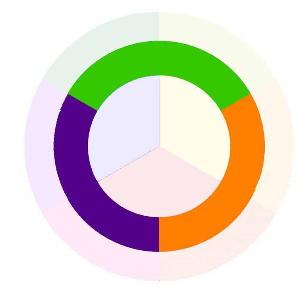
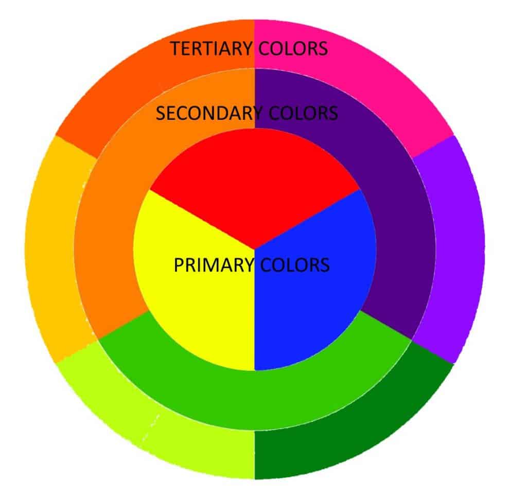
Secondary colors are the simplest colors that you can mix from basic primary colors. They form the 2nd layer in your color wheel (see below).
For the color to be a true secondary color, the primary colors need to be mixed in equal parts. If you use more red than yellow, you will still get an orange. However, this will be a redder orange than a true secondary color. These in-between shades are called tertiary colors, and we will talk about them in other articles.
There are an infinite number of colors beyond the primary, secondary, and tertiary sections of the color wheel, and with time and practice, you will learn to use your paints more effectively. You will get better and better at mixing the exact color you want.
How to create the different secondary colors
You can see below that each of the three secondary colors is associated with 2 primary colors. They sit between the 2 primary colors they are mixed from on the color wheel.
Green is mixed from equal amounts of primary blue and yellow. Orange is mixed from primary red and yellow in the same way. The 3rd secondary color is purple; this is mixed using primary red and blue paint.
Remember, not all blue paints are primary blue. For example, ultramarine blue has a fair amount of red pigment in. Most manufacturers make several shades of the different primary colors, and they aren’t always labeled as ‘primary’ colors.
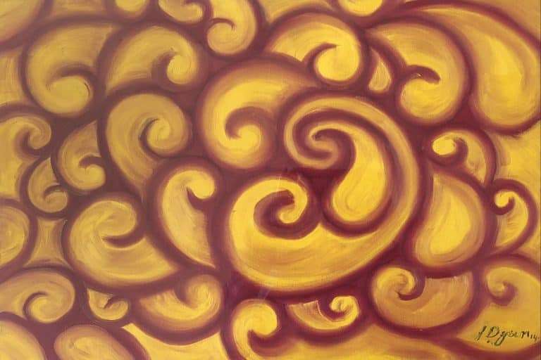
You will find that using secondary colors in conjunction with primary colors makes your painting more expressive and vibrant.
What are complementary or contrasting colors?
Each of the secondary colors has a complementary primary color opposite it in the color wheel. You can see in the image below. Each primary color has a complementary secondary color. Orange and blue are complementary colors, as are purple and yellow. The last pair of these complementary colors are red and green.
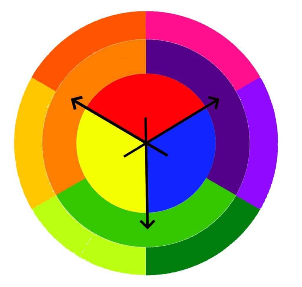
Using complementary colors in a painting can allow you to add contrast and bring your paintings to life. They create a vibrancy that allows you to grab the attention of people looking at the painting.
Complementary colors are also contrasting colors. When they are placed next to each other, they offer the most contrast possible. You will often see company logos that use complementary, contrasting colors, as they offer better readability, especially from a dis-tance.
There is a great contrast checker tool you can use to help you quantify the contrast between 2 colors. It will help you figure out how much 2 colors you are using stand out from each other. It is based on text readability but is just as relevant to painting.
Final Thoughts
This is the beginning of your journey into understanding color. You will find more information in our article about color wheels, but there is so much more.
Use the tools on the site to find the articles that will help you most.
If you want articles specifically about color, then just type color into the search bar and hit enter. Then you can search through the articles that discuss color in many different ways.
I am sure you will find something to help improve your paintings. If you do want something specific, leave a comment below, and I will answer as soon as I can. It may help me decide what the next article needs to be about.
Thanks again for reading on to the end. I hope the lessons I have learned help you to im-prove your painting and your understanding of color.