

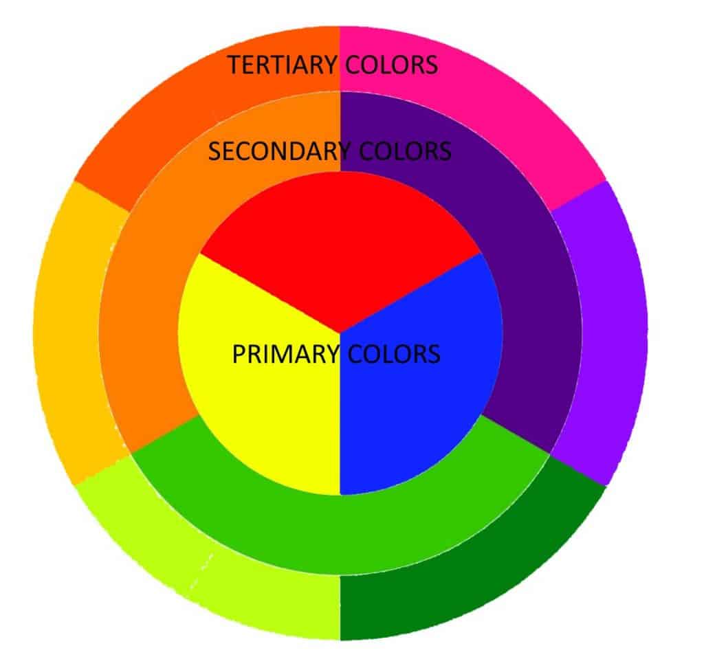
Color theory is based on the concept of the color wheel which we discuss more later. This concept defines all colors and sets them in groups. The 3 primary colors of red, blue and yellow. The three secondary colours and the third ring of colours on the color wheel which we call tertiary colors.
The concept was originally proposed by Sir Isaac Newton in 1666. Now over 350 years later it forms the foundation of art and is integral to many industries and organisations worldwide. It touches almost every area of our lives in some way.
To understand color theory you first have to understand what color is and how it can be used. Below you will find some fascinating insights from a professional artist who has spent a lot of time understanding the subject.
Colors all have distinct properties. In our article on the color wheel you will start to see how you can visualise colors before you have even mixed them. You will begin to see how any color affects the colors around it and changes our perception.
Table of Contents
Start with the Basics
We have several articles explaining the theory and use of color. Take the time to read them first if you haven’t already, They will help you understand more of what is written here.
To understand more about the Color wheel, Primary colors, Secondary colors and what color temperature is they will help you. It will all add to your understanding of the fascinating subject of color theory.
What are Primary colors
Primary colors cannot be mixed from any other colors and are a pure hue. They are used as the building blocks for all other colors. Our article on using primary colors will help you to understand the way any color can be mixed from just 3 pure colors.
What are Secondary colors
Secondary colors are a combination of any 2 primary colors. They are mixed using equal quantities of any 2 primary hues. Our article explaining how to use secondary colors will all help you and add to your understanding of this vast subject.
What are Tertiary colors
Tertiary colors are a mix of one primary color with one secondary color. They are usually shown on a color wheel as separate bars of distinct color but in reality they include an endless array of colors. Using a color chart and practicing mixing these colors will help your understanding more than any other exercise.
Watching how adding a tiny amount of certain colors can affect the color it is mixed with has always fascinated me. Studying those changes has helped me become a better painter for sure.
What is color theory?
Color theory is both a science and an art. It is a collection of guidelines and rules that artists and other professionals use to communicate on any visual platform.
Color theory is a subject that transcends the world of art. It is used in almost every decision we make. Advertising, marketing, web services and product design all rely on people understanding the way colors affect our brain.
Shops are constantly changing and adapting the internal color scheme of the shops themselves to “improve the customer experience” and maximise the profits they make.
It’s all about perception
One thing you should always remember. Color is about perception. This is something that is never fixed. A color that appears red to some of us may well appear green to others. Neither person is actually wrong, they just see things differently. Reflections and background colors can change the way we see a color completely.
When we say what a beautiful blue sky it is tonight, that is our own personal perception of the color we see. Someone else might well see more reds or purples in the same sky. We all see things quite differently. Practicing creating a color chart will help you begin to see beyond the color you have mixed to the component colors it is made from.
In branding, it is an accepted fact that the “Buy it Now” decision we make whenever we go shopping is triggered in the first 90 seconds of seeing a product. The biggest single factor in choosing to buy any product is actually color. That may be the color of the logo or the product itself, but color theory affects every one of those decisions.
If you are feeling angry that may make red products more appealing. If you are feeling tranquil and calm, a pastel blue or purple product may well entice you more. Red cleaning products can be viewed as stronger whereas blue ones are seen as more antibacterial.
This means at different times we will make different decisions based on the situation itself. Maybe trod mud all over the kitchen floor yesterday and your focus is more on cleaning strength so you choose the red cleaner. However, it might be that the bin split when you were emptying it. In this case you might choose the deep cool blue anti bacterial floor cleaner instead.
Color schemes.
Color schemes are groups of colors that we choose to fit together. There are several different kinds of color schemes and all have their merits.
What are Monochrome color schemes?
Monochrome doesn’t just mean the use of black, grey and white. It is the use of one dominant color to define a painting with just the value and saturation of that one color adjusted to create the shading and light within the painting. All the paintings below could be described as monochrome.
What are Analogous color schemes?
An analogous color scheme is the use of three colors located next to one another on the color wheel. This could be orange, yellow and red used to paint flames or blue, red and purple to color a night sky.
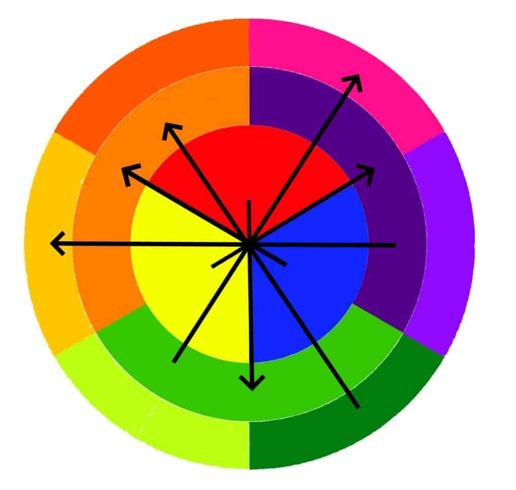
What are Complementary color schemes?
A complementary color scheme is one made up of colors opposite each other on the color wheel. These are often used in branding because they create a bold, high contrast, vibrant image. This makes something created using a complementary color scheme very striking.
Look at the color wheel and you will see that red complements green. Blue complements orange and yellow complements purple.
This works as long as you understand that to complement another color you should look one ring apart and on the opposite side of the color wheel. See the image below to give you a better idea.
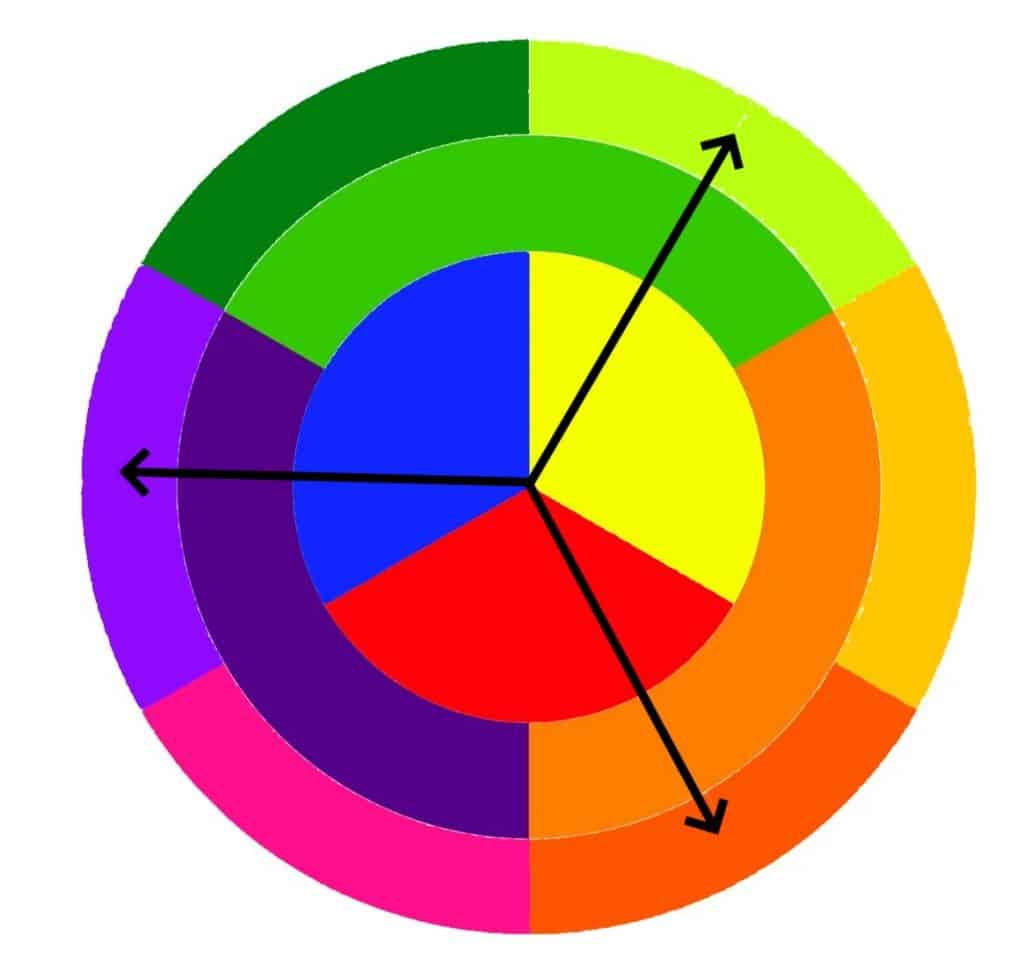
What are Split complementary color schemes?
Split complementary color schemes are probably the most widely used across many industries. They soften the contrast of a complementary color scheme and are seen as kinder on the eyes. Put in simple terms, Complementary color schemes are great for attracting attention but might make it difficult to focus on them long term. Split complementary color schemes may not be so striking, but they will hold the attention of the viewer for longer.
To create a split complementary color scheme, you should use colors from either side of one of your complementary pairs. For example, if your primary pair is red and green, you would use a yellower green or a bluer green alongside your original green.
What are Triadic color schemes?
Triadic color schemes use three colors that are equal angles apart on the color wheel/ The most basic of these is using the three primary colors of red, yellow and blue. However, the deep reddy orange, the violet purple and the greeny yellow are one of the other many triadic color schemes.
The vibrancy of the color may not be as intense as with a complementary color scheme but it can be easier to create a harmonious and appealing design using a triadic color scheme.
What are Tetradic color schemes?
A Tetradic color scheme is one that uses two distinct pairs of complementary colors. From these four colors one is chosen to be the dominant color. This color should be the highest intensity color you use and should be the first color you see when you look at the painting.
The other three colors can be used to balance the dominant color and create contrasts without the intense vibrancy you get using a single pair of complementary colors. It can be a useful way of balancing warm and cool colors and if used correctly can create rich and interesting designs that don’t get too intense.
What are Square color schemes?
A square color scheme is similar to the tetradic color scheme, but the four colors should be evenly spaced apart. In the example below you will see that gives you two yellows (one a cooler greeny yellow and one a warmer orangey yellow), a bluey violet and a reddy pink.
In a square color scheme these should be used more equally, not allowing one particular color to be dominant. Together these colors create an inherent temperature balance that will allow the colors to be used together without creating the sort of intense vibrancy you get with using a single pair of complementary colors.
Using color theory to achieve exactly what you want
You can use color theory to achieve many different end results. If you are creating a logo or brand header you have to imagine what that company want first. If they are a high intensity brand with a vibrant image you need to capture that. Using a complementary color scheme will make that much easier.
If what you need is a calming relaxing color scheme then obviously complementary colors won’t work so well. Using a softer Tetradic color scheme with one dominant color may help you create a much more relaxed logo that helps portray that calm image with serenity.
You wont always get it right first time which is why it is important to keep practicing. As you learn you will intuitively understand which colors will work best in a particular situation. This might not be a quick process but it will happen if you practice enough.
Color therapy
Beyond that color theory has been used to assist in the treatment of mental health patients too. Certain colors are acknowledged as having a “calming” or “soothing” effect.
An artist will inevitably want to create a different effect than a therapist, an interior designer or Signwriter. However they will all use color theory to help them choose the right colors for the particular job.
The relationship between primary secondary and tertiary colors is one that is fascinating. It may reveal more than you expect as you begin to understand it more.
Our first expert breaks it down simply.

Amy is the Interiors Writer at Wallsauce and sees things from a Well-being perspective. She breaks it down into very simple terms below. Different colors do make us feel differently.
“Orange makes you feel joy
Purple inspires creativity
Yellow drives confidence
Green combats anxiety
Red fills you with energy
Blue heals pain
Pink encourages compassion”
Understanding the terms used in color theory
What is Hue?
The term hue refers to a color in its purest form. Technically this means that only the three primary colors, red, yellow and blue are true hues.
What does Value mean?
The value of a color relates to the level of lightness or darkness. So a color of the same hue may appear different due to different levels of “Value”. Three types of value adjustment are fairly common. You can “lighten” an area by overpainting it with a thin glaze or tinting it on a computer. The opposite would be to “darken” it using darker colors to shade it in a similar way. The third option is to “tone down” the colour by using a grey to “wash out” the colour more.
What does Saturation mean?
The saturation, chroma or intensity of a color is a measure of how bright or dull the color is. A pure hue is acknowledged to be the brightest intensity of all. Mixing other colors with it will reduce that intensity or saturation. Even if a color is mixed with a complementary or neutral color, the intensity will be reduced.
An in depth analysis from Our Expert on Color Theory

Chris Semtner is a visual artist and author. He has been Curator of the Edgar Allan Poe Museum for over 15 years now. In addition to his painting and writing, Chris has curated and designed critically acclaimed exhibits for museums and galleries across the country.
Website: Chris Semtner – Artist, Author
Twitter: https://twitter.com/ChrisatthePoe
Instagram: https://www.instagram.com/chrissemtner
“Just what is color?” He asks.
“Scientists, philosophers, authors, and artists have been theorizing about color for centuries. When we think about the pigments in your paints, we tend to define color as the pigments that are not white.
If you mix all three primary colors or just two complimentary colors, you get brown. You can also get black by mixing a dark warm brown like burnt umber with a dark blue like ultramarine blue.
These mixtures of all the colors – black, brown, and grey – are called neutral colors. Some painters avoid them because they (along with white) are considered to be colorless.”
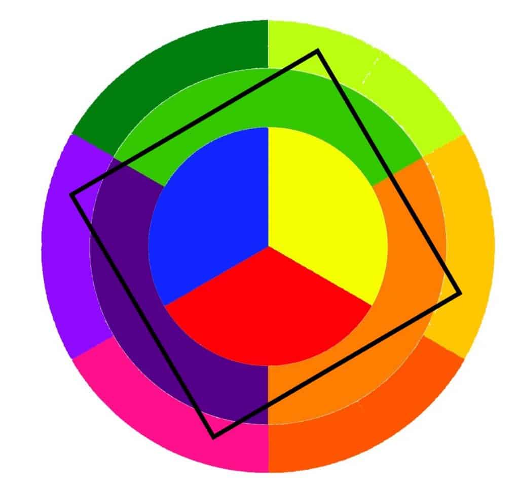
Complementary colors
“To understand complimentary colors, we should take a look at a color wheel. Think of the color spectrum (not including black, white, gray, and brown) as a pie. Cut that pie into three equal slices. They are red, yellow, and blue. We call them primary colors because they are the ones from which all the others are made and because you can’t mix any other colors to create them.
If you cut each of those slices in half, that gives you six pieces of pie. Between the yellow slice and blue one, you have a green one because mixing yellow and blue paint makes green.
Between the blue and the red is purple, and between the red and the yellow is orange. These three new colors are called secondary colors because they are made by mixing two primary colors.
If you cut the pie perfectly, the red should be directly across from the green, the purple should be across from the yellow, and the blue should be across from the orange. These pairs are called complimentary colors.
When you place compliments of the same value next to each other, they react like the red and green does in our demonstration below.”
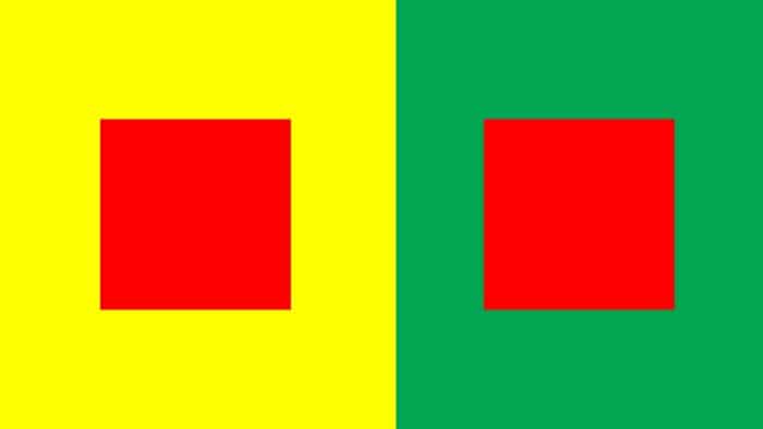
Different colors affect other colors differently
“To demonstrate this, cut out two small squares of red construction paper like in the example below. Place a sheet of yellow paper next to one of green. Then put your little red squares in the middle of each sheet. Those two red squares look different even though you know they are exactly the same color.
The red square on yellow looks darker because it is contrasting against the lighter background color.
The red square on the green sheet seems to flicker because it is the same value as the background. Your vision is having trouble distinguishing the background color from the foreground.
Your cones, the tiny structures in your eyes that are stimulated by colors, identify them as two different colors. However, the part of your brain that processes information about the patterns of light and dark that are sent to it by your eyes see it differently. It tries to identify shapes by interpreting things in values (rather than colors) and can’t make out the boundary between that red square and the surrounding green. Red and green interact with each other this way because they are complimentary colors.”
How to use complementary colors
“Artists have long used this trick to make their paintings more vibrant. Think of that Monet painting of a green field dotted with red flowers. In this portrait, look how little touches of blue and purple compliment the oranges and yellows in the background to create an expressive or unreal effect. That effect would have been lost if he had used more naturalistic colors.”
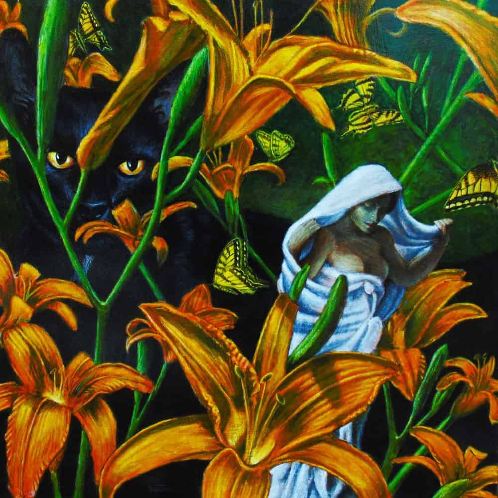
How I use the same trick
“I pulled a similar trick with The Dangerous Garden. Notice how the orange flowers are complimented by blues in the cat’s fur and in the woman’s garment. This makes the flowers appear more vibrant while giving the painting more of an illusion of depth.”
An expert Artists thoughts
“Painting a picture is like constructing a building. Instead of using bricks, mortar, and lumber, the painter utilizes a different sort of materials. Among the painter’s building blocks available are value (how light or dark something is), line (the borders between different shapes), composition (the way things are arranged on the two-dimensional plane of the painting), and color.
The pigments that are not neutrals are colors. Examples are red, blue, purple, and green. The proper name for a color is a hue. Let’s talk about hues. Take, for example, red.
When you are shopping for paints, you might notice there are a half dozen different tubes of red paint hanging next to each other on the display. They are all the same hue—red, but these reds vary in value and chroma. Value is how light or dark that red is. Chroma is the level of how red that red is. A bright red would have high chroma while a dull, brownish red has a low chroma.
When you look at the various reds in the world, you will see that there are dark reds and light ones as well as the vibrant red of a kid’s balloon or the dull red of a terracotta pot.”
Understanding hue
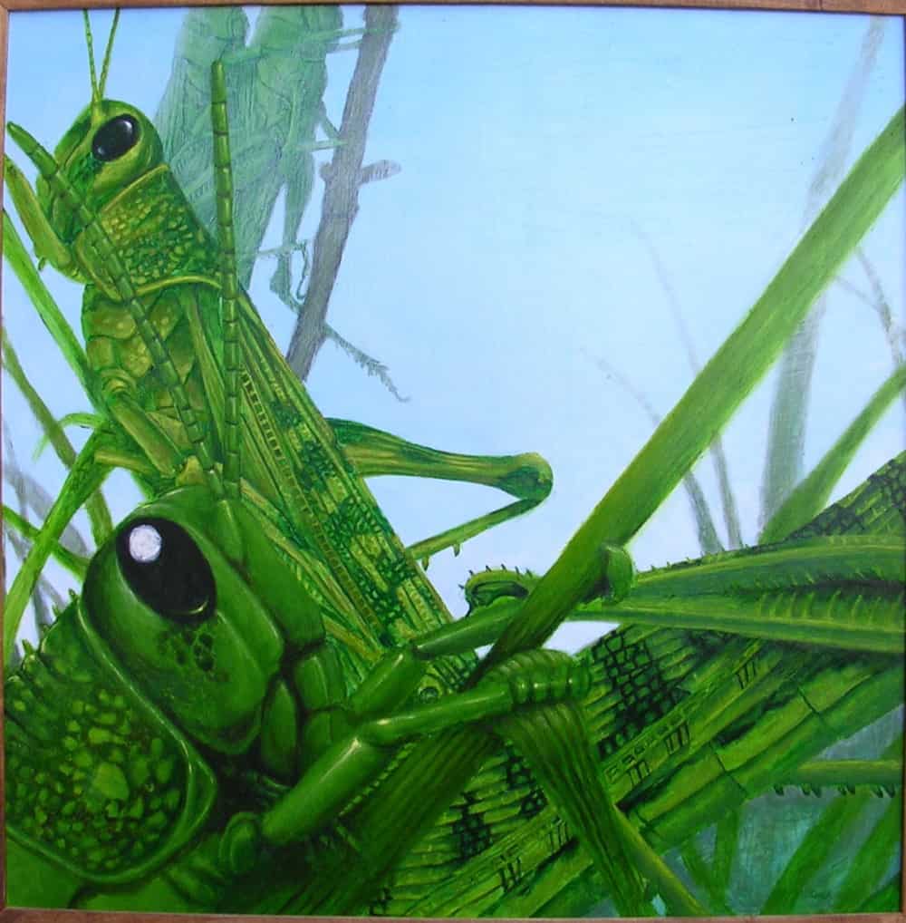
“You will also notice that any hue tends to be warm or cool. Reds are usually warm while blues tend to be cool. Cool colors tend to recede, like the bluish mountains in the distances. Warm colors tend to come forward, like the warm green leaves of the tree a few yards in front of you—and a few miles in front of those distant peaks.
To see this in action, take a look at the painting Swarm below. Although all the grasshoppers are green, I enhanced the illusion of depth by making the foreground grasshoppers darker and warmer than the pale, cool background grasshoppers.
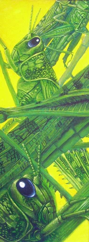
Another thing you will notice about hues is that they are affected by all the colors around them. Take a look at Swarm II. How different do the green grasshoppers look against a blue background than they did against the yellow background in the first Swarm?”
How to use the color black
“The Impressionist painter Claude Monet famously avoided using black in his paintings because he thought it would muddy his colors. His colleague Pierre Auguste Renoir, however, embraced the used of black because he understood it could be used as a color.
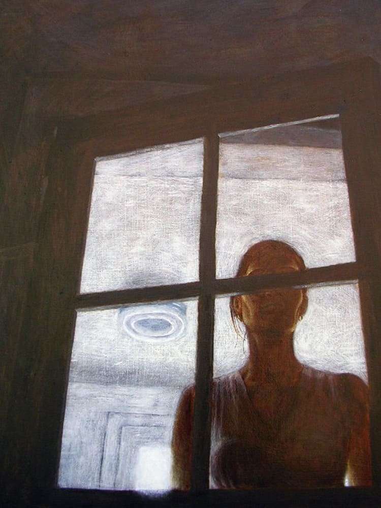
In my painting Arrival. I painted in neutral tones, especially browns, But I have added reds to the foreground to warm up the browns just as I have added a drop of blue to the background wall to make it appear to recede.
Compliments are also useful for adjusting a color’s chroma. If you are trying to paint the dull red of a brick but only get the vibrant red of a clown’s nose, add a tiny bit of red’s compliment, green, to the mix. Be careful not to add too much, or you will end up with brown.”
How to use Chroma
“Another way to adjust the chroma is to spread a very thin glaze of green mixed with your painting medium of choice (linseed oil and mineral spirits for you oil painters and acrylic polymer emulsion for us acrylic painters) over the red. Keep it very transparent by adding only a drop or two of green to your medium. You can always add another layer of glaze if it is not enough, but you’ll end up with green bricks if you apply too thick a layer.”
His conclusions
“This is only a brief introduction to color theory. You should continue to study and experiment to find out what works best for you.
Keep in mind that it is only a theory. When the great British painter Thomas Gainsborough was told that there should be no blue in the foreground of a painting because color theory tells us that blue tends to recede into the background, he painted a portrait of a boy standing front and center, wearing a bright blue outfit. Now that painting appears in all the best art history textbooks. It goes by the nickname Blue Boy.”
Color theory is everywhere
As I explained earlier, color theory is relevant to many industries. Two examples from different industries that rely on color theory a lot give an experts explanation of how they use it.
In the words of a professional

Evelyn Ott, Tattoo Artist and Content Writer from Soul Canvas Ink talks about color in the tattoo industry first.
Evelyn is a professional tattoo artist who specializes in a classic flash style, defined by its thick bold lines and playful subject matter. She dedicates her spare time to producing new sheets of flash and educating people on everything related to the tattoo industry.
Color theory is basically the art of how colors blend together, and the kind of image, or rather visual effect that they give off.
Colors are actually very powerful. Some are warm, inviting and calming, while others are screaming, hostile and angry. Some can make you sad and others can brighten up your day. This is why you’ll see that hospitals, psychiatric wards and places with the mentally ill, choose colors very carefully. They affect our emotions.
We decide whether we like a product in less than 90 seconds, and 90% of the time, our decision is mostly based on color. Color affects our emotions.
Look to create harmony
Some color combinations are harmonious while others are chaotic and ring warning bells in our heads. Color theory is all about how colors are more than just simply colors.
Color theory is basically how colors mix, match or contrast with each other. Some colors can be formed by mixing two different colors together. For instance, how you can mix red and yellow to make orange, as well as blue and yellow to make green.
As a tattoo artist, you don’t have to buy All the colors of tattoo ink. You can just buy red, yellow, and blue, which are the primary colors, to mix and form others, as well as white to make light colors. But you have to be conversant with color theory to know what amount of blue or red you need when mixing.
For instance, you can’t use a ratio of 1:1 of red and yellow to make orange. You need a little bit more of yellow to make orange. 1:3
White is used to make the color lighter. So if you want a light color, mix it with white to get it lighter. Example, a mix of red and blue gives you a dark purple, and when you mix this dark purple with white, you get a light color purple.
Color theory is very helpful because your client gets to pick the very exact color combination by mixing colors. They get some very unique shades of color they love that would have otherwise been difficult to get.
It saves you a lot of stress shopping for specific colors that clients want, because all you have to do is use color theory and experience to make them. You’d have like a million different ink bottles in your shop.
Another expert explains

Thalita Ferraz is a very successful beauty and fashion influencer originally from Brazil. She created a YouTube channel focused on fashion and beauty, building a following of over 2.3 million followers. She’s since transitioned her efforts over to her Instagram account.
Instagram – 665k Followers
Youtube – 49k Subscribers
TikTok – 180k Followers
In her words
“To explain it in simple terms, color theory is the science of combining colors by considering the way they interact with each other. This is based on the color wheel of primary, secondary, and tertiary colors.
Basically, color theory is understanding how colors relate and react to each other. Color theory is used by artists and painters, designers and marketing brands. However, it is also used in makeup when color correcting your face, and in fashion when putting an outfit together!
How color theory influences my profession
There’s a lot to know about color theory if you want perfect makeup or to create the perfect outfit for a special occasion. When I’m using makeup the most important thing to know is how to neutralize uneven skin tones.
If for example, you have dark circles under your eyes that are a blue or purple-ish color, you will need to use an orange or yellow concealer before your foundation. This will neutralize the purple and leave your eyes looking bright and fresh.
If you have some red blemishes, you should try and find a blue or green concealer for the same effect – take some time and look into color theory in order to help you improve your makeup.”
Final Conclusions
Color theory is a huge subject that expands into every aspect of our world. However, you don’t need to understand all of it. Try to learn how the basics affect the art you want to create.
Study the things around you to see how color theory is used everywhere.
Practice the basics like mixing colors and how to use color for a particular visual effect. You will learn how color affects perception and how you can use color to help create depth in your paintings.
Painting is a fantastic hobby and will teach you many things as you learn how to improve your painting and drawing. We have many tutorials that are designed to help you on your way. As you improve your confidence will grow and paintings that once seemed impossible will become much easier.
Enjoy your journey into the wonderful world of color.


