

Whether you are drawing or painting a tree there are some basic rules to help you. This article will give you all the basic ideas you need to follow. Learning how to draw trees will help you paint them easier so the 2 subjects are inextricably linked.
I love nature, and the beauty of Trees can be hard to beat. They can provide endless inspiration for paintings, and although they can be difficult at times, don’t be put off. With so many facets to consider, it can seem a difficult and daunting task. Don’t worry, it isn’t really.
As with any drawing or painting you just have to break the whole process down into a series of relatively simple tasks. Look past the whole tree. See the shape of each part. Look at how those parts fit together. You will also see the effect of where the light is coming from. This will help you bring the picture to life.
Table of Contents
Look beyond what you think the tree should look like
Try to get beyond what you think the tree should look like to seeing it as it truly is. Our preconceptions can be our enemy. You would be surprised how much the brain ‘fills in the gaps’ left by our eyes if we dont concentrate hard.
Much of the shape of the overal tree will be from the trunk, main branches and the shape of the crown of the tree. However, you need to see beyond what you think trees look like. All species of tree will have a slightly different standard shape, but their actual shape is affected by many things.
Nature has its own rules
Nature might have its own set of rules but every tree is affected by its environment. They will all look different. Imagine how a tree clinging to the side of a blustery cliff is affected by the place it grows. It will look very different to the same kind of tree grown in a sheltered garden.
It is the shapes, tones and colors within the tree that will help you create both life and emotion in your drawings and paintings.
My first piece of advice would be to collect as many photographs, sketches, paintings and drawings of as many different trees as you can.
Ideas to help and inspire you
As you can see below, a drawing or painting doesn’t need to be complicated to be good, simplified minimalist pieces can be very striking. Style is very personal. An impressionist image can be done quickly and easily, but be very striking.
Photo realism can evoke many feelings in the person looking at the image, and a surrealist approach may take both artist and viewer to a completely different dimension. All have their place. There is no such thing as the perfect picture. Your own style is the best one for you.

Bob Ross
One artist who possible painted trees better and more easily than most is the ubiquitous Bob Ross. Take the time to watch him prepare and paint in his particular big brush impressionist style. Watch how he first creates the basic shapes, and then layers up lighter colours and darker tones to bring out the depth of the picture.
Then see how he picks out the details and shadows of the trunk and bigger branches to bring the whole picture together. You can draw in the same way with a big chisel edged pencil. Make bold confident pencil lines with the wide blade annd bring details out with the sharp edge of the pencil.
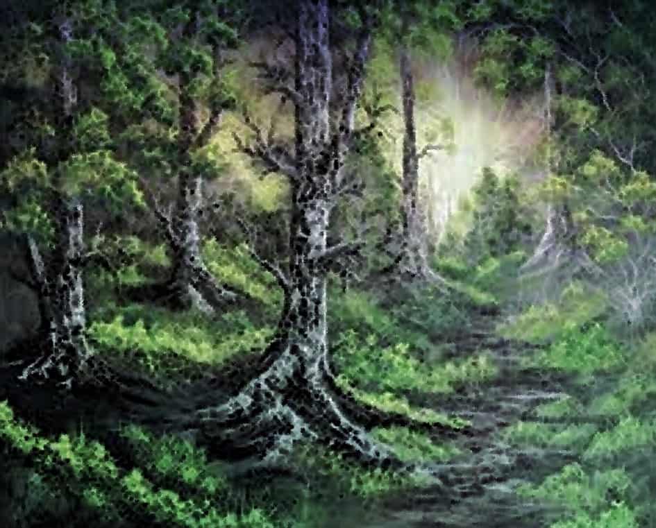
Below you can see one of my attempts at a Bob Ross style treescape.
Just Experiment
Just experiment on some old canvas or paper. Maybe try crushing the ferrule of a big old brush to spread the bristles and give you a tool that will help create the impression of leaves, and highlight the shaded sections quickly and easily. The practice will be invaluable, and give you insights as you begin each and every painting.
Starting your drawing or painting
You will see that the trunk is wider at the base of the tree and that branches get wider the closer they are to the trunk. Make sure you don’t make anything too even. The size of branches should vary in length and width. They should also be spaced unevenly apart from each other. Trees are never completely symetrical.
Draw in the lines lightly to begin with
Erase unwanted pencil lines as you go but dont get stress about it. If you draw them in light in the first place many will be covered as your drawing progresses.
In your paintings the paint will cover any lines you want to. However, painting in watercolors over a drawing and leaving the lines can create fantastic effects.
When using color
Remember to paint the colors you actually see. Where the light hits the leaves and branches you are likely to see yellows and lighter, brighter colors. In the shadows the colors will be much darker too. Remember, at extremes of dark and light the actual color will be much less obvious, as it is washed out by the shadows and highlights.
Blank out the unwanted details at this point
When you look at the subject you should look beyond the details at this point. Try to draw the basic shapes. One way to help you do this is to close your eyes until only a small slit is left open. You will still see the tree, just a simplified version. This will help you draw all the basic shapes within the tree.
Dark and light
Try to spot the very darkest and lightest areas of the picture. Look for the areas that are well defined. Try to see the empty spaces, these are as important as what you draw or paint. Look for areas where the colors are most intense too.
Remember the effect of perspective
You need to remember perspective too. Think about how a big tree gets distorted if you look at it from below. The leaves and other details closest to you will always be bigger than the ones further away.
You need to guide the eyes of people to where you want them to look so remember to keep the focal point of the drawing or painting prominent. Use the lines and color to emphasize what you want people to see.
You can create depth in the picture by emphasizing the details on any trees in the foreground and limiting the detail you use in trees as they get further away.
Color also plays an important part here as I detail below.
The effect of color
Color becomes more washed out the further away it is too so dont make the background too intense. In a row of trees the one closest should show the most vibrant color. As each tree gets further away the colors will become less saturated.
Think about color temperature too. The closer more vibrant colors are likely to be warmer. The color will get gradually more washed out as they get further back in the painting.
This might mean the leaves and branches to the rear of a tree standing in the foreground are less distinct than the branches closest to you. However, in a bigger landscape it will show as a gradual change of tone depending how far back in the picture you want the tree to appear.
Break up the color to bring out details
If you look at any great impressionist landscape you will notice the leaves rarely look like detailed leaves. They will often just break up one color with another to create the illusion of leaves. This can be a very useful trick.
Using a fan brush to shape the tree and create the leaves
After painting the background use a big splayed round brush with darker colors loaded onto it but don’t use too much paint. Then wipe the brush off and work in a little of the lighter colours.
Then take a good light fan brush (you can make them easily enough from old brushes) lightly load the ends of the bristles with the color you want and just touch them to the surface of the other colors.
You will see the result as small speckles of color in a changing background. It will look moe natural than trying to paint the leaves. It can dramatically change how you see a painting.
Color combinations you should consider
Natural Earthy greens can be difficult to get right. I rarely use a green from a tube to be frank. However, many blues just wont give you the natural greens you want as they are made from metallic elements.
Experiment by creating a color chart. Our article about the color wheel will help you understand how to create the colors you want. The articles about secondary colors should help too.
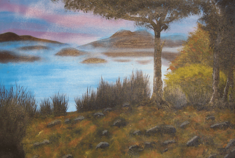
Below is a painting I did at Derwentwater in the Lake District. You can see the effects of the light and how I have broken the colors up without spending too much time on small details. All the greens were mixed using Yellow Ochre or Raw Sienna.
Working from dark to light
Think about the darkest color you want first. I usually begin with a Paynes Grey oil paint. Use this primarily to mix other colors but you can use it in some pictures to add real depth to dark shadowed areas.
Use a big old brush with most of the paint removed to lightly stipple the darker areas of the tree that will be covered in leaves. You won’t see much of this as it will be mixed wet on wet with the colors added on top
Then take some Raw Sienna or Yellow Ochre and mix in a little of the Paynes Grey. When mixed both these colors produce wonderful natural shades of green. You can adjust the amounts of the 2 colors to create any shades that you want.
You can add a little Lemon Yellow or even Cadmium yellow to change the temperature of the colors you create too. Cadmium yellow will warm everything up dramatically whereas Lemon Yellow is a cooler yellow. In the shadows adding a little ultramarine can create a different color within the shadows.
Don’t mix the colors too much
You shouldnt mix the colors too much. If you do they will just become one flat color which you wont see in nature. Dabbing on a little at a time will allow the colors to partly mix and can make it easy for you to control the balance of color within the painting.
You can mix them a little on your pallete but do it roughly. Don’t mix them too much. Deliberately leave areas on your pallete tray that are less mixed. On your painting, where there is more light use the lighter shades. Where there is more shadow use the darker shades.
The tree below was an experiment and has much flatter colors than i usually use. It was done like this to simplify the whole image.

Using earth colours
You can tap in more highlights with a small fan brush too when you need to. Adding some Zinc White with the tips of the fan brush will create the illusion of the leaves being hit by the sun. The shade will end up lighter and less intense because the color behind is ‘washed out’ by the Zinc White.
Breaking the image down
You should the image down into small manageable sections. This will help you bring the picture to life more quickly. First look at the overal shape of the trunk and try to draw its basic form. Gradually narrowing towards the top.
When you are happy with the basic shape, add the lower branches and work up. Draw the shape of each branch as you see it. Just sketch them in for now, dont worry about details as a lot of the sketching will just be covered by the leaves. Then you can begin to add the more subtle shapes within the branches.
Look at how light affects the colors
You need to look very carefully at how the light affects the picture. You can start to create depth and make the picture 3-dimensional quite quickly. Use the shadow to help create light on the branches, and the overlap of leaves will help you create depth.
With drawings, if you rub and smudge the lines it can help make the drawing feel more ‘organic’. With paints this same effect can be created using washes to shade and highlight colours to emphasize shape and depth.
Final details can be added at the end. This can be used to draw attention to certain areas. To emphasising what may be very physically small but important parts of the picture. Using different sizes of pencil tips or types of brushes can also help create the texture you will need.
Framing a picture with trees
Trees make great focal points anywhere in a picture. However, they are also really useful when framing a painting. You can paint a bold trunk up the side of the painting in the foreground and it will help the composition feel balanced.
You can see below how the trunks at the side frame the tree in the centre to create a nicely balanced image.

A simple trick
If you are drawing or painting from a picture and struggling, there is a trick I was once told by an old art teacher. Try turning the picture you are trying to paint from upside down, It will help you see exactly whats is there rather than letting your brain and its preconceptions fill in the gaps see beyond the image itself. It worked remarkably well for me, it may do for you too.
Final thoughts
Remember to have fun. The amazing array of tree shapes and the different ways to represent them means you will never be short of a new challenge.
Capturing the simplicity of a single branch can be just as fulfilling as drawing a whole tree. A forest can present an incredible challenge, but the results can be amazing. To capture the movement of each tree in the wind is the ultimate challenge for me, and you will find very few artists who can do it well.
Start in small easy steps. Get used to painting branches, with and without leaves. Then try single trees, and you can progress to a hedgerow or small wood. After that you can introduce that image within a bigger landscape. Once you have learnt the basics, your imagination is your only limit.
Above all, remember to enjoy it. Having fun will come through in your painting. If you are having problems with something, stop and take a break for a while. When you return you will often find it easier.
Sometimes the fastest way to finish a painting or drawing can be to stop and walk away. You may have that final idea that helps you complete your drawing.
You may just see it with a fresh set of eyes. Nothing shows up more in a drawing than the frustration of the artist. Nothing shows up better than the joy of painting.

")
